UPDATE HERE
As of today, it looks like the GOP will repeat or improve on its showing in the 2010 mid-term election. Four years ago, the GOP won 242 House seats, to retake the majority in that body, and posted a significant 6-seat gain in the Senate.
It’s almost certain that the GOP will hold a larger majority in the House when all the votes have been counted in November. Further, the smart money is on a GOP gain of at least 6 seats in the Senate — enough to recapture the majority.
Obama’s current unpopularity, compared with his unpopularity four years ago, also bodes will for Republicans. I have concocted four indicators of Obama’s unpopularity in 2014 vs. 2010. They’re plotted in the graph at the end of this post.
The first indicator (blue lines) measures Obama’s overall rating with likely voters. This indicator is a measure of superficial support for Obama. On that score, he’s doing a bit better than he was four years ago at this time.
The second indicator (black lines) measures Obama’s rating with likely voters who express strong approval or disapproval of him. Obama’s strong-approval rating remains well below the pace of four years ago, which is a good sign for the GOP.
The third indicator (red lines) represents Obama’s strong-approval quotient (fraction of likely voters who strongly approve/fraction of likely voters who approve) divided by his strong-disapproval quotient (fraction of likely voters who strongly disapprove/fraction of likely voters who disapprove). I call this the “enthusiasm” indicator. Higher values represent greater enthusiasm for Obama; lower values, less enthusiasm. This is perhaps the best measure of support for Obama — and, despite a recent uptick, it looks a lot worse (for Democrats) than it did in 2010.
The green points (connected by lines) are plots of Obamacare’s standing, as measured by the ratio of strong approval to strong disapproval among likely voters. Obamacare is faring much worse in 2014 than it did in 2010 — another good sign for the GOP.
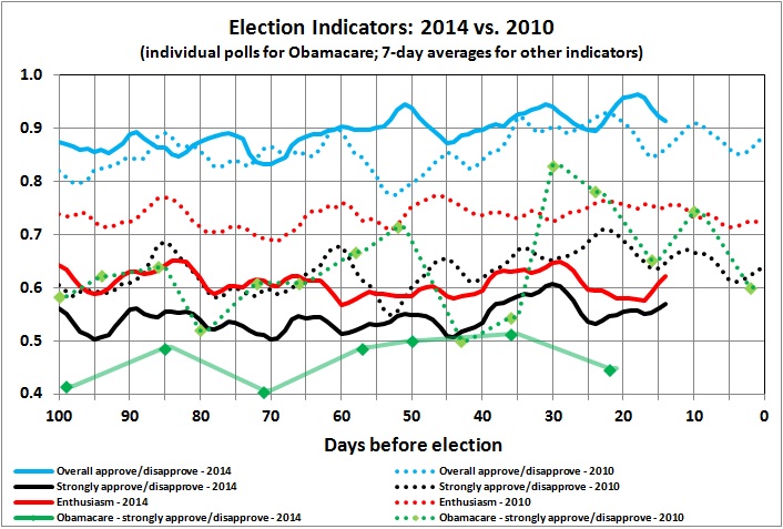
The indicators are drawn from the Obama Approval Index History published at Rasmussen Reports, and Rasmussen’s sporadic polling of likely voters about Obamacare (latest report here).

