Baseball Realignment Reconsidered

I happened upon a post by Nate Silver in which he opines about the realignment of major-league baseball franchises. His criteria:

[T]here’s value in maintaining the distinction between the American and National Leagues…. But teams also have traditional opponents…. [B]ut to preserve any sort of geographic integrity, it would require more switches between the AL and NL than I’m comfortable with — 4 divisions of 8 teams, or 8 divisions of 4 teams. And I’m going for the latter.

His plan:

American League East
Baltimore Orioles
Boston Red Sox
New York Yankees
Toronto Blue Jays

American League Midwest
Chicago White Sox
Cleveland Guardians
Detroit Tigers
Minnesota Twins

American League South
Houston Astros
Miami Marlins (league move)
Tampa Bay Rays
Texas Rangers

American League West
Arizona Diamondbacks (league move)
Las Vegas A’s (pending move from Oakland)
Los Angeles Angels
Seattle Mariners

National League East
Montreal Expos (expansion)
New York Mets
Philadelphia Phillies
Washington Nationals

National League Midwest
Chicago Cubs
Kansas City Royals (league move)
Milwaukee Brewers
St. Louis Cardinals

National League South
Atlanta Braves
Cincinnati Reds
Nashville Stars (expansion; Charlotte works fine too, I guess)
Pittsburgh Pirates

National League West
Colorado Rockies
Los Angeles Dodgers
San Diego Padres
San Francisco Giants

Way back in 2006, I gave this some thought, applying similar criteria. But I don’t see the need to retain the American and National League designations. And I would create four leagues of eight teams each (current affiliations listed in parentheses):

Pacific League
Seattle Mariners (AL)
Portland? (new) [If not Portland, then perhaps the Sacramento SMSA.]
San Francisco Giants (NL)
Oakland Athletics (AL) [Las Vegas works just as well.]
Los Angeles Dodgers (NL)
Los Angeles Angels (AL)
San Diego Padres (NL)
Arizona Diamondbacks (NL)

Central League
Colorado Rockies (NL)
Kansas City Royals (AL)
St. Louis Cardinals (NL)
Minnesota Twins (AL)
Milwaukee Brewers (NL)
Chicago Cubs (NL)
Chicago White Sox (AL)
Detroit Tigers (AL)

Northeastern League
Cincinnati Reds (NL)
Cleveland Indians (AL) [I guess they’re the Nannies Guardians now.]
Toronto Blue Jays (AL)
Pittsburgh Pirates (NL)
Philadelphia Phillies (NL)
Boston Red Sox (AL)
New York Yankees (AL)
New York Mets (NL)

Southern League
Texas Rangers (AL)
Houston Astros (AL) [They were NL when I proposed this.]
Baltimore Orioles (AL)
Washington Nationals (NL)
Charlotte? (new) [This could be Nashville, as Silver suggests.]
Atlanta Braves (NL)
Tampa Bay Devil Rays (AL)
Florida Marlins (NL)

Gone would be the American and National Leagues, which have become less and less meaningful with free agency and the standardization of umpiring practices. The remaining distinction that makes a difference — the designated-hitter rule — has been blunted by interleague play, and its across-the-board use would be a boon to scoring (and thus to fan interest).

Yes, a few old (but not very intense) rivalries would be broken up (e.g., Tigers and Indians Nannies Guardians, Tigers and Blue Jays, Cleveland and whatever). But look at all the new pairings: Mariners and Portland?, Giants and As, Angels and Dodgers, Angels and Padres, Royals and Cardinals, Cubs and White Sox, Reds and Indians, Indians and Pirates, Yankees and Mets, Orioles and Nationals, Charlotte? and the Braves, Devil Rays and Marlins.

A return to eight-team leagues would allow for a shorter regular season. In my ideal MLB, there would be no interleague play until the end of the season, so that each team would play every other team in its league 22 times during the regular season — 11 games at home and 11 games away — just like the good old days from that preceded expansion in 1961. That would reduce the regular season from 162 games to 154 games.

The season could be further shortened by eliminating the (yawn) All-Star Game. So, the season could start in mid-April instead of early April, when so many games are rained-, snowed-, and frozen-out.

Post-season play? Two rounds:

  • In the first round, the league champ with the best W-L record faces the league champ with the worst (fourth-best) W-L record; the league champs with the second-best and third-best records face each other. Both series are best-of-seven. In each case, the team with the better regular-season record is the home team for the first two games and the last two games (if they are necessary).
  • The first-round winners meet in the best-of-seven World Series. The team with the better regular-season record is the home team for the first two games and the last two games (if they are necessary).

Two rounds (vice the present four-round format) would cut a week off the end of the season. Games could be postponed when the weather is truly foul, instead of forcing players and fans to endure cold, rainy nights.

Would postseason play determine the best team? Probably not, for the reasons discussed here. But my scheme would eliminate the possibility that a World Series could be won by a weak division winner or wild-card team. That possibility is my strongest argument against Silvers’ eight-division lashup.

Baseball Roundup: Pennant Droughts, Post-Season Play, and Seven-Game World Series

The occasion for this post is the end of the 2019 World Series, which was unique in one way: It is the only Series in which the road team won every game. I begin with a discussion of pennant droughts — the number of years that the 30 teams in MLB have gone without winning a league championship or a World Series. Next is a dissection of post-season play, which has devolved into something like a game of chance rather than a contest between the best teams of each league. I close with a recounting and analysis of the classic World Series — the 38 that have gone to seven games.

PENNANT DROUGHTS

Everyone in the universe knows that when the Chicago Cubs won the National League championship in 2016, that feat ended what had been the longest pennant drought of the 16 old-line franchises in the National and American Leagues. The mini-bears had gone 71 years since winning the NL championship in 1945. The Cubs went on to win the 2016 World Series; their previous win had occurred 108 years earlier, in 1908.

Here are the most recent league championships and World Series wins by the other old-line National League teams: Atlanta (formerly Boston and Milwaukee) Braves — 1999, 1995; Cincinnati Reds — 1990, 1990; Los Angeles (formerly Brooklyn) Dodgers — 2018, 1988; Philadelphia Phillies — 2009, 2008; Pittsburgh Pirates — 1979, 1979; San Francisco (formerly New York) Giants — 2014, 2014; and St. Louis Cardinals — 2013, 2011.

The American League lineup looks like this: Baltimore Orioles (formerly Milwaukee Brewers and St. Louis Browns) — 1983, 1983; Boston Red Sox — 2018, 2018; Chicago White Sox — 2005, 2005; Cleveland Indians — 2016 (previously 1997), 1948; Detroit Tigers — 2012, 1984; Minnesota Twins (formerly Washington Senators) — 1991, 1991; New York Yankees — 2009, 2009; and Oakland (formerly Philadelphia and Kansas City) Athletics — 1990, 1989.

What about the expansion franchises, of which there are 14? I won’t separate them by league because two of them (Milwaukee and Houston) have switched leagues since their inception. Here they are, in this format: Team (year of creation) — year of last league championship, year of last WS victory:

Arizona Diamondbacks (1998) — 2001, 2001

Colorado Rockies (1993) — 2007, never

Houston Astros (1962) — 2019, 2017

Kansas City Royals (1969) — 2015, 2015

Los Angeles Angels (1961) –2002, 2002

Miami Marlins (1993) — 2003, 2003

Milwaukee Brewers (1969, as Seattle Pilots) –1982, never

New York Mets (1962) — 2015, 1986

San Diego Padres (1969) — 1998, never

Seattle Mariners (1977) — never, never

Tampa Bay Rays (1998) — 2008, never

Texas Rangers (1961, as expansion Washington Senators) — 2011, never

Toronto Blue Jays (1977) — 1993, 1993

Washington Nationals (1969, as Montreal Expos) — 2019, 2019

POST-SEASON PLAY — OR, MAY THE BEST TEAM LOSE

The first 65 World Series (1903 and 1905-1968) were contests between the best teams in the National and American Leagues. The winner of a season-ending Series was therefore widely regarded as the best team in baseball for that season (except by the fans of the losing team and other soreheads).

The advent of divisional play in 1969 meant that the Series could include a team that wasn’t the best in its league. From 1969 through 1993, when participation in the Series was decided by a single postseason playoff between division winners (1981 excepted), the leagues’ best teams met in only 10 of 24 series.

The advent of three-tiered postseason play in 1995 and four-tiered postseason play in 2012 has only made matters worse.

By the numbers:

  • Postseason play originally consisted of a World Series (period) involving 1/8 of major-league teams — the best in each league. Postseason play now involves 1/3 of major-league teams and 7 postseason playoffs (3 in each league plus the inter-league World Series).
  • Only 4 of the 25 Series from 1995 through 2019 featured the best teams of both leagues, as measured by W-L record.
  • Of the 25 Series from 1995 through 2019, only 9 were won by the best team in a league.
  • Of the same 25 Series, 12 (48 percent) were won by the better of the two teams, as measured by W-L record. Of the 65 Series played before 1969, 35 were won by the team with the better W-L record and 2 involved teams with the same W-L record. So before 1969 the team with the better W-L record won 35/63 of the time for an overall average of 56 percent. That’s not significantly different from the result for the 25 Series played in 1995-2019, but the teams in the earlier era were always their league’s best, which is no longer true. . .
  • From 1995 through 2019, a league’s best team (based on W-L record) appeared in a Series only 18 of 50 possible times — 7 times for the NL, 11 times for the AL. A random draw among teams qualifying for post-season play would have resulted in the selection of each league’s best team about 9 times.
  • Division winners opposed each other in just over half (13/25) of the Series from 1995 through 2019.
  • Wild-card teams appeared in 11 of those Series, with all-wild-card Series in 2002 and 2014.
  • Wild-card teams occupied almost 1/4 of the slots in the 1995-2019 Series — 12 out of 50.

The winner of the World Series used to be its league’s best team over the course of the entire season, and the winner had to beat the best team in the other league. Now, the winner of the World Series usually can claim nothing more than having won the most postseason games. Why not eliminate the 162-game regular season, select the postseason contestants at random, and go straight to postseason play?

Here are the World Series pairings for 1995-2019 (National League teams listed first; + indicates winner of World Series):

1995 –
Atlanta Braves (division winner; .625 W-L, best record in NL)+
Cleveland Indians (division winner; .694 W-L, best record in AL)

1996 –
Atlanta Braves (division winner; .593, best in NL)
New York Yankees (division winner; .568, 2nd-best in AL)+

1997 –
Florida Marlins (wild-card team; .568, 2nd-best in NL)+
Cleveland Indians (division winner; .534, 4th-best in AL)

1998 –
San Diego Padres (division winner; .605 3rd-best in NL)
New York Yankees (division winner, .704, best in AL)+

1999 –
Atlanta Braves (division winner; .636, best in NL)
New York Yankees (division winner; .605, best in AL)+

2000 –
New York Mets (wild-card team; .580, 4th-best in NL)
New York Yankees (division winner; .540, 5th-best in AL)+

2001 –
Arizona Diamondbacks (division winner; .568, 4th-best in NL)+
New York Yankees (division winner; .594, 3rd-best in AL)

2002 –
San Francisco Giants (wild-card team; .590, 4th-best in NL)
Anaheim Angels (wild-card team; .611, 3rd-best in AL)+

2003 –
Florida Marlins (wild-card team; .562, 3rd-best in NL)+
New York Yankees (division winner; .623, best in AL)

2004 –
St. Louis Cardinals (division winner; .648, best in NL)
Boston Red Sox (wild-card team; .605, 2nd-best in AL)+

2005 –
Houston Astros (wild-card team; .549, 3rd-best in NL)
Chicago White Sox (division winner; .611, best in AL)*

2006 –
St. Louis Cardinals (division winner; .516, 5th-best in NL)+
Detroit Tigers (wild-card team; .586, 3rd-best in AL)

2007 –
Colorado Rockies (wild-card team; .552, 2nd-best in NL)
Boston Red Sox (division winner; .593, tied for best in AL)+

2008 –
Philadelphia Phillies (division winner; .568, 2nd-best in NL)+
Tampa Bay Rays (division winner; .599, 2nd-best in AL)

2009 –
Philadelphia Phillies (division winner; .574, 2nd-best in NL)
New York Yankees (division winner; .636, best in AL)+

2010 —
San Francisco Giants (division winner; .568, 2nd-best in NL)+
Texas Rangers (division winner; .556, 4th-best in AL)

2011 —
St. Louis Cardinals (wild-card team; .556, 4th-best in NL)+
Texas Rangers (division winner; .593, 2nd-best in AL)

2012 —
San Francisco Giants (division winner; .580, 3rd-best in AL)+
Detroit Tigers (division winner; .543, 7th-best in AL)

2013 —
St. Louis Cardinals (division winner; .599, best in NL)
Boston Red Sox (division winner; .599, best in AL)+

2014 —
San Francisco Giants (wild-card team; .543, 4th-best in NL)+
Kansas City Royals (wild-card team; .549, 4th-best in AL)

2015 —
New York Mets (division winner; .556, 5th-best in NL)
Kansas City Royals (division winner; .586, best in AL)+

2016 —
Chicago Cubs (division winner; .640, best in NL)+
Cleveland Indians (division winner; .584, 2nd-best in AL)

2017 —
Los Angeles Dodgers (division winner; .642, best in NL)
Houston Astros (division winner; .623, best in AL)+

2018 —
Los Angeles Dodgers (division winner; .564, 3rd-best in NL)
Boston Red Sox (division winner; .667, best in AL)+

2019 —
Washington Nationals (wild-card team; .574, 3rd-best in NL)+
Houston Astros (divison winner; .660, best in AL)

THE SEVEN-GAME WORLD SERIES

The seven-game World Series holds the promise of high drama. That promise is fulfilled if the Series stretches to a seventh game and that game goes down to the wire. Courtesy of Baseball-Reference.com, here are the scores of the deciding games of every seven-game Series:

1909 – Pittsburgh (NL) 8 – Detroit (AL) 0

1912 – Boston (AL) 3 – New York (NL) 2 (10 innings)

1924 – Washington (AL) 4 – New York (NL) 3 (12 innings)

1925 – Pittsburgh (NL) 9 – Washington (AL) 7

1926 – St. Louis (NL) 3 – New York (AL) 2

1931 – St. Louis (NL) 4 – Philadelphia (AL) 2

1934 – St. Louis (NL) 11 – Detroit (AL) 0

1940 – Cincinnati (NL) 2 – Detroit (AL) 1

1945 – Detroit (AL) 9 – Chicago (NL) 3

1946 – St. Louis (NL) 4 – Boston (AL) 3

1947 – New York (AL) 5 – Brooklyn (NL) 2

1955 – Brooklyn (NL) 2 – New York (AL) 0

1956 – New York (AL) 9 – Brooklyn (NL) 0

1957 – Milwaukee (NL) 5 – New York (AL) 0

1958 – New York (AL) 6 – Milwaukee (NL) 2

1960 – Pittsburgh (NL) 10 – New York (AL) 9 (decided by Bill Mazeroski’s home run in the bottom of the 9th)

1964 – St. Louis (NL) 7 – New York (AL) 5

1965 – Los Angeles (NL) 2 – Minnesota (AL) 0

1967 – St. Louis (NL) 7 – Boston (AL) 2

1968 – Detroit (AL) 4 – St. Louis (NL) 1

1971 – Pittsburgh (NL) 2 – Baltimore (AL) 1

1972 – Oakland (AL) 3 – Cincinnati (NL) 2

1973 – Oakland (AL) 5 – New York (NL) 2

1975 – Cincinnati (AL) 4 – Boston (AL) 3

1979 – Pittsburgh (NL) 4 – Baltimore (AL) 1

1982 – St. Louis (NL) 6 – Milwaukee (AL) 3

1985 – Kansas City (AL) 11 – St. Louis (NL) 0

1986 – New York (NL) 8 – Boston (AL) 5

1987 – Minnesota (AL) 4 – St. Louis (NL) 2

1991 – Minnesota (AL) 1 – Atlanta (NL) 0 (10 innings)

1997 – Florida (NL) 3 – Cleveland (AL) 2 (11 innings)

2001 – Arizona (NL) 3 – New York (AL) 2 (decided in the bottom of the 9th)

2002 – Anaheim (AL) 4 – San Francisco (NL) 1

2011 – St. Louis (NL) 6 – Texas (AL) 2

2014 – San Francisco (NL) 3 – Kansas City (AL) 2

2016 – Chicago (NL) 8 – Cleveland (AL) 7 (10 innings)

2017 – Houston (AL) 5 – Los Angeles (AL) 1

2019 – Washington (NL) 6 – Houston (AL) 2

Summary statistics:

34 percent (38) of 112 Series have gone to the limit of seven games (another four Series were in a best-of-nine format, but none went to nine games).

20 of the 38 Series were decided by 1 or 2 runs.

14 of those Series were decided by 1 run (7 times in extra innings or the winning team’s last at-bat).

20 of the 38 Series were won by the team that was behind after five games

6 of the 38 Series were won by the team that was behind after four games.

There were 4 consecutive seven-game Series 1955-58, all involving the New York Yankees (almost 1/5 of the Yankees’ Series — 8 of 41 — went to seven games).

Does the World Series deliver high drama? If a seven-game Series is high drama, the World Series has delivered about 1/3 of the time. If high drama means a seven-game Series in which the final game was decided by 1 run, the World Series has delivered about 1/8 of the time. If high drama means a seven-game series where the final game was decided by only 1 run in extra innings or the winning team’s final at-bat, the World Series has delivered only 1/16 percent of the time.

The rest of the time the World Series is merely an excuse to fill seats and sell advertising, inasmuch as it’s seldom a contest between the best team in each league.

Automate the Ball-Strike Call?

Adam Kilgore addresses the issue:

[Umpire Lance] Barksdale’s faulty ball-strike calls did not define the Houston Astros’ 7-1 victory in Game 5 of the World Series, and they did not deserve credit reserved for Gerrit Cole or blame assigned to Washington’s quiet bats and leaky bullpen. But they did overtake the conversation during the game, and they will provide a backdrop as Major League Baseball continues a seemingly inevitable — if potentially misguided — creep toward robot umpires.

All game, the Nationals fumed over borderline calls that went against them. Immediately and decisively, technology allowed them, their fans and anybody with an Internet connection to validate their anger….

It is precisely that scenario that prompts MLB’s consideration of an automated ball-strike system. Players, media and fans have instant access to data compiled by TrackMan and synthesized into binary outcomes. Ball or strike. Right or wrong….

The next logical step, of course, is that if everybody can see clear-cut results immediately, why shouldn’t they be used to determine outcomes rather than a failure-prone set of human eyes?…

The introduction of the system in the majors would come with undesirable consequences, some of them unintended and some unforeseen. It would change the way the sport looks as we know it. For 150 years, a pitcher who missed his spot in the strike zone and made his catcher lunge awkwardly often was punished with a ball; those would become strikes. The three-dimensional nature of the strike zone, and the human eye’s ability to recognize how a 90-mph projectile flies through that plot, means balls in the dirt have always been balls, even if they clip the very front of the zone at the knees. Those would become strikes. It would also eradicate the skill of pitch framing or expanding the zone throughout the game, skills that make baseball richer.

The final paragraph above is unmitigated horsesh**t.

All of the so-called undesirable consequences cited would result from actually enforcement of the actual strike zone. Which would be a big plus because (a) it would be enforced consistently and (b) there would be far less controversy about ball and strike calls.

Players, managers, and fans would quickly adapt to the subtle changes in the way the game is played. The “way that the sport looks as we know it” has changed dramatically — but slowly — for 150 years. But Kilgore is too young to appreciate that fact of life.

I have been in favor of automated ball-strike calls for many years. I’m conservative, which means that I’m in favor of demonstrably beneficial changes. I guess that makes Kilgore of The Washington Post a reactionary. How ironic.

Handicapping the 2019 World Series: Game 6 (and Maybe Game 7)

The Astros and Nats both played 20 other teams during the regular season. They didn’t play each other, but they had 12 opponents in common: The had similar records against the 12 common opponents: The Astros won 36 games and lost 24 games for an overall W-L average of .600. The Nats won 35 games and lost 24 games for an overall average of .593.

But … here’s the kicker. Game 6 (and maybe game 7) will be played in Houston. The Astros played at home against 10 of the 12 common opponents. The Nats played on the road against 11 of the 12 common opponents. The Astros’ home record against the 10 teams was 19-12, for a W-L average of .613. The Nats’ road record against the 11 teams was 16-13, for a .552 W-L average. Moreover, the Astros compiled a 50-31 (.617) record at home, while the Nats went 43-38 (.531) on the road.

My numbers are in sync with the betting line. Take the Astros if you’re a betting person. I’m not, but I expect them to win the Series.

But I won’t be at all surprised if the Nats pull off an upset. Single events don’t have probabilities. Non-random events (like physical games) don’t have probabilities. Single, non-random events are unpredictable, which is why people bet on them. If they were predictable, all bets would be off.

Competitiveness in Major-League Baseball

Only 30 days and fewer than 30 games per team remain in major-league baseball’s regular season. There are all-but-certain winners in three of six divisions: the New York Yankees, American League (AL) East; Houston Astros, AL West; and Los Angeles Dodgesr, National League (NL) West.

The Boston Red Sox, last year’s AL East and World Series champions, probably won’t make it to the AL wild-card playoff game. The Milwaukee Brewers, last year’s NL Central champs, are in the same boat. The doormat of AL Central, the Detroit Tigers, are handily winning the race to the bottom, with this year’s worst record in the major leagues.

Anecdotes, however, won’t settle the question whether major-league baseball is becoming more or less competitive. Numbers won’t settle the question, either, but they might shed some light on the matter. Consider this graph, which I will explain and discuss below:


Based on statistics for the National League and American League compiled at Baseball-Reference.com.

Though the NL began play in 1876, I have analyzed its record from 1901 through 2018, for parallelism with the AL, which began play in 1901. The rough similarity of the two time series lends weight to the analysis that I will offer shortly.

First, what do the numbers mean? The deviation between a team’s won-lost (W-L) record and the average for the league is simply

Dt = Rt – Rl , where, Rt is the team’s record and Rl is the league’s record in a given season.

If the team’s record is .600 and the league’s record is .500 (as it always was until the onset of interleague play in 1997), then Dt = .100. And if a team’s record is .400 and the league’s record is .500, then Dt = -.100. Given that wins and losses cancel each other, the mean deviation for all teams in a league would be zero, or very near zero, which wouldn’t tell us much about the spread around the league average. So I use the absolute values of Dt and average them. In the case of teams with deviations of .100 and -.100, the absolute values of the deviations would be .100 and .100, yielding a mean of .100. In a more closely contested season, the deviations for the two teams might be .050 and -.050, yielding a mean absolute deviation of .050.

The smaller the mean absolute deviation, the more competitive the league in that season. Season-by-season plots of the means are rather jagged, obscuring long-term trends. I therefore used centered five-year averages of mean absolute deviations.

Both leagues generally became more competitive from the early 1900s until around 1970. Since then, the AL has experienced two less-competitive periods: the late 1970s (when the New York Yankees re-emerged as a dominant team), and the early 2000s (when the Yankees were enjoying another era of dominance that began in the late 1990s). (The Yankees’ earlier periods of dominance show up as local peaks in the black line centered at 1930 and the early 1950s.)

The NL line highlights the dominance of the Chicago Cubs in the early 1900s and the recent dominance of the Chicago Cubs, Los Angeles Dodgers, and St. Louis Cardinals.

What explains the long-term movement toward greater competitiveness in both leagues? Here’s my hypothesis:

Integration, which began in the late 1940s, eventually expanded the pool of baseball talent by opening the door not only to American blacks but also to black and white Hispanics from Latin America. (There were a few non-black Hispanic players in major-league ball before integration, but they were notable freckles on the game’s pale complexion.) Integration of blacks and Latins continue for decades after the last major-league team was nominally integrated in the late 1950s.

Meanwhile, the minor leagues were dwindling — from highs of 59 leagues and 448 teams in 1949 to 15 leagues and 176 teams in 2017. Players who might otherwise have stayed in the minor leagues have been promoted to the major leagues more often than in the past.

That tendency was magnified by expansion of the major leagues. The AL started in 1961 (2 teams), and the NL followed suit in 1962 (2 teams). Further expansion in 1969 (2 teams in each league), 1977 (2 teams in the AL), 1993 (2 teams in the NL), and 1998 (1 team in each league) brought the number of major-league teams to 30.

While there are now 88 percent more major-league teams than there were in 1949, there are far fewer teams in major-league and minor-league ball, combined. Meanwhile the population of the United States has more than doubled, and that source of talent has been augmented significantly by the recruitment of players of Latin America.

Further, free agency, which began in the mid-1970s, allowed weaker teams to attract high-quality players by offering them more money than stronger teams found it wise to offer, given roster limitations. Each team may carry only 25 players on its active roster until the final month of the season. Therefore, no matter how much money a team’s owner has, the limit on the size of his team’s roster constrains his ability to sign the best players available for every position. So the richer pool of talent is spread more evenly across teams.

What’s Wrong With Baseball?

A short list:

Long commercial breaks.

Too many players on a team, especially pitchers.

Too many pitching changes.

Small playing fields.

Butterfly-net gloves.

Loud music (sic) and exploding scoreboards.

Too many young kids in the stands.

Roaming concessionaires clogging aisles and blocking views.

Hairy players.

Interviews with players (especially hairy ones).

Interviews with managers and coaches.

More than one announcer in the booth.

Night games.

Small strike zones.

A Summing Up

This post has been updated and moved to “Favorite Posts“.

Recommended Reading

Leftism, Political Correctness, and Other Lunacies (Dispatches from the Fifth Circle Book 1)


On Liberty: Impossible Dreams, Utopian Schemes (Dispatches from the Fifth Circle Book 2)


We the People and Other American Myths (Dispatches from the Fifth Circle Book 3)


Americana, Etc.: Language, Literature, Movies, Music, Sports, Nostalgia, Trivia, and a Dash of Humor (Dispatches from the Fifth Circle Book 4)

Living Baseball Hall-of-Famers

In case you were wondering:


Derived from the Play Index (subscription required) at Baseball-Reference.com. Players with the same birth year may not be listed in birth order; for example, Hank Aaron was born in February 1934, and Al Kaline was born in December 1934, but Kaline is listed ahead of Aaron.

A personal note: I am older than 70 percent of the living hall-of-famers, and I have seen every one of them play in real time — mainly on TV but also at ballparks in Detroit and Baltimore.

Competitiveness in Major-League Baseball (III)

UPDATED 10/04/17

I first looked at this 10 years ago. I took a second look 3 years ago. This is an updated version of the 3-year-old post, which draws on the 10-year-old post.

Yesterday marked the final regular-season games of the 2014 season of major league baseball (MLB), In observance of that event, I’m shifting from politics to competitiveness in MLB. What follows is merely trivia and speculation. If you like baseball, you might enjoy it. If you don’t like baseball, I hope that you don’t think there’s a better team sport. There isn’t one.

Here’s how I compute competitiveness for each league and each season:

INDEX OF COMPETITIVENESS = AVEDEV/AVERAGE; where

AVEDEV = the average of the absolute value of deviations from the average number of games won by a league’s teams in a given season, and

AVERAGE =  the average number of games won by a league’s teams in a given season.

For example, if the average number of wins is 81, and the average of the absolute value of deviations from 81 is 8, the index of competitiveness is 0.1 (rounded to the nearest 0.1). If the average number of wins is 81 and the average of the absolute value of deviations from 81 is 16, the index of competitiveness is 0.2.  The lower the number, the more competitive the league.

With some smoothing, here’s how the numbers look over the long haul:


Based on statistics for the National League and American League compiled at Baseball-Reference.com.

The National League grew steadily more competitive from 1940 to 1987, and has slipped only a bit since then. The American League’s sharp climb began in 1951, peaked in 1989, slipped until 2006, and has since risen to the NL’s level. In any event, there’s no doubt that both leagues are — and in recent decades have been — more competitive than they were in the early to middle decades of the 20th century. Why?

My hypothesis: integration compounded by expansion, with an admixture of free agency and limits on the size of rosters.

Let’s start with integration. The rising competitiveness of the NL after 1940 might have been a temporary thing, but it continued when NL teams (led by the Brooklyn Dodgers) began to integrate by adding Jackie Robinson in 1947. The Cleveland Indians of the AL followed suit, by adding Larry Doby later in the same season. By the late 1950s, all major league teams (then 16) had integrated, though the NL seems to have integrated faster. The more rapid integration of the NL could explain its earlier ascent to competitiveness. Integration was followed in short order by expansion: The AL began to expand in 1961 and the NL began to expand in 1962.

How did expansion and integration combine to make the leagues more competitive? Several years ago, I opined:

[G]iven the additional competition for talent [following] expansion, teams [became] more willing to recruit players from among the black and Hispanic populations of the U.S. and Latin America. That is to say, teams [came] to draw more heavily on sources of talent that they had (to a large extent) neglected before expansion.

Further, free agency, which began in the mid-1970s,

made baseball more competitive by enabling less successful teams to attract high-quality players by offering them more money than other, more successful, teams. Money can, in some (many?) cases, compensate a player for the loss of psychic satisfaction of playing on a team that, on its record, is likely to be successful.

Finally,

[t]he competitive ramifications of expansion and free agency [are] reinforced by the limited size of team rosters (e.g., each team may carry only 25 players until September 1). No matter how much money an owner has, the limit on the size of his team’s roster constrains his ability to sign all (even a small fraction) of the best players.

It’s not an elegant hypothesis, but it’s my own (as far as I know). I offer it for discussion.

UPDATE

Another way of looking at the degree of competitiveness is to look at the percentage of teams in W-L brackets. I chose these seven: .700+, .600-.699, .500-.599, .400-.499, .300-.399, and <.300. The following graphs give season-by-season percentages for the two leagues:

Here’s how to interpret the graphs, taking the right-hand bar (2017) in the American League graph as an example:

  • No team had a W-L record of .700 or better.
  • About 13 percent (2 teams) had records of .600-.699; the same percentage, of course, had records of .600 or better because there were no teams in the top bracket.
  • Only one-third (5 teams) had records of .500 or better, including one-fifth (3 teams) with records of .500-.599.
  • Fully 93 percent of teams (14) had records of .400 or better, including 9 teams with records of .400-.499.
  • One team (7 percent) had a record of .300-.399.
  • No teams went below .300.

If your idea of competitiveness is balance — with half the teams at .500 or better — you will be glad to see that in a majority of years half the teams have had records of .500 or better. However, the National League has failed to meet that standard in most seasons since 1983. The American League, by contrast, met or exceeded that standard in every season from 2000 through 2016, before decisively breaking the streak in 2017.

Below are the same two graphs, overlaid with annual indices of competitiveness. (Reminder: lower numbers = greater competitiveness.)

I prefer the index of competitiveness, which integrates the rather jumbled impression made by the bar graphs. What does it all mean? I’ve offered my thoughts. Please add yours.

Babe Ruth and the Hot-Hand Hypothesis

According to Wikipedia, the so-called hot-hand fallacy is that “a person who has experienced success with a seemingly random event has a greater chance of further success in additional attempts.” The article continues:

[R]esearchers for many years did not find evidence for a “hot hand” in practice. However, later research has questioned whether the belief is indeed a fallacy. More recent studies using modern statistical analysis have shown that there is evidence for the “hot hand” in some sporting activities.

I won’t repeat the evidence cited in the Wikipedia article, nor will I link to the many studies about the hot-hand effect. You can follow the link and read it all for yourself.

What I will do here is offer an analysis that supports the hot-hand hypothesis, taking Babe Ruth as a case in point. Ruth was a regular position player (non-pitcher) from 1919 through 1934. In that span of 16 seasons he compiled 688 home runs (HR) in 7,649 at-bats (AB) for an overall record of 0.0900 HR/AB. Here are the HR/AB tallies for each of the 16 seasons:

Year HR/AB
1919 0.067
1920 0.118
1921 0.109
1922 0.086
1923 0.079
1924 0.087
1925 0.070
1926 0.095
1927 0.111
1928 0.101
1929 0.092
1930 0.095
1931 0.086
1932 0.090
1933 0.074
1934 0.060

Despite the fame that accrues to Ruth’s 1927 season, when he hit 60 home runs, his best season for HR/AB came in 1920. In 1919, Ruth set a new single-season record with 29 HR. He almost doubled that number in 1920, getting 54 HR in 458 AB for 0.118 HR/AB.

Here’s what that season looks like, in graphical form:

The word for it is “streaky”, which isn’t surprising. That’s the way of most sports. Streaks include not only cold spells but also hot spells. Look at the relatively brief stretches in which Ruth was shut out in the HR department. And look at the relatively long stretches in which he readily exceeded his HR/AB for the season. (For more about the hot and and streakiness, see Brett Green and Jeffrey Zwiebel, “The Hot-Hand Fallacy: Cognitive Mistakes or Equilibrium Adjustments? Evidence from Major League Baseball“, Stanford Graduate School of Business, Working Paper No. 3101, November 2013.)

The same pattern can be inferred from this composite picture of Ruth’s 1919-1934 seasons:

Here’s another way to look at it:

If hitting home runs were a random thing — which they would be if the hot hand were a fallacy — the distribution would be tightly clustered around the mean of 0.0900 HR/AB. Nor would there be a gap between 0 HR/AB and the 0.03 to 0.06 bin. In fact, the gap is wider than that; it goes from 0 to 0.042 HR/AB. When Ruth broke out of a home-run slump, he broke out with a vengeance, because he had the ability to do so.

In other words, Ruth’s hot streaks weren’t luck. They were the sum of his ability and focus (or “flow“); he was “putting it all together”. The flow was broken at times — by a bit of bad luck, a bout of indigestion, a lack of sleep, a hangover, an opponent who “had his number”, etc. But a great athlete like Ruth bounces back and put it all together again and again, until his skills fade to the point that he can’t overcome his infirmities by waiting for his opponents to make mistakes.

The hot hand is the default condition for a great player like a Ruth or a Cobb. The cold hand is the exception until the great player’s skills finally wither. And there’s no sharp dividing line between the likes of Cobb and Ruth and lesser mortals. Anyone who has the ability to play a sport at a professional level (and many an amateur, too) will play with a hot hand from time to time.

The hot hand isn’t a fallacy or a matter of pure luck (or randomness). It’s an artifact of skill.


Related posts:
Flow
Fooled by Non-Randomness
Randomness Is Over-Rated
Luck and Baseball, One More Time
Pseudoscience, “Moneyball,” and Luck
Ty Cobb and the State of Science
The American League’s Greatest Hitters: III

A Baseball Note: The 2017 Astros vs. the 1951 Dodgers

If you were following baseball in 1951 (as I was), you’ll remember how that season’s Brooklyn Dodgers blew a big lead, wound up tied with the New York Giants at the end of the regular season, and lost a 3-game playoff to the Giants on Bobby Thomson’s “shot heard ’round the world” in the bottom of the 9th inning of the final playoff game.

On August 11, 1951, the Dodgers took a doubleheader from the Boston Braves and gained their largest lead over the Giants — 13 games. The Dodgers at that point had a W-L record of 70-36 (.660), and would top out at .667 two games later. But their W-L record for the rest of the regular season was only .522. So the Giants caught them and went on to win what is arguably the most dramatic playoff in the history of professional sports.

The 2017 Astros peaked earlier than the 1951 Dodgers, attaining a season-high W-L record of .682 on July 5, and leading the second-place team in the AL West by 18 games on July 28. The Astros’ lead has dropped to 12 games, and the team’s W-L record since the July 5 peak is only .438.

The Los Angeles Angels might be this year’s version of the 1951 Giants. The Angels have come from 19 games behind the Astros on July 28, to trail by 12. In that span, the Angels have gone 11-4 (.733).

Hold onto your hats.

The American League’s Greatest Hitters: III

This post supersedes “The American League’s Greatest Hitters: Part II” and “The American League’s Greatest Hitters.” Here, I build on “Bigger, Stronger, and Faster — but Not Quicker?” which assesses the long-term trend (or lack thereof) in batting skill.

Specifically, I derived ballpark factors (BF) for each AL team for each season from 1901 through 2016. For example, the fabled New York Yankees of 1927 hit 1.03 times as well at home as on the road. Given a schedule evenly divided between home and road games, this means that batting averages for the Yankees of 1927 were inflated by 1.015 relative to batting averages for players on other teams.

The BA of a 1927 Yankee — as adjusted by the method described in “Bigger, Stronger…” — should therefore be multiplied by a BF of 0.985 (1/1.015) to obtain that Yankee’s “true” BA for that season. (This is a player-season-specific adjustment, in addition the long-term trend adjustment applied in “Bigger, Stronger…,” which captures a gradual and general decline in home-park advantage.)

I made those adjustments for 147 players who had at least 5,000 plate appearances in the AL and an official batting average (BA) of at least .285 in those plate appearances. Here are the adjustments, plotted against the middle year of each player’s AL career:

batting-average-analysis-top-147-al-hitters-unadjusted-graph

When all is said and done, there are only 43 qualifying players with an adjusted career BA of .300 or higher:

batting-average-analysis-greatest-hitters-top-43-table

Here’s a graph of the relationship between adjusted career BA and middle-of-career year:

batting-average-analysis-top-43-al-hitters-graph

The curved line approximates the trend, which is downward until about the mid-1970s, then slightly upward. But there’s a lot of variation around that trend, and one player — Ty Cobb at .360 — clearly stands alone as the dominant AL hitter of all time.

Michael Schell, in Baseball’s All-Time Best Hitters, ranks Cobb second behind Tony Gwynn, who spent his career (1982-2001) in the National League (NL), and much closer to Rod Carew, who played only in the AL (1967-1985). Schell’s adjusted BA for Cobb is .340, as opposed to .332 for Carew, an advantage of .008 for Cobb. I have Cobb at .360 and Carew at .338, an advantage of .022 for Cobb. The difference in our relative assessments of Cobb and Carew is typical; Schell’s analysis is biased (intentionally or not) toward recent and contemporary players and against players of the pre-World War II era.

Here’s how Schell’s adjusted BAs stack up against mine, for 32 leading hitters rated by both of us:

batting-average-analysis-schell-vs-pandp

Schell’s bias toward recent and contemporary players is most evident in his standard-deviation (SD) adjustment:

In his book Full House, Stephen Jay Gould, an evolutionary biologist [who imported his ideological biases into his work]…. Gould imagines [emphasis added] that there is a “wall” of human ability. The best players at the turn of the [20th] century may have been close to the “wall,” many of their peers were not. Over time, progressively better hitters replace the weakest hitters. As a result, the best current hitters do not stand out as much from their peers.

Gould and I believe that the reduction in the standard deviation [of BA within a season] demonstrates that there has been an improvement in the overall quality of major league baseball today compared to nineteenth-century and early twentieth-century play. [pp. 94-95]

Thus Schell’s SD adjustment, which slashes the BA of the better hitters of the early part of the 20th century because the SDs of that era were higher than the SDs after World War II. The SD adjustment is seriously flawed for several reasons:

1. There may be a “wall” of human ability, or it may truly be imaginary. Even if there is such a wall, we have no idea how close Ty Cobb, Tony Gwynn, and other great hitters have been to it. That is to say, there’s no a priori reason (contra Schell’s implicit assumption) that Cobb couldn’t have been closer to the wall than Gwynn.

2. It can’t be assumed that reaction time — an important component of human ability, and certainly of hitting ability — has improved with time. In fact, there’s a plausible hypothesis to the contrary, which is stated in “Bigger, Stronger…” and examined there, albeit inconclusively.

3. Schell’s discussion of relative hitting skill implies, wrongly, that one player’s higher BA comes at the expense of other players. Not so. BA is a measure of the ability of a hitter to hit safely given the quality of pitching and other conditions (examined in detail in “Bigger, Stronger…”). It may be the case that weaker hitters were gradually replaced by better ones, but that doesn’t detract from the achievements of the better hitter, like Ty Cobb, who racked up his hits at the expense of opposing pitchers, not other batters.

4. Schell asserts that early AL hitters were inferior to their NL counterparts, thus further justifying an SD adjustment that is especially punitive toward early AL hitters (e.g., Cobb). However, early AL hitters were demonstrably inferior to their NL counterparts only in the first two years of the AL’s existence, and well before the arrival of Cobb, Joe Jackson, Tris Speaker, Harry Heilmann, Babe Ruth, George Sisler, Lou Gehrig, and other AL greats of the pre-World War II era. Thus:

batting-average-analysis-single-season-change-in-ba-following-league-switch

There seems to have been a bit of backsliding between 1905 and 1910, but the sample size for those years is too small to be meaningful. On the other hand, after 1910, hitters enjoyed no clear advantage by moving from NL to AL (or vice versa). The data for 1903 through 1940, taken altogether, suggest parity between the two leagues during that span.

One more bit of admittedly sketchy evidence:

  • Cobb hit as well as Heilmann during Cobb’s final nine seasons as a regular player (1919-1927), which span includes the years in which the younger Heilmann won batting titles with average of .394, .403, 398, and .393.
  • In that same span, Heilmann outhit Ruth, who was the same age as Heilmann.
  • Ruth kept pace with the younger Gehrig during 1925-1932.
  • In 1936-1938, Gehrig kept pace with the younger Joe DiMaggio, even though Gehrig’s BA dropped markedly in 1938 with the onset of the disease that was to kill him.
  • The DiMaggio of 1938-1941 was the equal of the younger Ted Williams, even though the final year of the span saw Williams hit .406.
  • Williams’s final three years as a regular, 1956-1958, overlapped some of the prime seasons of Mickey Mantle, who was 13 years Williams’s junior. Williams easily outhit Mantle during those years, and claimed two batting titles to Mantle’s one.

I see nothing in the preceding recitation to suggest that the great hitters of the years 1901-1940 were inferior to the great hitters of the post-WWII era. In fact, it points in the opposite direction. This might be taken as indirect confirmation of the hypothesis that reaction times have slowed. Or it might have something to do with the emergence of football and basketball as “serious” professional sports after WWII, an emergence that could well have led potentially great hitters to forsake baseball for another sport. Yet another possibility is that post-war prosperity and educational opportunities drew some potentially great hitters into non-athletic trades and professions. In other words, unlike Schell, I remain open to the possibility that there may have been a real, if slight, decline in hitting talent after WWII — a decline that was gradually reversed because of the eventual effectiveness of integration (especially of Latin American players) and the explosion of salaries with the onset of free agency.

Finally, in “Bigger, Stronger…” I account for the cross-temporal variation in BA by applying a general algorithm and then accounting for 14 discrete factors, including the ones applied by Schell. As a result, I practically eliminate the effects of the peculiar conditions that cause BA to be inflated in some eras relative to other eras. (See figure 7 of “Bigger, Stronger…” and the accompanying discussion.) Even after taking all of those factors into account, Cobb still stands out as the best AL hitter of all time — by a wide margin.

And given Cobb’s statistical dominance over his contemporaries in the NL, he still stands as the greatest hitter in the history of the major leagues.

Not Just for Baseball Fans

I have substantially revised “Bigger, Stronger, and Faster — But Not Quicker?” I set out to test Dr. Michael Woodley’s hypothesis that reaction times have slowed since the Victorian era:

It seems to me that if Woodley’s hypothesis has merit, it ought to be confirmed by the course of major-league batting averages over the decades. Other things being equal, quicker reaction times ought to produce higher batting averages. Of course, there’s a lot to hold equal, given the many changes in equipment, playing conditions, player conditioning, “style” of the game (e.g., greater emphasis on home runs), and other key variables over the course of more than a century.

I conclude that my analysis

says nothing definitive about reaction times, even though it sheds a lot of light on the relative hitting prowess of American League batters over the past 116 years. (I’ll have more to say about that in a future post.)

It’s been great fun but it was just one of those things.

Sandwiched between those statements you’ll find much statistical meat (about baseball) to chew on.

Bigger, Stronger, and Faster — but Not Quicker?

SUBSTANTIALLY REVISED 12/22/16; FURTHER REVISED 01/22/16

There’s some controversial IQ research which suggests that reaction times have slowed and people are getting dumber, not smarter. Here’s Dr. James Thompson’s summary of the hypothesis:

We keep hearing that people are getting brighter, at least as measured by IQ tests. This improvement, called the Flynn Effect, suggests that each generation is brighter than the previous one. This might be due to improved living standards as reflected in better food, better health services, better schools and perhaps, according to some, because of the influence of the internet and computer games. In fact, these improvements in intelligence seem to have been going on for almost a century, and even extend to babies not in school. If this apparent improvement in intelligence is real we should all be much, much brighter than the Victorians.

Although IQ tests are good at picking out the brightest, they are not so good at providing a benchmark of performance. They can show you how you perform relative to people of your age, but because of cultural changes relating to the sorts of problems we have to solve, they are not designed to compare you across different decades with say, your grandparents.

Is there no way to measure changes in intelligence over time on some absolute scale using an instrument that does not change its properties? In the Special Issue on the Flynn Effect of the journal Intelligence Drs Michael Woodley (UK), Jan te Nijenhuis (the Netherlands) and Raegan Murphy (Ireland) have taken a novel approach in answering this question. It has long been known that simple reaction time is faster in brighter people. Reaction times are a reasonable predictor of general intelligence. These researchers have looked back at average reaction times since 1889 and their findings, based on a meta-analysis of 14 studies, are very sobering.

It seems that, far from speeding up, we are slowing down. We now take longer to solve this very simple reaction time “problem”.  This straightforward benchmark suggests that we are getting duller, not brighter. The loss is equivalent to about 14 IQ points since Victorian times.

So, we are duller than the Victorians on this unchanging measure of intelligence. Although our living standards have improved, our minds apparently have not. What has gone wrong? [“The Victorians Were Cleverer Than Us!” Psychological Comments, April 29, 2013]

Thompson discusses this and other relevant research in many posts, which you can find by searching his blog for Victorians and Woodley. I’m not going to venture my unqualified opinion of Woodley’s hypothesis, but I am going to offer some (perhaps) relevant analysis based on — you guessed it — baseball statistics.

It seems to me that if Woodley’s hypothesis has merit, it ought to be confirmed by the course of major-league batting averages over the decades. Other things being equal, quicker reaction times ought to produce higher batting averages. Of course, there’s a lot to hold equal, given the many changes in equipment, playing conditions, player conditioning, “style” of the game (e.g., greater emphasis on home runs), and other key variables over the course of more than a century.

Undaunted, I used the Play Index search tool at Baseball-Reference.com to obtain single-season batting statistics for “regular” American League (AL) players from 1901 through 2016. My definition of a regular player is one who had at least 3 plate appearances (PAs) per scheduled game in a season. That’s a minimum of 420 PAs in a season from 1901 through 1903, when the AL played a 140-game schedule; 462 PAs in the 154-game seasons from 1904 through 1960; and 486 PAs in the 162-game seasons from 1961 through 2016. I found 6,603 qualifying player-seasons, and a long string of batting statistics for each of them: the batter’s age, his batting average, his number of at-bats, his number of PAs, etc.

The raw record of batting averages looks like this, fitted with a 6th-order polynomial to trace the shifts over time:

FIGURE 1
batting-average-analysis-unadjusted-ba-1901-2016

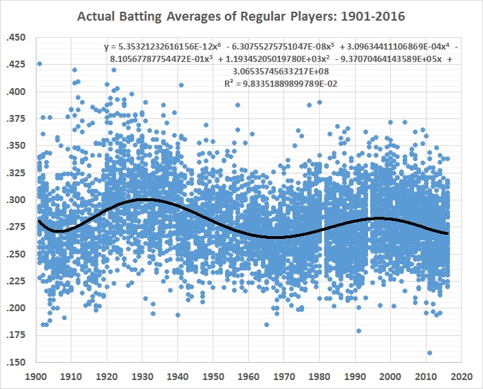
Everything else being the same, the best fit would be a straight line that rises gradually, falls gradually, or has no slope. The undulation reflects the fact that everything hasn’t stayed the same. Major-league baseball wasn’t integrated until 1947, and integration was only token for a couple of decades after that. For example: night games weren’t played until 1935, and didn’t become common until after World War II; a lot of regular players went to war, and those who replaced them were (obviously) of inferior quality — and hitting suffered more than pitching; the “deadball” era ended after the 1919 season and averages soared in the 1920s and 1930s; fielders’ gloves became larger and larger.

The list goes on, but you get the drift. Playing conditions and the talent pool have changed so much over the decades that it’s hard to pin down just what caused batting averages to undulate rather than move in a relatively straight line. It’s unlikely that batters became a lot better, only to get worse, then better again, and then worse again, and so on.

Something else has been going on — a lot of somethings, in fact. And the 6th-order polynomial captures them in an undifferentiated way. What remains to be explained are the differences between official BA and the estimates yielded by the 6th-order polynomial. Those differences are the stage 1 residuals displayed in this graph:

FIGURE 2
batting-average-analysis-stage-1-residuals

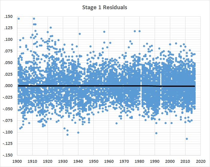
There’s a lot of variability in the residuals, despite the straight, horizontal regression line through them. That line, by the way, represents a 6th-order polynomial fit, not a linear one. So the application of the equation shown in figure 1 does an excellent job of de-trending the data.

The variability of the stage 1 residuals has two causes: (1) general changes in the game and (2) the performance of individual players, given those changes. If the effects of the general changes can be estimated, the remaining, unexplained variability should represent the “true” performance of individual batters.

In stage 2, I considered 16 variables in an effort to isolate the general changes. I began by finding the correlations between each of the 16 candidate variables and the stage 1 residuals. I then estimated a regression equation with stage 1 residuals as the dependent variable and the most highly correlated variable as the explanatory variable. I next found the correlations between the residuals of that regression equation and the remaining 15 variables. I introduced the most highly correlated variable into a new regression equation, as a second explanatory variable. I continued this process until I had a regression equation with 16 explanatory variables. I chose to use the 13th equation, which was the last one to introduce a variable with a highly significant p-value (less than 0.01). Along the way, because of collinearity among the variables, the p-values of a few others became high, but I kept them in the equation because they contributed to its overall explanatory power.

Here’s the 13-variable equation (REV13), with each coefficient given to 3 significant figures:

R1 = 1.22 – 0.0185WW – 0.0270DB – 1.26FA + 0.00500DR + 0.00106PT + 0.00197Pa + 0.00191LT – 0.000122Ba – 0.00000765TR + 0.000816DH – 0.206IP + 0.0153BL – 0.000215CG

Where,

R1 = stage 1 residuals

WW = World War II years (1 for 1942-1945, 0 for all other years)

DB = “deadball” era (1 for 1901-1919, 0 thereafter)

FA = league fielding average for the season

DR = prevalence of performance-enhancing drugs (1 for 1994-2007, 0 for all other seasons)

PT = number of pitchers per team

Pa = average age of league’s pitchers for the season

LT = fraction of teams with stadiums equipped with lights for night baseball

Ba = batter’s age for the season (not a general condition but one that can explain the variability of a batter’s performance)

TR = maximum distance traveled between cities for the season

DH = designated-hitter rule in effect (0 for 1901-1972, 1 for 1973-2016)

IP = average number of innings pitched per pitcher per game (counting all pitchers in the league during a season)

BL = fraction of teams with at least 1 black player

CG = average number of complete games pitched by each team during the season

The r-squared for the equation is 0.035, which seems rather low, but isn’t surprising given the apparent randomness of the dependent variable. Moreover, with 6,603 observations, the equation has an extremely significant f-value of 1.99E-43.

A positive coefficient means that the variable increases the value of the stage 1 residuals. That is, it causes batting averages to rise, other things being equal. A negative coefficient means the opposite, of course. Do the signs of the coefficients seem intuitively right, and if not, why are they the opposite of what might be expected? I’ll take them one at a time:

World War II (WW)

A lot of the game’s best batters were in uniform in 1942-1945. That left regular positions open to older, weaker batters, some of whom wouldn’t otherwise have been regulars or even in the major leagues. The negative coefficient on this variable captures the war’s effect on hitting, which suffered despite the fact that a lot of the game’s best pitchers also went to war.

Deadball era (DB)

The so-called deadball era lasted from the beginning of major-league baseball in 1871 through 1919 (roughly). It was called the deadball era because the ball stayed in play for a long time (often for an entire game), so that it lost much of its resilience and became hard to see because it accumulated dirt and scuffs. Those difficulties (for batters) were compounded by the spitball, the use of which was officially curtailed beginning with the 1920 season. (See this and this.) As figure 1 indicates, batting averages rose markedly after 1919, so the negative coefficient on DB is unsurprising.

Performance-enhancing drugs (DR)

Their rampant use seems to have begun in the early 1990s and trailed off in the late 2000s. I assigned a dummy variable of 1 to all seasons from 1994 through 2007 in an effort to capture the effect of PEDs. The coefficient suggests that the effect was (on balance) positive.

Number of pitchers per AL team (PT)

This variable, surprisingly, has a positive coefficient. One would expect the use of more pitchers to cause BA to drop. PT may be a complementary variable, one that’s meaningless without the inclusion of related variable(s). (See IP.)

Average age of AL pitchers (Pa)

The stage 1 residuals rise with respect to Pa rise until Pa = 27.4 , then they begin to drop. This variable represents the difference between 27.4 and the average age of AL pitchers during a particular season. The coefficient is multiplied by 27.4 minus average age; that is, by a positive number for ages lower than 27.4, by zero for age 27.4, and by a negative number for ages above 27.4. The positive coefficient suggests that, other things being equal, pitchers younger than 27.4 give up hits at a lower rate than pitchers older than 27.4. I’m agnostic on the issue.

Night baseball, that is, baseball played under lights (LT)

It has long been thought that batting is more difficult under artificial lighting than in sunlight. This variable measures the fraction of AL teams equipped with lights, but it doesn’t measure the rise in night games as a fraction of all games. I know from observation that that fraction continued to rise even after all AL stadiums were equipped with lights. The positive coefficient on LT suggests that it’s a complementary variable. It’s very highly correlated with BL, for example.

Batter’s age (Ba)

The stage 1 residuals don’t vary with Ba until Ba = 37 , whereupon the residuals begin to drop. The coefficient is multiplied by 37 minus the batter’s age; that is, by a positive number for ages lower than 37, by zero for age 37, and by a negative number for ages above 37. The very small negative coefficient probably picks up the effects of batters who were good enough to have long careers and hit for high averages at relatively advanced ages (e.g., Ty Cobb and Ted Williams). Their longevity causes them to be “over represented” in the sample.

Maximum distance traveled by AL teams (TR)

Does travel affect play? Probably, but the mode and speed of travel (airplane vs. train) probably also affects it. The tiny negative coefficient on this variable — which is highly correlated with several others — is meaningless, except insofar as it combines with all the other variables to account for the stage 1 residuals. TR is highly correlated with the number of teams (expansion), which suggests that expansion has had little effect on hitting.

Designated-hitter rule (DH)

The small positive coefficient on this variable suggests that the DH is a slightly better hitter, on average, than other regular position players.

Innings pitched per AL pitcher per game (IP)

This variable reflects the long-term trend toward the use of more pitchers in a game, which means that batters more often face rested pitchers who come at them with a different delivery and repertoire of pitches than their predecessors. IP has dropped steadily over the decades, presumably exerting a negative effect on BA. This is reflected in the rather large, negative coefficient on the variable, which means that it’s prudent to treat this variable as a complement to PT (discussed above) and CG (discussed below), both of which have counterintuitive signs.

Integration (BL)

I chose this variable to approximate the effect of the influx of black players (including non-white Hispanics) since 1947. BL measures only the fraction of AL teams that had at least one black player for each full season. It begins at 0.25 in 1948 (the Indians and Browns signed Larry Doby and Hank Thompson during the 1947 season) and rises to 1 in 1960, following the signing of Pumpsie Green by the Red Sox during the 1959 season. The positive coefficient on this variable is consistent with the hypothesis that segregation had prevented the use of players superior to many of the whites who occupied roster slots because of their color.

Complete games per AL team (CG)

A higher rate of complete games should mean that starting pitchers stay in games longer, on average, and therefore give up more hits, on average. The negative coefficient seems to contradict that hypothesis. But there are other, related variables (PT and CG), so this one should be thought of as a complementary variable.

Despite all of that fancy footwork, the equation accounts for only a small portion of the stage 1 residuals:

FIGURE 3
batting-average-analysis-stage-2-estimates

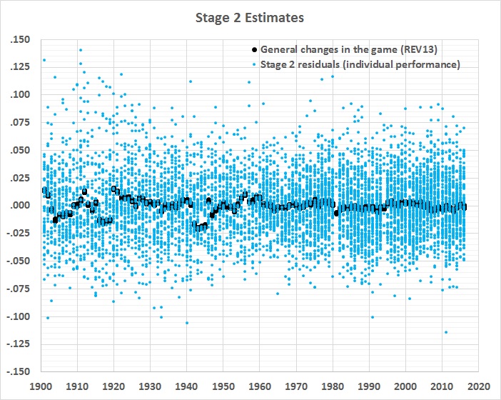
What’s left over — the stage 2 residuals — is (or should be) a good measure of comparative hitting ability, everything else being more or less the same. One thing that’s not the same, and not yet accounted for is the long-term trend in home-park advantage, which has slightly (and gradually) weakened. Here’s a graph of the inverse of the trend, normalized to the overall mean value of home-park advantage:

FIGURE 4
batting-average-analysis-long-term-trend-in-ballpark-factors-adjustment-normed

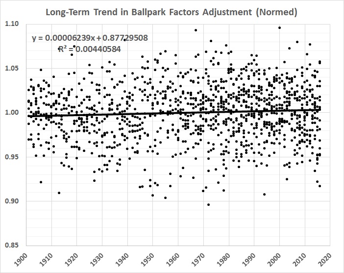
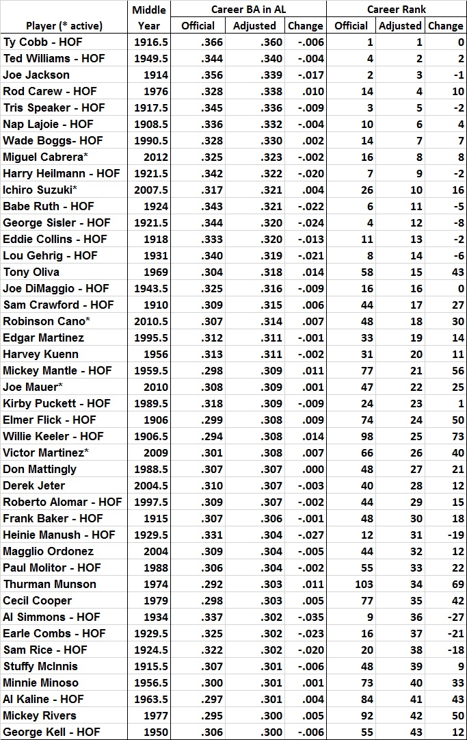
To get a true picture of a player’s single-season batting average, it’s just a matter of adding the stage 2 residual for that player’s season to the baseline batting average for the entire sample of 6,603 single-season performances. The resulting value is then multiplied by the equation given in figure 4. The baseline is .280, which is the overall average  for 1901-2016, from which individual performances diverge. Thus, for example, the stage 2 residual for Jimmy Williams’s 1901 season, adjusted for the long-term trend shown in figure 4, is .022. Adding that residual to .280 results in an adjusted (true) BA of .302, which is 15 points (.015) lower than Williams’s official BA of .317 in 1901.

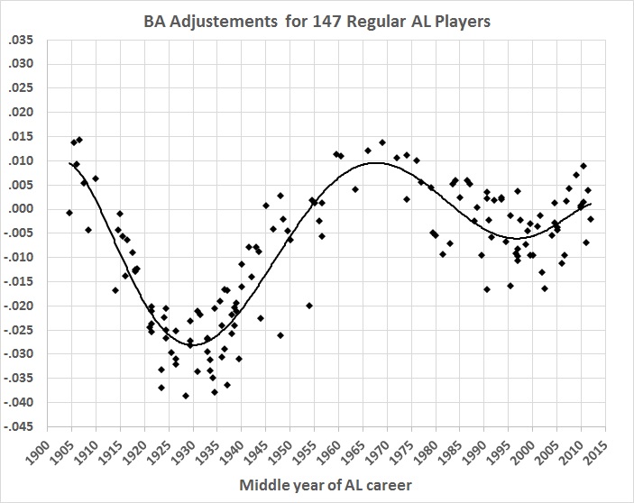
Here are the changes from official to adjusted averages, by year:

FIGURE 5
batting-average-analysis-ba-adjustments-by-year

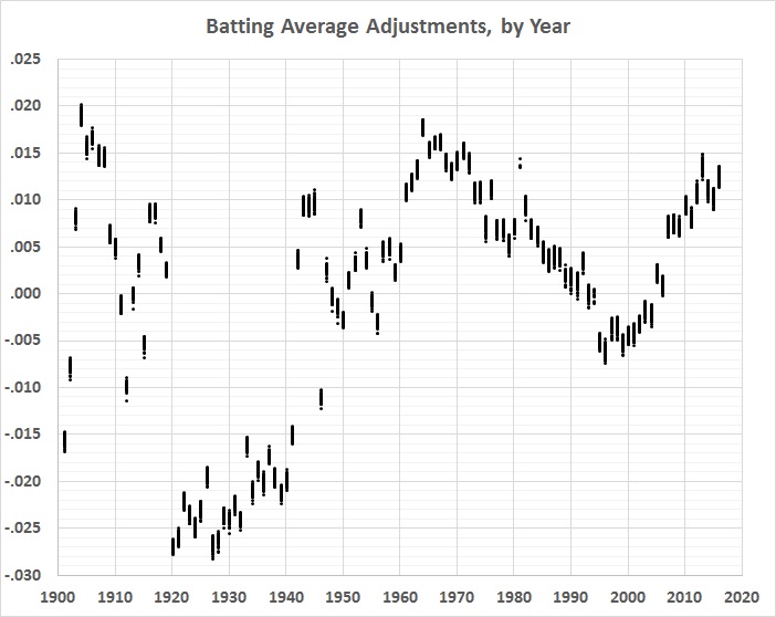
Unsurprisingly, the pattern is roughly a mirror image of the 6th-order polynomial regression line in figure 1.

Here’s how the adjusted batting averages (vertical axis) correlate with the official batting averages (horizontal axis):

FIGURE 6
batting-average-analysis-adjusted-vs-official-ba

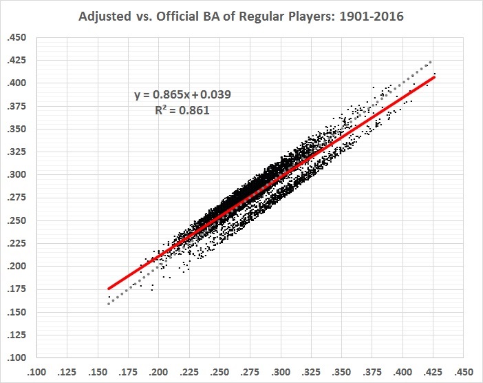
The red line represents the correlation between official and adjusted BA. The dotted gray line represents a perfect correlation. The actual correlation is very high (r = 0.93), and has a slightly lower slope than a perfect correlation. High averages tend to be adjusted downward and low averages tend to be adjusted upward. The gap separates the highly inflated averages of the 1920s and 1930s (lower right) from the less-inflated averages of most other decades (upper left).

Here’s a time-series view of the official and adjusted averages:

FIGURE 7
batting-average-analysis-official-and-adjusted-ba-time-series

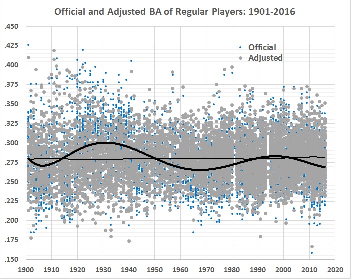
The wavy, bold line is the 6th-order polynomial fit from figure 1. The lighter, almost-flat line is a 6th-order polynomial fit to the adjusted values. The flatness is a good sign that most of the general changes in game conditions have been accounted for, and that what’s left (the gray plot points) is a good approximation of “real” batting averages.

What about reaction times? Have they improved or deteriorated since 1901? The results are inconclusive. Year (YR) doesn’t enter the stage 2 analysis until step 15, and it’s statistically insignificant (p-value = 0.65). Moreover, with the introduction of another variable in step 16, the sign of the coefficient on YR flips from slightly positive to slightly negative.

In sum, this analysis says nothing definitive about reaction times, even though it sheds a lot of light on the relative hitting prowess of American League batters over the past 116 years. (I’ll have more to say about that in a future post.)

It’s been great fun but it was just one of those things.

A Drought Endeth

Tonight the Chicago Cubs beat the Los Angeles Dodgers to become champions of the National League for 2016. The Cubs thus ended the longest pennant drought of the 16 old-line franchises in the National and American Leagues, having last made a World Series appearance 71 years ago in 1945. The Cubs last won the World Series 108 years ago in 1908, another ignominious record for an old-line team.

Here are the most recent league championships and World Series wins by the other old-line National League teams: Atlanta (formerly Boston and Milwaukee) Braves — 1999, 1995; Cincinnati Reds — 1990, 1990; Los Angeles (formerly Brooklyn) Dodgers — 1988, 1988; Philadelphia Phillies — 2009, 2008; Pittsburgh Pirates — 1979, 1979; San Francisco (formerly New York) Giants — 2014, 2014; and St. Louis Cardinals — 2013, 2011.

The American League lineup looks like this: Baltimore Orioles (formerly Milwaukee Brewers and St. Louis Browns) — 1983, 1983; Boston Red Sox — 2013, 2013; Chicago White Sox — 2005, 2005; Cleveland Indians — 2016 (previously 1997), 1948; Detroit Tigers — 2012, 1984; Minnesota Twins (formerly Washington Senators) — 1991, 1991; New York Yankees — 2009, 2009; and Oakland (formerly Philadelphia and Kansas City) Athletics — 1990, 1989.

Facts about Hall-of-Fame Hitters

In this post, I look at the batting records of the 136 position players who accrued most or all of their playing time between 1901 and 2015. With the exception of a bulge in the .340-.345 range, the frequency distribution of lifetime averages for those 136 players looks like a rather ragged normal distribution:

Distribution of HOF lifetime BA

That’s Ty Cobb (.366) at the left, all by himself (1 person = 0.7 percent of the 136 players considered here). To Cobb’s right, also by himself, is Rogers Hornsby (.358). The next solo slot to the right of Hornsby’s belongs to Ed Delahanty (.346). The bulge between .340 and .345 is occupied by Tris Speaker, Billy Hamilton, Ted Williams, Babe Ruth, Harry Heilmann, Bill Terry, Willie Keeler, George Sisler, and Lou Gehrig. At the other end, in the anchor slot, is Ray Schalk (.253), to his left in the next slot are Harmon Killebrew (.256) and Rabbit Maranville (.258). The group in the .260-.265 column comprises Gary Carter, Joe Tinker, Luis Aparacio, Ozzie Smith, Reggie Jackson, and Bill Mazeroski.

Players with relatively low batting averages — Schalk, Killibrew, etc. — are in the Hall of Fame because of their prowess as fielders or home-run hitters. Many of the high-average players were also great fielders or home-run hitters (or both). In any event, for your perusal here’s the complete list of 136 position players under consideration in this post:

Lifetime BA of 136 HOFers

For the next exercise, I normalized the Hall of Famers’ single-season averages, as discussed here. I included only those seasons in which a player qualified for that year’s batting championship by playing in enough games, compiling enough plate appearances, or attaining enough at-bats (the criteria have varied).

For the years 1901-2015, the Hall-of-Famers considered here compiled  1,771 seasons in which they qualified for the batting title. (That’s 13 percent of the 13,463 batting-championship-qualifying seasons compiled by all major leaguers in 1901-2015.) Plotting the Hall-of-Famers’ normalized single-season averages against age, I got this:

HOF batters - normalzed BA by age

The r-squared value of the polynomial fit, though low, is statistically significant (p<.01). The equation yields the following information:

HOF batters - changes in computed mean BA

The green curve traces the difference between the mean batting average at a given age and the mean batting average at the mean peak age, which is 28.3. For example, by the equation, the average Hall of Famer batted .2887 at age 19, and .3057 at age 28.3 — a rise of .0017 over 9.3 years.

The black line traces the change in the mean batting average from age to age; the increase is positive, though declining from ages 20 through 28, then negative (and still declining) through the rest of the average Hall of Famer’s career.

The red line represents the change in the rate of change, which is constant at -.00044 points (-4.4 percent) a year.

In tabular form:

HOF batters - mean BA stats vs age

Finally, I should note that the combined lifetime batting average of the 136 players is .302, as against the 1901-2015 average of .262 for all players. In other words, the Hall of Famers hit safely in 30.2 percent of at-bats; all players hit safely in 26.2 percent of at-bats. What’s the big deal about 4 percentage points?

To find out, I consulted “Back to Baseball,” in which I found the significant determinants of run-scoring. In the years 1901-1919 (the “dead ball” era), a 4 percentage-point (.040) rise in batting average meant, on average, an increase in runs scored per 9 innings of 1.18. That’s a significant jump in offensive output, given that the average number of runs scored per 9 innings was 3.97 in 1901-1919.

For 1920-2015, a rise in batting average of 4 percentage points meant, on average, an increase in runs scored per 9 innings of 1.03, as against an average number of runs scored per 9 innings of 4.51. That’s also significant, and it doesn’t include the effect of extra-base hits, which Hall of Famers produced at a greater rate than other players.

So Hall of Famers, on the whole, certainly made greater offensive contributions than other players, and some of them were peerless in the field. But do all Hall of Famers really belong in the Hall? No, but that’s the subject of another post.

Baseball’s Greatest 40-and-Older Hitters

Drawing on the Play Index at Baseball-Reference.com, I discovered the following bests for major-league hitters aged 40 and older:

Most games played — Pete Rose, 732

Most games in starting lineup — Pete Rose, 643

Most plate appearances — Pete Rose, 2955

Most at-bats — Pete Rose, 2574

Most runs — Sam Rice, 327

Most hits — Pete Rose, 699

Most doubles — Sam Rice, 95

Most triples — Honus Wagner, 36

Most home runs — Carlton Fisk, 72

Most runs batted in — Carlton Fisk, 282

Most stolen bases — Rickey Henderson, 109

Most times caught stealing — Rickey Henderson, 34

Most times walked — Pete Rose, 320

Most times struck out — Julio Franco, 336

Highest batting average — Ty Cobb, .343*

Highest on-base percentage — Barry Bonds, .464*

Highest slugging percentage — Barry Bonds, .561*

Highest on-base-plus-slugging percentage (OPS) — Barry Bonds, 1.025*

Most sacrifice hits (bunts) — Honus Wagner, 45

Also of note:

Babe Ruth had only 6 home runs as a 40-year-old in his final (partial) season, as a member of the Boston Braves.

Ted Williams is remembered as a great “old” player, and he was. But his 40-and-over record (compiled in 1959-60) is almost matched by that of his great contemporary, Stan Musial (whose 40-and-older record was compiled in 1961-63):

Williams vs. Musial 40 and older
_________
* In each case, this excludes players with small numbers of plate appearances (always fewer than 20). Also, David Ortiz has a slugging average of .652 and an OPS of 1.067 for the 2016 season (his first as a 40-year-old), but the season isn’t over.

Griffey and Piazza: True Hall-of-Famers or Not?

Ken Griffey Jr. and Mike Piazza have just been voted into baseball’s Hall of Fame.

Griffey belongs there. Follow this link and you’ll see, in the first table, that he’s number 45 on the list of offensive players whom I consider deserving of the honor.

Piazza doesn’t belong there. He falls short of the 8,000 plate appearances (or more) that I would require to prove excellence over a sustained span. Piazza would be a true Hall of Famer if I relaxed the standard to 7,500 plate appearances, but what’s the point of having standards if they can be relaxed just to reward popularity (or mediocrity)?