“Not-So-Random Thoughts” is an occasional series in which I highlight writings by other commentators on varied subjects that I have addressed in the past. Other entries in the series can be found at these links: I, II, III, IV, V, VI, VII, VIII, IX, X, XI, XII, XIII, XIV, XV, XVI, XVII, XVIII, XIX, XX, XXI, XXII, and XXIII. For more in the same style, see “The Tenor of the Times” and “Roundup: Civil War, Solitude, Transgenderism, Academic Enemies, and Immigration“.
CONTENTS
The Transgender Trap: A Political Nightmare Becomes Reality
Begin here and here, then consider the latest outrage.
First, from Katy Faust (“Why It’s Probably Not A Coincidence That The Mother Transing Her 7-Year-Old Isn’t Biologically Related“, The Federalist, October 24, 2019):
The story of seven-year-old James, whom his mother has pressured to become “Luna,” has been all over my newsfeed. The messy custody battle deserves every second of our click-bait-prone attention: Jeffrey Younger, James’s father, wants to keep his son’s body intact, while Anne Georgulas, James’s mother, wants to allow for “treatment” that would physically and chemically castrate him.
The havoc that divorce wreaks in a child’s life is mainstage in this tragic case. Most of us children of divorce quickly learn to act one way with mom and another way with dad. We can switch to a different set of rules, diet, family members, bedtime, screen time limits, and political convictions in that 20-minute ride from mom’s house to dad’s.
Unfortunately for little James, the adaptation he had to make went far beyond meat-lover’s pizza at dad’s house and cauliflower crusts at mom’s: it meant losing one of the most sacred aspects of his identity—his maleness. His dad loved him as a boy, so he got to be himself when he was at dad’s house. But mom showered love on the version of James she preferred, the one with the imaginary vagina.
So, as kids are so apt to do, when James was at her house, he conformed to the person his mother loved. This week a jury ruled that James must live like he’s at mom’s permanently, where he can “transition” fully, regardless of the cost to his mental and physical health….
Beyond the “tale of two households” that set up this court battle, and the ideological madness on display in the proceedings, something else about this case deserves our attention: one of the two parents engaged in this custodial tug-of-war isn’t biologically related to little James. Care to guess which one? Do you think it’s the parent who wants to keep him physically whole? It’s not.
During her testimony Georgulas stated she is not the biological mother of James or his twin brother Jude. She purchased eggs from a biological stranger. This illuminates a well-known truth in the world of family and parenthood: biological parents are the most connected to, invested in, and protective of their children.
Despite the jury’s unfathomable decision to award custody of James to his demented mother, there is hope for James. Walt Hyer picks up the story (“Texas Court Gives 7-Year-Old Boy A Reprieve From Transgender Treatments“, The Federalist, October 25, 2019):
Judge Kim Cooks put aside the disappointing jury’s verdict of Monday against the father and ruled Thursday that Jeffrey Younger now has equal joint conservatorship with the mother, Dr. Anne Georgulas, of their twin boys.
The mother no longer has unfettered authority to manipulate her 7-year old boy into gender transition. Instead both mother and father will share equally in medical, psychological, and other decision-making for the boys. Additionally, the judge changed the custody terms to give Younger an equal amount of visitation time with his sons, something that had been severely limited….
For those who need a little background, here’s a recap. “Six-year-old James is caught in a gender identity nightmare. Under his mom’s care in Dallas, Texas, James obediently lives as a trans girl named ‘Luna.’ But given the choice when he’s with dad, he’s all boy—his sex from conception.
“In their divorce proceedings, the mother has charged the father with child abuse for not affirming James as transgender, has sought restraining orders against him, and is seeking to terminate his parental rights. She is also seeking to require him to pay for the child’s visits to a transgender-affirming therapist and transgender medical alterations, which may include hormonal sterilization starting at age eight.”
All the evidence points to a boy torn between pleasing two parents, not an overwhelming preference to be a girl….
Younger said at the trial he was painted as paranoid and in need of several years of psychotherapy because he doesn’t believe his young son wants to be a girl. But many experts agree that transgendering young children is hazardous.
At the trial, Younger’s expert witnesses testified about these dangers and provided supporting evidence. Dr. Stephen Levine, a psychiatrist renowned for his work on human sexuality, testified that social transition—treating them as the opposite sex—increases the chance that a child will remain gender dysphoric. Dr. Paul W. Hruz, a pediatric endocrinologist and professor of pediatrics and cellular biology at Washington University School of Medicine in Saint Louis, testified that the risks of social transition are so great that the “treatment” cannot be recommended at all.
Are these doctors paranoid, too? Disagreement based on scientific evidence is now considered paranoia requiring “thought reprogramming.” That’s scary stuff when enforced by the courts….
The jury’s 11-1 vote to keep sole managing conservatorship from the father shows how invasive and acceptable this idea of confusing children and transitioning them has become. It’s like we are watching a bad movie where scientific evidence is ignored and believing the natural truth of male and female biology is considered paranoia. I can testify from my life experience the trans-life movie ends in unhappiness, regret, detransitions, or sadly, suicide.
The moral of the story is that the brainwashing of the American public by the media may have advanced to the tipping point. The glory that was America may soon vanish with a whimper.
Spygate (a.k.a. Russiagate) Revisited
I posted my analysis of “Spygate” well over a year ago, and have continually updated the appended list of supporting reference. The list continues to grow as evidence mounts to support the thesis that the Trump-Russia collusion story was part of a plot hatched at the highest levels of the Obama administration and executed within the White House, the CIA, and the Department of Justice (including especially the FBI).
Margot Cleveland addresses the case of Michael Flynn (“Sidney Powell Drops Bombshell Showing How The FBI Trapped Michael Flynn“, The Federalist, October 25, 2019):
Earlier this week, Michael Flynn’s star attorney, Sidney Powell, filed under seal a brief in reply to federal prosecutors’ claims that they have already given Flynn’s defense team all the evidence they are required by law to provide. A minimally redacted copy of the reply brief has just been made public, and with it shocking details of the deep state’s plot to destroy Flynn….
What is most striking, though, is the timeline Powell pieced together from publicly reported text messages withheld from the defense team and excerpts from documents still sealed from public view. The sequence Powell lays out shows that a team of “high-ranking FBI officials orchestrated an ambush-interview of the new president’s National Security Advisor, not for the purpose of discovering any evidence of criminal activity—they already had tapes of all the relevant conversations about which they questioned Mr. Flynn—but for the purpose of trapping him into making statements they could allege as false” [in an attempt to “flip” Flynn in the Spygate affair]….
The timeline continued to May 10 when McCabe opened an “obstruction” investigation into President Trump. That same day, Powell writes, “in an important but still wrongly redacted text, Strzok says: ‘We need to lock in [redacted]. In a formal chargeable way. Soon.’” Page replies: “I agree. I’ve been pushing and I’ll reemphasize with Bill [Priestap].”
Powell argues that “both from the space of the redaction, its timing, and other events, the defense strongly suspects the redacted name is Flynn.” That timing includes Robert Mueller’s appointment as special counsel on May 17, and then the reentering of Flynn’s 302 on May 31, 2017, “for Special Counsel Mueller to use.”
The only surprise (to me) is evidence cited by Cleveland that Comey was deeply embroiled in the plot. I have heretofore written off Comey as an opportunist who was out to get Trump for his own reasons.
In any event, Cleveland reinforces my expressed view of former CIA director John Brennan’s central role in the plot (“All The Russia Collusion Clues Are Beginning To Point Back To John Brennan“, The Federalist, October 25, 2019):
[I]f the media reports are true, and [Attorney General William] Barr and [U.S. attorney John] Durham have turned their focus to Brennan and the intelligence community, it is not a matter of vengeance; it is a matter of connecting the dots in congressional testimony and reports, leaks, and media spin, and facts exposed during the three years of panting about supposed Russia collusion. And it all started with Brennan.
That’s not how the story went, of course. The company story ran that the FBI launched its Crossfire Hurricane surveillance of the Trump campaign on July 31, 2016, after learning that a young Trump advisor, George Papadopoulos, had bragged to an Australian diplomat, Alexander Downer, that the Russians had dirt on Hillary Clinton….
But as the Special Counsel Robert Mueller report made clear, it wasn’t merely Papadopoulos’ bar-room boast at issue: It was “a series of contacts between Trump Campaign officials and individuals with ties to the Russian government,” that the DOJ and FBI, and later the Special Counsel’s office investigated.
And who put the FBI on to those supposedly suspicious contacts? Former CIA Director John Brennan….
The evidence suggests … that Brennan’s CIA and the intelligence community did much more than merely pass on details about “contacts and interactions between Russian officials and U.S. persons involved in the Trump campaign” to the FBI. The evidence suggests that the CIA and intelligence community—including potentially the intelligence communities of the UK, Italy, and Australia—created the contacts and interactions that they then reported to the FBI as suspicious.
The Deep State in action.
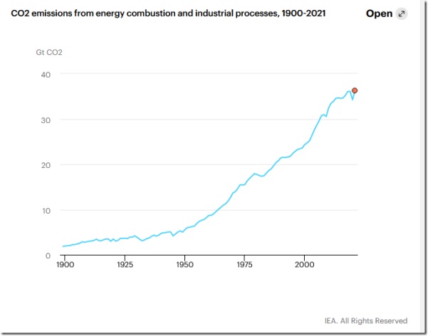
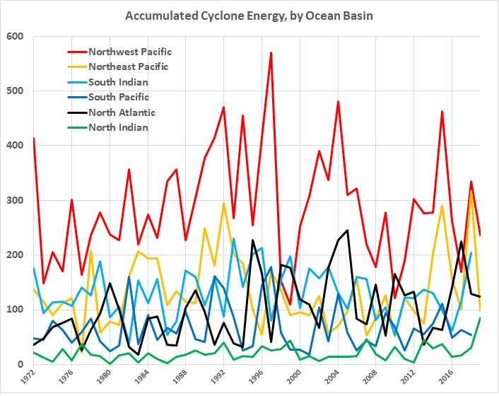
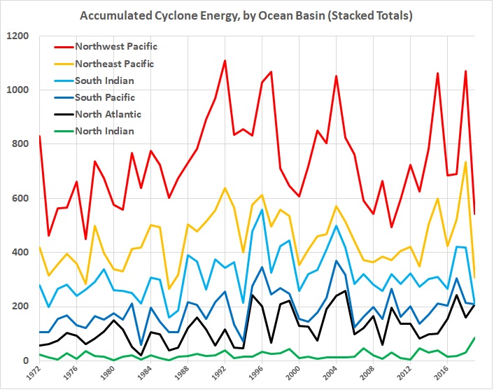
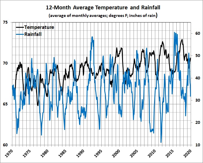
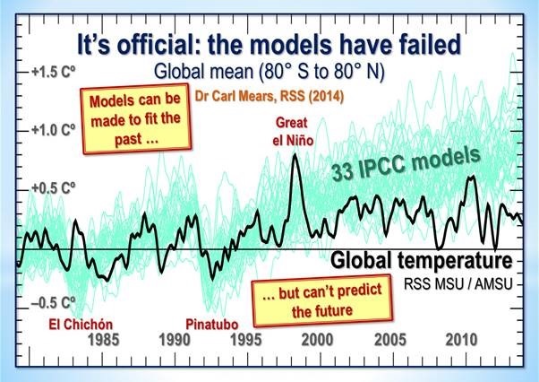
More Evidence for Why I Don’t Believe in “Climate Change”
I’ve already adduced a lot of evidence in “Why I Don’t Believe in Climate Change” and “Climate Change“. One of the scientists to whom I give credence is Dr. Roy Spencer of the Climate Research Center at the University of Alabama-Huntsville. Spencer agrees that CO2 emissions must have an effect on atmospheric temperatures, but is doubtful about the magnitude of the effect.
He revisits a point that he has made before, namely, that the there is no “preferred” state of the climate (“Does the Climate System Have a Preferred Average State? Chaos and the Forcing-Feedback Paradigm“, Roy Spencer, Ph.D., October 25, 2019):
If there is … a preferred average state, then the forcing-feedback paradigm of climate change is valid. In that system of thought, any departure of the global average temperature from the Nature-preferred state is resisted by radiative “feedback”, that is, changes in the radiative energy balance of the Earth in response to the too-warm or too-cool conditions. Those radiative changes would constantly be pushing the system back to its preferred temperature state…
[W]hat if the climate system undergoes its own, substantial chaotic changes on long time scales, say 100 to 1,000 years? The IPCC assumes this does not happen. But the ocean has inherently long time scales — decades to millennia. An unusually large amount of cold bottom water formed at the surface in the Arctic in one century might take hundreds or even thousands of years before it re-emerges at the surface, say in the tropics. This time lag can introduce a wide range of complex behaviors in the climate system, and is capable of producing climate change all by itself.
Even the sun, which we view as a constantly burning ball of gas, produces an 11-year cycle in sunspot activity, and even that cycle changes in strength over hundreds of years. It would seem that every process in nature organizes itself on preferred time scales, with some amount of cyclic behavior.
This chaotic climate change behavior would impact the validity of the forcing-feedback paradigm as well as our ability to determine future climate states and the sensitivity of the climate system to increasing CO2. If the climate system has different, but stable and energy-balanced, states, it could mean that climate change is too complex to predict with any useful level of accuracy [emphasis added].
Which is exactly what I say in “Modeling and Science“.
Thoughts on Mortality
I ruminated about it in “The Unique ‘Me’“:
Children, at some age, will begin to understand that there is death, the end of a human life (in material form, at least). At about the same time, in my experience, they will begin to speculate about the possibility that they might have been someone else: a child born in China, for instance.
Death eventually loses its fascination, though it may come to mind from time to time as one grows old. (Will I wake up in the morning? Is this the day that my heart stops beating? Will I be able to break my fall when the heart attack happens, or will I just go down hard and die of a fractured skull?)
Bill Vallicella (Maverick Philosopher) has been ruminating about it in recent posts. This is from his “Six Types of Death Fear” (October 24, 2019):
1. There is the fear of nonbeing, of annihilation….
2. There is the fear of surviving one’s bodily death as a ghost, unable to cut earthly attachments and enter nonbeing and oblivion….
3. There is the fear of post-mortem horrors….
4. There is the fear of the unknown….
5. There is the fear of the Lord and his judgment….
6. Fear of one’s own judgment or the judgment of posterity.
There is also — if one is in good health and enjoying life — the fear of losing what seems to be a good thing, namely, the enjoyment of life itself.
Assortative Mating, Income Inequality, and the Crocodile Tears of “Progressives”
Mating among human beings has long been assortative in various ways, in that the selection of a mate has been circumscribed or determined by geographic proximity, religious affiliation, clan rivalries or alliances, social relationships or enmities, etc. The results have sometimes been propitious, as Gregory Cochran points out in “An American Dilemma” (West Hunter, October 24, 2019):
Today we’re seeing clear evidence of genetic differences between classes: causal differences. People with higher socioeconomic status have ( on average) higher EA polygenic scores. Higher scores for cognitive ability, as well. This is of course what every IQ test has shown for many decades….
Let’s look at Ashkenazi Jews in the United States. They’re very successful, averaging upper-middle-class. So you’d think that they must have high polygenic scores for EA (and they do).
Were they a highly selected group? No: most were from Eastern Europe. “Immigration of Eastern Yiddish-speaking Ashkenazi Jews, in 1880–1914, brought a large, poor, traditional element to New York City. They were Orthodox or Conservative in religion. They founded the Zionist movement in the United States, and were active supporters of the Socialist party and labor unions. Economically, they concentrated in the garment industry.”
And there were a lot of them: it’s harder for a sample to be very unrepresentative when it makes up a big fraction of the entire population.
But that can’t be: that would mean that Europeans Jews were just smarter than average. And that would be racist.
Could it be result of some kind of favoritism? Obviously not, because that would be anti-Semitic.
Cochran obviously intends sarcasm in the final two paragraphs. The evidence for the heritability of intelligence is, as he says, quite strong. (See, for example, my “Race and Reason: The Achievement Gap — Causes and Implications” and “Intelligence“.) Were it not for assortative mating among Ashkenazi Jews, they wouldn’t be the most intelligent ethnic-racial group.
Branko Milanovic specifically addresses the “hot” issue in “Rich Like Me: How Assortative Mating Is Driving Income Inequality“, Quillette, October 18, 2019):
Recent research has documented a clear increase in the prevalence of homogamy, or assortative mating (people of the same or similar education status and income level marrying each other). A study based on a literature review combined with decennial data from the American Community Survey showed that the association between partners’ level of education was close to zero in 1970; in every other decade through 2010, the coefficient was positive, and it kept on rising….
At the same time, the top decile of young male earners have been much less likely to marry young women who are in the bottom decile of female earners. The rate has declined steadily from 13.4 percent to under 11 percent. In other words, high-earning young American men who in the 1970s were just as likely to marry high-earning as low-earning young women now display an almost three-to- one preference in favor of high-earning women. An even more dramatic change happened for women: the percentage of young high-earning women marrying young high-earning men increased from just under 13 percent to 26.4 percent, while the percentage of rich young women marrying poor young men halved. From having no preference between rich and poor men in the 1970s, women currently prefer rich men by a ratio of almost five to one….
High income and wealth inequality in the United States used to be justified by the claim that everyone had the opportunity to climb up the ladder of success, regardless of family background. This idea became known as the American Dream. The emphasis was on equality of opportunity rather than equality of outcome….
The American Dream has remained powerful both in the popular imagination and among economists. But it has begun to be seriously questioned during the past ten years or so, when relevant data have become available for the first time. Looking at twenty-two countries around the world, Miles Corak showed in 2013 that there was a positive correlation between high inequality in any one year and a strong correlation between parents’ and children’s incomes (i.e., low income mobility). This result makes sense, because high inequality today implies that the children of the rich will have, compared to the children of the poor, much greater opportunities. Not only can they count on greater inheritance, but they will also benefit from better education, better social capital obtained through their parents, and many other intangible advantages of wealth. None of those things are available to the children of the poor. But while the American Dream thus was somewhat deflated by the realization that income mobility is greater in more egalitarian countries than in the United States, these results did not imply that intergenerational mobility had actually gotten any worse over time.
Yet recent research shows that intergenerational mobility has in fact been declining. Using a sample of parent-son and parent-daughter pairs, and comparing a cohort born between 1949 and 1953 to one born between 1961 and 1964, Jonathan Davis and Bhashkar Mazumder found significantly lower intergenerational mobility for the latter cohort.
Milanovic doesn’t mention the heritabiliity of intelligence, which is bound to be generally higher among children of high-IQ parents (like Ashkenzi Jews and East Asians), and the strong correlation between intelligence and income. Does this mean that assortative mating should be banned and “excess” wealth should be confiscated and redistributed? Elizabeth Warren and Bernie Sanders certainly favor the second prescription, which would have a disastrous effect on the incentive to become rich and therefore on economic growth.
I addressed these matters in “Intelligence, Assortative Mating, and Social Engineering“:
So intelligence is real; it’s not confined to “book learning”; it has a strong influence on one’s education, work, and income (i.e., class); and because of those things it leads to assortative mating, which (on balance) reinforces class differences. Or so the story goes.
But assortative mating is nothing new. What might be new, or more prevalent than in the past, is a greater tendency for intermarriage within the smart-educated-professional class instead of across class lines, and for the smart-educated-professional class to live in “enclaves” with their like, and to produce (generally) bright children who’ll (mostly) follow the lead of their parents.
How great are those tendencies? And in any event, so what? Is there a potential social problem that will have to be dealt with by government because it poses a severe threat to the nation’s political stability or economic well-being? Or is it just a step in the voluntary social evolution of the United States — perhaps even a beneficial one?…
[Lengthy quotations from statistical evidence and expert commentary.]
What does it all mean? For one thing, it means that the children of top-quintile parents reach the top quintile about 30 percent of the time. For another thing, it means that, unsurprisingly, the children of top-quintile parents reach the top quintile more often than children of second-quintile parents, who reach the top quintile more often than children of third-quintile parents, and so on.
There is nevertheless a growing, quasi-hereditary, smart-educated-professional-affluent class. It’s almost a sure thing, given the rise of the two-professional marriage, and given the correlation between the intelligence of parents and that of their children, which may be as high as 0.8. However, as a fraction of the total population, membership in the new class won’t grow as fast as membership in the “lower” classes because birth rates are inversely related to income.
And the new class probably will be isolated from the “lower” classes. Most members of the new class work and live where their interactions with persons of “lower” classes are restricted to boss-subordinate and employer-employee relationships. Professionals, for the most part, work in office buildings, isolated from the machinery and practitioners of “blue collar” trades.
But the segregation of housing on class lines is nothing new. People earn more, in part, so that they can live in nicer houses in nicer neighborhoods. And the general rise in the real incomes of Americans has made it possible for persons in the higher income brackets to afford more luxurious homes in more luxurious neighborhoods than were available to their parents and grandparents. (The mansions of yore, situated on “Mansion Row,” were occupied by the relatively small number of families whose income and wealth set them widely apart from the professional class of the day.) So economic segregation is, and should be, as unsurprising as a sunrise in the east.
None of this will assuage progressives, who like to claim that intelligence (like race) is a social construct (while also claiming that Republicans are stupid); who believe that incomes should be more equal (theirs excepted); who believe in “diversity,” except when it comes to where most of them choose to live and school their children; and who also believe that economic mobility should be greater than it is — just because. In their superior minds, there’s an optimum income distribution and an optimum degree of economic mobility — just as there is an optimum global temperature, which must be less than the ersatz one that’s estimated by combining temperatures measured under various conditions and with various degrees of error.
The irony of it is that the self-segregated, smart-educated-professional-affluent class is increasingly progressive….
So I ask progressives, given that you have met the new class and it is you, what do you want to do about it? Is there a social problem that might arise from greater segregation of socio-economic classes, and is it severe enough to warrant government action. Or is the real “problem” the possibility that some people — and their children and children’s children, etc. — might get ahead faster than other people — and their children and children’s children, etc.?
Do you want to apply the usual progressive remedies? Penalize success through progressive (pun intended) personal income-tax rates and the taxation of corporate income; force employers and universities to accept low-income candidates (whites included) ahead of better-qualified ones (e.g., your children) from higher-income brackets; push “diversity” in your neighborhood by expanding the kinds of low-income housing programs that helped to bring about the Great Recession; boost your local property and sales taxes by subsidizing “affordable housing,” mandating the payment of a “living wage” by the local government, and applying that mandate to contractors seeking to do business with the local government; and on and on down the list of progressive policies?
Of course you do, because you’re progressive. And you’ll support such things in the vain hope that they’ll make a difference. But not everyone shares your naive beliefs in blank slates, equal ability, and social homogenization (which you don’t believe either, but are too wedded to your progressive faith to admit). What will actually be accomplished — aside from tokenism — is social distrust and acrimony, which had a lot to do with the electoral victory of Donald J. Trump, and economic stagnation, which hurts the “little people” a lot more than it hurts the smart-educated-professional-affluent class….
The solution to the pseudo-problem of economic inequality is benign neglect, which isn’t a phrase that falls lightly from the lips of progressives. For more than 80 years, a lot of Americans — and too many pundits, professors, and politicians — have been led astray by that one-off phenomenon: the Great Depression. FDR and his sycophants and their successors created and perpetuated the myth that an activist government saved America from ruin and totalitarianism. The truth of the matter is that FDR’s policies prolonged the Great Depression by several years, and ushered in soft despotism, which is just “friendly” fascism. And all of that happened at the behest of people of above-average intelligence and above-average incomes.
Progressivism is the seed-bed of eugenics, and still promotes eugenics through abortion on demand (mainly to rid the world of black babies). My beneficial version of eugenics would be the sterilization of everyone with an IQ above 125 or top-40-percent income who claims to be progressive [emphasis added].
Enough said.