Is a Reckoning at Hand?

If it is, it will arrive on two fronts: political and economic.

On the political front, Conrad Black and Victor Davis Hanson are (sort of) optimistic that the left’s audacious power-grab will fail. A recent op-ed by Black at Epoch Times ends with this:

But we are almost at the point where this administration’s attempt to revolutionize American elections by practically abolishing any verification process for ballots and turning election day into a weeks-long orgy of ballot-harvesting, while packing the Senate and the Supreme Court and gagging congressional minorities, will collide with public opposition to all of these measures.

In those circumstances, the Supreme Court, its attempt at appeasement of the Democrats by abdicating as head of a co-equal third branch of government having failed, might also reassert the legitimacy of the Constitution.

A turning in the road is almost at hand.

Hanson’s view complements Black’s:

We are becoming cynical 1980s Eastern Europeans who quietly scoffed at their daily government news. And this is step one to a repudiation of the lies we have been living with—that masks were necessary outdoors even for those fully vaccinated; that derelict, sexual harasser Andrew Cuomo is a noted author, Emmy-winner and national icon rather than a reckless sexual-harasser and responsible for needless death and misery by his unhinged long-term facilities policies; that Oprah, LeBron, and the Obamas are genuine voices of what it is like to be oppressed in America, and all the subsidiary untruths: the “brave” former intelligence officials who signed campaign-sensitive affidavits seconding Joe Biden’s insistence that Hunter’s laptop was a Russian disinformation trick; that Trump scoffed at “proof” that Russians put bounties on Americans in Afghanistan as they were appease;, and that Joe Biden has no cognitive issues and never did, at least of the sort that prompted his predecessor to take cognitive tests and draw the attention of a Yale psychiatry professor to diagnose him as unhinged in absentia.

In sum, the woke movement daily, hourly, second-by-second hinges on untruth, from the 1619 canard to America is systemically racist. And the number who spot the lies is beginning to outnumber the number who lives by them—which means the Revolution is likely to follow the Jacobin rather than Bolshevik fate.

On the economic front, the huge increase in government spending over the past two years — which Biden wants to perpetuate — will bear rotten fruit.

Here is the increase, in perspective:


Derived from Bureau of Economic Affairs, Table 1.1.5 Gross Domestic Product (billions of dollars, seasonally adjusted at annual rates) and Table 3.1. Government Current Receipts and Expenditures (billions of dollars, seasonally adjusted at annual rates)

As I have amply documented, government spending doesn’t “multiply”. If fact, it “divides”; that is, it causes real GDP to decline because government spending (and the regulatory activities funded by it) result in the transfer of resources from productive private uses to unproductive and counterproductive government uses, while also discouraging business expansion and productive investments in capital formation.

The bottom line is that a sustained increase in the share of GDP spent by government from about 33 percent (the average for the 10 years before the recent surge) to about 45 percent (the average for the recent surge) would cause a long-term reduction 4 percent of real GDP. If that doesn’t seem like a lot, consider that it would be the equivalent of a Great Recession that lasts for years on end instead of two or three years.

Voters flocked to the Democrat Party in the 1930s because they believed (mistakenly) that it — and especially FDR’s “New Deal” — would rescue them from the Great Depression. Voters will flock the the GOP in the 2020s if the Democrat Party remains stubbornly “woke” and persists in economic policies that impoverish them.

And if voters fail to switch in droves, it will prove the wisdom of the Framers’ (long-abandoned) Constitution, which was designed to prevent demagogues from pillaging the nation.


Related reading:

Victor Davis Hanson, “Are Americans Becoming Sovietized?“, The Daily Signal, May 6, 2021
Patricia McCarthy, “Aldous Huxley Foresaw Our Despots — Fauci, Gates, and Their Vaccine Crusaders“, American Thinker, May 5, 2021
Jeffrey A. Tucker, “Is the U.S. Economy a Virtual Reality?“, AIER, May 2, 2021

Related post: Turning Points

Macroeconomic Modeling Revisited

Modeling is not science. Take Professor Ray Fair, for example. He teaches macroeconomic theory, econometrics, and macroeconometric models at Yale University. He has been plying his trade since 1968, first at Princeton, then at M.I.T., and (since 1974) at Yale. Those are big-name schools, so I assume that Prof. Fair is a big name in his field.

Well, since 1983 Professor Fair has been forecasting changes in real GDP four quarters ahead. He has made dozens of forecasts based on a model that he has tweaked many times over the years. The current model can be found here. His forecasting track record is here.

How has he done? Here’s how:

1. The mean absolute error of his forecasts is 70 percent; that is, on average his predictions vary by 70 percent from actual rates of growth.

2. The median absolute error of his forecasts is 33 percent.

3. His forecasts are systematically biased: too high when real, four-quarter GDP growth is less than 3 percent; too low when real, four-quarter GDP growth is greater than 3 percent. (See figure 1.)

4. His forecasts have grown generally worse — not better — with time. (See figure 2.)

5. In sum, the overall predictive value of the model is weak. (See figures 3 and 4.)

FIGURE 1

Figures 1-4 are derived from The Forecasting Record of the U.S. Model, Table 4: Predicted and Actual Values for Four-Quarter Real Growth, at Fair’s website.

FIGURE 2

FIGURE 3

FIGURE 4

Given the foregoing, you might think that Fair’s record reflects the persistent use of a model that’s too simple to capture the dynamics of a multi-trillion-dollar economy. But you’d be wrong. The model changes quarterly. This page lists changes only since late 2009; there are links to archives of earlier versions, but those are password-protected.

As for simplicity, the model is anything but simple. For example, go to Appendix A: The U.S. Model: July 29, 2016, and you’ll find a six-sector model comprising 188 equations and hundreds of variables.

Could I do better? Well, I’ve done better, with the simple model that I devised to estimate the Rahn Curve. It’s described in “The Rahn Curve in Action“, which is part III of “Economic Growth Since World War II“.

The theory behind the Rahn Curve is simple — but not simplistic. A relatively small government with powers limited mainly to the protection of citizens and their property is worth more than its cost to taxpayers because it fosters productive economic activity (not to mention liberty). But additional government spending hinders productive activity in many ways, which are discussed in Daniel Mitchell’s paper, “The Impact of Government Spending on Economic Growth.” (I would add to Mitchell’s list the burden of regulatory activity, which grows even when government does not.)

What does the Rahn Curve look like? Mitchell estimates this relationship between government spending and economic growth:

Rahn curve_Mitchell

The curve is dashed rather than solid at low values of government spending because it has been decades since the governments of developed nations have spent as little as 20 percent of GDP. But as Mitchell and others note, the combined spending of governments in the U.S. was 10 percent (and less) until the eve of the Great Depression. And it was in the low-spending, laissez-faire era from the end of the Civil War to the early 1900s that the U.S. enjoyed its highest sustained rate of economic growth.

Elsewhere, I estimated the Rahn curve that spans most of the history of the United States. I came up with this relationship (terms modified for simplicity (with a slight cosmetic change in terminology):

Yg = 0.054 -0.066F

To be precise, it’s the annualized rate of growth over the most recent 10-year span (Yg), as a function of F (fraction of GDP spent by governments at all levels) in the preceding 10 years. The relationship is lagged because it takes time for government spending (and related regulatory activities) to wreak their counterproductive effects on economic activity. Also, I include transfer payments (e.g., Social Security) in my measure of F because there’s no essential difference between transfer payments and many other kinds of government spending. They all take money from those who produce and give it to those who don’t (e.g., government employees engaged in paper-shuffling, unproductive social-engineering schemes, and counterproductive regulatory activities).

When F is greater than the amount needed for national defense and domestic justice — no more than 0.1 (10 percent of GDP) — it discourages productive, growth-producing, job-creating activity. And because government spending weighs most heavily on taxpayers with above-average incomes, higher rates of F also discourage saving, which finances growth-producing investments in new businesses, business expansion, and capital (i.e., new and more productive business assets, both physical and intellectual).

I’ve taken a closer look at the post-World War II numbers because of the marked decline in the rate of growth since the end of the war (Figure 2).

Here’s the revised result, which accounts for more variables:

Yg = 0.0275 -0.340F + 0.0773A – 0.000336R – 0.131P

Where,

Yg = real rate of GDP growth in a 10-year span (annualized)

F = fraction of GDP spent by governments at all levels during the preceding 10 years

A = the constant-dollar value of private nonresidential assets (business assets) as a fraction of GDP, averaged over the preceding 10 years

R = average number of Federal Register pages, in thousands, for the preceding 10-year period

P = growth in the CPI-U during the preceding 10 years (annualized).

The r-squared of the equation is 0.74 and the F-value is 1.60E-13. The p-values of the intercept and coefficients are 0.093, 3.98E-08, 4.83E-09, 6.05E-07, and 0.0071. The standard error of the estimate is 0.0049, that is, about half a percentage point.

Here’s how the equation stacks up against actual 10-year rates of real GDP growth:

What does the new equation portend for the next 10 years? Based on the values of F, A, R, and P for 2008-2017, the real rate of growth for the next 10 years will be about 2.0 percent.

There are signs of hope, however. The year-over-year rate of real growth in the four most recent quarters (2017Q4 – 2018Q3) were 2.4, 2.6, 2.9, and 3.0 percent, as against the dismal rates of 1.4, 1.2, 1.5, and 1.8 percent for four quarters of 2016 — Obama’s final year in office. A possible explanation is the election of Donald Trump and the well-founded belief that his tax and regulatory policies would be more business-friendly.

I took the data set that I used to estimate the new equation and made a series of out-of-sample estimates of growth over the next 10 years. I began with the data for 1946-1964 to estimate the growth for 1965-1974. I continued by taking the data for 1946-1965 to estimate the growth for 1966-1975, and so on, until I had estimated the growth for every 10-year period from 1965-1974 through 2008-2017. In other words, like Professor Fair, I updated my model to reflect new data, and I estimated the rate of economic growth in the future. How did I do? Here’s a first look:

FIGURE 5

For ease of comparison, I made the scale of the vertical axis of figure 5 the same as the scale of the vertical axis of figure 2. It’s obvious that my estimate of the Rahn Curve does a much better job of predicting the real rate of GDP growth than does Fair’s model.

Not only that, but my model is less biased:

FIGURE 6

The systematic bias reflected in figure 6 is far weaker than the systematic bias in Fair’s estimates (figure 1).

Finally, unlike Fair’s model (figure 4), my model captures the downward trend in the rate of real growth:

FIGURE 7

The moral of the story: It’s futile to build complex models of the economy. They can’t begin to capture the economy’s real complexity, and they’re likely to obscure the important variables — the ones that will determine the future course of economic growth.

A final note: Elsewhere (e.g., here) I’ve disparaged economic aggregates, of which GDP is the apotheosis. And yet I’ve built this post around estimates of GDP. Am I contradicting myself? Not really. There’s a rough consistency in measures of GDP across time, and I’m not pretending that GDP represents anything but an estimate of the monetary value of those products and services to which monetary values can be ascribed.

As a practical matter, then, if you want to know the likely future direction and value of GDP, stick with simple estimation techniques like the one I’ve demonstrated here. Don’t get bogged down in the inconclusive minutiae of a model like Professor Fair’s.

Economic Growth Since World War II, Updated

Here, using data through September 2018. I will tantalize you with a few tid-bits:

(Note: The first, and brief, post-war cycle is omitted.)

The Rahn Curve depicts the relationship between government spending, as a share of the economy, and the rate of growth. My analysis, which takes into account more than government spending, yields this result:

For a full explanation, go to III. The Rahn Curve in Action.

Economic Modeling: A Case of Unrewarded Complexity

This is the fifth entry in a series of loosely connected posts on economics. Previous entries are here, here, here, and here.

I wrote “About Economic Forecasting” twelve years ago. Here are some highlights:

In the the previous post I disparaged the ability of economists to estimate the employment effects of the minimum wage. I’m skeptical because economists are notoriously bad at constructing models that adequately predict near-term changes in GDP. That task should be easier than sorting out the microeconomic complexities of the labor market.

Take Professor Ray Fair, for example. Prof. Fair teaches macroeconomic theory, econometrics, and macroeconometric models at Yale University. He has been plying his trade since 1968, first at Princeton, then at M.I.T., and (since 1974) at Yale. Those are big-name schools, so I assume that Prof. Fair is a big name in his field.

Well, since 1983, Prof. Fair has been forecasting changes in real GDP over the next four quarters. He has made 80 such forecasts based on a model that he has undoubtedly tweaked over the years. The current model is here. His forecasting track record is here. How has he done? Here’s how:

1. The median absolute error of his forecasts is 30 percent.

2. The mean absolute error of his forecasts is 70 percent.

3. His forecasts are rather systematically biased: too high when real, four-quarter GDP growth is less than 4 percent; too low when real, four-quarter GDP growth is greater than 4 percent.

4. His forecasts have grown generally worse — not better — with time.

Prof. Fair is still at it. And his forecasts continue to grow worse with time:

FIGURE 1
fair-model-forecasting-errors-vs-time
This and later graphs pertaining to Prof. Fair’s forecasts were derived from The Forecasting Record of the U.S. Model, Table 4: Predicted and Actual Values for Four-Quarter Real Growth, at Prof. Fair’s website. The vertical axis of this graph is truncated for ease of viewing; 8 percent of the errors exceed 200 percent.

You might think that Fair’s record reflects the persistent use of a model that’s too simple to capture the dynamics of a multi-trillion-dollar economy. But you’d be wrong. The model changes quarterly. This page lists changes only since late 2009; there are links to archives of earlier versions, but those are password-protected.

As for simplicity, the model is anything but simple. For example, go to Appendix A: The U.S. Model: July 29, 2016, and you’ll find a six-sector model comprising 188 equations and hundreds of variables.

And what does that get you? A weak predictive model:

FIGURE 2
fair-model-estimated-vs-actual-growth-rate

It fails the most important test; that is, it doesn’t reflect the downward trend in economic growth:

FIGURE 3
fair-model-year-over-year-growth-estimated-and-actual

Could I do better? Well, I’ve done better — without knowing it until now — with the simple model that I devised to estimate the Rahn Curve. It’s described in “The Rahn Curve Revisited.” The following quotations and discussion draw on the October 20, 2016, version of that post:

The theory behind the Rahn Curve is simple — but not simplistic. A relatively small government with powers limited mainly to the protection of citizens and their property is worth more than its cost to taxpayers because it fosters productive economic activity (not to mention liberty). But additional government spending hinders productive activity in many ways, which are discussed in Daniel Mitchell’s paper, “The Impact of Government Spending on Economic Growth.” (I would add to Mitchell’s list the burden of regulatory activity, which grows even when government does not.)

Rahn curve (2)

. . . .

In an earlier post, I ventured an estimate of the Rahn curve that spanned most of the history of the United States. I came up with this relationship (terms modified for simplicity:

G = 0.054 -0.066F

To be precise, it’s the annualized rate of growth over the most recent 10-year span (G), as a function of F (fraction of GDP spent by governments at all levels) in the preceding 10 years. The relationship is lagged because it takes time for government spending (and related regulatory activities) to wreak their counterproductive effects on economic activity. Also, I include transfer payments (e.g., Social Security) in my measure of F because there’s no essential difference between transfer payments and many other kinds of government spending. They all take money from those who produce and give it to those who don’t (e.g., government employees engaged in paper-shuffling, unproductive social-engineering schemes, and counterproductive regulatory activities).

When F is greater than the amount needed for national defense and domestic justice — no more than 0.1 (10 percent of GDP) — it discourages productive, growth-producing, job-creating activity. And because government spending weighs most heavily on taxpayers with above-average incomes, higher rates of F also discourage saving, which finances growth-producing investments in new businesses, business expansion, and capital (i.e., new and more productive business assets, both physical and intellectual).

I’ve taken a closer look at the post-World War II numbers because of the marked decline in the rate of growth since the end of the war:

Real GDP 1947q1-2016q2

Here’s the revised result (with cosmetic changes in terminology):

G = 0.0275 -0.347F + 0.0769A – 0.000327R – 0.135P

Where,

G = real rate of GDP growth in a 10-year span (annualized)

F = fraction of GDP spent by governments at all levels during the preceding 10 years

A = the constant-dollar value of private nonresidential assets (business assets) as a fraction of GDP, averaged over the preceding 10 years

R = average number of Federal Register pages, in thousands, for the preceding 10-year period

P = growth in the CPI-U during the preceding 10 years (annualized).

The r-squared of the equation is 0.73 and the F-value is 2.00E-12. The p-values of the intercept and coefficients are 0.099, 1.75E-07, 1.96E-08, 8.24E-05, and 0.0096. The standard error of the estimate is 0.0051, that is, about half a percentage point. (Except for the p-value on the coefficient, the other statistics are improved from the previous version, which omitted CPI).

Here’s how the equations with and without P stack up against actual changes in 10-year rates of real GDP growth:

rahn-curve-model-actual-vs-estimates-with-and-without-p

The equation with P captures the “bump” in 2000, and is generally (though not always) closer to the mark than the equation without P.

What does the new equation portend for the next 10 years? Based on the values of F, A, R, and P for the most recent 10-year period (2006-2015), the real rate of growth for the next 10 years will be about 1.9 percent. (It was 1.4 percent for the version of the equation without P.) The earlier equation (discussed above) yields an estimate of 2.9 percent. The new equation wins the reality test, as you can tell by the blue line in the second graph above.

In fact the year-over-year rates of real growth for the past four quarters (2015Q3 through 2016Q2) are 2.2 percent, 1.9 percent, 1.6 percent, and 1.3 percent. So an estimate of 1.9 percent for the next 10 years may be optimistic.

I took the data set that I used to estimate the new equation and made a series of out-of-sample estimates of growth over the next 10 years. I began with the data for 1946-1964 to estimate the growth for 1965-1974. I continued by taking the data for 1946-1965 to estimate the growth for 1966-1975, and so on, until I had estimated the growth for every 10-year period from 1965-1974 through 2006-2015. In other words, like Prof. Fair I updated my model to reflect new data, and I estimated the rate of economic growth in the future. How did I do? Here’s a first look:

FIGURE 4
rahn-curve-model-estimation-errors-vs-actual-values

The errors get larger with time, but they are far smaller than the errors in Fair’s model (see figure 1).

Not only that, but there’s a much better fit. Compare the following graph with figure 2:

FIGURE 5
rahn-curve-model-10-year-real-rates-of-growth-actual-and-estimated

Why do the errors in Fair’s model and mine increase with time? Probably of the erratic downward trend in economic growth, which Fair doesn’t capture in his estimates (see figure 3), but which is matched more closely by my estimates:

FIGURE 6
rahn-curve-model-estimated-vs-actual

The moral of the story: It’s futile to build complex models of the economy. They can’t begin to capture the economy’s real complexity, and they’re likely to obscure the important variables — the ones that will determine the future course of economic growth.

A final note: In earlier posts I’ve disparaged economic aggregates, of which GDP is the apotheosis. And yet I’ve built this post around estimates of GDP. Am I contradicting myself?

Not really. There’s a rough consistency in measures of GDP across time, and I’m not pretending that GDP represents anything but an estimate of the monetary value of those products and services to which monetary values can be ascribed.

As a practical matter, then, if you’re a person who wants to know the likely future direction and value of GDP, stick with simple estimation techniques like the one I’ve demonstrated here. Don’t get bogged down in the inconclusive minutiae of a model like Prof. Fair’s.

Estimating the Rahn Curve: Or, How Government Inhibits Economic Growth

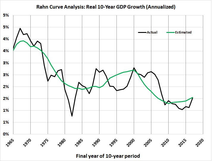
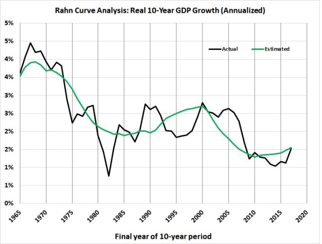
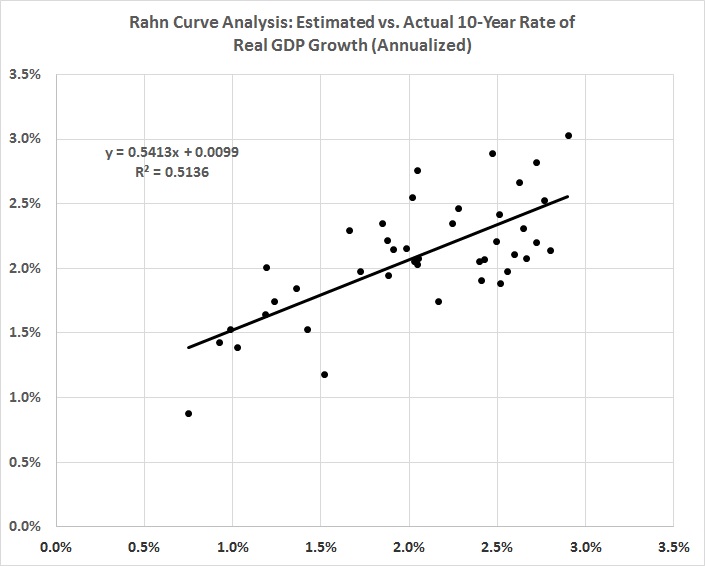
UPDATED 12/13/14 — This update consists of a comment about my estimate of the Rahn curve. I have just published a much better estimate of the curve for the post-World War II era.

UPDATED 12/28/11 — This update incorporates GDP and government spending statistics for 2010 and corrects a minor discrepancy in the estimation of government spending. Also, there are new, easier-to-read graphs. The bottom line is the same as before: Government spending and everything that goes with it (including regulation) is destructive of economic growth.

UPDATED 09/19/13 — This version incorporates two later posts “Estimating the Rahn Curve: A Sequel” (01/24/12) and “More Evidence for the Rahn Curve” (05/27/12).

*     *     *

The theory behind the Rahn Curve is simple — but not simplistic. A relatively small government with powers limited mainly to the protection of citizens and their property is worth more than its cost to taxpayers because it fosters productive economic activity (not to mention liberty). But additional government spending hinders productive activity in many ways, which are discussed in Daniel Mitchell’s paper, “The Impact of Government Spending on Economic Growth.” (I would add to Mitchell’s list the burden of regulatory activity, which accumulates with the size of government.)

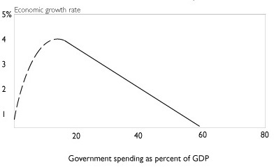
What does the Rahn Curve look like? Daniel Mitchell estimates this relationship between government spending and economic growth:

Rahn curve (2)

The curve is dashed rather than solid at low values of government spending because it has been decades since the governments of developed nations have spent as little as 20 percent of GDP. But as Mitchell and others note, the combined spending of governments in the U.S. was 10 percent (and less) until the eve of the Great Depression. And it was in the low-spending, laissez-faire era from the end of the Civil War to the early 1900s that the U.S. enjoyed its highest sustained rate of economic growth.

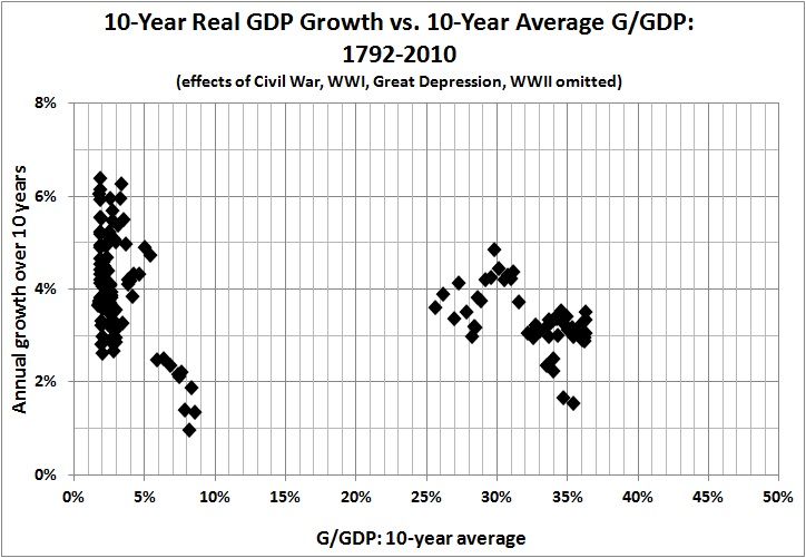
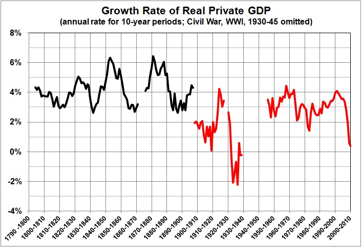
Here is a graphic look at the historical relationship between government spending and GDP growth:

(Source notes for this graph and those that follow are at the bottom of this post.)

The regression lines are there simply to emphasize the long-term trends. The relationship between government spending as a percentage of GDP (G/GDP) and real GDP growth will emerge from the following graphs. There are chronological gaps because the Civil War, WWI, the Great Depression, and WWII distorted the relationship between G/GDP and economic growth. Large wars inflate government spending and GDP. The Great Depression saw a large rise in G/GDP, by pre-Depression standards, even as the economy shrank and then sputtered to a less-than-full recovery before the onset of WWII.

Est Rahn curve 1792 1861

Est Rahn curve 1866 1917

Est Rahn curve 1792 1917

Est Rahn curve 1946-2010

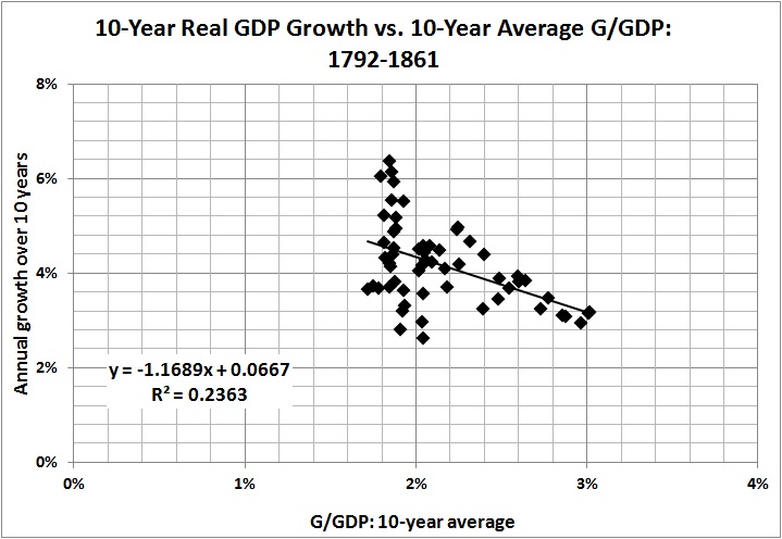
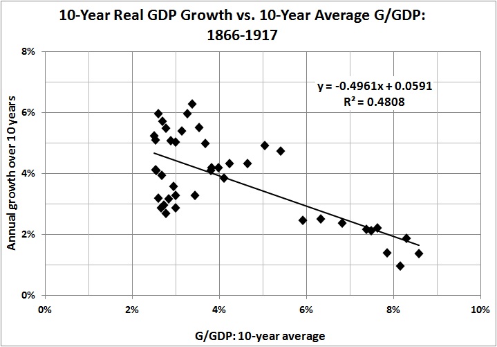
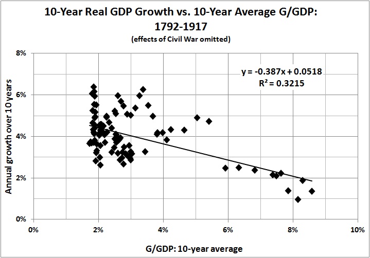
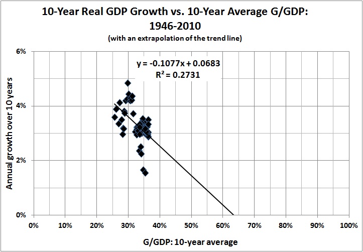
The graphs paint a consistent picture: Higher G/GDP means lower growth. There is one inconsistency, however, and that is the persistence of growth in the range of 2 to 4 percent during the post-WWII era, despite G/GDP in the range of 25-45 percent. That is not the kind of growth one would expect, given the relationships that obtain in the earlier eras. (The extrapolated trend line for 1946-2009 comes into use below.)

There are at least five plausible — and not mutually exclusive — explanations for the discrepancy. First, there is the difficulty of estimating GDP for years long past. Second, it is almost impossible to generate a consistent estimate of real GDP spanning two centuries; current economic output is vastly greater in volume and variety than it was in the early days of the Republic. Third, productivity gains (advances in technology, management techniques, and workers’ skills) may offset the growth-inhibiting effects of government spending, to some extent. Fourth, government regulations and active interventions (e.g., antitrust activity, the income tax) have a cumulative effect that operates independently of G/GDP. Regulations and interventions may have had an especially strong effect in the early 1900s (see the second graph in this post). The effects of regulations and interventions may diminish with time because of  adaptive behavior (e.g., “capture” of regulatory bodies).

Finally, and perhaps most importantly, there is the shifting composition of government spending. At relatively low levels of G/GDP, G consists largely of government programs that usurp and interfere with private-sector functions by diverting resources from productive uses to uses favored by politicians, bureaucrats, and their patrons. Higher levels of G/GDP — such as those we in the United States have known since the end of WWII — are reached by the expansion of the welfare state. Government spending (at all levels) on so-called social benefits accounted for only 7 percent of G and 0.8 percent of GDP in 1929; in 2009, it accounted for 36 percent of G and 15 percent of GDP. The provision of “social benefits” brings government into the business of redistributing income, which discourages work, saving, and capital formation to some extent, but doesn’t impinge directly on commerce. Therefore, I would expect G to be less damaging to GDP growth at higher levels of G/GDP — which is the message to be found in the contrast between the experience of 1946-2009 and the experience of earlier periods.

With those thoughts in mind, I present this empirical picture of the relationship between G/GDP and GDP growth in the United States:

Est Rahn curve 1792-2010

The intermediate points, unfortunately, are missing because of the chronological gaps mentioned above. But, as indicated by the five earlier graphs, it is entirely reasonable to infer from the preceding graph a strong relationship between GDP growth and changes in G/GDP throughout the history of the Republic.

It is possible to obtain a rough estimate of the downward sloping portion of the Rahn curve by focusing on two eras: the post-Civil War years 1866-1890 — before the onset of “progressivism,” with its immediate and strong negative effects — and the post-WWII years 1946-2009. Thus:

Est Rahn curve rough sketch

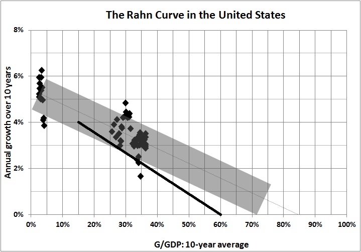
My rough estimate is appropriately “fuzzy” and somewhat more generous than Daniel Mitchell’s, which is indicated by the heavy black line. In light of my discussion of the shifting composition of G as G/GDP becomes relatively large, I  have followed the slope of the trend line for 1792-2010; that is, every 1 percentage-point increase in G/GDP yields a decrease in the growth rate of about 0.07 percent. That seemingly small effect becomes a huge one when G/GDP rises over a long period of time (as has been the case for more than a century, with no end in sight).

For the record, the best fit through the “fuzzy” area is:

Annual rate of growth = -0.066(G/GDP) + 0.054.

[A revised and more realistic estimate for the post-World War II era is

Real rate of growth = -0.372(G/GDP) + 0.067(BA/GDP) + 0.080 ,

where the real rate of growth is the annualized rate over a 10-year period, G/GDP is the fraction of GDP spent by government (including social transfers) over the preceding 10-year period, and BA/GDP represents business assets as a fraction of GDP for the preceding 10-year period.]

Again, it’s the annualized rate of growth over a 10-year span, as a function of G/GDP (fraction of GDP spent by governments at all levels) in the preceding 10 years. The new term, BA/GDP, represents the constant-dollar value of private nonresidential assets (i.e., business assets) as a fraction of GDP, averaged over the preceding 10 years. The idea is to capture the effect of capital accumulation on economic growth, which I didn’t do in the earlier analysis.

Maximum GDP growth seems to occur when G/GDP is 2-4  percent. That is somewhat less than the 7-percent share of GDP that was spent on national defense, public order, and safety in 2010. The excess represents additional “insurance” against predators, foreign and domestic. (The effectiveness of the additional “insurance” is a separate question, though I am inclined to err on the side of caution when it comes to defense and law enforcement. Those functions are not responsible for the economic woes facing America’s taxpayers.)

If G/GDP reaches 55 percent — which it will if present entitlement “commitments” are not curtailed — the “baseline” rate of growth will shrink further: probably to less than 2 percent. And thus America will remain mired in its Mega-Depression.

*     *     *

Source notes:

Estimates of real and nominal GDP, back to 1790, come from the feature “What Was the U.S GDP Then?” at MeasuringWorth.com.

Estimates of government spending (federal, State, and local) come from USgovernmentspending.com; Statistical Abstracts of the United States, Colonial Times to 1970: Part 2. Series Y 533-566. Federal, State, and Local Government Expenditures, by Function; and the Bureau of Economic Analysis (BEA), Table 3.1. Government Current Receipts and Expenditures (lines 34, 35).

I found the amount spent by governments (federal, State, and local) on national defense and public order and safety by consulting BEA Table 3.17. Selected Government Current and Capital Expenditures by Function.

The BEA tables cited above are available here.

*     *     *

ADDENDUM: THE RAHN CURVE: A SEQUEL

In the original post (above) I note that maximum GDP growth occurs when government spends two to four percent of GDP. The two-to-four percent range represents the share of GDP claimed by American governments (federal, State, and local) throughout most of the 19th century, when government spending exceeded five percent of GDP only during the Civil War.

Of course, until the early part of the 20th century, when Progressivism began to make itself felt in Americans’ tax bills, governments restricted themselves (in the main) to the functions of national defense, public order, and safety — the terms used in national-income accounting. It is those functions — hereinafter called defense and justice — that foster liberty and economic growth because they protect peaceful, voluntary activity. Effective protection probably would cost more than four percent of GDP in these parlous times. But an adequate figure, except in the rare event of a major war, is probably no more than seven percent of GDP — the value for 2010, which includes the cost of fighting in Iraq and Afghanistan.

In any event, government spending — even on defense and justice — is impossible without private economic activity. It is that activity which yields the wherewithal for the provision of defense and justice. Once those things have been provided, the further diversion of resources by government is economically destructive. Specifically, from “Estimating the Rahn Curve” (above):

It is possible to obtain a rough estimate of the downward sloping portion of the Rahn curve by focusing on two eras: the post-Civil War years 1866-1890 — before the onset of “progressivism,” with its immediate and strong negative effects — and the post-WWII years 1946-2009. Thus:

Est Rahn curve rough sketch

My rough estimate is appropriately “fuzzy” and somewhat more generous than Daniel Mitchell’s [in “The Impact of Government Spending on Economic Growth”], which is indicated by the heavy black line. In light of my discussion of the shifting composition of G as G/GDP becomes relatively large, I  have followed the slope of the trend line for 1792-2010; that is, every 1 percentage-point increase in G/GDP yields a decrease in the growth rate of about 0.06 percent. That seemingly small effect becomes a huge one when G/GDP rises over a long period of time (as has been the case for more than a century, with no end in sight).

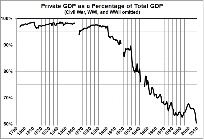
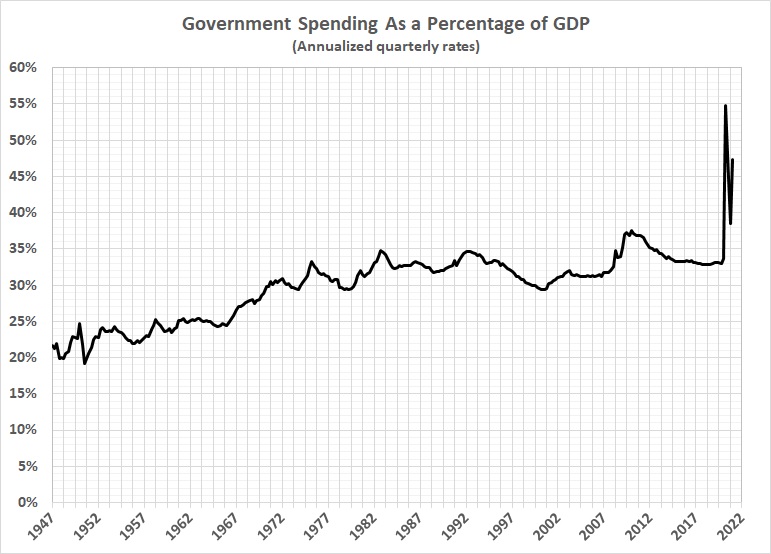
The following graphs offer another view of the devastation wrought by the growth of government spending — and regulation. (Sources are given in “Estimating the Rahn Curve.”) I begin with the share of GDP which is not spent by government:

Est Rahn curve sequel_priv GDP as pct total GDP

A note about my measure of government spending is in order. National-income accounting purists would insist that transfer payments (mainly Social Security, Medicare, and Medicaid) should not count as spending, even though I count them as such. But what does it matter whether money is taken from taxpayers and given to retired persons (as Social Security) or to government employees (as salary and benefits) or contractors (as reimbursement for products and services delivered to government)? All government spending represents the transfer of claims on resources from persons who earned those claims to other persons, who either did something of questionable value for the money (government employees and contractors) or nothing (e.g., retirees).

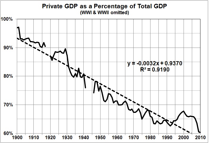
In any event, it is obvious that Americans enjoyed minimal government until the early 1900s, and have since “enjoyed” a vast expansion of government. Here is a closer look at the trend from 1900 onward:

Est Rahn curve sequel_private GDP pct total GDP since 1900

This is a good point at which to note that the expansion of government is understated by the growth of government spending, which only imperfectly captures the effects of the rapidly growing regulatory burden on America’s economy. The combined effects of government spending and regulation can be seen in this “before” and “after” depiction of growth rates:

Est Rahn curve sequel_growth rate of private GDP

(I omitted the major wars and the Great Depression because their inclusion would give an exaggerated view of economic growth in the aftermath of abnormally suppressed private economic activity.)

The marked diminution of growth  after 1900 has led to what I call America’s Mega-Depression. Note the similarity between the downward path of private sector GDP (two graphs earlier) and the downward path of the Mega-Depression in the following graph:

Est Rahn curve sequel_mega-depression

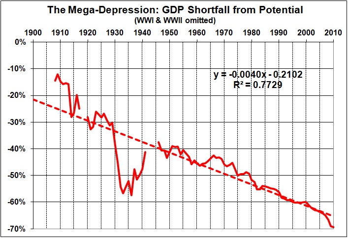
What is the Mega-Depression? It is a measure of the degree to which real GDP has fallen below what it would have been had economic growth continued at its post-Civil War pace. As I explain here, the Mega-Depression began in the early 1900s, when the economy began to sag under the weight of Progressivism (e.g., trust-busting, regulation, the income tax, the Fed). Then came the New Deal, whose interventions provoked and prolonged the Great Depression (see, for example, this, and this). From the New Deal and the Great Society arose the massive anti-market/initiative-draining/dependency-promoting schemes known as Social Security, Medicare, and Medicaid. The extension and expansion of those and other intrusive government programs has continued unto the present day (e.g., Obamacare), with the result that our lives and livelihoods are hemmed in by mountains of regulatory restrictions.

Regulation aside, government spending — except for defense and justice — is counterproductive. Not only does it fail to stimulate the economy in the short run, but it also robs the economy of the investments that are needed for long-run growth.

*     *     *

ADDENDUM: MORE EVIDENCE FOR THE RAHN CURVE

Here:

[W]e have some new research from the United Kingdom. The Centre for Policy Studies has released a new study, authored by Ryan Bourne and Thomas Oechsle, examining the relationship between economic growth and the size of the public sector.

The chart above compares growth rates for nations with big governments and small governments over the past two decades. The difference is significant, but that’s just the tip of the iceberg. The most important findings of the report are the estimates showing how more spending and more taxes are associated with weaker performance.

Here are some key passages from the study.

Using tax to GDP and spending to GDP ratios as a proxy for size of government, regression analysis can be used to estimate the effect of government size on GDP growth in a set of countries defined as advanced by the IMF between 1965 and 2010. …As supply-side economists would expect, the coefficients on the tax revenue to GDP and government spending to GDP ratios are negative and statistically significant. This suggests that, ceteris paribus, a larger tax burden results in a slower annual growth of real GDP per capita. Though it is unlikely that this effect would be linear (we might expect the effect to be larger for countries with huge tax burdens), the regressions suggest that an increase in the tax revenue to GDP ratio by 10 percentage points will, if the other variables do not change, lead to a decrease in the rate of economic growth per capita by 1.2 percentage points. The result is very similar for government outlays to GDP, where an increase by 10 percentage points is associated with a fall in the economic growth rate of 1.1 percentage points. This is in line with other findings in the academic literature. …The two small government economies with the lowest marginal tax rates, Singapore and Hong Kong, were also those which experienced the fastest average real GDP growth.

My own estimate (see above) for the United States, is that

every 1 percentage-point increase in G/GDP yields a decrease in the growth rate of about 0.07 percent. That seemingly small effect becomes a huge one when G/GDP rises over a long period of time (as has been the case for more than a century, with no end in sight).

In other words, every 10 percentage-point increase in the ratio of government spending to GDP causes a not-insignificant drop of 0.7 percentage points in the rate of growth. That is somewhat below the estimate quoted above (1.1 percentage points), but surely it is within the range of uncertainty that surrounds the estimate.

The Price of Government, Once More

I was pleased to read a recent post by Mark Perry, “Federal regulations have lowered real GDP growth by 2% per year since 1949 and made America 72% poorer.” It wasn’t the message that pleased me; it was the corroboration of what I have been saying for several years.

Regulation is one of the many counterproductive activities that is financed by government spending. The main economic effect of government spending, aside from regulation, is the deadweight loss it imposes on the economy; that is, it moves resources from productive uses to less productive, unproductive, and counterproductive ones. And then there is taxation (progressive and otherwise), which penalizes success and deters growth-producing investment.

All in all, the price of government is extremely high. But most voters are unaware of the price, and so they continue to elect and support the very “free lunch” politicians who are, in fact, robbing them blind.

Consider, for example, these posts by James Pethokoukis:
Is the Era of Fast U.S. Economic Growth Coming to an End?AEIdeas, July 13, 2013
My Counter: Why U.S. Economic Growth Doesn’t Have to Come to an End,” AEIdeas, August 23, 2012

Pethokoukis’s thesis, with which I agree, is that government — not lack of opportunity — is the main obstacle to the resumption of a high rate of growth.

For much more, see:
The Price of Government
The Price of Government Redux
The Mega-Depression
Ricardian Equivalence Reconsidered
The Real Burden of Government
The Rahn Curve at Work
The “Forthcoming Financial Collapse”
Estimating the Rahn Curve: Or, How Government Inhibits Economic Growth
The Deficit Commission’s Deficit of Understanding
The Bowles-Simpson Report
The Bowles-Simpson Band-Aid
The Stagnation Thesis
America’s Financial Crisis Is Now
Estimating the Rahn Curve: A Sequel
Lay My (Regulatory) Burden Down
More Evidence for the Rahn Curve


The Economic Outlook in Brief

I have elsewhere quantified the connection between government spending and economic growth (e.g., here and here).* I have also shown that stock prices indicate the direction of economic growth. It should not surprise you if I say that

  • the re-election of Obama portends further growth of government spending — specifically, the uncontrolled growth of entitlement spending, as accelerated by Obamacare;
  • the rate of economic growth will continue to decline for as long as entitlements grow as a percentage of GDP; and
  • in anticipation of slower economic growth, stock prices will continue to decline, in real terms.

You can follow the links in the first paragraph if you wish to learn more. Here is a bit of additional evidence for my gloomy outlook. The real value of the S&P Composite Index has fluctuated in trough-to peak-to trough cycles, four of which have been completed since the 1870s:


Derived from Robert Shiller’s data set at http://www.econ.yale.edu/~shiller/data/ie_data.xls.

We are now on the downside of the fifth cycle, which began in July 1982 and peaked in August 2000. If the present cycle follows the pattern of the other two long cycles, it may not bottom out until sometime after 2020  (though it may never end if economic growth continues to decline). And if it does bottom out then, the real value of the S&P composite will have risen only about two-fold from where its value at the start of the cycle in July 1982. In nominal terms, the S&P Composite will have dropped to about half its current level by 2020.

But, as I say, the stock market merely anticipates underlying economic conditions. Those conditions seem destined to worsen because the entitlements mess will not be dealt with for as long as there is gridlock in Washington.

__________
* See also the second graph in this post by James Pethokoukis of the American Enterprise Institute. The graph highlights the inverse relationship between entitlement spending and growth-producing innovation. Entitlement spending diminishes investments in innovation by (a) diverting resources from productive to unproductive uses and (b) penalizing (taxing) productive activities that fund innovation and its implementation.

Related posts:
The Laffer Curve, “Fiscal Responsibility,” and Economic Growth
The Causes of Economic Growth
In the Long Run We Are All Poorer
A Short Course in Economics
Addendum to a Short Course in Economics
The Price of Government
The Price of Government Redux
The Mega-Depression
As Goes Greece
Ricardian Equivalence Reconsidered
The Real Burden of Government
The Illusion of Prosperity and Stability
Estimating the Rahn Curve: Or, How Government Inhibits Economic Growth
Taxing the Rich
More about Taxing the Rich
America’s Financial Crisis Is Now
A Keynesian Fantasy Land
The Keynesian Fallacy and Regime Uncertainty
Why the “Stimulus” Failed to Stimulate
The “Jobs Speech” That Obama Should Have Given
Say’s Law, Government, and Unemployment
Unemployment and Economic Growth
Regime Uncertainty and the Great Recession
Regulation as Wishful Thinking
The Real Multiplier
Vulgar Keynesianism and Capitalism
Why Are Interest Rates So Low?
The Commandeered Economy
Stocks for the Long Run?
We Owe It to Ourselves
Stocks for the Long Run? (Part II)
Estimating the Rahn Curve: A Sequel
In Defense of the 1%
Bonds for the Long Run?
The Real Multiplier (II)
Lay My (Regulatory) Burden Down
The Burden of Government
Economic Growth Since World War II
More Evidence for the Rahn Curve
The Economy Slogs Along
The Obama Effect: Disguised Unemployment
The Stock Market as a Leading Indicator of GDP
Government in Macroeconomic Perspective
Where We Are, Economically
Keynesianism: Upside-Down Economics in the Collectivist Cause

Where We Are, Economically

UPDATED (10/26/12)

The advance estimate of GDP for the third quarter of 2012 has been released. Real growth continues to slog along at about 2 percent. I have updated the graph, but the text needs no revision.

*  *   *

It occurred to me that the trend line in the second graph of “The Economy Slogs Along” is misleading. It is linear, when it should be curvilinear. Here is a better version:


Derived from the October 26, 2012 release of GDP estimates by the Bureau of Economic Analysis. (Contrary to the position of the National Bureau of Economic Research, there was no recession in 2000-2001. For my definition of a recession, see “Economic Growth Since World War II.”)

The more descriptive regression line underscores the moral of “Obama’s Economic Record in Perspective,” which is this:

The claims by Obama and his retinue about O’s supposed “rescue” of the economy from the abyss of depression are ludicrous. (See, for example, “A Keynesian Fantasy Land,” “The Keynesian Fallacy and Regime Uncertainty,” “Why the “Stimulus” Failed to Stimulate,” “Regime Uncertainty and the Great Recession,” The Real Multiplier,” “The Real Multiplier (II),”The Economy Slogs Along,” and “The Obama Effect: Disguised Unemployment.”) Nevertheless our flannel-mouthed president his sycophants insist that he has done great things for the country, though the only great thing that he could do is to leave it alone.

Obama is not to blame for the Great Recession, but the sluggish recovery is due to his anti-business rhetoric and policies (including Obamacare, among others). All that Obama can rightly take “credit” for is an acceleration of the downward trend of economic growth.

Related posts:
Are We Mortgaging Our Children’s Future?
In the Long Run We Are All Poorer
Mr. Greenspan Doth Protest Too Much
The Price of Government
Fascism and the Future of America
The Indivisibility of Economic and Social Liberty
Rationing and Health Care
The Fed and Business Cycles
The Commandeered Economy
The Perils of Nannyism: The Case of Obamacare
The Price of Government Redux
As Goes Greece
The State of the Union: 2010
The Shape of Things to Come
Ricardian Equivalence Reconsidered
The Real Burden of Government
Toward a Risk-Free Economy
The Rahn Curve at Work
The Illusion of Prosperity and Stability
More about the Perils of Obamacare
Health Care “Reform”: The Short of It
The Mega-Depression
I Want My Country Back
The “Forthcoming Financial Collapse”
Estimating the Rahn Curve: Or, How Government Inhibits Economic Growth
The Deficit Commission’s Deficit of Understanding
The Bowles-Simpson Report
The Bowles-Simpson Band-Aid
The Stagnation Thesis
America’s Financial Crisis Is Now
Understanding Hayek
Money, Credit, and Economic Fluctuations
A Keynesian Fantasy Land
The Keynesian Fallacy and Regime Uncertainty
Why the “Stimulus” Failed to Stimulate
The “Jobs Speech” That Obama Should Have Given
Say’s Law, Government, and Unemployment
Regime Uncertainty and the Great Recession
Regulation as Wishful Thinking
Vulgar Keynesianism and Capitalism
Why Are Interest Rates So Low?
Don’t Just Stand There, “Do Something”
The Commandeered Economy
Stocks for the Long Run?
We Owe It to Ourselves
Stocks for the Long Run? (Part II)
Bonds for the Long Run?
The Real Multiplier (II)
The Burden of Government
Economic Growth Since World War II
More Evidence for the Rahn Curve
The Economy Slogs Along
The Obama Effect: Disguised Unemployment
Obama’s Economic Record in Perspective

Higher Taxes, Higher Government Spending, Slower Economic Growth

J.D. Foster and Curtis Dubay, writing at The Foundry (“Of Course Higher Taxes Slow Growth — A Response to Diamond and Saez“), make mincemeat of Peter Diamond and Emmanuel Saez’s arguments for higher taxes on “the rich.” Implicit in Foster and Dubay’s takedown of Diamond and Saez is the demonstrably strong (and negative relationship) between government spending and economic growth.

Spending is funded by taxes, after all. And even when spending is funded by borrowing it amounts to a tax on the productive sectors of the economy. How is that? When government sell bonds to the public it redirects money from productive uses in the private sector to unproductive and counter-productive uses in the so-called public sector (i.e., government). The thievery is no less destructive — but more apparent — when the Fed creates money out of thin air to finance government spending.

So, the focus should be on spending, for which taxation is a proxy. The effect of government spending on economic growth is nothing less than disastrous. I have treated the subject at length in “Estimating the Rahn Curve: Or, How Government Inhibits Economic Growth.” Here is another version of the final graph in that post:

The bottom line is that for every 10 percentage points by which government spending rises, the rate of growth declines by 0.7 percentage points. If you think that 0.7 percent is negligible, try compounding it over a lifespan of 80 years. In that time, a sustained 10 percent rise in government spending will reduce the average person’s real income by more than 40 percent.

That, my friends, is soak-the-rich Obamanomics at work. Apologists for Obamanomics, like Diamond and Saez, should be ashamed of themselves for abetting economically destructive demagoguery.

Related posts:
The Causes of Economic Growth
A Short Course in Economics
Addendum to a Short Course in Economics
Enough of “Social Welfare”
The Case of the Purblind Economist
Economic Growth since WWII
The Price of Government
Does the Minimum Wage Increase Unemployment?
The Price of Government Redux
The Mega-Depression
The Real Burden of Government
Toward a Risk-Free Economy
The Rahn Curve at Work
The Illusion of Prosperity and Stability
Society and the State
The “Forthcoming Financial Collapse”
Estimating the Rahn Curve: Or, How Government Inhibits Economic Growth
The Deficit Commission’s Deficit of Understanding
Undermining the Free Society
The Bowles-Simpson Report
The Bowles-Simpson Band-Aid
Build It and They Will Pay
Government vs. Community
The Stagnation Thesis
Government Failure: An Example
Taxing the Rich
More about Taxing the Rich
Voluntary Taxation
Money, Credit, and Economic Fluctuations
A Keynesian Fantasy Land
“Tax Expenditures” Are Not Expenditures
The Keynesian Fallacy and Regime Uncertainty
Why the “Stimulus” Failed to Stimulate
The “Jobs Speech” That Obama Should Have Given
Regime Uncertainty and the Great Recession
The Real Multiplier
Vulgar Keynesianism and Capitalism
Why Are Interest Rates So Low?
Don’t Just Stand There, “Do Something”
Economic Growth Since World War II
The Commandeered Economy
We Owe It to Ourselves
In Defense of the 1%
The Real Multiplier (II)