Politicizing Economic Growth

UPDATED (04/09/08, 04/10/08)

According to economist Dani Rodrik, the author of the following graph (one Larry Bartels) claims to have shown that

[w]hen a Republican president is in power, people at the top of the income distribution experience much larger real income gains than those at the bottom–a difference of 1.5 percent per year going from the bottom to the top quintile in the income distribution. The situation is reversed when a Democrat is in power: those who benefit the most are the lower income groups.

Source: Dani Rodrik’s Weblog, American political economics in one picture.”

As I discuss below, the graph is deceptive because of the period it encompasses. Taking into account the downward trend in real GDP growth that began a century ago, and the timing of Democrat and Republican presidencies from Truman’s second term onward, the graph shows only this: Republican presidents (when they had congressional support) enacted tax and regulatory policies that encouraged economic growth. The rewards of stronger growth, naturally, went mainly (though not exclusively) to those who contributed the most to growth, namely, risk-takers and highly skilled persons. Conversely, Democrat presidents (when they had congressional support, which was more often) enacted tax and regulatory policies that discouraged economic growth, which harmed high earners more than low earners.

Nor is this table conclusive of anything:

Source: Marginal Revolution, More on Bartels

The preceding graph and table both mask the long, downward trend in the real rate of GDP growth, which I document in this post. Thus:


Why the downward trend in real GDP growth? See this post. In sum, the downward trend is due to the policies of (most) presidents and Congresses since the early 1900s: deliberate expansion of the regulatory-welfare state, with almost no opposition from the Supreme Court after the mid-1930s.

Here’s a closer look at the GDP trend since Truman’s first year as an elected president:

Source: Year-over-year changes in real GDP computed from estimates of real GDP available at Louis D. Johnston and Samuel H. Williamson, “What Was the U.S. GDP Then? MeasuringWorth.Com, 2008.

Given the long, downward trend in the real rate of GDP growth, it is statistical nonsense to pin the growth rate in any given year to a particular year of a particular president’s term. It is evident that GDP growth has been influenced mainly by the cumulative, anti-growth effects of government regulation. And GDP growth, in any given year, has been an almost-random variation on a downward theme.

As an additional piece of evidence for that proposition, I offer this: The strongest correlation between the year of a presidential term (i.e., first, second, etc.) and real GDP growth during 1949-2007 does not involve a one-year lag (as Dani Rodrik’s post suggests) but a one-year lead. There is a positive statistical relationship between growth rate and Democrat presidencies for the period 1949-2007 only because Democrats sat in the White House in half of the years from 1949 through 1981 and less than a third of the years after that. But Democrats weren’t responsible for the higher growth rate of those earlier years. They were, if anything, responsible for the lower growth rate of the later years. It took decades for the cumulative regulatory and redistributive effects of the New Deal, Fair Deal, and Great Society to be felt. But felt they were, eventually, even during the years of the so-called Clinton boom — when the liar-in-chief compounded them.

A more useful analysis of the influence of government policy on growth is found in this post. It is about the Laffer curve and the real stimulus afforded by tax cuts, regardless of the president’s party affiliation.

UPDATE: Paul Krugman, of course, is eager to believe the pseudo-relationship “discovered” by Bartels.

SECOND UPDATE: An analysis by The Corner‘s Jim Manzi corroborates my points.

The Fed: Unconstitutional and Worse than Useless

Here and here.

More about "Libertarian" Paternalism…

…from Jonah Goldberg, here. See related posts here, here, here, here, here, here, here, here, and here.

UPDATE (04/04/08): See these three posts by Jim Manzi, and related posts here, here, here, and here.

Bootleggers, Baptists, and Satellite Radio

The good news: Justice Dept. approves XM-Sirius merger

…despite opposition from consumer groups and an intense lobbying campaign by the land-based radio industry.

What does this news have to do with “Bootleggers and Baptists”?

  • “Bootleggers” are market incumbents (in this case, the land-based radio industry), who benefit from the suppression of competition (as bootleggers did during Prohibition).
  • “Baptists” are self-appointed guardians of our health and well-being (the sum of all our risk-averse fears, you might say). In this case, the Baptists are “consumer groups” (meaning anti-business alliances), which reflexively oppose mergers.

(For more, see Bruce Yandle’s “Bootleggers and Baptists in Retrospect.”)

As a Sirius subscriber, I am glad of the Justice Department’s decision — given that DoJ had to be involved, in the first place. Why? Because (a) Sirius is now more likely to survive , and (b) it will offer (via its merger with XM) more programs.

Related posts:
More Commandments of Economics” (#19) (06 Dec 2005)
Monopoly and the General Welfare” (25 Feb 2006)

A Message for "Green" Auto Buyers

From this paper:

[T]he Honda Accord Hybrid has an Energy Cost per Mile of $3.29 while the conventional Honda Accord is $2.18. Put simply, over the “Dust to Dust” lifetime of the Accord Hybrid, it will require about 50 percent more energy than the non-hybrid version.

One of the reasons hybrids cost more than non-hybrids is the manufacture, replacement and disposal of such items as batteries, electric motors (in addition to the conventional engine), lighter weight materials and complexity of the power package. And while many consumers and environmentalists have targeted sport utility vehicles because of their lower fuel economy and/or perceived inefficiency as a means of transportation, the energy cost per mile shows at least some of that disdain is misplaced.

For example, while the industry average of all vehicles sold in the U.S. in 2005 was $2.28 cents per mile, the Hummer H3 (among most SUVs) was only $1.949 cents per mile. That figure is also lower than all currently offered hybrids and Honda Civic at $2.42 per mile.

“If a consumer is concerned about fuel economy because of family budgets or depleting oil supplies, it is perfectly logical to consider buying high-fuel-economy vehicles…. But if the concern is the broader issues such as environmental impact of energy usage, some high-mileage vehicles actually cost … more than conventional or even larger models over their lifetime.

“…Basing purchase decisions solely on fuel economy or vehicle size does not get to the heart of the energy usage issue.”

Har!

More generally, as I say here:

All costs matter; one cannot make good economic decisions by focusing on one type of cost, such as the cost of energy.

Perspective on the Stock Market

Yes, we are in a bear market, as I foresaw here and confirmed here. But before you jump out a window, put the current state of the market in perspective:

Dow Jones Wilshire 5000 Composite Index
(as of 12:36 p.m. ET today)

(c) BigCharts.com

Even with today’s significant drop (thus far), the market is relatively high by historical standards. The “bear” of 2000-2003 was far deeper than the current decline. Don’t panic.

Democrats and Trade

A post at The New York Times Blog reminds me of an old post of mine:

What U.S. consumers should (and do) care about is getting the most for their money. If more of their dollars happen to flow across international borders as American companies strive for efficiency, so what? If American companies “send jobs” to Juan in Nuevo Laredo, Mexico, and Pierre in St. Stephen, New Brunswick, Juan and Pierre wil use the extra dollars they earn to buy things of good value to them that are made in the U.S., things that they couldn’t afford before. That’s called job creation.

In sum, Juan and Pierre outsource to us because we outsource to them, just as you outsource auto repair to your local mechanic and he outsources, say, computer programming to you. And if Juan and Pierre don’t spend all of their dollars on consumer goods, they put some of their dollars (directly or indirectly) into U.S. stocks and bonds, which helps to finance economic growth in the U.S.

Outsourcing, which is really the same thing as international trade, creates jobs, creates wealth, and raises real incomes — for all. Economics is a positive-sum “game.”

If you’re not convinced, think of it this way: If product X is a good value, does it matter to you whether it was made in Poughkeepsie or Burbank? Well, then, there’s nothing wrong with Laredo, Texas, or Calais, Maine, is there?

Now imagine that the Rio Grande River shifts course and, poof, Nuevo Laredo, Mexico, becomes Nuevo Laredo, Texas. Or suppose that the Saint Croix River between Maine and New Brunswick shifts course and the former St. Stephen, New Brunswick, becomes St. Stephen, Maine. Juan and Pierre are now Americans. Feel better?

What’s in a border? A border is something to be defended against an enemy. But do you want a border to stand between you and lower prices, more jobs, and economic growth? I thought not.

See also this, this, and this (#17).

Income and Diminishing Marginal Utility

David Friedman (Ideas) subscribes to the mistaken notion that the utility (enjoyment) gained from additional income diminishes as income increases; for example:

Consider a program such as social security which collects money and pays out money. Dollars collected from the richer taxpayer probably cost him less utility than dollars collected from the poorer taxpayer cost him. But dollars paid to the richer taxpayers also provide less utility than dollars paid to the poorer.

Friedman’s mistake is a common one. It is one misapplication of the concept of diminishing marginal utility (DMU): the entirely sensible notion that the enjoyment of a particular good or service declines, at some point, with the quantity consumed during a given period of time. For example, a second helping of chocolate dessert might be more enjoyable than a first helping, but a third helping might not be as enjoyable as the second one.

The misapplication of DMU arises from an error of logic, an error of observation, and an error of arrogance. (Friedman doesn’t make all three errors, but avowed redistributionists do.)

The error of logic is to assume (implicitly) that as one’s income rises one continues to consume the same goods and services, just at a higher rate. But, in fact, having more income enables a person to consume goods and services of greater variety and higher quality. Given that, it is possible always to increase one’s enjoyment by shifting from a “third helping” of a cheap product to a “first helping” of an expensive one, and to keep on doing so as one’s income rises.

As for the error of observation, look around you. As I explain here,

diminishing marginal utility, DMU, is a key postulate of microeconomic theory. Therefore, the [rich] Xs of the world must be “sated” by having “so much” money, whereas the [poorer] Ys remain relatively “unsated.”

If that were true, why would Bill Gates, Warren Buffet, and partners in Wall Street investment banks (not to mention most of you who are reading this) seek to make more money and amass more wealth? Perhaps the likes of Gates and Buffet do so because they want to engage in philanthropy on a grand scale. But their happiness is being served by making others happy through philanthropy; the wealthier they are, the happier they can make others and themselves.

In other words, should you run out of new and different things to consume (an unlikely event), you can make yourself happier by acquiring more income to amass more wealth and (if it makes you happy) by giving away some of your wealth.

Is there a point at which one opts for leisure (or other non-work activities) over income? Yes, but that point varies widely from person to person and, for some, isn’t really a marginal preference for leisure over work and income. The committed workaholic sleeps, at times, but only in order to sustain himself in his quest for more income and wealth. Even non-workaholics generally say “yes” to better-paying jobs. And most of them keep saying “yes” until the offers stop coming. Why “yes”? Because the extra effort involved in earning a higher salary (and there usually is some extra effort), is worth it. Where’s the diminishing marginal utility in that?

Why do most people try to save some of their income instead of spending it all on current consumption? For a “rainy day,” a new house, the kids’ education, retirement, the kids’ legacy, etc. How do they do it? By choosing investments that (they hope) will yield a high return (given the risk involved); that is, by earning more income (and amassing more wealth) than one is able to do just by working. How much is enough? For almost everyone (the main exceptions being super-rich hypocrites like Warren Buffet), there’s never enough. Where’s the diminishing marginal utility in that?

Except for the rare bird who truly prefers less to more, the marginal utility of income per se does not diminish. That is why we accept promotions, invest our savings, and (irrationally) buy lottery tickets.

I come now to the error of arrogance:

…[H]ow much wealth is “enough” for one person? I cannot answer that question for you; you cannot answer it for me. (I may have a DMU for automobiles, cashew nuts, and movies, but not for wealth, in and of itself.) And that’s the bottom line: However much we humans may have in common, each of is happy (or unhappy) in his own way and for his own peculiar reasons.

In any event, even if individual utilities (states of happiness) could be measured, there is no such thing as [a] social welfare function: X’s and Y’s utilities are not interchangeable. Taking income from X makes X less happy. Giving some of X’s income to Y may make Y happier (in the short run), but it does not make X happier. It is the height of arrogance for anyone — liberal, fascist, communist, or whatever — to assert that making X less happy is worth it if it makes Y happier.

Thus endeth today’s lesson in economics and humility.

How Attractive Is Your State?

REVISED (02/29/08)

Americans are known for “voting with their feet,” that is, for moving to a more congenial locale, often across State lines. The reasons for doing so are many (e.g., being near family, getting away from family, taking a new job, retiring to a warmer climate, retiring to a climate and terrain conducive to winter sports). One of the reasons, of course, is to reduce one’s State and local tax burden.

But moves based on tax reasons aren’t tabulated in the 2008 Statistical Abstract, Table 31 (Movers by Type of Move and Reason for Moving: 2006), which seems (in my view) to understate the frequency of moves related to climate and retirement. A comparison of the totals in Table 31 with the corresponding totals in Table 33 (Mobility Status of Resident Population by State: 2005) suggests that Table 31 is incomplete, to the tune of about 6 million Americans out of the 45 million or so who change houses, counties, States, and countries every year.

So, it’s up to me to quantify the extent to which decisions about interstate moves are influenced by State and local taxes, among other things.

1. Drawing on Table 33 (linked above), I found the rate at which Americans moved from one State to another in 2005. The answer is 2.47 percent. That is, 7.1 million of the 284.4 million Americans age 1 or older in 2005 were residents of a different State in 2004.

2. Every State gains some new residents from other States, but some States are net gainers and others are net losers. To measure a particular State’s net gain or loss, I subtracted 2.47 percent (the all-State average) from the percentage of residents who moved into that State from other States. Nevada is at one extreme, with a net gain of 3.07 percent; New York is at the other extreme, with a net loss of 1.24 percent.

3. Overall, there is a negative correlation (-0.399) between net gain and tax burden; the lower the tax burden, the greater the gain. Graphically:

Sources: Net moves = net percentage of a State’s population gained from/lost to other States. Net moves are computed at described in the text. Tax burdens for 2004 are from this table, available via this page at the website of The Tax Foundation.

4. Tax policy evidently has a strong effect on decisions to move from State to State. Another quantifiable factor to be accounted for is population. As it turns out, the less populous a State, the greater its attraction:

REVISED PORTION:

5. I took the obvious next step and ran a regression with natural logarithms of tax burden and population as explanatory variables, with this result:

Net population gain or loss (as a decimal fraction of previous year’s population) =
-0.049256
-0.027145 x natural logarithm of State + local tax burden (as a decimal fraction)
-0.005241 x natural logarithm State’s population (in millions)

The R-squared of the equation is 0.420. The F-test on the regression and the t-statistics on the intercept and explanatory variables all are significant at the 0.995 level of confidence, or better.

In other words, after adjusting for population, a 1-percentage point increase in the tax burden from the mean rate of 10.29 percent yields a net population loss of 0.25 percent.

6. The regression equation, as indicated by its fairly low R-squared, leaves much to be explained by factors other than tax burden and population (the latter of which may be a rough proxy for work and family connections). The difference between a State’s actual net gain or loss and the net gain or loss estimated by the equation tells us something about that State’s inherent attractiveness (or unattractiveness). For example, the actual net population gain for Arizona is 2.57 percent; the estimated net gain, 0.25 percent. The difference (known as the residual) is 2.32 percent, which is the largest residual for any State. Arizona is therefore (and for obvious reasons, given its climate) an inherently attractive State. At the other end of the spectrum is Michigan, with a residual of -1.19 percent, which makes it the least inherently attractive State (for entirely fathomable reasons, given its economy).

7. So, I have two measures of a State’s attractiveness

  • overall attractiveness — net percentage of population gained from or lost to other States
  • inherent (natural) attractiveness — the portion of overall attractiveness that is not explained by taxes or population

What really matters, of course, is overall attractiveness, or the lack thereof. Unsurprisingly, the upper Midwest and Northeast dominate the list of 15 least-attractive States (those with negative values in the left panel of the table below). Inherent attractiveness (the right panel of the table below) is, nevertheless, an interesting property. The difference between overall attractiveness and inherent attractiveness is a good measure of the gain (or loss) in a State’s attractiveness because of its tax burden and/or population. Thus:

The two graphs immediately above underscore the importance of taxes and population (that is, the lack thereof) to a State’s overall attractiveness.

States that gain or lose significantly (more than a standard deviation from the mean of 0.59%) fall into three categories:

  • Less-populous States that make themselves significantly more attractive through below-average tax burdens: Alaska (gain of 2.70%, tax burden of 6.6%), Delaware (1.92%, 8.4%), Montana (1.50%, 9.6%), New Hampshire (1.78%, 8.1%), North Dakota (1.68%, 9.7%), South Dakota (1.86%, 8.7%), and Wyoming (1.79%, 9.7%).
  • More-populous States that make themselves significantly less attractive through above-average tax burdens: California (-0.82%, 10.8%), Illinois (-0.11%, 10.5%), New York (-1.07%, 13.5%), Ohio (-0.30%, 11.3%), and Pennsylvania (-0.11%, 10.3%).
  • Populous States with below-average tax burdens whose rapid growth seems to be undermining their attractiveness: Florida (-0.19%, 9.9%) and Texas (-0.18%, 9.4%).

How does your State stack up? See for yourself:

Overall attractiveness

Inherent attractiveness

1

Nevada

3.07%

1

Arizona

2.32%

2

Wyoming

2.91%

2

Nevada

2.22%

3

Arizona

2.57%

3

Idaho

1.46%

4

Idaho

2.50%

4

Florida

1.41%

5

Alaska

2.44%

5

Wyoming

1.12%

6

Delaware

1.85%

6

Georgia

1.02%

7

Oregon

1.72%

7

Oregon

1.01%

8

New Mexico

1.64%

8

Hawaii

0.87%

9

Hawaii

1.55%

9

Washington

0.79%

10

Montana

1.52%

10

New Mexico

0.65%

11

Colorado

1.30%

11

Virginia

0.61%

12

New Hampshire

1.28%

12

North Carolina

0.58%

13

Florida

1.21%

13

Colorado

0.57%

14

Arkansas

1.16%

14

South Carolina

0.51%

15

Georgia

1.14%

15

Arkansas

0.51%

16

Washington

1.02%

16

Maryland

0.28%

17

South Carolina

1.01%

17

Utah

0.21%

18

South Dakota

0.99%

18

Montana

0.02%

19

Virginia

0.88%

19

Texas

0.01%

20

Vermont

0.86%

20

Kansas

0.00%

21

Utah

0.83%

21

Maine

-0.03%

22

Tennessee

0.75%

22

Delaware

-0.07%

23

North Carolina

0.71%

23

Vermont

-0.09%

24

Oklahoma

0.69%

24

Tennessee

-0.11%

25

North Dakota

0.62%

25

New York

-0.17%

26

Maryland

0.56%

26

Oklahoma

-0.20%

27

Kansas

0.55%

27

Alaska

-0.26%

28

Maine

0.44%

28

Iowa

-0.28%

29

Iowa

0.38%

29

Missouri

-0.35%

30

Mississippi

0.36%

30

California

-0.36%

31

West Virginia

0.19%

31

Mississippi

-0.37%

32

Missouri

0.11%

32

New Jersey

-0.38%

33

Alabama

0.08%

33

Connecticut

-0.46%

34

Kentucky

0.04%

34

Kentucky

-0.48%

35

Nebraska

0.03%

35

Pennsylvania

-0.50%

36

Rhode Island

-0.13%

36

New Hampshire

-0.51%

37

Connecticut

-0.13%

37

Wisconsin

-0.58%

38

Texas

-0.17%

38

Ohio

-0.59%

39

Indiana

-0.33%

39

Illinois

-0.60%

40

Minnesota

-0.44%

40

Indiana

-0.63%

41

New Jersey

-0.44%

41

Nebraska

-0.63%

42

Wisconsin

-0.60%

42

West Virginia

-0.69%

43

Pennsylvania

-0.60%

43

Minnesota

-0.70%

44

Massachusetts

-0.72%

44

Alabama

-0.85%

45

Louisiana

-0.75%

45

South Dakota

-0.86%

46

Illinois

-0.77%

46

Rhode Island

-0.98%

47

Ohio

-0.89%

47

Massachusetts

-1.02%

48

California

-1.18%

48

North Dakota

-1.07%

49

Michigan

-1.20%

49

Louisiana

-1.16%

50

New York

-1.24%

50

Michigan

-1.19%

The Folly of Centrism

Paul Silver, writing at The Moderate Voice, opines:

Most of us like talk and performance that is moderate in tone and balanced in application. And it is a useful exercise to continually reflect on what we mean by moderate, extreme and balanced.

It seems to me that each issue can be laid out along a spectrum from one extreme to another. e.g. Nationalized businesses on one end and unfettered markets on the other with gradations of regulation in the middle. I am drawn to the gradations in the middle. For me the compelling debate is about what kind of regulation and how much.

Similarly on Taxes: Socialism on one end and Libertarianism on the other with various philosophies of taxation in the middle. For me the attractive debate is about how much taxes are necessary to provide some agreed upon level of wellbeing for our citizens. I think it is a canard to talk about any significant reduction in overall tax burdens. Even with scrupulous management, our Federal budget might only shrink from $3 Trillion to $2.5 Trillion. The real issue is how the burden is shared by those to whom much has been given.

This is political philosophy as an extension of personality. It has nothing to do with moral judgments or the weighing of consequences. It is compromise, for the sake of compromise.

The “middle” has shifted so far leftward since 1929 that Silver cannot imagine a much smaller government, even though we had a much smaller one until the government-caused and government-prolonged Great Depression.

Silver reveals himself not as a “moderate” or “centrist” but as a class-warring socialist when he invokes “those to whom so much has been given.” “Those” are, in fact, people who have done much to provide goods and services of value to others. What “those” have has not been given to them; they have earned it. But that matters not to Silver and his ilk, who see income disparities as an excuse for government-enforced theft.

As I say, the “middle” has shifted far leftward.

Stability Isn’t Everything

Mark Perry (Carpe Diem) touts the stability of the U.S. economy:

The U.S. economy has become increasingly more stable over time…. Since 1985, real GDP growth has fluctuated in a range between 0 and 5%. Despite a slowdown, or even a recession, we are fortunate to be living in the most economically stable period in U.S. history.

Well, maybe not so fortunate. As I note here:

Had the economy continued to grow after 1907 at the 1790-1907 rate, real GDP in 2006 would have been $32 trillion, vice the actual value of $11 trillion [in year 2000 dollars].

The year 1907 marks the onset of the regulatory-welfare state (see this). The era of economic stability that we now “enjoy” has come at a very high price. It is the stability of imprisonment in a government-controlled economy. The result has been a diminishing rate of growth, accompanied by a rising rate of inflation:

Real GDP is nominal (current-dollar) GDP divided by the GDP deflator, a measure of changes in the overall level of prices for the goods and services that make up GDP. I derived five-year averages from the estimates of real GDP and the GDP deflator for 1790 through 2006, as provided by Louis D. Johnston and Samuel H. Williamson, “The Annual Real and Nominal GDP for the United States, 1790 – Present.” Economic History Services, July 27, 2007, URL : http://eh.net/hmit/gdp/. UPDATE (01/30/08): The averages for 2005 include estimates of real GDP and the GDP deflator for 2007, as issued by the Bureau of Economic Analysis on January 30, 2008. [From “Is Inflation Inevitable?” (18 Jan 2008)]

Ignore the artificially high rate of growth from the early 1930s to the end of World War II. It reflects the recovery from the government-caused-and prolonged Great Depression, followed by the war-fueled “boom.” Similarly, ignore the inflation spikes that coincide with the Civil War and World War I. The true story is told by the trend lines. Things were going quite well until the early 1900s. Then, thanks to “progressives” and their “reforms,” government got into the act, in a big way…

Those who cannot remember the past are condemned to repeat it.

George Santayana, The Life of Reason

Nonprofits and Charity

Guest post:

There are interesting items at the First Things blog (like a recent commentary by Robert Spencer on slavery in western and eastern cultures). The post that particularly piqued my interest was the one by Charles Chaput, the Catholic Archbishop of Denver, discussing Colorado HB 1080, a law promoted by the leftist Anti-Defamation League. Ostensibly an “anti-discriminatory” measure it is in fact aimed at preventing the

legitimate freedom of religiously affiliated nonprofits to hire employees of like faith to carry out their mission. In practice, HB 1080 would strike down the freedom of Catholic Charities to preferentially hire Catholics for its leadership jobs if it takes state funds.

Now one may ask why nonprofits would want to enter into that devil’s bargain in the first place. Chaput, speaking for his own church, says that

Catholic Charities can always decline public funds and continue its core mission with private money. In the Archdiocese of Denver, we’re ready to do exactly that. But the issues involved in HB 1080, and the troubling agenda behind it, are worth some hard reflection.

But the “big lesson” behind all this is that

Religious groups have been delivering services to the poor a great deal longer than the government. The government uses religious social service agencies precisely because they’re good at it and typically more cost-effective in their work than the government could be.

Chaput is well known for his outspokenness on moral issues. But perhaps even more surprising is this unambiguous endorsement of market economics.

Sadly, Catholics have bought heavily into statist/socialist economic schemes since the late 19th century. Just look at the northern urban trade union vote which caused many Catholics to support the New Deal and subsequent Democratic policies. No doubt much of this was well intentioned—unlike outright utopianism which is less interested in charity and more interested in arrogant social engineering. Still, the damage has been done (for background on this, see “The Rise of the Religious Left,” from The Wall Street Journal).

One might think that there is something analogous, after all, between the social gospel and socialism. Yet there can be no doubt that collectivism involves a very different set of assumptions from the Christian creed. While traditional Christianity is not an individualist creed (it can never endorse anarchism) it rests on the fundamental belief in individual responsibility, which is the antithesis of collective virtue/collective guilt ideologies. When, for example, clerics embraced “liberation theology” and similar theories in the 1960s and ’70s, the core issues fell by the wayside and one saw (at least until recently) prominent Catholic prelates endorsing Democratic leftist politicians.

These things will take a long time to sort out. Statism is really nothing new to western culture—though it has become more obnoxious over time. And for most religious traditionalists moral issues will still trump economic ones (either way), since even a good social order will fall part without ethical fortitude. Nevertheless, it’s about time that Christians recovered not only their spiritual but the best of their socio-political heritage.

For related comments, see “The Economic Divide on the Right: Distributists vs. Capitalists.”

The Poor Get Richer

Mark Perry (Carpe Diem) points to some research about economic mobility, and concludes

that more than 2 out 3 Americans born a generation ago have already surpassed their parents’ income, and more than 4 of every 5 Americans born to parents in the bottom fifth during the late 1960s and early 1970s are better off than their parents.

I told you so:
Why Class Warfare Is Bad for Everyone” (21 Sep 2004)
Fighting Myths with Facts” (27 Sep 2004)
Debunking More Myths of Income Inequality” (13 Oct 2004)
Ten Commandments of Economics” (02 Dec 2005)
More Commandments of Economics” (06 Dec 2005)
Zero-Sum Thinking” (29 Dec 2005)
On Income Inequality” (09 Mar 2006)
The Causes of Economic Growth” (08 Apr 2006)
The Last(?) Word about Income Inequality” (21 Jul 2006)
Your Labor Day Reading” (04 Sep 2006)
Status, Spite, Envy, and Income Redistribution” (04 Sep 2006)

Cell Phones and Driving, Once More: Addendum

This is an addendum to “Cell Phones and Driving, Once More,” at Liberty Corner. In that post, I dispense with the attempt by Saurabh Bhargava and Vikram Pathania (B&P) to disprove the well established causal link between cell-phone use and traffic accidents through a poorly specified time-series analysis. (Their paper is “Driving Under the (Cellular) Influence: The Link Between Cell Phone Use and Vehicle Crashes,” AEI-Brookings Joint Center for Regulatory Studies, Working Paper 07-15, July 2007.) The question I address here is whether it is possible to quantify that link through time-series analysis.

Coming directly to the point, a rigorously quantitative time-series analysis is impossible because (a) some of the relevant variables cannot be quantified — item by item, along a common dimension — and (b) others are strongly correlated with each other.

The relevant variables that cannot be quantified properly are improvements in the design of automobiles and the streets and highways on which they travel. There simply have been too many different improvements over too long a period of time, during which other significant (and correlated) changes have taken place. There can be no doubt that the design of automobiles has evolved toward greater safety almost since their initial production in the 1890s. What were flimsy, open-bodied carriages with no protection for their occupants are now reinforced, air-bag and shoulder-harness-equipped juggernauts with safety glass, power brakes, and power steering. In parallel, city streets have evolved from unmarked, uncontrolled, unlighted buggy routes to comparatively broad, well-controlled, well-lighted avenues; and highways have evolved from rutted, dirt wagon tracks to comparatively smooth, wide, controlled-access expressways. Thus the combined, long-term effects of design improvements on traffic safety can be seen in aggregate statistics, to which I will come.

Relevant variables that are strongly correlated with each other are traffic fatalities per 100 million vehicle-miles (the dependent variable in this analysis); the proportion of young adults in the population, as measured by the percentage of persons 15-24 years old; the incidence of alcohol consumption, as measured in gallons of ethanol per year; per capita cell-phone use (in average monthly minutes); and the passage of time (measured in years), which is a proxy for improvements in the safety of motor vehicles. Here are the cross-correlations among those variables for the period 1970-2005 (1970 being the earliest year for which I have data on alcohol consumption):

Fatalities

15-24

Alcohol

Cell phone

Year

Fatalities

0.884

0.799

-0.466

-0.954

15-24

0.884

0.963

-0.429

-0.918

Alcohol

0.799

0.963

-0.500

-0.885

Cell phone

-0.466

-0.429

-0.500

0.644

Year

-0.954

-0.918

-0.885

0.644

(The endnote to this post gives the sources for the various statistics discussed and presented in this analysis.)

Obviously, given the strong correlations between the percentage of persons aged 15-24, per capita alcohol consumption, and year, only one of those three variables can be accounted for meaningfully in a regression on the dependent variable, fatalities per 100 million vehicle-miles. Year is the obvious choice, in that it accounts not only for the percentage of 15-24 year olds and alcohol consumption, but also for improvements in the design of motor vehicles and highways.

That cell-phone use is negatively correlated with the fatality rate is merely an artifact of the general decline in the fatality rate, which began long before cell phones came into use. Similarly, the negative correlation between the percentage of 15-24 year olds and the volume of cell-phone use is an artifact of the trends prevailing during 1970-2005: a general decline in the percentage of 15-24 year olds (after 1977), accompanied by a swelling tide of cell-phone use.

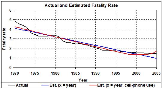
Regression analysis illustrates these points. First, I used year as the sole explanatory variable. Despite the high R-squared of the regression (0.911), it lacks nuance; graphically, it is a straight line that bisects the meandering, downward curve of fatality rate (see below). Introducing 15-24 year olds and/or alcohol consumption into the regression would yield a better fit, but because those variables are so strongly correlated with time (and one another) their signs are either intuitively incorrect or their coefficients are statistically insignificant. (This is true for15-24 year olds, even when the regression covers 1957-2005, the period for which I have data for the percentage of 15-24 year olds.)

Adding cell-phone use to year results in a better fit (R-squared = 0.948), and the coefficient for cell-phone use squares with the results of valid studies (i.e., it is significant and positive). But because of the exclusion of 15-24 year olds and alcohol consumption, cell-phone use carries too much weight. Here is the equation:

Annual traffic fatalities per 100mn vehicle-miles =
211.255
– (0.105 x year)
+ (0.0022 x number of cell-phone minutes/month/capita in a year)

The t-values of the intercept and coefficients are 21.847, -21.565, and 4.886, respectively (all significant at the 0.99 level). The adjusted R-squared of the equation is 0.945. The mean values of the dependent and explanatory variables are 2.52, 1987.5, and 50.602, respectively. The standard error of the estimate (0.232)/the mean of the dependent variable (2.522) = 0.092. The equation is significant at the 0.99 level.

This equation, when viewed graphically, loses its charm:

It is obvious that the variable for cell-phone use carries too much weight; it over-explains the fatality rate. According to the equation, in 2005, when monthly cell-phone use had ballooned to more than 500 minutes per American, almost 80 percent of traffic fatalities were caused by cell-phone use. That’s an absurd result: an artifact of the difficulty of statistically analyzing traffic fatalities when key variables (time, 15-24 year olds, and alcohol consumption) are strongly correlated. I have no doubt that cell-phone use contributes much to traffic accidents and fatalities (see main post), but not as much as the equation suggests.

A more meaningful relationship is found in the strong, positive correlation (0.973) between cell-phone use and the portion of traffic fatalities that the passage of time fails to account for after 1998, that is, where the blue line crosses below the black line in the graph above. (Similarly, the “hump” in the black line that occurs around 1980, and the declivities that precede and follow it, can be attributed to the rise and fall of the population of 15-24 year olds and the consumption of alcohol.)

It’s time to pull back and look at the big picture. The rate of traffic fatalities has been declining for a long time, owing mainly to improvements in the design of autos and highways. Thus:

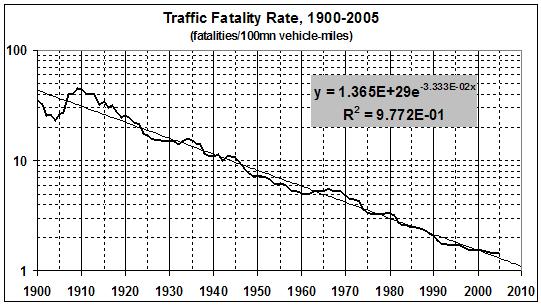
Even though a meaningful time-series analysis of traffic fatalities is impossible, it is possible to interpret broadly the history of traffic fatalities since 1900. The first thing to note, of course, is the strong negative relationship between the fatality rate and time, which is a proxy for the kinds of improvements in automobile and highway safety that I mention earlier. Those improvements obviously predate the ascendancy Ralph Nader’s Unsafe at Any Speed (1965), and the ensuing hysteria about automobile safety. Consumers had, for a long time, been demanding — and getting — safer (and more reliable) automobiles. The market works, when you allow it to do its job.

The initial decline in the fatality rate, after 1909, marks the transition from open-sided, unenclosed, buggy-like conveyances to cars with closed sides and metal roofs. Improvements in highway design must have helped, too. Ironically, the drop in the fatality rate became more pronounced after the onset of Prohibition in 1920. It leveled off a bit in the late 1920s, when the “reckless youth of the Jazz Age” came to the fore, equipped with cars and bootleg gin. The rate then spiked at the (official) end of Prohibition (1933), suggesting that that ignoble experiment had some effect on Americans’ drinking habits. The slight bulge during World War II reflects the increasing unreliability of autos then in use; relatively few Americans could afford new cars during the Depression, and new cars weren’t built during the war. The vigorous descent of the fatality rate from 1945 to the early 1960s captures the effects of (a) the resumption of auto production after WWII and (b) continued improvements in auto and highway design. Later bulges and dips in the fatality rate can be traced to the influence of a growing, then declining, population of young adults and the (presumably related) rise and fall in per capita alcohol consumption. Then, along came the cell-phone eruption, with its tidal wave of inattentive drivers, as impaired as if they had been drinking. (The prospect of encountering a cell-phone-using drunk driver is frightening.)

Here are some observations and predictions:

  • In the 48 years from 1909 to 1957 — when the Interstate Highway System was in its infancy and eight years before Nader published Unsafe at Any Speed — the fatality rate dropped from 45.33 to 5.73 fatalities per million vehicle-miles. That’s 39.6 fewer fatalities per million vehicle-miles, a drop of 87 percent.
  • In the 48 years from 1957 to 2005 — the era of federalization — the fatality rate dropped to 1.45 fatalities per million vehicle-miles. That’s 4.28 fewer fatalities per million vehicle-miles, a drop of 73 percent. The smaller absolute and relative decline during these 48 years than in the preceding ones can be explained, in part, by the Peltzman effect (discussed below).
  • Traffic fatalities will continue to drop at about the same rate, whether or not cell-phone bans are widely adopted and enforced. Why? Because technology will save the day. Moore’s law (a description of the declining cost of computing technology) will lead to cheap, reliable, sensor-controlled warning, steering, and braking systems.
  • But the already low fatality rate can’t go much lower, in absolute terms. It may drop another 70 to 80 percent in the next 48 years, from about 1.5 to about 0.3.

I now come to the Peltzman effect: “the hypothesized tendency of people to react to a safety regulation by increasing other risky behavior, offsetting some or all of the benefit of the regulation.” The effect is named after Sam Peltzman, a professor economics at the University of Chicago, who in the 1970s originated the theory of offsetting behavior. Peltzman, writing in 2004, had this to say:

A recent article [here] by Alma Cohen and Linan Einav (2003) on the effects of mandatory seatbelt use laws…. shares with most such studies the crucial bottom line: The real-world effect of these laws on highway mortality is substantially less than it should be if there was no offsetting behavior. [Cohen and Einav] conclude that the increased belt usage occasioned by these laws should, in the absence of any behavioral response, have saved more than three times as many lives as were in fact saved.

Equally important, this kind of “regulatory failure” does not arise because the engineers at NHTSA are wrong abou the effectiveness of the devices they prescribe. Most studies show that, if you are involved in a serious accident, you are much better off buckled than not and with an air bag rather than without. The auto safety liberature attributes the shortfall, either implicitly or explicitly, to an offsetting increase in the likelihood of aserious accident.

Imagine the lives that would have been saved without the “help” of the Naderites of this world.
__________
SOURCES

Fatality Rates. These are from the Statistical Abstract of the United States (online version), Table HS-41, Transportation Indicators for Motor Vehicles and Airlines: 1900 to 2001, and Table 1071, Motor Vehicle Accidents–Number and Deaths: 1980 to 2005.

Population aged 15-24. The numbers of persons aged 15-24 are from the Statistical Abstract, Table HS-3, Population by Age: 1900 to 2002, and Table 7, Resident Population by Age and Sex: 1980 to 2006. The same tables give total population, which I used to compute the percentage of the population aged 15-24.

Alcohol consumption. Estimates of annual, per capita consumption for 1970-2005 are from Per capita ethanol consumption for States, census regions, and the United States, 1970–2005 (National Institute on Alcohol Abuse and Alcoholism).

Per capital cell-phone use. I derived monthly cell-phone use, by year, from Trends in Telephone Service, February 2007 (Wireline Competition Bureau, Industry Analysis and Technology Division, Federal Communications Commission). I obtained total monthly cell-phone usage by multiplying the December values for the number of subscribers, given in tables 11-1 and 11-3, by the average number of minutes of use per month, given in table 11-3. The values for monthly minutes begin with 1993, so I estimated the values for 1984-92 by ussing the average of the values for 1993-98. To estimate per capita use, I divided total monthly minutes by the population of the U.S. (see above).

The Stimulus Package

If there is a “stimulus package,” and if it is delivered in the form of rebates, it will be tantamount to a tax cut. Tax cuts work.

Pace Arnold Kling.

Is Inflation Inevitable?

Inflation is inevitable as long as government spending, taxation, and regulation continue to inhibit productivity gains by stifling innovation, entrepreneurship, and risk-taking. The historical record shows as much:

Real GDP is nominal (current-dollar) GDP divided by the GDP deflator, a measure of changes in the overall level of prices for the goods and services that make up GDP. I derived five-year averages from the estimates of real GDP and the GDP deflator for 1790 through 2006, as provided by Louis D. Johnston and Samuel H. Williamson, “The Annual Real and Nominal GDP for the United States, 1790 – Present.” Economic History Services, July 27, 2007, URL : http://eh.net/hmit/gdp/. UPDATE (01/30/08): The averages for 2005 include estimates of real GDP and the GDP deflator for 2007, as issued by the Bureau of Economic Analysis on January 30, 2008.

Before the early 1900s — before federal income taxes were made constitutional, before government spending rose from less than 10 percent to about 30 percent of GDP, before the Federal Reserve was created, and before the nation’s businesses were engulfed in a regulatory tsunami — the U.S. experienced prolonged periods of deflation, accompanied by rapid economic growth.

The only sustained periods of deflation since 1900 occurred in conjunction with the deep (but relatively brief) recession of the early 1920s and the Great Depression of the 1930s.

The real issue is not inflation per se, it is government. Inflation is a symptom of chronic, government-induced, economic weakness. There is no way, really, to “fight inflation” but to remove the heavy hand of government from the economy.

Related posts:
The Destruction of Income and Wealth by the State” (01 Jan 2005)
Why Government Spending Is Inherently Inflationary” (18 Sep 2005)
Ten Commandments of Economics” (02 Dec 2005)
More Commandments of Economics” (06 Dec 2005)
Liberty, General Welfare, and the State” (06 Feb 2006)
Monopoly and the General Welfare” (25 Feb 2006)
The Causes of Economic Growth” (08 Apr 2006)
Slopes, Ratchets, and the Death Spiral of Liberty” (03 Aug 2006)
The Anti-Phillips Curve” (25 Aug 2006)
Median Household Income and Bad Government” (18 Sep 2006)
Toward a Capital Theory of Value” (12 Jan 2007)
Things to Come” (27 Jun 2007)
The Laffer Curve, “Fiscal Responsibility, and Economic Growth” (26 Oct 2007)
A Political Compass: Locating the United States” (13 Nov 2007)
Intellectuals and Capitalism” (15 Jan 2008)

Whither the Stock Market? (II)

UPDATED (03/12/08)

On November 14, 2007, I wrote:

Is it possible that the current bull market reached a temporary peak in May of this year, and is now descending toward a secondary bottom that it will not reach for a few years?

This was my tentative answer, then:

A reversal that lasts a year or two seems entirely possible to me.

My less tentative answer, now, is that the stock market (as measured by the Dow Jones Wilshire 5000 Composite Index) has crossed into “bear country.” That is, it has met the two conditions which indicate a “correction” or bear market that will last for months or years:

  • the index has dropped below its 250-trading-day average, and
  • the 250-day average is moving downward (if imperceptibly).

To see that this is so, go to BigCharts.

1. At the top of the page, in the box for symbol or keyword, type “DWC” and click on the “advanced chart” button.

2 A list of “companies” will appear. Select “Dow Jones Wilshire 5000 Composite Index” by clicking on the icon for that item which is labeled “A.”

3. Then, make the following entries or selections in the panel on the left side of the screen:

Time Frame
Time — select “1 year”
Frequency — select “daily”

Indicators
Moving averages — select “SMA” and type “250” in the box to the right of that

Chart style
Price display — select “logarithmic”
Chart size — select “medium”

At the bottom, click on “save chart settings.” Then, return to the top of the panel and click “draw chart.” Change the length of time to “1 month, “2 months, “3 months,” and “6 months,” then redraw the chart each time.

What you will see in each chart (as of today) is a dip in the 250-trading-day average. More obviously, you will see that the value of the index has moved below the 250-day average. It is therefore likely that the market has entered a downward phase that could last for months or years.

To see why, change your “Time” selection to “all data” and redraw the chart. The resulting graphic shows 25 years of the index and its 250-day average for the last 24 years. You can see that a market downturn of several months’ or years’ duration has ensued whenever the index has dropped below its 250-day average and the 250-day average has turned down.

On the other side of the coin, how can you know — for sure — when a downturn has ended and the market is in recovery? Answer: The end of a downturn is confirmed when the index rises upward through the 250-day average and the 250-day average is rising.

Regardless of the current state of the market, please remember this:

Don’t bail out now, unless you absolutely, positively need the money. I could be wrong about the reversal. In any event, stocks are for the long run.

P.S. By my reckoning, every downturn in the 250-day average since 1970 has signaled every recession since 1970.

Index of Economic Freedom, 2008

The Heritage Foundation has published the 2008 Index of Economic Freedom. I am not impressed by the degree of economic freedom in the world, given that the United States ranks fifth; Canada, sixth, and the UK, tenth.

Hillary Admits Error

Error, in this case, being Democrats’ opposition to deficit spending (when it’s the result of GOP tax cuts) because it’s “fiscally irresponsible.” Now that she’s running (scared) for president, Hillary has changed her tune:

“Stimulus shouldn’t be paid for,” declared Mrs. Clinton on NBC’s “Meet the Press” on Sunday. “The stimulus, by the very nature of the economic problems we’re facing, is going to require an injection of federal funding.”

You will notice, however, that she’s calling for more spending (for the children, I presume), not further tax cuts. How cynical can you get?

Related posts:

Curing Debt Hysteria in One Easy Lesson” (21 Apr 2004)
Debt Hysteria, Revisited” (17 Sep 2005)

France, Happiness, and Socialism

What price happiness? French President Nicolas Sarkozy is seeking an answer to the eternal question — so that happiness can be included in measurements of French economic growth.

That’s the lede of an AP story, “French Use Happiness As Economic Measure” (January 10, 2008). The story continues:

Sarkozy said he asked U.S. economist Joseph Stiglitz, winner of the 2001 Nobel economics prize and a critic of free market economists, and Armatya Sen of India, who won the 1998 Nobel prize for work on developing countries, to lead the analysis in France….

Richard Layard, a professor at the London School of Economics and author of the 2005 book “Happiness: Lessons from a New Science,” said Sarkozy may be seeking recognition for policies, popular in Europe, that promote well-being but don’t show up in the GDP statistics….

Jean-Philippe Cotis, the former OECD chief economist who took over as head of France’s statistics office Insee two months ago, said Wednesday that a measure of happiness would complement GDP by taking into account factors such as leisure time — something France has a lot of.

France’s unemployment rate is stubbornly high, and when French people do work they spend less time on the job — 35.9 hours per week compared with the EU average of 37.4.

In other words, if you don’t have the political clout (or stomach) to repeal France’s state-imposed limit on the length of the workweek (35 hours), then you justify it by “proving” that it makes the French happier. (Pourquoi pas?)

And who better to do the job than Stiglitz and Sen, socialists both? Layard’s endorsement of the effort is a dead giveaway, for Layard is a leading proponent of the politics of envy and leveling.