SUBSTANTIALLY REVISED 12/22/16; FURTHER REVISED 01/22/16
There’s some controversial IQ research which suggests that reaction times have slowed and people are getting dumber, not smarter. Here’s Dr. James Thompson’s summary of the hypothesis:
We keep hearing that people are getting brighter, at least as measured by IQ tests. This improvement, called the Flynn Effect, suggests that each generation is brighter than the previous one. This might be due to improved living standards as reflected in better food, better health services, better schools and perhaps, according to some, because of the influence of the internet and computer games. In fact, these improvements in intelligence seem to have been going on for almost a century, and even extend to babies not in school. If this apparent improvement in intelligence is real we should all be much, much brighter than the Victorians.
Although IQ tests are good at picking out the brightest, they are not so good at providing a benchmark of performance. They can show you how you perform relative to people of your age, but because of cultural changes relating to the sorts of problems we have to solve, they are not designed to compare you across different decades with say, your grandparents.
Is there no way to measure changes in intelligence over time on some absolute scale using an instrument that does not change its properties? In the Special Issue on the Flynn Effect of the journal Intelligence Drs Michael Woodley (UK), Jan te Nijenhuis (the Netherlands) and Raegan Murphy (Ireland) have taken a novel approach in answering this question. It has long been known that simple reaction time is faster in brighter people. Reaction times are a reasonable predictor of general intelligence. These researchers have looked back at average reaction times since 1889 and their findings, based on a meta-analysis of 14 studies, are very sobering.
It seems that, far from speeding up, we are slowing down. We now take longer to solve this very simple reaction time “problem”. This straightforward benchmark suggests that we are getting duller, not brighter. The loss is equivalent to about 14 IQ points since Victorian times.
So, we are duller than the Victorians on this unchanging measure of intelligence. Although our living standards have improved, our minds apparently have not. What has gone wrong? [“The Victorians Were Cleverer Than Us!” Psychological Comments, April 29, 2013]
Thompson discusses this and other relevant research in many posts, which you can find by searching his blog for Victorians and Woodley. I’m not going to venture my unqualified opinion of Woodley’s hypothesis, but I am going to offer some (perhaps) relevant analysis based on — you guessed it — baseball statistics.
It seems to me that if Woodley’s hypothesis has merit, it ought to be confirmed by the course of major-league batting averages over the decades. Other things being equal, quicker reaction times ought to produce higher batting averages. Of course, there’s a lot to hold equal, given the many changes in equipment, playing conditions, player conditioning, “style” of the game (e.g., greater emphasis on home runs), and other key variables over the course of more than a century.
Undaunted, I used the Play Index search tool at Baseball-Reference.com to obtain single-season batting statistics for “regular” American League (AL) players from 1901 through 2016. My definition of a regular player is one who had at least 3 plate appearances (PAs) per scheduled game in a season. That’s a minimum of 420 PAs in a season from 1901 through 1903, when the AL played a 140-game schedule; 462 PAs in the 154-game seasons from 1904 through 1960; and 486 PAs in the 162-game seasons from 1961 through 2016. I found 6,603 qualifying player-seasons, and a long string of batting statistics for each of them: the batter’s age, his batting average, his number of at-bats, his number of PAs, etc.
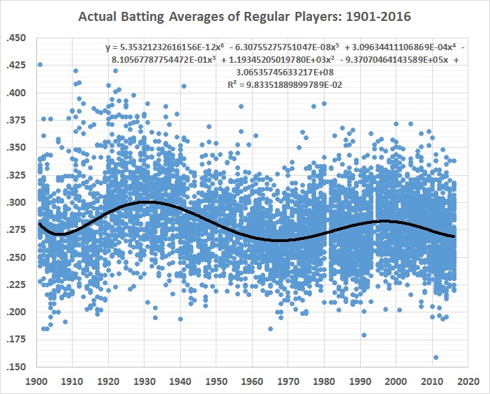
The raw record of batting averages looks like this, fitted with a 6th-order polynomial to trace the shifts over time:
FIGURE 1

Everything else being the same, the best fit would be a straight line that rises gradually, falls gradually, or has no slope. The undulation reflects the fact that everything hasn’t stayed the same. Major-league baseball wasn’t integrated until 1947, and integration was only token for a couple of decades after that. For example: night games weren’t played until 1935, and didn’t become common until after World War II; a lot of regular players went to war, and those who replaced them were (obviously) of inferior quality — and hitting suffered more than pitching; the “deadball” era ended after the 1919 season and averages soared in the 1920s and 1930s; fielders’ gloves became larger and larger.
The list goes on, but you get the drift. Playing conditions and the talent pool have changed so much over the decades that it’s hard to pin down just what caused batting averages to undulate rather than move in a relatively straight line. It’s unlikely that batters became a lot better, only to get worse, then better again, and then worse again, and so on.
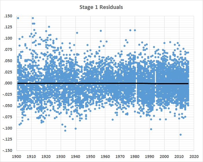
Something else has been going on — a lot of somethings, in fact. And the 6th-order polynomial captures them in an undifferentiated way. What remains to be explained are the differences between official BA and the estimates yielded by the 6th-order polynomial. Those differences are the stage 1 residuals displayed in this graph:
FIGURE 2

There’s a lot of variability in the residuals, despite the straight, horizontal regression line through them. That line, by the way, represents a 6th-order polynomial fit, not a linear one. So the application of the equation shown in figure 1 does an excellent job of de-trending the data.
The variability of the stage 1 residuals has two causes: (1) general changes in the game and (2) the performance of individual players, given those changes. If the effects of the general changes can be estimated, the remaining, unexplained variability should represent the “true” performance of individual batters.
In stage 2, I considered 16 variables in an effort to isolate the general changes. I began by finding the correlations between each of the 16 candidate variables and the stage 1 residuals. I then estimated a regression equation with stage 1 residuals as the dependent variable and the most highly correlated variable as the explanatory variable. I next found the correlations between the residuals of that regression equation and the remaining 15 variables. I introduced the most highly correlated variable into a new regression equation, as a second explanatory variable. I continued this process until I had a regression equation with 16 explanatory variables. I chose to use the 13th equation, which was the last one to introduce a variable with a highly significant p-value (less than 0.01). Along the way, because of collinearity among the variables, the p-values of a few others became high, but I kept them in the equation because they contributed to its overall explanatory power.
Here’s the 13-variable equation (REV13), with each coefficient given to 3 significant figures:
R1 = 1.22 – 0.0185WW – 0.0270DB – 1.26FA + 0.00500DR + 0.00106PT + 0.00197Pa + 0.00191LT – 0.000122Ba – 0.00000765TR + 0.000816DH – 0.206IP + 0.0153BL – 0.000215CG
Where,
R1 = stage 1 residuals
WW = World War II years (1 for 1942-1945, 0 for all other years)
DB = “deadball” era (1 for 1901-1919, 0 thereafter)
FA = league fielding average for the season
DR = prevalence of performance-enhancing drugs (1 for 1994-2007, 0 for all other seasons)
PT = number of pitchers per team
Pa = average age of league’s pitchers for the season
LT = fraction of teams with stadiums equipped with lights for night baseball
Ba = batter’s age for the season (not a general condition but one that can explain the variability of a batter’s performance)
TR = maximum distance traveled between cities for the season
DH = designated-hitter rule in effect (0 for 1901-1972, 1 for 1973-2016)
IP = average number of innings pitched per pitcher per game (counting all pitchers in the league during a season)
BL = fraction of teams with at least 1 black player
CG = average number of complete games pitched by each team during the season
The r-squared for the equation is 0.035, which seems rather low, but isn’t surprising given the apparent randomness of the dependent variable. Moreover, with 6,603 observations, the equation has an extremely significant f-value of 1.99E-43.
A positive coefficient means that the variable increases the value of the stage 1 residuals. That is, it causes batting averages to rise, other things being equal. A negative coefficient means the opposite, of course. Do the signs of the coefficients seem intuitively right, and if not, why are they the opposite of what might be expected? I’ll take them one at a time:
World War II (WW)
A lot of the game’s best batters were in uniform in 1942-1945. That left regular positions open to older, weaker batters, some of whom wouldn’t otherwise have been regulars or even in the major leagues. The negative coefficient on this variable captures the war’s effect on hitting, which suffered despite the fact that a lot of the game’s best pitchers also went to war.
Deadball era (DB)
The so-called deadball era lasted from the beginning of major-league baseball in 1871 through 1919 (roughly). It was called the deadball era because the ball stayed in play for a long time (often for an entire game), so that it lost much of its resilience and became hard to see because it accumulated dirt and scuffs. Those difficulties (for batters) were compounded by the spitball, the use of which was officially curtailed beginning with the 1920 season. (See this and this.) As figure 1 indicates, batting averages rose markedly after 1919, so the negative coefficient on DB is unsurprising.
Performance-enhancing drugs (DR)
Their rampant use seems to have begun in the early 1990s and trailed off in the late 2000s. I assigned a dummy variable of 1 to all seasons from 1994 through 2007 in an effort to capture the effect of PEDs. The coefficient suggests that the effect was (on balance) positive.
Number of pitchers per AL team (PT)
This variable, surprisingly, has a positive coefficient. One would expect the use of more pitchers to cause BA to drop. PT may be a complementary variable, one that’s meaningless without the inclusion of related variable(s). (See IP.)
Average age of AL pitchers (Pa)
The stage 1 residuals rise with respect to Pa rise until Pa = 27.4 , then they begin to drop. This variable represents the difference between 27.4 and the average age of AL pitchers during a particular season. The coefficient is multiplied by 27.4 minus average age; that is, by a positive number for ages lower than 27.4, by zero for age 27.4, and by a negative number for ages above 27.4. The positive coefficient suggests that, other things being equal, pitchers younger than 27.4 give up hits at a lower rate than pitchers older than 27.4. I’m agnostic on the issue.
Night baseball, that is, baseball played under lights (LT)
It has long been thought that batting is more difficult under artificial lighting than in sunlight. This variable measures the fraction of AL teams equipped with lights, but it doesn’t measure the rise in night games as a fraction of all games. I know from observation that that fraction continued to rise even after all AL stadiums were equipped with lights. The positive coefficient on LT suggests that it’s a complementary variable. It’s very highly correlated with BL, for example.
Batter’s age (Ba)
The stage 1 residuals don’t vary with Ba until Ba = 37 , whereupon the residuals begin to drop. The coefficient is multiplied by 37 minus the batter’s age; that is, by a positive number for ages lower than 37, by zero for age 37, and by a negative number for ages above 37. The very small negative coefficient probably picks up the effects of batters who were good enough to have long careers and hit for high averages at relatively advanced ages (e.g., Ty Cobb and Ted Williams). Their longevity causes them to be “over represented” in the sample.
Maximum distance traveled by AL teams (TR)
Does travel affect play? Probably, but the mode and speed of travel (airplane vs. train) probably also affects it. The tiny negative coefficient on this variable — which is highly correlated with several others — is meaningless, except insofar as it combines with all the other variables to account for the stage 1 residuals. TR is highly correlated with the number of teams (expansion), which suggests that expansion has had little effect on hitting.
Designated-hitter rule (DH)
The small positive coefficient on this variable suggests that the DH is a slightly better hitter, on average, than other regular position players.
Innings pitched per AL pitcher per game (IP)
This variable reflects the long-term trend toward the use of more pitchers in a game, which means that batters more often face rested pitchers who come at them with a different delivery and repertoire of pitches than their predecessors. IP has dropped steadily over the decades, presumably exerting a negative effect on BA. This is reflected in the rather large, negative coefficient on the variable, which means that it’s prudent to treat this variable as a complement to PT (discussed above) and CG (discussed below), both of which have counterintuitive signs.
Integration (BL)
I chose this variable to approximate the effect of the influx of black players (including non-white Hispanics) since 1947. BL measures only the fraction of AL teams that had at least one black player for each full season. It begins at 0.25 in 1948 (the Indians and Browns signed Larry Doby and Hank Thompson during the 1947 season) and rises to 1 in 1960, following the signing of Pumpsie Green by the Red Sox during the 1959 season. The positive coefficient on this variable is consistent with the hypothesis that segregation had prevented the use of players superior to many of the whites who occupied roster slots because of their color.
Complete games per AL team (CG)
A higher rate of complete games should mean that starting pitchers stay in games longer, on average, and therefore give up more hits, on average. The negative coefficient seems to contradict that hypothesis. But there are other, related variables (PT and CG), so this one should be thought of as a complementary variable.
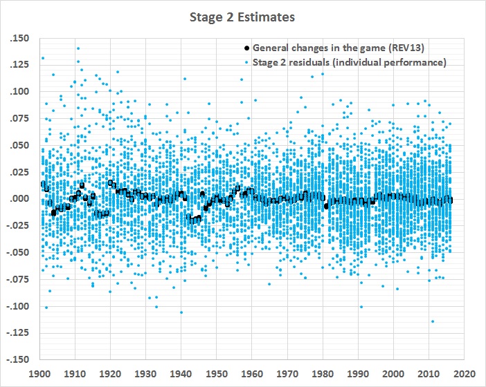
Despite all of that fancy footwork, the equation accounts for only a small portion of the stage 1 residuals:
FIGURE 3

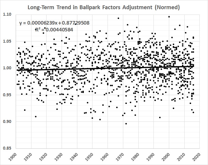
What’s left over — the stage 2 residuals — is (or should be) a good measure of comparative hitting ability, everything else being more or less the same. One thing that’s not the same, and not yet accounted for is the long-term trend in home-park advantage, which has slightly (and gradually) weakened. Here’s a graph of the inverse of the trend, normalized to the overall mean value of home-park advantage:
FIGURE 4

To get a true picture of a player’s single-season batting average, it’s just a matter of adding the stage 2 residual for that player’s season to the baseline batting average for the entire sample of 6,603 single-season performances. The resulting value is then multiplied by the equation given in figure 4. The baseline is .280, which is the overall average for 1901-2016, from which individual performances diverge. Thus, for example, the stage 2 residual for Jimmy Williams’s 1901 season, adjusted for the long-term trend shown in figure 4, is .022. Adding that residual to .280 results in an adjusted (true) BA of .302, which is 15 points (.015) lower than Williams’s official BA of .317 in 1901.
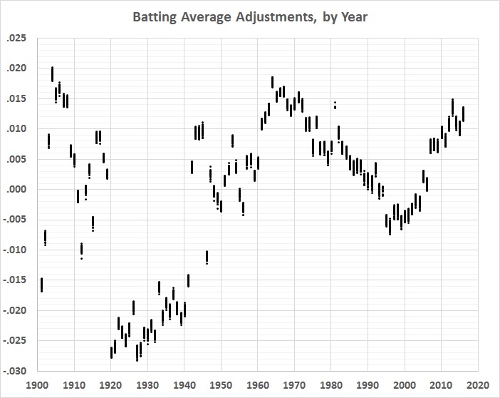
Here are the changes from official to adjusted averages, by year:
FIGURE 5

Unsurprisingly, the pattern is roughly a mirror image of the 6th-order polynomial regression line in figure 1.
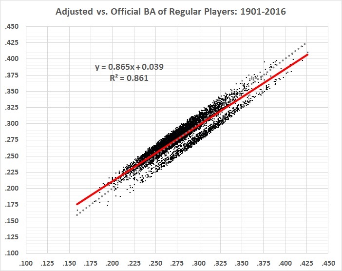
Here’s how the adjusted batting averages (vertical axis) correlate with the official batting averages (horizontal axis):
FIGURE 6

The red line represents the correlation between official and adjusted BA. The dotted gray line represents a perfect correlation. The actual correlation is very high (r = 0.93), and has a slightly lower slope than a perfect correlation. High averages tend to be adjusted downward and low averages tend to be adjusted upward. The gap separates the highly inflated averages of the 1920s and 1930s (lower right) from the less-inflated averages of most other decades (upper left).
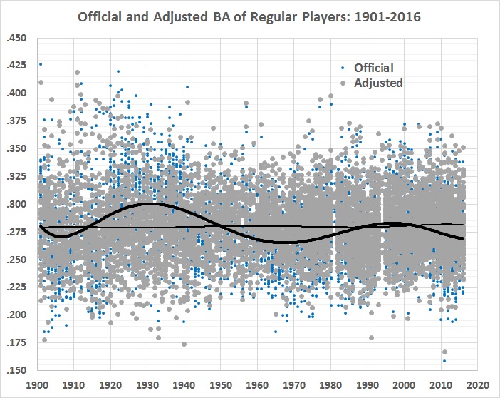
Here’s a time-series view of the official and adjusted averages:
FIGURE 7

The wavy, bold line is the 6th-order polynomial fit from figure 1. The lighter, almost-flat line is a 6th-order polynomial fit to the adjusted values. The flatness is a good sign that most of the general changes in game conditions have been accounted for, and that what’s left (the gray plot points) is a good approximation of “real” batting averages.
What about reaction times? Have they improved or deteriorated since 1901? The results are inconclusive. Year (YR) doesn’t enter the stage 2 analysis until step 15, and it’s statistically insignificant (p-value = 0.65). Moreover, with the introduction of another variable in step 16, the sign of the coefficient on YR flips from slightly positive to slightly negative.
In sum, this analysis says nothing definitive about reaction times, even though it sheds a lot of light on the relative hitting prowess of American League batters over the past 116 years. (I’ll have more to say about that in a future post.)
It’s been great fun but it was just one of those things.

