The Economic Outlook in Brief

I have elsewhere quantified the connection between government spending and economic growth (e.g., here and here).* I have also shown that stock prices indicate the direction of economic growth. It should not surprise you if I say that

  • the re-election of Obama portends further growth of government spending — specifically, the uncontrolled growth of entitlement spending, as accelerated by Obamacare;
  • the rate of economic growth will continue to decline for as long as entitlements grow as a percentage of GDP; and
  • in anticipation of slower economic growth, stock prices will continue to decline, in real terms.

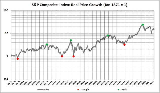
You can follow the links in the first paragraph if you wish to learn more. Here is a bit of additional evidence for my gloomy outlook. The real value of the S&P Composite Index has fluctuated in trough-to peak-to trough cycles, four of which have been completed since the 1870s:
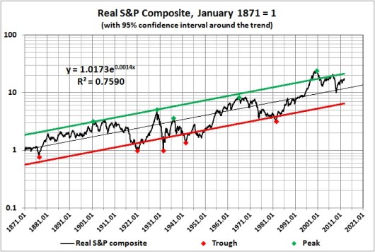

Derived from Robert Shiller’s data set at http://www.econ.yale.edu/~shiller/data/ie_data.xls.
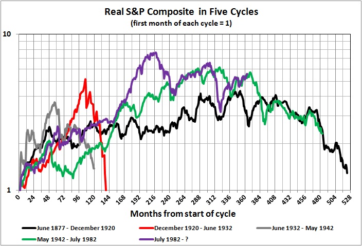
We are now on the downside of the fifth cycle, which began in July 1982 and peaked in August 2000. If the present cycle follows the pattern of the other two long cycles, it may not bottom out until sometime after 2020  (though it may never end if economic growth continues to decline). And if it does bottom out then, the real value of the S&P composite will have risen only about two-fold from where its value at the start of the cycle in July 1982. In nominal terms, the S&P Composite will have dropped to about half its current level by 2020.

But, as I say, the stock market merely anticipates underlying economic conditions. Those conditions seem destined to worsen because the entitlements mess will not be dealt with for as long as there is gridlock in Washington.

__________
* See also the second graph in this post by James Pethokoukis of the American Enterprise Institute. The graph highlights the inverse relationship between entitlement spending and growth-producing innovation. Entitlement spending diminishes investments in innovation by (a) diverting resources from productive to unproductive uses and (b) penalizing (taxing) productive activities that fund innovation and its implementation.

Related posts:
The Laffer Curve, “Fiscal Responsibility,” and Economic Growth
The Causes of Economic Growth
In the Long Run We Are All Poorer
A Short Course in Economics
Addendum to a Short Course in Economics
The Price of Government
The Price of Government Redux
The Mega-Depression
As Goes Greece
Ricardian Equivalence Reconsidered
The Real Burden of Government
The Illusion of Prosperity and Stability
Estimating the Rahn Curve: Or, How Government Inhibits Economic Growth
Taxing the Rich
More about Taxing the Rich
America’s Financial Crisis Is Now
A Keynesian Fantasy Land
The Keynesian Fallacy and Regime Uncertainty
Why the “Stimulus” Failed to Stimulate
The “Jobs Speech” That Obama Should Have Given
Say’s Law, Government, and Unemployment
Unemployment and Economic Growth
Regime Uncertainty and the Great Recession
Regulation as Wishful Thinking
The Real Multiplier
Vulgar Keynesianism and Capitalism
Why Are Interest Rates So Low?
The Commandeered Economy
Stocks for the Long Run?
We Owe It to Ourselves
Stocks for the Long Run? (Part II)
Estimating the Rahn Curve: A Sequel
In Defense of the 1%
Bonds for the Long Run?
The Real Multiplier (II)
Lay My (Regulatory) Burden Down
The Burden of Government
Economic Growth Since World War II
More Evidence for the Rahn Curve
The Economy Slogs Along
The Obama Effect: Disguised Unemployment
The Stock Market as a Leading Indicator of GDP
Government in Macroeconomic Perspective
Where We Are, Economically
Keynesianism: Upside-Down Economics in the Collectivist Cause

The Stock Market as a Leading Indicator of GDP

Stock prices are notoriously volatile, even when measured by a broad index like the S&P Composite. You might think that the S&P Composite is sensitive to broad changes in economic activity, as measured by GDP, for instance. But, as it turns out the S&P Composite, despite its volatility, is a leading indicator of GDP.

I begin with this graph:


Sources: The index of real GDP is derived from estimates of real GDP available at MeasuringWorth.com. The index of the value of the S&P Composite index is derived from Robert Shiller’s data set at http://www.econ.yale.edu/~shiller/data/ie_data.xls.

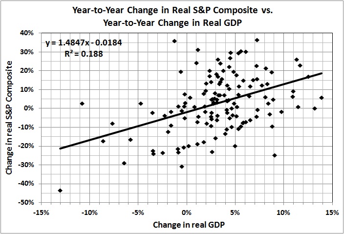
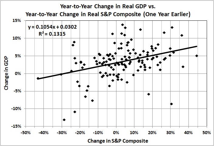
It is not apparent in the preceding graph, but GDP lags the S&P Composite. The correlation between the percentage change in real GDP and the percentage change in the real S&P composite in the same year is 0.43 (r-squared = .19). The correlation between the change in GDP and the change in the S&P a year earlier is 0.36 (r-squared = 0.13). That correlation is considerably stronger than the correlation between the change in GDP and the change in the S&P a year later (-0.10; r-squared = 0.01), which suggests that the S&P index is a leading indicator of GDP, not the the other way around.

In graphs:


Notes: Both correlations are significant at the 0.1-percent level. The years 1941-1946 are omitted because of the abrupt and largely artificial changes in GDP that arose when the U.S. government commandeered the economy and diverted vast resources to the war effort during World War II.

It seems unnecessary to point out that the correlations are not strong enough to derive precise predictions of GDP from changes in the S&P. However, one could do worse than rely on simple correlations, given the poor track record of complex macroeconomic models (e.g., see this).

It is unsurprising that the stock market has been heading downward since 2000 (despite occasional rallies). Investors know that economic growth is sagging under the pressure of government spending and regulation.

Related posts:
The Price of Government
The Price of Government Redux
The Mega-Depression
Ricardian Equivalence Reconsidered
The Real Burden of Government
The Rahn Curve at Work
The “Forthcoming Financial Collapse”
Estimating the Rahn Curve: Or, How Government Inhibits Economic Growth
The Deficit Commission’s Deficit of Understanding
The Bowles-Simpson Report
The Bowles-Simpson Band-Aid
The Stagnation Thesis
America’s Financial Crisis Is Now
Stocks for the Long Run?
Estimating the Rahn Curve: A Sequel
Bonds for the Long Run?
The Real Multiplier (II)
Lay My (Regulatory) Burden Down
Economic Growth Since World War II
More Evidence for the Rahn Curve
Progressive Taxation Is Alive and Well in the U.S. of A.
The Economy Slogs Along
The Obama Effect: Disguised Unemployment

Stocks for the Long Run?

This post examines the relationship between stock prices and GDP and considers the long-term outlook for stock prices. I begin with a question: Do swings in stock prices — as as measured by a broad index like the S&P Composite — portend swings in the rate and direction of economic growth?

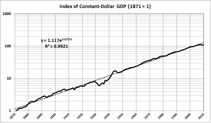
Here is a chart of constant-dollar GDP, indexed to its value in 1871, which I derived from estimates of constant-dollar GDP that are available at What Was U.S. GDP Then?:

Drawing on the data set for Robert Shiller’s Irrational Exuberance — a data set that Shiller keeps up to date — I graphed the real value of the  S&P Composite Index and identified major turning points in the constant-dollar value of the S&P Composite:

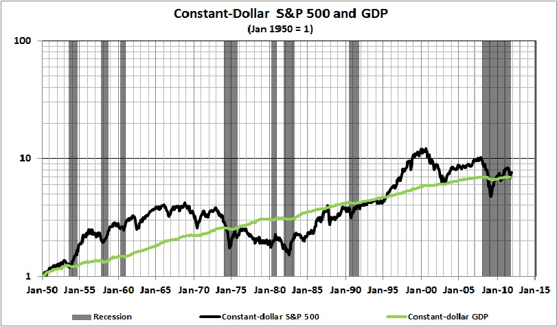
A comparison of the two charts suggests that stock prices react strongly to transient events (e.g., shifts in the rate of inflation and consumer confidence), but that there is not a strong relationship between GDP and the daily, weekly, monthly, or quarterly gyrations of the stock market. There is a weak but statistically significant correlation between annual changes in stock prices and GDP, which is evident in the following comparison of stock prices and GDP, dating back to 1950, which I derived from historical prices of the S&P 500 (available here) and estimates of constant-dollar GDP (available here).

In words, the first three graphs suggest that stock prices, measured broadly, oscillate jaggedly around the GDP trend, in cycles of irrational exuberance and rational pessimism.

On closer inspection of the long-term trends depicted in the first two graphs, I found some evidence that major turns in stock prices mark major turns in the course of economic growth. I should emphasize that the points of coincidence between major turns in stock prices and economic growth are evident only with long hindsight; I advise against attempts to predict the near-term course of GDP by transitory changes in stock prices, and vice versa.

Specifically, I calculated the changes in stock prices and GDP that occurred between the turning points identified in the second graph above, with this result:

Market turning point (Year and month)

Duration of trend (years and months)

Real S&P change (annual rate)

Read GDP change (annual rate)

1877.06

28.07

5.2%

4.4%

1906.01

14.11

-7.7%

1.9%

1920.12

8.09

20.6%

4.0%

1929.09

2.09

-44.9%

-9.4%

1932.06

33.07

6.5%

5.0%

1966.01

16.07

-5.6%

2.7%

1982.08

18.00

12.0%

3.3%

2000.08

11.04

-3.8%

1.5%

2011.12

(December 2011 probably is not a turning point. I include the period from August 2000 to the present only to show that the trend in stock prices since August 2000 has mirrored the trend in GDP growth since that date.)

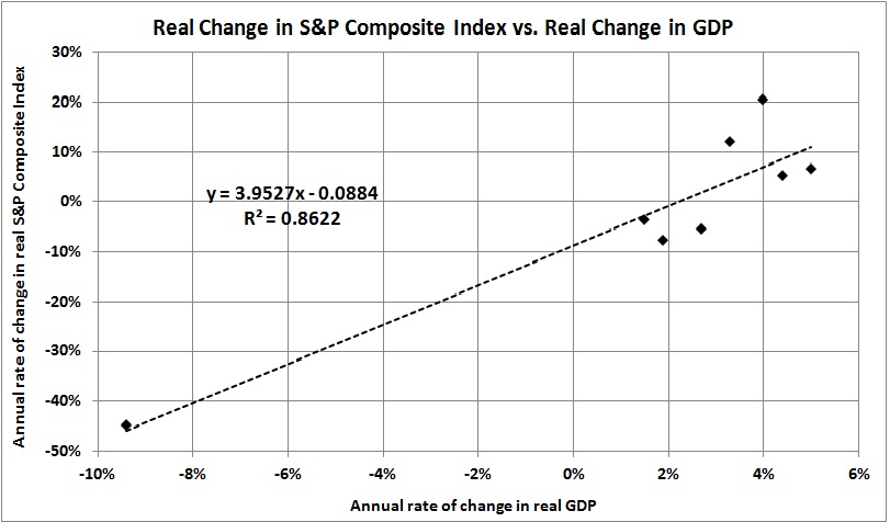
The relationship between rates of change in real GDP and stock prices seems to be robust:

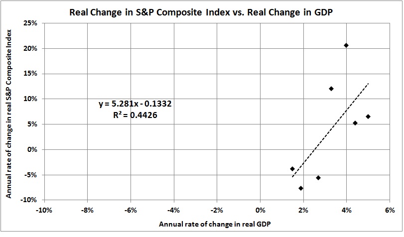
A similar relationship holds even with the removal of the “outlier” (1929-1932):

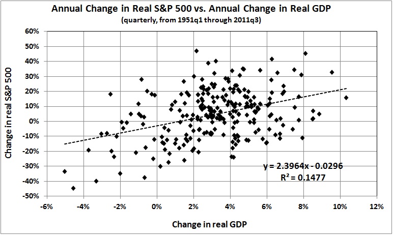
Both correlations are statistically significant, despite the small sample sizes. And they are similar to the following (also significant) correlation, which is drawn from the data presented in the third chart above:

The bottom line is that stock prices can decline even as GDP rises. A long-term, downward shift in the real rate of GDP growth is likely to trigger a significant downward shift in the movement of stock prices.

In fact, unless the course of the regulatory-welfare state is reversed, a prolonged downward shift in the real rate of GDP growth is in the works — probably to about 2 percent. At that rate, expect a continuation of the present trend — stock-price “growth” of about -4 percent a year.

If you think that I am being unduly pessimistic, look at the trend for 1906-1920 (the aftermath of Progressivism’s rise) and the trend for 1966-1982 (the aftermath of the formation of the Great Society). What we have today is a vast regulatory-welfare state built on the foundations of Progressivism, the New Deal, the Great Society.

Happy New Year!

*   *   *

Related posts:
The Price of Government
The Price of Government Redux
The Mega-Depression
As Goes Greece
The Real Burden of Government
The Illusion of Prosperity and Stability
The “Forthcoming Financial Collapse”
Estimating the Rahn Curve: Or, How Government Inhibits Economic Growth
The Deficit Commission’s Deficit of Understanding
The Bowles-Simpson Report
The Bowles-Simpson Band-Aid
The Stagnation Thesis
America’s Financial Crisis Is Now
Why Are Interest Rates So Low?
Economic Growth Since World War II
The Commandeered Economy