UPDATED (BELOW) 07/24/12
For no particular reason, I looked up the most recent U.S. life tables issued by … are you ready? … the National Vital Statistics System of the National Center for Health Statistics of the Centers for Disease Control and Prevention of the U.S. Department of Health and Human Services. The full citation is Arias, Elizabeth; “United States life tables, 2007“; National vital statistics reports, vol. 59, no. 9; Hyattsville, Maryland: National Center for Health Statistics, September 28, 2011.
Relevant quotations from the report:
There are two types of life tables—the cohort (or generation) and the period (or current). The cohort life table presents the mortality experience of a particular birth cohort—all persons born in the year 1900, for example—from the moment of birth through consecutive ages in successive calendar years….
…[The] period life table for 2007 [the type presented in the report[ assumes a hypothetical cohort subject throughout its lifetime to the age-specific death rates prevailing for the actual population in 2007. The period life table may thus be characterized as rendering a ‘‘snapshot’’ of current mortality experience, and shows the long-range implications of a set of age-specific death rates that prevailed in a given year…..
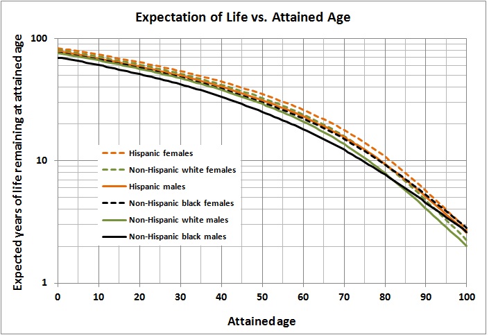
…Hispanic females continued to have the highest life expectancy at birth (83.4 years), followed by non-Hispanic white
females (80.6 years), Hispanic males (78.2 years), non-Hispanic black females (76.5 years), non-Hispanic white males (75.8 years), and non-Hispanic black males (69.6 years)….
I constructed a couple of graphs from tables 11, 12, 14, 15, 17, and 18 of the report. The first depicts the additional number of years that a person of a given age (in 2007) could expect to live:
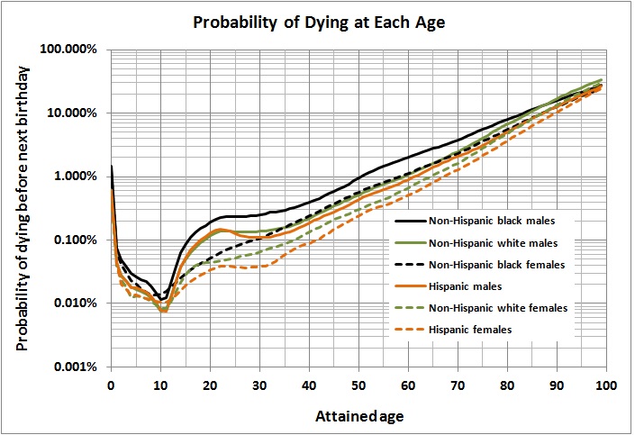
The second graph is self-explanatory:
Mortality rates bottom out at around age 11. Then rates then rise sharply, especially among males. The dangerous years for males extend from age 12 to about age 22. Male mortality then levels off or declines slightly before embarking on its long, steady, inexorable rise.
Hispanic females are the longest-lived of the groups, and have the lowest mortality rate at almost every age. But the pattern of the Hispanic-female mortality rate resembles that of male mortality from age 12 to age 22. Perhaps a lot of Hispanic female are exposed to the risks that beset males in their teens and early twenties. Nevertheless, Hispanic females in that age group fare better than other females.
Non-Hispanic black females fare as well as Non-Hispanic white females until age 20. But in the age range of 35 to 60, Non-Hispanic black females experience mortality rates that are second only to those of Non-Hispanic black males.
UPDATE
The statistics in the tables cited above include estimates of person-years attained for 100,000 live births. The disparities are striking:
| Person-years | Index* | ||
| Hispanic females | 8,337,374 | 1.00 | |
| Non-Hispanic white females | 8,061,655 | 0.97 | |
| Hispanic males | 7,823,786 | 0.94 | |
| Non-Hispanic black females | 7,654,925 | 0.92 | |
| Non-Hispanic white males | 7,580,601 | 0.91 | |
| Non-Hispanic black males | 6,963,840 | 0.84 | |
| * As a fraction of the number for Hispanic females. | |||


