For my latest analysis of trends in RCP’s polls and several others, see “Election 2016.”
REVISED AND UPDATED 10/23/16
A lot of commentators cite the “poll of polls” at RealClearPolitics.com. You know the one I mean; it looks like this:
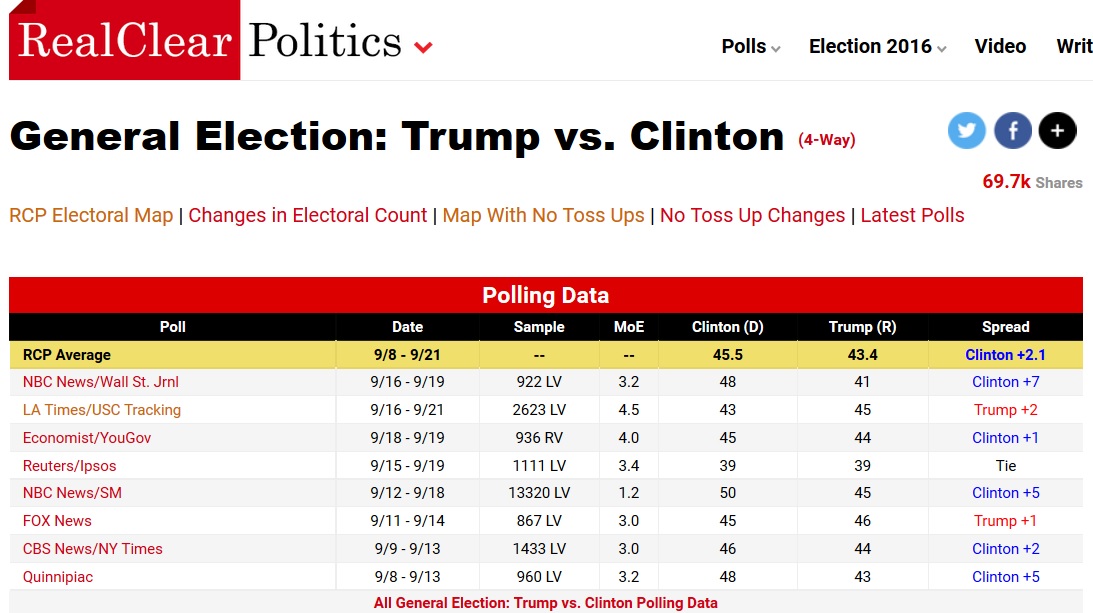
The graph is followed by a long list of historical polling results, on which the graph is based. It all looks authoritative. But it’s misleading.
Take the values for September 22, 2016, which show a spread of 2.1 points in favor of Clinton. However, the values for September 22 represent polling that was done between September 8 and September 21. That’s quite a lag and it badly distorts what’s really happening in the Trump-Clinton race.
So I reconstructed the “poll of polls,” as follows:
- Assigned a date to each poll that coincides with the central date of the polling period it represents.
- Computed, for each poll, the spread in favor of (or against) Clinton.
- Arranged the polls in chronological order, according to central date.
- Averaged the spreads for polls having the same central date.
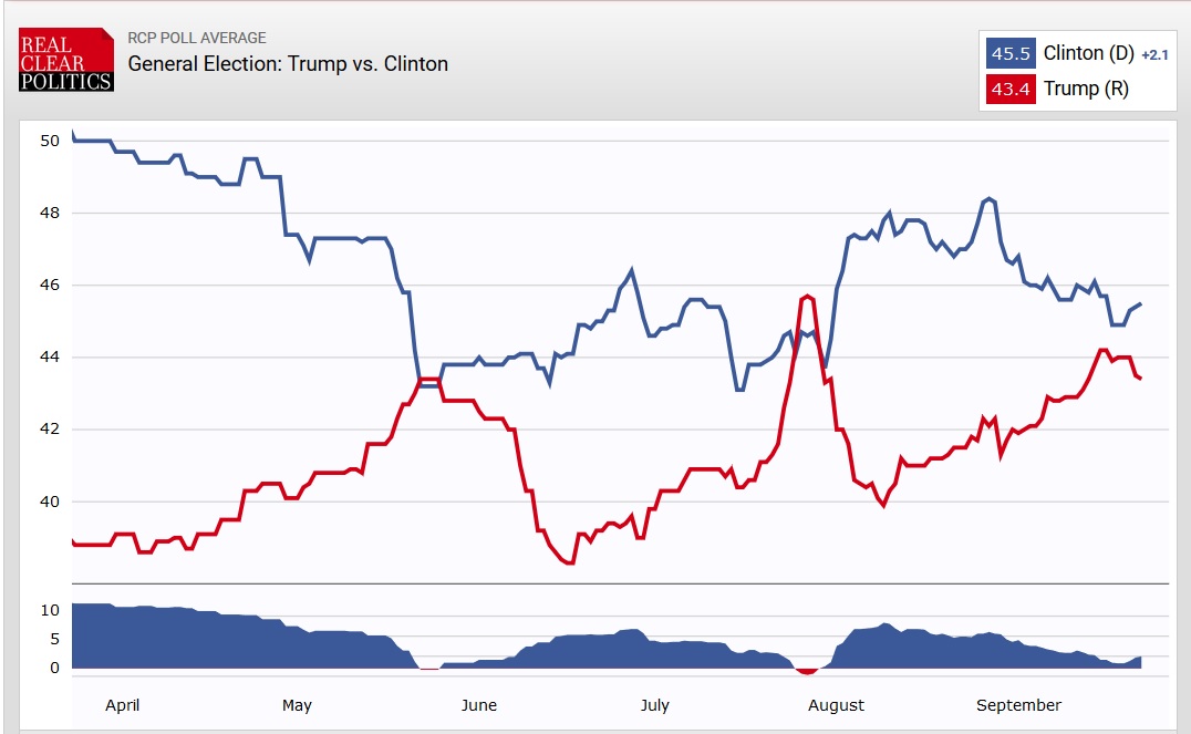
Because only one or two polls are assigned to many dates, I added a trendline to emphasize the pattern that emerges from the many polls included in RCP’s “poll of polls.” Here’s a graph of the result, for polls conducted since August 1:

That’s a much more realistic depiction.
