Compare their standing with likely voters polled by Rasmussen Reports:
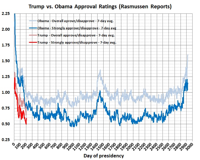
Derived from polling statistics for Obama and Trump published by Rasmussen Reports.
Each line represents the ratio of favorable to unfavorable views. Values above 1 mean that the favorables outweigh the unfavorables; values below 1 mean that the unfavorables outweigh the favorables. The light-blue and light-red lines track the 7-day averages of Obama and Trump’s overall ratings with likely voters. The dark-blue and dark-red lines track the 7-day averages of Obama and Trump’s ratings with likely voters who express strong approval or disapproval.
Trump’s comparative disadvantage seems to be shrinking. Here are ratios of the ratios plotted in the first graph:

Trump’s recent upswing relative to Obama reflects not only a slight softening of opinions about Trump’s presidency, but also the rapid decline in Obama’s popularity in the summer of 2009. (Caveat: The full effect of the events in Charlottesville on Trump’s standing may not be reflected in his numbers.)
Given the media’s incessant attacks on Trump, it seems unlikely that he’ll ever gain parity with Obama — whose negative ratings were based on his actual (and abysmal) performance.
Stay tuned.
Related post: Ending as He Began
