UPDATED 10/04/17
I first looked at this 10 years ago. I took a second look 3 years ago. This is an updated version of the 3-year-old post, which draws on the 10-year-old post.
Yesterday marked the final regular-season games of the 2014 season of major league baseball (MLB), In observance of that event, I’m shifting from politics to competitiveness in MLB. What follows is merely trivia and speculation. If you like baseball, you might enjoy it. If you don’t like baseball, I hope that you don’t think there’s a better team sport. There isn’t one.
Here’s how I compute competitiveness for each league and each season:
INDEX OF COMPETITIVENESS = AVEDEV/AVERAGE; where
AVEDEV = the average of the absolute value of deviations from the average number of games won by a league’s teams in a given season, and
AVERAGE = the average number of games won by a league’s teams in a given season.
For example, if the average number of wins is 81, and the average of the absolute value of deviations from 81 is 8, the index of competitiveness is 0.1 (rounded to the nearest 0.1). If the average number of wins is 81 and the average of the absolute value of deviations from 81 is 16, the index of competitiveness is 0.2. The lower the number, the more competitive the league.
With some smoothing, here’s how the numbers look over the long haul:
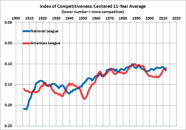
Based on statistics for the National League and American League compiled at Baseball-Reference.com.
The National League grew steadily more competitive from 1940 to 1987, and has slipped only a bit since then. The American League’s sharp climb began in 1951, peaked in 1989, slipped until 2006, and has since risen to the NL’s level. In any event, there’s no doubt that both leagues are — and in recent decades have been — more competitive than they were in the early to middle decades of the 20th century. Why?
My hypothesis: integration compounded by expansion, with an admixture of free agency and limits on the size of rosters.
Let’s start with integration. The rising competitiveness of the NL after 1940 might have been a temporary thing, but it continued when NL teams (led by the Brooklyn Dodgers) began to integrate by adding Jackie Robinson in 1947. The Cleveland Indians of the AL followed suit, by adding Larry Doby later in the same season. By the late 1950s, all major league teams (then 16) had integrated, though the NL seems to have integrated faster. The more rapid integration of the NL could explain its earlier ascent to competitiveness. Integration was followed in short order by expansion: The AL began to expand in 1961 and the NL began to expand in 1962.
How did expansion and integration combine to make the leagues more competitive? Several years ago, I opined:
[G]iven the additional competition for talent [following] expansion, teams [became] more willing to recruit players from among the black and Hispanic populations of the U.S. and Latin America. That is to say, teams [came] to draw more heavily on sources of talent that they had (to a large extent) neglected before expansion.
Further, free agency, which began in the mid-1970s,
made baseball more competitive by enabling less successful teams to attract high-quality players by offering them more money than other, more successful, teams. Money can, in some (many?) cases, compensate a player for the loss of psychic satisfaction of playing on a team that, on its record, is likely to be successful.
Finally,
[t]he competitive ramifications of expansion and free agency [are] reinforced by the limited size of team rosters (e.g., each team may carry only 25 players until September 1). No matter how much money an owner has, the limit on the size of his team’s roster constrains his ability to sign all (even a small fraction) of the best players.
It’s not an elegant hypothesis, but it’s my own (as far as I know). I offer it for discussion.
UPDATE
Another way of looking at the degree of competitiveness is to look at the percentage of teams in W-L brackets. I chose these seven: .700+, .600-.699, .500-.599, .400-.499, .300-.399, and <.300. The following graphs give season-by-season percentages for the two leagues:


Here’s how to interpret the graphs, taking the right-hand bar (2017) in the American League graph as an example:
- No team had a W-L record of .700 or better.
- About 13 percent (2 teams) had records of .600-.699; the same percentage, of course, had records of .600 or better because there were no teams in the top bracket.
- Only one-third (5 teams) had records of .500 or better, including one-fifth (3 teams) with records of .500-.599.
- Fully 93 percent of teams (14) had records of .400 or better, including 9 teams with records of .400-.499.
- One team (7 percent) had a record of .300-.399.
- No teams went below .300.
If your idea of competitiveness is balance — with half the teams at .500 or better — you will be glad to see that in a majority of years half the teams have had records of .500 or better. However, the National League has failed to meet that standard in most seasons since 1983. The American League, by contrast, met or exceeded that standard in every season from 2000 through 2016, before decisively breaking the streak in 2017.
Below are the same two graphs, overlaid with annual indices of competitiveness. (Reminder: lower numbers = greater competitiveness.)


I prefer the index of competitiveness, which integrates the rather jumbled impression made by the bar graphs. What does it all mean? I’ve offered my thoughts. Please add yours.
