Rich Voter, Poor Voter: Revisited

REVISED AND EXTENDED, 10/27/07

All manner of good (and bad) stuff has popped up about the relationship between income and political preferences. Tyler Cowen of Marginal Revolution points to this post at Free exchange, which I shamelessly repeat in its entirety (with the addition of some comments and additional links) and then expand upon:

PAUL KRUGMAN, brimming with conscience [a reference to Krugman’s recently published The Conscience of a Liberal: LC], continues to scrounge for evidence [here also: LC] that the monied prefer the Grand Old Party. “There’s a weird myth among the commentariat that rich people vote Democratic,” Mr Krugman sighs.

Well, I suppose it’s weird for the commentariat to believe Pew Research Center reports that find “Democrats pulling even with Republicans among registered voters with annual family incomes in excess of roughly $135,000 per annum.” $135,000 may not sound exactly “rich” to some of us, but it is well into the top decile of the income distribution, which counts as the “upper class” if we’re doing decile-based class analysis. As part of his myth-slaying efforts, Mr Krugman offers a chart from Columbia’s Andrew Gelman from whom we have also learned that the wealthiest American states now lean Democratic (as was noted in this August post on precisely this issue). [I wrote here about an earlier version of the Gelman paper that is linked in the preceding sentence. Krugman links to a recently updated version, which is here: LC] Wealthy localities remains likely to tilt Republican in the South, Gelman finds. But in “media center” states such as New York, California, and the states contiguous to the Imperial Capital, Democrats dominate the country clubs. [See this post by Gelman, especially the x-y plots and the final sentence. See also this list of the 100 Zip Codes with the highest incomes: LC]

Furthermore, the writer and bon vivant Julian Sanchez points us to this Daniel Gross column in Slate wherein we are informed of a poll showing that:

The petit bourgeoisie millionaires were passionately for Bush: Those worth between $1 million and $10 million favored Bush by a 63-37 margin. But the haute millionaires, those worth more than $10 million, favored Kerry 59-41.

Mr Sanchez smartly comments:

You hit a point at which you don’t just have a lot of money; you’ve got “f[—] you” money. … At which point “voting your economic self-interest” ceases to mean much, since your economic interests are covered [by] whoever’s in power. You can afford to stop voting your pocketbook and start voting whatever makes you feel like a mensch. [You can vote your inner adolescent or your irrespsonsible “take that” attitude: LC]…

Ironically, this may be a point in favor of those who appeal to the declining marginal utility of money as an argument for economic redistribution. If this is right, then the efficient place to start imposing really crushing marginal taxes is at the income or wealth level where people start voting heavily Democratic.

Ha! But seriously, the real issue here is whether economic interests are a major determinant of voting patterns at all. If wealthy voters in certain culturally similar states prefer Democrats and those in other culturally similar states prefer Republicans, we might plausibly infer that something other than their wealth is determining wealthy votes. And since individual votes are drops in an ocean, with barely a whisper of causal power, those of us who take economic logic seriously might expect citizens, wealthy or not, to forget about voting their interests and instead cast ballots that will reliably supply utility by, say, expressing their moral values, political identity, or sense of solidarity with an imagined community. As Loren Lomasky and Geoffrey Brennan write in their classic work “Democracy and Decision“:

It would be an error of method to assume whenever electoral behavior is consistent with the self-interest hypothesis that citizens vote in order to further self-interest. And it is an error of logic to assume that rational agents will, purely as a matter of course, vote in a self-interested manner.

I fear that Mr Krugman’s book may turn on at least one of these.

I have no doubt that Krugman’s book is both erroneous of method and logic.

I entirely agree with Julian Sanchez’s point that very rich voters vote mainly to make a statement. As I wrote here,

[t]he “rich” in the rich States — as is obvious from casual reading about limousine liberals and wannabe limousine liberals in New York and California — have by and large bought into the regulatory-welfare state, which is mainly a creation of the Democrat Party. So, the rich-State rich vote their “consciences” or, rather, they tend to vote Democrat because the think they can

  • keep the unwashed masses at bay with the modern equivalent of bread and circuses.
  • salve their (misplaced) guilt about the “good luck” that made them rich….

Why does it work like that? Because where you live has a lot to do with your values. People tend to adapt (“go along and get along”) or migrate.

The same principle applies to academia [e.g., see this]. Conservative and libertarian intellectuals tend to avoid academic careers (call it pre-emptive migration) because they don’t want to adapt their thinking to fit in with the liberal supermajority on most campuses.

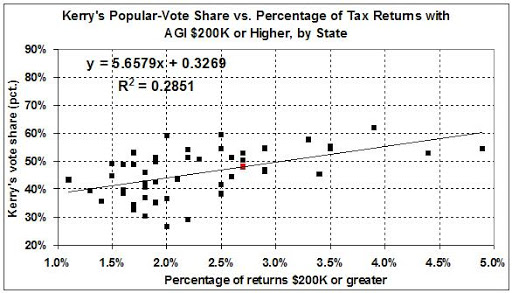
Joining Andrew Gelman and the Pew Research Center, I offer this evidence of Krugman’s displacement from reality:

Sources: Kerry’s vote, as a percentage of the total number of popular votes cast in each State, is from RealClearPolitics (here). I derived the percentage of tax returns with an adjusted gross income of $200,000 or more from “Table 2.–Individual Income and Tax Data, by State and Size of Adjusted Gross Income, Tax Year 2005,” which is available through this page at the IRS website.

What could be clearer than that? The more you make, once you have crossed a threshold, the more likely you are to vote Democrat. That threshold, according to the Pew Research Center, is a household income in 2007 of $135,000 — the point at which one joins the top 10 percent.

Let’s take a closer look at the graph. The red dot — at 2.7 percent of tax returns and 48.3 percent of the popular vote — represents the U.S. in the aggregate. The Red-State outliers are represented by the many points that lie to the left of the red dot and well below the regression line, which include Nebraska (1.7, 32.4), Idaho (1.8, 30.3), Utah (2.0, 26.5), and Wyoming (2.2, 29.1) — States that are deeply Republican, far from the effete East and West Coasts, and too small to carry any weight in a national election. Their political opposites are (well above the line) Maine (1.7, 53.0), Vermont (2.0, 59.1) and Rhode Island (2.5, 59.6), and (on the far right, graphically speaking) New York (3.3, 57.8), Virginia (3.4, 45.2 — a high Blue vote for this once deep-Red State), California (3.5, 54.6), Maryland (3.5, 55.4), Massachusetts (3.9, 62.1), New Jersey (4.4, 52.3), D.C. (the Imperial Capital) (4.6, 89.3), and Connecticut (4.9, 54.2). We know all we need to know about the pathological politics of the Northeastern States and California. As for the formerly conservative States of Maryland and Virginia, elections there are increasingly dominated by the affluent and rapidly growing suburbs that border the Imperial Capital.

A geographical breakdown confirms the generalization that the more you make (above the threshold), the more likely you are to vote Blue:

Sources as above. States in each region (from left to right on the x-axis): West — North Dakota, Montana, South Dakota, Nebraska; Southeast — Mississippi, Arkansas, Kentucky, Oklahoma, Alabama, Louisiana, South Carolina, Missouri, Tennessee, North Carolina, Georgia, Texas, Florida, Virginia; North Central — West Virginia, Iowa, Indiana, Ohio, Michigan, Wisconsin, Minnesota, Illinois; West Coast & Far Southwest — New Mexico, Hawaii, Oregon, Arizona, Nevada, Washington, California; Northeast — Maine, Vermont, Pennsylvania, Delaware, Rhode Island, New Hampshire, New York, Maryland, Massachusetts, New Jersey, D.C., Connecticut.

In ascending order of Blueness (or descending order of Redness) we have:

West
Southeast
North Central/West Coast & Far Southwest (about the same)
Northeast

A few observations and explanations: The Southeast isn’t as Red as it was a few elections ago — owing to the rapid urbanization of such States as Georgia, Florida, and Virginia — but most Southeastern States remain on the Red side of the ledger, most of the time. Maryland and D.C., as long-standing denizens of the super-urban Bos-Wash corridor, belong in the Northeast region, just as West Virginia — a unionized, industrial State — belongs in the North Central region with its neighbor, Ohio.

Out of curiosity, I tried moving Maryland and D.C. from the Northeast to the Southeast, with these results: a flat trendline for the Northeast; a more positive slope on the trendline for the Southeast. In other words, the Northeast without Maryland and D.C. displays a constant degree of Blueness (about 55 percent for Kerry), regardless of the proportion of tax returns with AGI of $200,000 or more. Thus, the omission of Maryland and D.C. from the Northeast simply underscores the deep-rooted Blueness of the “old” Northeast. It just is Blue, from its heavily unionized “working stiffs” to its super-affluent “masters of the universe.” But, as I say in the preceding paragraph, Maryland and D.C. merged into the Northeast quite some time ago.

In any event, the positive relationship between income and Blueness holds for each region, even though there are also inter-regional differences. (“Birds of a feather…,” as suggested above.) If Blueness were simply a regional trait, each of the trendlines would be flat — but, in fact, each one slopes upward to the right. Thus (to say it again):

The more you make (above a threshold which is now $135,000), the more likely you are to vote Democrat.

Paul Krugman (no prole he) is living evidence of that statement.

The Laffer Curve, "Fiscal Responsibility," and Economic Growth


The Laffer Curve and Supply-Side Economics

The Laffer curve is the centerpiece of so-called supply-side economics. The idea behind both concepts is straightforward. Here it is, in my words:

Taxes inhibit economic activity, especially because progressive tax rates reduce saving among persons with higher incomes and, thereby, reduce the flow of funds available for growth-producing capital investments (e.g., new manufacturing equipment, better computers, R&D on drugs that improve the health of workers and others). Lower tax rates therefore foster a higher rate of economic growth. The economic growth that is fostered by tax-rate reductions may, in some instances, cause tax revenues to rise.

Many commentators accept that reductions in tax rates spur economic growth. Far fewer accept that faster economic growth will, in turn, cause tax revenues to rise. (For various views on the matter, see this, this, this, this, this, and this.)

Questions and Brief Answers

The Laffer hypothesis, and criticisms of it, stir me to ask (and answer) these questions:

  1. Would tax rates below (above) the current level spur (inhibit) economic growth?
  2. If so, by how much?
  3. At what tax rate would revenues be maximized?
  4. Are tax revenues more important than economic growth?

My brief answers are these:

  1. Yes, changes in tax rates cause economic growth to move in the opposite direction.
  2. By a lot.
  3. It is possible to estimate the rate at which tax revenues are maximized, but who would want to maximize them, other than a “fiscally responsible” (i.e., tax-and-spend) “liberal”?
  4. Only to a tax-and-spend “liberal.”

In what follows, I enlarge on those answers.

The Laffer Curve, in Theory

I begin with this depiction of the Laffer curve (via Wikipedia):

t* represents the rate of taxation at which maximal revenue is generated. Note: This diagram is not to scale; t* could theoretically be anywhere, not necessarily in the vicinity of 50% as shown here.

Many criticisms of the Laffer curve are recited here (not all of which I accept). My main reservation about the curve is its span:

  • With real taxes (i.e., government spending) at zero or close to it, the rule of law would break down and the economy would collapse. Thus the curve should not extend to zero on the x-axis.
  • With real taxes (i.e., government spending) at very high rates (much about the level of 50 percent, which the U.S. reached in World War II), the economy would be subsumed by government.

The Proper Range of the Laffer Curve

With regard to the first problem, I would set the minimum tax rate at 15 percent of GDP. The normal peacetime burden of government spending between the end of the Civil War and the eve of the Great Depression ranged from 5 to 10 percent of GDP,1 enough to maintain law and order and to provide minimal “social services.” To that I would add 5 to 10 percent for the kind of defense that we need in these parlous times. (See this post, for example.)

I therefore consider a tax rate of 15 percent to be the lowest rate of interest along the x-axis of the Laffer curve. I include in that 15-percent rate taxes levied by all levels of government, not only to to fund governmental functions (e.g., justice and defense) but also to fund social transfers (e.g., Social Security).

As for the second problem, at a very high tax rate we would have a command economy (as in the former Soviet Union). At a tax rate of 100 percent, for example, government would have to confiscate everyone’s income, then turn around and refund that income to everyone in the form of government-dictated access to goods and services. Those goods and services would, of necessity, be produced by the populace at the direction of government; there would be no private sector.2 Everyone — excepting brave black-marketeers — would be a government employee or contractor. The distribution of income in a Soviet-style economy does not, of course, match the distribution of income in a market economy. A Soviet-style economy, rather, operates on the following principle: “From each according to his ability, to each — especially the commissariat and its favorites — according to his needs.”

The U.S. economy was practically a command economy during World War II, when government commandeered as much as 50 percent of the nation’s output. (See the graph in the footnote to this post.) I therefore regard 50 percent as the highest meaningful value along the x-axis of the Laffer curve.

Quantifying the Laffer Curve and More Important Values

In sum, the Laffer curve is relevant over the range of a 15-percent to 50-percent tax rate. And the Laffer curve can be quantified over that range. To quantify it, I draw on “The Macroeconomic Effects of Tax Changes: Estimates Based on a New Measure of Fiscal Shocks,” by Christina D. Romer and David H. Romer, both of the Department of Economics at the University of California, Berkeley. (A free copy of the paper is available here. A copy is available here for $5.)

The Romers’ estimate, among other things, the effects of exogenous changes in taxes on GDP. (“Exogenous” meaning tax cuts aimed at stimulating the economy, as opposed — for example — to tax increases aimed at reducing government deficits.) Here is the key finding, from pages 21 and 22 of the free version of the paper:

Figure 4 summarizes the estimates by showing the implied effect of a tax increase of one percent of GDP on the path of real GDP (in logarithms), together with the one-standard-error bands. The effect is steadily down, first slowly and then more rapidly, finally leveling off after ten quarters. The estimated maximum impact is a fall in output of 3.0 percent. This estimate is overwhelmingly significant (t = –3.5). The two-standard-error confidence interval is (–4.7%,–1.3%). In short, tax increases appear to have a very large, sustained, and highly significant negative impact on output. Since most of our exogenous tax changes are in fact reductions, the more intuitive way to express this result is that tax cuts have very large and persistent positive output effects.

The Romers assess the effects of tax cuts over a period of only 12 quarters (3 years). Some of the resulting growth in GDP during that period takes the form of greater spending on capital investments, the payoff from which usually takes more than 3 years to realize. So, a 1-percent tax cut yields more than a 3-percent rise in GDP, over the longer run. How much more? About 0.25 percent. Thus a tax cut of 1 percent of GDP yields a total, long-run increase in GDP of about 3.25 percent.3

With that number in hand, and knowing the current, effective tax rate (28 percent of GDP in 20064), it is then easy to compute GDP, tax revenues, and after-tax GDP as a function of the overall tax rate. The following graphs display those values in index form, where 1.00 is the value in 2006. Figure 1 is my estimate of the Laffer curve. Figure 2 contrasts the Laffer curve with more important values, namely, the effects of tax-rate changes on GDP and after-tax GDP.


Questions and Answers, Revisited

I return now to the earlier questions, and expand on my brief answers to them:

  1. Q. Would tax rates below/above the current level spur/inhibit economic growth? A. Yes, lower tax rates would spur growth and higher tax rates would inhibit growth — markedly, in both cases.
  2. Q. If so, by how much? A. Reducing taxes to an effective rate of 15 percent of GDP, for example, would lead to an increase in GDP of about 50 percent and an increase in after-tax GDP of about 80 percent. An effective tax rate of 40 percent, on the other hand, would lead to a one-third decrease in GDP and a 45-percent decrease in after-tax GDP.
  3. Q. At what tax rate would revenues be maximized? A. An increase in the effective tax rate from 28 percent to 30 percent would cause tax revenues to rise by 0.3 percent (that’s three-tenths of 1 percent). Wow! As a result of that “fiscally responsible” increase, GDP would drop by 6 percent and after-tax GDP would drop by 9 percent.
  4. Q. Are tax revenues more important than economic growth? A. No. Why? First, see the answer to question number 3. Then, consider this: It is blind stupidity to focus on tax revenues. The economy does not exist for the purpose of generating tax revenues, it exists for the purpose of providing goods and services for today’s use and “wealth” (in such forms as housing and savings) for use over the longer term (e.g., for our children’s education and our retirement). It is necessary to divert a minimal fraction of economic output to government (about 15 percent, nowadays), for the purpose of protecting ourselves and our economic activities from predators, foreign and domestic. Any diversion beyond that is pure waste.

The Laffer Curve Puts the Emphasis on the Wrong Economic Variable

I cannot over-emphasize this point: The Laffer curve does a great disservice by emphasizing tax revenues, when the proper emphasis is on economic growth. Government doesn’t create jobs; on balance, it only destroys them, through taxation (and regulation).

By focusing on tax revenues, Lafferites play into the hands of “fiscally responsible” (i.e., tax-and-spend) “liberals” (i.e. Leftists). The Left is interested in neither fiscal responsibility nor economic growth. The Left simply wants to raise taxes in order to pay for more social goodies, and that’s that. In return for those goodies, most of us — even including the Left’s protégés — would get less of everything. The proof of that statement is found not only in the Romers’ analysis, but also in the case study of economic suicide that is Michigan, and in the retrogressive economic history of the United States.

Yet, the Left (i.e., Charlie Rangel and friends) want to pay for their social goodies by levying punitive taxes on the so-called “super-rich” — those high-earning, highly productive citizens who, on the one hand, finance economic growth and, on the other hand, implement it through hard work, entrepreneurship, and innovativeness. They already subsidize the rest of us when it comes to taxes (e.g., here, here, here, here, and here). Forcing the “rich” to pay more will only cause economic harm to the rest of us.

(UPDATE, 10/31/07: It is good news that the tax-rate cuts in 2003 seem to have yielded higher tax revenues, because the apparent correlation between lower tax rates and higher revenues seems to confirm the Laffer effect. It is bad news that tax revenues have risen, because the money would have been used more productively in the private sector. My take, however, is that tax revenues have risen mainly because of cyclical growth. I don’t doubt the stimulus afforded by tax-rate cuts; I simply doubt the presence of a Laffer effect at the effective tax rate in 2003, which was 26 percent.

This, on the other hand is good news: lower taxes for the highest earners. The highest earners save and invest more than the rest of us. And that means more economic growth for all of us.

If you’re super-duper rich — as is Warren Buffet — and you think your taxes are too low, take this advice: Voluntarily write a check to the Treasury, and shut up. But don’t propound a rise in marginal tax rates at the high end of the income distribution.)

Coda

So, Mr. Laffer is entirely correct when he writes:

Lower tax rates change people’s economic behavior and stimulate economic growth….

Unfortunately, instead of stopping there, he adds:

…which can create more–not less–tax revenues.

Tax-rate reductions (down to about 15 percent of GDP) will always stimulate economic growth, but they will not always result in higher tax revenues. The mistake that Mr. Laffer and his followers make is to argue that tax cuts lead inexorably to higher tax revenues. In doing so, they play into the hands of tax-and-spend Leftists.

Growth, growth, growth! That’s the winning mantra.
__________
1. See “Martin’s estimates” in Series F216-225, “Percent Distribution of National Income or Aggregate Payments, by Industry, in Current Prices: 1869-1968,” in Chapter F, National Income and Wealth, Historical Statistics of the United States, Colonial Times to 1970: Part 1.

2. Aggregate income (the claims on or distribution of output) must be equal to the aggregate of all types of output.Income and output (the two faces of GDP) in a closed economy (no imports or exports) can be expressed in terms of certain parameters:

Income = C + S + T
Output = C + I + G,
where the parameters are defined as follows:
C = consumption (private-sector consumption of goods and services produced domestically, excluding consumption that is subsidized by government transfer payments to the beneficiaries of such programs Social Security and Medicare)
S = saving (private-sector income not consumed, taxed, or spent on imports)
I = private-sector investment (output invested by non-governmental entities in technology, buildings, equipment, etc., for the purpose of increasing the future output of goods and services)
T = taxes, including transfer-payment taxes for Social Security, etc.
G = government spending (including spending that is subsidized by transfer payments for such programs as Social Security and Medicare)

(These definitions vary from the standard version in that any spending subsidized by government transfer payments for such programs as Social Security and Medicare is included in G rather than C . These definitions also implicitly reject a role for government in saving and investment, for reasons spelled out in my post, “Joe Stiglitz, Ig-Nobelist.”)

It is trivial to show that as government commandeers all output (G = GDP), the values for C and I must shrink to zero.

But, since C (if not I) cannot be reduced to zero without starving the populace and thus reducing its output to zero, government must allocate some G to C. That which it does not allocate to C or fritter away in entirely wasteful endeavors becomes S (and therefore I), by default. But under such a regime, C, S, and I become entirely different — quantitatively and qualitatively — than they would be under a quasi-free-market regime, such as we have in the United States.

Related posts:
Why Government Spending Is Inherently Inflationary
Trade, Government Spending, and Economic Growth

3. Figure 14.c on page 70 of the free version of the Romers’ paper indicates that a 1-percent tax cut leads to a rise in fixed, nonresidential (i.e., business) investment of about 6 percent. Given that business investment is about one-tenth of GDP (see table 3, here), business investment accounts for about 1.8 percentage points of a 3 percentage point rise in GDP (6 x 1/10 x 3 = 1.8).

More importantly, that 1.8-percent rise in investment spending yields, over the longer run, something like an additional 0.25-percent growth in GDP, assuming a rate of return on business investment (capital) of 10-15 percent. See, for example, the bottom panel of figure 3 in “Growth, Productivity, and the Rate of Return on Capital,” by Charles Adams and Bankim Chadha. (For more about investment and its economic effects, see this tutorial.)

Additional growth of 0.25 percent a year might seem like small change, but over 25 years it adds 5 percent to GDP. That’s $660 billion in 2006 dollars — more than $200 per capita.

4. Taxes collected by all levels of government in the U.S. in 2006 (including “social insurance contributions”) amounted to $3,697 billion. GDP in 2006 was $13,195 billion. (These estimates are from the U.S. Department of Commerce, Bureau of Economic Analysis, National Income and Product Accounts, tables 1.1.5 and 3.1, respectively.) Thus the effective tax rate in 2006 was 28.0 percent.

Why Would We Want to Do That?

Ilya Somin asks “can we make the Constitution more democratic?” His answer seems to be “why would we want to do that?” Right answer. Here’s why:
Democracy vs. Liberty
Something Controversial
Liberty, Democrarcy, and Voting Rights
More about Democracy and Liberty
Yet Another Look at Democracy
Conservatism, Libertarianism, Socialism, and Democracy
If Liberty Depends on Democracy, We’re Doomed to Slavery
Democracy and the Irrational Voter
The Ruinous Despotism of Democracy

Academic Bias

Neil Gross (of Harvard University) and Solon Simmons (of George Mason University), writing in “The Social and Political Views of American Professors,” do two things:

  • assess many previous studies of academicians’ politics, and
  • report their own findings on the matter, based on a survey of 1,417 professors.

The bottom line is that Gross and Simmons try hard — but fail — to minimize the Left’s domination of academia.

This is from the concluding section of the paper:

Although we would not contest the claim that professors are one of the most liberal occupational groups in American society, or that the professoriate is a Democratic stronghold, we have shown that there is a sizable, and often ignored, center/center-left contingent within the faculty…. (page 72)

But “center/center left” is a subjective and misleading description. Going back to pages 35 and 36, we find this:

To get a better handle on the relationship between political orientation and party affiliation, we constructed a new variable by performing a factor analysis on three items from our survey: the political orientation variable, allowed to remain on a seven point scale; the party affiliation variable, also kept in its original seven point scale; and a question we wrote that asked respondents to locate themselves on a continuum ranging from “extremely left” to “extremely right.” The analysis extracted one common underlying dimension, accounting for nearly 85 percent of the variance on the three items, and in our view representing a more robust measure of overall political orientation than has typically been employed in faculty surveys. Figure 1 [p. 36] shows the distribution of this new politics variable. The further to the left a professor is, the lower her or his score. A score of four indicates the middle of the distribution, which may be interpreted as a moderate political identity…. [T]he figure indicates not simply that most respondents are located on the left hand side of the distribution, but also that significant numbers of them are located near the center left, a fact too often ignored in discussions that treat the university as a site of uniform liberalism.

As if the “center left” were not of the Left. The “center left” is simply a less overtly menacing animal than the “hard left,” just as Nikita Kruschchev was a less overtly menacing figure than Josef Stalin. The crucial fact is that both Kruschchev and Stalin were enemies of liberty, as is the American Left — however its adherents choose to describe themselves.

Gross and Simmons earlier (page 27) reveal the slipperiness of their political taxonomy as they explain how they manipulated respondents’ self-classifications:

In order to assess whether there were differences between the slightlys [those classifying themselves as “slightly liberal” and “slightly conservative”] and their colleagues further at the extremes, we averaged scores on all twelve of the Pew [Values survey] items. In this exercise, a score of 1 would indicate the most liberal response possible on all of the items, a score of 3 would indicate an intermediary position, and a score of 5 would indicate the most conservative response possible on all items. The score of those who stated their political orientation as extremely liberal or liberal was 1.4, while the score of those who identified themselves as conservative or extremely conservative was 3.7. The scores of those respondents closer to the center of the distribution in terms of political orientation were different: the slightly liberal scored at 1.7, middle of the roaders at 2.2, and the slightly conservative 2.8. Although the differences here between the slightly conservative and their more conservative colleagues are greater than the differences between the slightly liberal and their more liberal colleagues, that there are differences at all provides further reason to think that the slightlys should not be treated as belonging to the extremes.

Collapsing the data accordingly to a three point scale, we find that 44.1 percent of respondents [9.4 percent “very liberal” plus 34.7 percent “liberal”] can be classified as liberals, 46.6 percent [18.1 percent “slightly liberal” plus 18.0 percent “moderate” plus 10.5 percent “slightly conservative”] as moderates, and 9.2 percent [8.0 percent “conservative” plus 1.2 percent “very conservative”] as conservatives. Such a recoding thus reveals a moderate bloc that – while consisting of more liberal- than conservative-leaning moderates – is nevertheless equal in size to the liberal bloc.

If a “score” of 3 indicates an “intermediary position” (on a scale of 1 to 5), everyone who self-identifies in the range from “very liberal” (1) to “slightly conservative” (2.8) is left-of-center. Even the average “conservative” and “very conservative” respondent is barely right-of-center. Granting, for the sake of argument, that “slightly conservative” is “moderate” rather than “liberal,” here is the correct breakdown:

80.2 percent “liberal” (Left)
10.5 percent “moderate”
9.2 percent “conservative”

That breakdown is entirely consistent with the most revealing data of all: the voting preferences of the respondents. From page 36:

In Table 10, we show the distribution of Democratic, Republican, and other votes in the 2004 Presidential elections across broad disciplinary fields. Averaging the figures for the social sciences and humanities generates a ratio of Democratic to Republican voters of 8.1 to 1. It is in business and health-science fields that Bush fared better, though even in business Kerry did better than Bush by a margin of more than 2:1.

Table 10

Kerry

Bush

Nader

Other

Phys/bio sciences

77.4

20.8

0.9

0.9

Social sciences

87.6

6.2

1.8

4.4

Humanities

83.7

15.0

0.0

1.3

Comp sci/engineering

61.9

33.3

0.0

4.8

Health sciences

48.1

51.9

0.0

0.0

Business

65.4

32.1

2.6

0.0

Other

81.6

17.5

0.3

0.6

Total

77.6

20.4

0.5

1.5

Q.E.D.

The Gross-Simmons paper is worth reading for its rich detail. But do not be seduced by the authors’ attempt to minimize the academy’s strong Leftward bias. It is real, and the authors’ own data confirm its reality.

P.S. Gross and Simmons — like the typical product of post-World War II “education,” the media, and other fish in water — seem unaware that what now passes for “moderation” is far to the left of the pre-Depression, pre-War, pro-Constitution mainstream.

In the election of 1972, George McGovern polled only 38 percent of the popular vote. In the elections of 2000 and 2004, both Al Gore and John Kerry (nothing, if not McGovernites) polled 48 percent of the popular vote. Throw in the Naderites, and the Left’s share hovers around 50 percent.

Throw in big-government “conservativism,” and you have…well, just what we’ve got: something much closer to socialism than to laissez-faire capitalism. Why? Mises explains, in “Middle-of-the-Road Policy Leads to Socialism“:

The conflict of the two principles [capitalism and socialism] is irreconcilable and does not allow for any compromise. Control is indivisible. Either the consumers’ demand as manifested on the market decides for what purposes and how the factors of production should be employed, or the government takes care of these matters. There is nothing that could mitigate the opposition between these two contradictory principles. They preclude each other.

That is to say, the good intentions (and ill intentions) of those who would intervene willy-nilly in private affairs for the sake of “the public good,” “the children,” and cheap “compassion” can lead to nothing but ruinous state socialism. One cannot be “slightly liberal,” “moderate,” or even “slightly conservative” in the defense of liberty.

I refuse to be nonjudgmental in such matters. You are either for liberty or you are against it.

Related posts:
What Is the Point of Academic Freedom?
How to Deal with Left-Wing Academic Blather
Lefty Profs
Apropos Academic Freedom and Western Values
Why So Few Free-Market Economists?
The Shoe Is on the Other Foot
Affirmative Action for Conservatives and Libertarians?

World Series Contestants: Not the Best Teams

UPDATED, 10/28/07

As I explain here, since the advent of divisional play and the introduction of the wild-card slot in 1995, the best team in a league doesn’t always represent its league in the World Series. Here’s the tally (National League teams listed first, * indicates winner of World Series):

1995 —
Atlanta Braves (division winner, best record)*
Cleveland Indians (division winner, best record)

1996 —
Atlanta Braves (division winner, best record)
New York Yankees (division winner, second-best record)*

1997 —
Florida Marlins (wild-card team, second-best record)*
Cleveland Indians (division winner, fourth-best record)

1998–
San Diego Padres (division winner, third-best record)
New York Yankees (division winner, best record)*

1999–
Atlanta Braves (division winner, best record)
New York Yankees (division winner, best record)*

2000–
New York Mets (wild-card team, fourth-best record)
New York Yankees (division winner, fourth-best record)*

2001–
Arizona Diamondbacks (division winner, third-best record)*
New York Yankees (division winner, second-best record)

2002–
San Francisco Giants (wild-card team, fourth-best record)
Anaheim Angels (wild-card team, third-best record)*

2003–
Florida Marlines (wild-card team, third-best record)*
New York Yankees (division winner, best record)

2004–
St. Louis Cardinals (division winner, best record)
Boston Red Sox (wild-card team, second-best record)*

2005–
Houston Astros (wild-card team, third-best record)
Chicago White Sox (division winner, best record)*

2006–
St. Louis Cardinals (division winner, fourth-best record)*
Detroit Tigers (wild-card team, third-best record)

2007–
Colorado Rockies (wild-card team, second-best record)
Boston Red Sox (division winner, tied for best record)*

There you have it. The last year in which the World Series featured both leagues’ best teams was 1999. The only other time, for the years of interest here, was in 1996.

Of the 13 Series from 1995 through 2007, five were won by the inferior team, as measured by the two teams’ performance in their respective leagues. The best team in either league has won only five of the 13 Series.

Wild-card teams have gone on to play in seven of the 13 Series from 1995 through 2007. In 2002 there was an all-wild-card Series.

As always, the winner of this year’s Series will be able to claim nothing more than having been the better team over a span of four to seven games.

Psychology and Libertarianism

I wrote here about “the Big Five personality traits,”

five broad factors or dimensions of personality discovered through empirical research (Goldberg, 1993). These factors are Neuroticism, Extraversion, Agreeableness, Conscientiousness, and Openness to Experience.

My scores and my analysis of them:

Extraversion — 4th percentile
Agreeableness — 4th percentile
Conscientiousness — 99th percentile
Emotional stability — 12th percentile
Openness — 93rd percentile

Note that “emotional stability” is also called “neuroticism,” “a tendency to experience unpleasant emotions easily, such as anger, anxiety, depression, or vulnerability.” My “neuroticism” doesn’t involve anxiety, except to the extent that I am super-conscientious and, therefore, bothered by unfinished business. Nor does it involve depression or vulnerability. But I am easily angered by incompetence, stupidity, and carelessness. There is far too much of that stuff in the world, which explains my low scores on “extraversion” and “agreeableness.” “Openness” measures my intellectual openness, of course, and not my openness to people.

(You can test yourself by going here.)

Those scores — coupled with my introspective bent (typical of an INTJ) — led me to ask myself if I display the symptoms of Asperger Syndrome or High Functioning Autism, which the Autism Research Centre describes thusly:

Asperger Syndrome (AS), a subgroup conceptualised as part of the autistic spectrum, shares the features of autism but without the associated learning difficulties (normal or even above average IQ) and without any language delay.

Are AS (Asperger Syndrome) or HFA (High Functioning Autism) disabilities?

  • Both can be thought of as a personality style in which the individual does not ‘tune in’ naturally to people and is more attracted by objects, systems, and how things work
  • Both involve strengths in attention to detail, and can be associated with talent in areas such as mathematics, science, fact-collecting or rule-based subjects
  • Both are disabilities only in environments where the individual is expected to be both sociable and a good communicator

What is the difference between AS and HFA?

Both share:

  • Abnormalities in social development
  • Abnormalities in communicative development
  • The presence of unusual and strong, narrow repetitive behaviours (sometimes called obsessions)
  • Average or above average intelligence (IQ)

But in HFA there is language delay; in AS there is not.

AS is more likely than HFA; I began talking quite early.

Do I have AS? To answer that question, without going to a psychologist, I self-administered the Autism Quotient (AQ), scored my answers, and read these two papers:

M. Woodbury-Smith, J. Robinson and S. Baron-Cohen, (2005)
Screening adults for Asperger Syndrome using the AQ : diagnostic validity in clinical practice
Journal of Autism and Developmental Disorders 35:331-335 S. Baron-Cohen, S. Wheelwright, R. Skinner, J. Martin and E. Clubley, (2001)

The Autism Spectrum Quotient (AQ) : Evidence from Asperger Syndrome/High Functioning Autism, Males and Females, Scientists and Mathematicians
Journal of Autism and Developmental Disorders 31:5-17

(Links to AQ, scoring key, and papers are here.)

What does my AQ score of 32 (out of 50) indicate? According to the second of the papers listed above,

A score of 32+ appears to be a useful cut-off for distinguishing individuals who have clinically significant levels of autistic traits. Such a high score on the AQ however does not mean an individual has AS or HFA, since a diagnosis is only merited if the individual is suffering a clinical level of distress as a result of their autistic traits. As shown in the subsample of students in Group 3 above, 80% of those scoring 32+ met DSM-IV criteria for HFA, but did not merit a diagnosis as they were not suffering any significant distress.

Hey, no distress, no AS or HFA. I’m just your typical, weird, leave-me-alone kind of conservative libertarian.

But, being introspective, I recognize my weirdness and understand that it is a poor foundation on which to build a political philosophy. That is why I scoff at anarcho-libertarians, whose solipsism leads them to believe in a never-never land of contractualism, “untainted” by broadly accepted and long-evolved social norms. (More about contractualism in a future post.)

A Glaring Omission

An AP “story” about capital punishment (really a thinly disguised anti-punishment editorial) ends with this:

Nearly 1,100 people have been put to death since 1977 and more than 3,000 others are on death row.

Not a word about the lives taken by those 4,100 “fine” individuals. Nor about the lives saved by capital punishment. Nor about justice.

Related posts:
Does Capital Punishment Deter Homicide?
Libertarian Twaddle about the Death Penalty
Crime and Punishment
Abortion and Crime
Saving the Innocent?
Saving the Innocent?: Part II
More on Abortion and Crime
More Punishment Means Less Crime
More About Crime and Punishment
More Punishment Means Less Crime: A Footnote
Clear Thinking about the Death Penalty
Let the Punishment Fit the Crime
A Precedent for the Demise of the Insanity Defense?
Another Argument for the Death Penalty
Less Punishment Means More Crime

PC Madness

“Dumbleore was gay,” says J.K Rowling.

Pinocchio was Chucky‘s father,” say I.

Both statements bear the same relation to reality, which is none. Mine, at least, isn’t tritely au courant.

UPDATE: For a hilarious parody of Rowling’s PC “revelation,” see this post at The Needle.

Worth Revisiting

I sometimes use Site Meter to determine which of the posts at this blog have been of special interest to visitors. Pleasantly surprised am I to find that “Science, Axioms, and Economics” has been drawing some traffic. I consider it to be among Liberty Corner‘s best offerings.

Friday’s Best Reading

Links and excerpts:

The Laffer Curve Straw Man,” by Daniel Mitchell (Cato-at-Liberty)

The real issue is whether certain changes in tax policy will have some impact on economic activity. If an increase (decrease) in tax rates changes behavior and causes a reduction (increase) in taxable income, then revenues will not rise (fall) as much as “static” revenue-estimating models would predict. This is hardly a radical concept, and evidence of Laffer-Curve effects is very well established in the academic literature.

Sociologists Discover Religion,” by Heyecan Veziorglu (campusreportonline.net)

Associate Professor Dr. Jeffrey Ulmer from Pennsylvania State University examines the degree to which religiosity increases self-control. He points out that religious observance builds self-control and substance use is lower in stronger moral communities.

Eminent Scientist Censored for Truth-Telling [about genes and IQ],” by John J. Ray (Tongue Tied 3)

…There is no inconsistency in saying that blacks as a whole are less intelligent while also acknowledging that some individual blacks are very intelligent. What is true of most need not be true of all.

Scientists have spent decades looking for holes in the evidence [Dr. James] Watson [of DNA fame] was referring to but all the proposed “holes” have been shown not to be so. There is NO argument against his conclusions that has not been meticulously examined by skeptics already. And all objections have been shown not to hold up. There is an introduction to the studies concerned here.

Some commentators have mentioned that old Marxist propagandist, Stephen Jay Gould, as refuting what Watson said. Here is just one comment pointing out what a klutz Gould was. And for an exhaustive scientific refutation of Gould by an expert in the field, see here. [Highly recommended: LC.] Gould’s distortions of the facts really are quite breathtaking.

Hanson Joins Cult,” by Robin Hanson (Overcoming Bias)

Rumors of a weird cult of “Straussians” obsessed with hidden meanings in classic texts have long amused me. Imagine my jaw-dropping surprise then to read an articulate and persuasive Straussian paper by Arthur Melzer in the November Journal of Politics:

Leo Strauss…argued that, prior to the rise of liberal regimes and freedom of thought in the nineteenth century, almost all great thinkers wrote esoterically: they placed their most important reflections “between the lines” of their writings, hidden behind a veneer of conventional pieties. They did so for one or more of the following reasons: to defend themselves from persecution, to protect society from harm, to promote some positive political scheme, and to increase the effectiveness of their philosophical pedagogy….

Melzer convinced me with data:

By now we have seen a good number of explicit statements by past thinkers acknowledging and praising the use of esoteric writing for pedagogical purposes. What is perhaps even more striking in this context is that I have been unable to find any statements, prior to the nineteenth century, criticizing esotericism for the aforementioned problem, or indeed for any other.

This great transition is my best bet for the essential change underlying the industrial revolution:

In The Flight from Ambiguity, the distinguished sociologist Donald Levine writes: “The movement against ambiguity led by Western intellectuals since the seventeenth century figures as a unique development in world history. There is nothing like it in any premodern culture known to me”. This remarkable transformation of our intellectual culture was produced by a variety of factors, but most obviously by the rise of the modern scientific paradigm of knowledge which encouraged the view that, in all fields, intellectual progress required the wholesale reform of language and discourse, replacing ordinary parlance with an artificial, technical, univocal mode of communication

Modern growth began when enough intellectuals gained status not from ambiguity but from clarity, forming a network of specialists exchanging clear concise summaries of new insights.

Adolescents Will Be Adolescents, Even When They’re Grown

Bookworm (of Bookworm Room) plays a theme that I explore in “The Adolescent Rebellion Syndrome.” Writing about an episode of Frontline, she says,

those who oppose Cheney and the Neocons are outraged that all those guys had the temerity to take so seriously the 9/11 attacks and their aftermath. The opposers clearly want to view these matters as Kerry once did: police matters, with the crime scene encompassing a few thousand, rather than one or two…. And to them, to these opposers, it just seems ridiculous that Cheney et al are trying to put in place systems that enable the Commander in Chief to try to nip any future attacks in the bud.

Listening to this outrage, outrage that’s certainly not unique to this Frontline episode, I couldn’t help but think of the difference between your average teenager and your average grownup. To the grownup, things such as mortgages, insurance, and other life security matters are of overriding importance. To the teenager in the house, “Dad is, like, so totally stupid, because he’s, you know, like, always sitting at his desk worrying about the bills, you know. So, I’m all, ‘Dude, stop thinking about that. You know, I’m like trying to score some tickets to the Ugly Red Rash concert, and I need, like, oh, $200 dollars. Right?’”

All of which is both amusing and irritating when you’re in the house with the teenager, but remarkably less interesting when the teenagers are trying to run your country.

As I say in “…Syndrome,”

adolescent rebellion and other forms of intellectual immaturity…are to be found mainly — but not exclusively — among “artists,” academicians, and the Left generally.

I leave room in that indictment for anarcho-libertarians, though they’re so ineffectual that their adolescent petulance is of no account (but of some intellectual interest).

Mark Steyn…

…is always on target. Today he writes:

When the family dies, the nation follows: We’ve all seen heartwarming Hollywood movies about plucky waitress moms struggling to do the best for their kids against the odds. But that’s the point: It’s against the odds. In Britain, a quarter of all children are being raised by single parents – which is to say a lot of them aren’t being raised at all, which is why many a quaint old English market town transforms after dusk into a desolate dystopia preyed on by packs of feral 14-year olds. And, as always, it’s easier to fall into the hole than to climb out. The Scottish journalist Andrew Neil recently pointed out that, in Glasgow, government spending now accounts for 70% of GDP, and in the poorest part of the city life is nasty, brutish and as short as in the Third World. Male life expectancy in North Korea: 60 years; Bangladesh: 58; Yemen: 57; Gabon: 55; Calton, Scotland: 54 years. Middle-aged Torontonians live with their parents but middle-aged Glaswegians live with their ancestors.

This is what you might call trickle-down morality: In the space of 40 years, the middle-class abolished “living in sin” and embraced “long-term partners”, and the working class stopped worrying about “broken homes” and accepted the sociological designation of “alternative families”. And reversing it will take a lot more than targeted tax breaks and entitlements: It’s the stupidity, economists.

Tell me again why we should further hasten the breakdown of society by legitimating* illegitimacy, quick-and-easy divorce, homosexual “marriage,” and involuntary euthanasia.

We reap what we sow. We are about to reap chaos, right here at home. Mark my words.
__________
* The correct word (see “legitimate“), not the barbarous “legitimizing,” from the neologism, “legitimize.”

Re: Election 2008

I salivate at the thought of an all-New York — Giuliani-Clinton — race for president. A real New Yorker vs. a carpet-bagger. A prosecutor vs. an almost-prosecutee. (Remember Whitewater, the missing records, the cattle futures, Travel-gate, etc.? I do.)

Do Better Teams Finish First?

The answer to the title question might seem obvious. But it is not.

For reasons I discuss here, here, and here, post-season play is of no account when it comes to assessing a baseball team’s quality. The acid test of quality is the ability to finish first at the end of a regular season’s play. The acid test of quality over the long haul is the ability to amass first-place finishes, measured in terms of first-place finishes per season.

But what about quality as measured by the proportion of games won by a franchise over the long haul? Is there a good correlation between that overall record and the number of first-place finishes garnered per season of play? I will here answer that question — and question some of the answers — with a look at the American League.

Before plunging into the numbers, I must note that value of a first-place finish has fluctuated, given expansion and, then, divisional play. A first-place finish in the years before expansion, when the AL had 8 teams, ought to count for more than, say, a first-place finish in the AL West since it became a 4-team circuit.

Accordingly, I value first-place finishes according to the number of teams competing for first place in the league (before divisional play) and in a division (from the onset of divisional play). I use the number of original teams (8) to index the value of each first-place finish. Thus:

1901-1960 (8 teams, no divisions) — 8/8 = 1.000
1961-1968 (10 teams, no divisions) — 10/8 = 1.250
1969-1976 (6 teams in each of 2 divisions) — 6/8 = 0.750
1977-1993 (7 teams in each of 2 divisions) — 7/8 = 0.875
1994-2007, AL East (5 teams) — 5/8 = 0.625
1994-2007, AL Central (5 teams) — 5/8 = 0.625
1994-2007, AL West (4 teams) — 4/8 = 0.500

Drawing on statistics available at Baseball-Reference.com, I derived for each AL franchise its overall record and number of weighted first-place finishes per season:

Franchise

Record

1st/season

Devil Rays

0.399

0.000

Rangers

0.468

0.043

Mariners

0.473

0.048

Orioles

0.476

0.078

Twins

0.481

0.082

Brewers

0.482

0.030

Athletics

0.486

0.179

Royals

0.487

0.131

Angels

0.491

0.088

Blue Jays

0.496

0.141

White Sox

0.505

0.092

Tigers

0.506

0.100

Indians

0.511

0.069

Red Sox

0.516

0.120

Yankees

0.567

0.375

I then regressed first-place finishes per season against overall record, including only those teams with any first-place finishes. (In other words, I omitted the hapless and perhaps hopeless Devil Rays; the Brewers, late of the AL, escaped oblivion only by dint of their 1982 division title.) The result:

The gray lines bound the standard error of the regression and highlight the outliers: the Athletics and Yankees on the high side, the Indians on the low side. (The plot points, going from left to right, correspond with the franchises listed in the table above, reading downward from Rangers through Yankees.)

Inspection of the graph suggests at least three questions:

  1. Who has fared better, original teams or expansion teams?
  2. Why have the A’s outshone the Indians?
  3. With the Yankees out of the picture, would there still be a positive relationship between overall record and first-place finishes?
  4. Which is more important, overall record or frequency of first-place finishes?

A 1. The expansion teams — on the whole and even including the Devil Rays — have slightly outperformed the original teams.

A 2. The Indians have been more consistent, with fewer highs and lows than the A’s. The A’s more frequent highs have enabled them to garner more first-place finishes than the Indians. The A’s more frequent lows, of course, don’t count against them when it comes to tallying first-place finishes. Graphically:

A 3. By taking the Yankees out of the picture, I get this:

There’s still a positive relationship between overall record and first-place finishes, albeit a weaker one. However, if the Yankees did not exist, it would be necessary to invent them. Oops, I mean that if there had been no Yankees franchise, the White Sox, Tigers, and Red Sox (especially the Red Sox) would have had more first-place finishes. (The Indians might have had more, as well.) That is to say, there would be a stronger positive relationship than the one depicted immediately above.

A4. Frequency of first place finishes is more important than overall record. A winning record — as in the case of the Indians, with the third-best overall record in the AL — means only that a franchise has had more good years than bad ones. Look at the Red Sox, with their second-best overall record and their general frustration at the hands of the Yankees over the years:

Before 1967, the Red Sox’ overall record was only 0.499; the Yankees’, 0.575. From 1967 through 2007, however, the Yankees played 0.555 ball, as against 0.542 for the Red Sox. The Red Sox, in other words, have become a much stronger team — almost as strong as the Yankees. And the graph shows it. But from 1967 through 2007 the Yankees earned 16 league/division titles to 7 for the Red Sox. (Har, har!)

Finishing first is the measure of a team’s quality, regardless of the team’s fate in post-season play.

Note to baseball purists: I write 0.xxx instead of .xxx because I am a purist when it comes to style. I follow A Manual of Style, published by The University of Chicago Press (twelfth edition, revised, section 13.13).

Perry for Vice President?

Rick Perry, purported conservative and governor of Texas, has endorsed Rudy Giuliani’s bid for the Republican presidential nomination. Giuliani currently leads the GOP race, having opened a comfortable lead over Mitt Romney at Iowa Electronic Markets. (McCain’s spike seems to coincide with Thompson’s slide and the possibility — as I see it — that Thompson will withdraw from the race before long.)

Why has Perry endorsed front-runner Giuliani? Perry’s term as governor runs until January 20, 2011. But why play on the Texas stage — big as it is — when you have a shot at national office? Perry, as a purported conservative and known Texan, would “balance” Giuliani’s watery Republicanism and Noo Yawk accent. Perry’s “clout” as a big-State governor and presumed appeal to Southern and Southwestern conservatives might just garner him the number-two spot on a Giuliani ticket.

P.S. As a Giuliani-Clinton race has become increasingly likely, bettors at Iowa Electronic Markets have begun to see a closer race in November ’08. The odds still favor the Democrat nominee, but the gap is narrow in the vote-share market, where the current betting is 0.516 Democrat to 0.489 Republican.

Scratch Another One

I haven’t found much of interest at QandO lately. Now Jon Henke wades in with this:

The Right likes to cast its leaders in the role of Churchill in 1938 – a visionary, warning the world of a gathering threat on the horizon. The US invaded Iraq because of an uncertain risk that we thought it important to guard against, spending thousands of US lives, tens/hundreds of thousands of Iraqi lives, and around a trillion dollars so far.

Well, climate change – to some extent or another – is a far more certain threat to the world than was Iraq, and Gore is genuinely playing the role of Churchill to warn the public of the risk.

That’s worse than boring; it’s dead wrong. “Global warming” is a natural, short-run phenomenon, not a “threat” about which we can or should do anything — unlike the possibility of an oil-rich Middle East under the thumb of Islamofascists.

A boring and wrong-headed blog: lethally trivial and not even worth a glance at the RSS feed.

Bye, bye, QandO.

Baseball’s Losers

UPDATED, 10/28/07

The Colorado (Denver) Rockies won the National League Championship Series for 2007, taking four straight games from the Arizona Diamondbacks. The Rockies thus left the short list of franchises that have never won a league championship. The remaining perennial losers and also-rans are:

Seattle Mariners, American League 1977-2007 (best record in 2001, but lost AL pennant to NY Yankees)
Tampa Bay Devil Rays, American League 1998-2007
Texas Rangers (formerly the expansion Washington Senators), American League 1961-2007
Washington Nationals (formerly the Montreal Expos), National League 1969-2007

The Milwaukee Brewers (originally the Seattle Pilots) joined the American League in 1969 and won a pennant there in 1982. But the Brewers have gone pennantless since becoming a National League team in 1998.

The Mariners, Devil Rays, Rangers, and Nationals (and their predecessors, if any) have not won a World Series, of course. Four other franchises have won league championships but have failed to win a World Series:

Colorado Rockies (2007)
Houston Astros (2005)
Milwaukee Brewers (1982)
San Diego Padres (1984, 1998)

Related posts:
Can Money Buy Excellence in Baseball?
The Meaning of the World Series
Pennant Winner vs. Best Team

The Sveriges Riksbank Prize in Economic Sciences for 2007

The Royal Swedish Academy of Sciences has awarded The Sveriges Riksbank Prize in Economic Sciences in Memory of Alfred Nobel 2007 to Leonid Hurwicz, University of Minnesota; Eric S. Maskin, Institute for Advanced Study, Princeton; and Roger B. Myerson, University of Chicago, for having initiated and developed “mechanism design theory,” which (according to the Academy),

has greatly enhanced our understanding of the properties of optimal allocation mechanisms in such situations, accounting for individuals’ incentives and private information. The theory allows us to distinguish situations in which markets work well from those in which they do not. It has helped economists identify efficient trading mechanisms, regulation schemes and voting procedures.

(For more, read this.)

“Mechanism design theory” is, in fact, a tool for centralized planning. It assumes, among other things, that there is such a thing as a “social welfare function,” when there is not. It assumes, also, that there are such things as “public goods,” and that markets “fail” to provide such goods, when there are not such failures (or would not be in the absence of government intervention). (See, for example, #15 and #16 here.) The provision of defense as a public good, for example, arises not out of economic necessity but out of political prudence. (For more on that point, see this and this, and the posts linked therein.)

Recommended reading: a post by Justin Ptak at Mises Economics Blog, and an article by Alex Tabarrok at reasononline (the only flaw of which is a too-willing acceptance of the idea of “public goods”).

Other related posts at Liberty Corner:
Socialist Calculation and the Turing Test
Second-Guessing, Paternalism, Parentalism, and Choice
Whose Incompetence Do You Trust?
Joe Stiglitz, Ig-Nobelist
Three Truths for Central Planners
Risk and Regulation
Back-Door Paternalism
Liberty, General Welfare, and the State
Science, Axioms, and Economics
Mathematical Economics
Economics: The Dismal (Non) Science
Positive Rights and Cosmic Justice: Part IV

Punctuation

David Bernstein of The Volokh Conspiracy writes:

I frequently have disputes with law reviewer editors over the use of dashes. Unlike co-conspirator Eugene, I’m not a grammatical expert, or even someone who has much of an interest in the subject.

But I do feel strongly that I shouldn’t use a dash between words that constitute a phrase, as in “hired gun problem”, “forensic science system”, or “toxic tort litigation.” Law review editors seem to want to generally want to change these to “hired-gun problem”, “forensic-science system”, and “toxic-tort litigation.” My view is that “hired” doesn’t modify “gun”; rather “hired gun” is a self-contained phrase. The same with “forensic science” and “toxic tort.”

Most of the commenters (thus far) are right in advising Bernstein that the “dashes” — he means hyphens — are necessary. Why? To avoid confusion as to what is modifying the noun “problem.”

In “hired gun,” for example, “hired” (adjective) modifies “gun” (noun, meaning “gunslinger” or the like). But in “hired-gun problem,” “hired-gun” is a compound adjective which requires both of its parts to modify “problem.” It is not a “hired problem” or a “gun problem,” it is a “hired-gun problem.” The function of the hyphen is to indicate that “hired” and “gun,” taken separately, are meaningless as modifiers of “problem,” that is, to ensure that the meaning of the adjective-noun phrase is not misread.

A hyphen isn’t always necessary in such instances. But the consistent use of the hyphen in such instances avoids confusion and the possibility of misinterpretation.

The consistent use of the hyphen to form a compound adjective has a counterpart in the consistent use of the serial comma, which is the comma that precedes the last item in a list of three or more items (e.g., the red, white, and blue). Newspapers (among other sinners) eschew the serial comma for reasons too arcane to pursue here. Thoughtful counselors advise its use. Why? Because the serial comma, like the hyphen in a compound adjective, averts ambiguity. It isn’t always necessary, but if it is used consistently, ambiguity can be avoided. (Here’s a great example, from the Wikipedia article linked in the first sentence of this paragraph: “To my parents, Ayn Rand and God.” The writer means, of course, “To my parents, Ayn Rand, and God.”)

This all reminds me of the unfortunate demise of the comma in adjectival phrases. If “hired” and “gun” were meant to modify “problem” separately, the expression would (should) be written “hired, gun problem.” Not that “hired, gun problem” means anything, but if it did, the proper use of a comma between “hired” and “gun” would ensure against misreading the phrase as “hired gun problem” (unpunctuated, as Bernstein prefers) as “hire-gun problem.”

A little punctuation goes a long way.

Sports, Illustrated

Hockey: a Three Stooges film with many extras

Basketball: a video game

Football: a feature-length cartoon

Baseball: a novel that sometimes becomes a trilogy