Understanding Investment Bubbles

In the classic definition of gross domestic product (GDP), saving (income not spent) is always equal to investment (output allocated to capital rather than current consumption). Thus, in the simple case of an economy without government or foreign trade:

GDP = C + I = C + S

∴ I = S

Whether I represents an addition to productive capital is another matter.

Consider a self-sufficient baker who bakes 8 loaves of bread a week. He usually consumes 7 of the loaves and saves 1 in case he gets sick and isn’t able to bake enough to cover his consumption. The extra loaf is just an investment in inventory, not an investment in productive capital. To be an investment in productive capital, the baker would have to increase his rate of consumption for the purpose of fortifying himself for an expansion of his baking operation.

If the baker doesn’t get sick and his inventory of uneaten loaves continues to grow, some of the loaves will become inedible. In other words, the baker’s inventory will depreciate, and he will have wasted time and materials because he overestimated his own demand for bread.

In the extreme, if the baker never gets sick and effectively wastes a loaf of bread a week, his apparent output (GDP) is higher than his actual income — his consumption (C) — by 1 loaf a week. The baker has created an inventory “bubble” that he’s unlikely to sustain when the facts of his situation hit home. Until then, his real GDP will have been overstated because of the inventory buildup that was unwarranted by his own demand for bread.

Alternatively, the baker consumes the 8th loaf of bread every week and expends the resulting boost in energy by building another oven, which can produce another 8 loaves a week. He has invested in productive capacity, yes? Only if there is demand for the additional output. But there isn’t. After he has built the new oven, the baker reverts to his previous consumption rate — 7 loaves of bread a week — so his new oven stands idle. Superficially, the baker has invested in additional productive capacity. But in reality, he has created an investment “bubble” — the additional oven that doesn’t produce anything because there’s no demand for its output.

The inflated inventory and the unused productive capacity seem, on the surface, to represent investment. But both are bubbles: the wasted expenditure of resources (the baker’s efforts and materials). The bigger the bubble, the more waste there is.

Bubbles are inevitable in a complex economy, where there’s imperfect information about the demand for various goods and services. But markets quickly put an end to bubbles because they promptly fill information gaps.

Government interventions stifle the transmission of information, with the result that such interventions cause resources to be wasted in profusion. When government steps in to mandate low-income mortgages, for example, demand for housing is overstated to the extent that home-buyers are encouraged to buy houses which they can’t afford. Absent the mandate, fewer home-buyers would be tempted to borrow beyond their means. And fewer builders would hire workers and buy materials to construct houses that are foreclosed and stand empty for months and years.

The self-sufficient baker harms only himself when he bakes too much bread. Government harms millions of people when it pushes resources toward unsupportable uses.

*     *     *

Related posts:
Mr. Greenspan Doth Protest Too Much
Monopoly: Private Is Better than Public
The Fed and Business Cycles
Government Failure: An Example
Money, Credit, and Economic Fluctuations
Lay My (Regulatory) Burden Down
“Big SIS”: A Review
How Not to Cope with Government Failure
Government in Macroeconomic Perspective
Greed, Conscience, and Big Government

Signature

Busting the Bubble-Predictors

ADDENDUM BELOW

Scott Sumner has some thoughts on the subject. Sumner debunks the bubble-prediction prowess of Robert J. Shiller, and concludes with this:

[Shiller’s] stock market model has done very poorly since 2010, when his model suggested the S&P500 was 20% overvalued. At the time it was at 1070! [It closed on Friday, August 30, at 2003.]

We all make either implicit or explicit forecasts about the markets. If we later notice market movements that seem to align with our initial forecasts we tend the pat ourselves on the back and assume the forecasts were correct. This is just one of many cognitive biases that we human beings are prone to. My suggestion is to pay no attention to bubble forecasts. They are useless. Indeed the entire bubble concept is useless.

Shiller’s model relies heavily on an indicator that he devised: CAPE-10 (10-year cyclically adjusted price-earnings ratio). A current graph and the underlying data can be found here.

One problem with CAPE-10 — though not the only problem — is knowing when the market is “too high.” What is the norm against which current stock prices should be evaluated? It seems that a lot of weight is given to the trend since January 1871, which is how far back Shiller has reconstructed the value of the S&P 500 Index. (He calls it the S&P Composite, which is a broader index of 1,500 stocks — but he uses values for the S&P 500.)

January 1871 is an arbitrary date, of course. There have been many trends in the intervening 143 years. Consider some of the trends that began in January 1871:

Cyclically adjusted price-earnings ratio

Of the trends shown in the graph, only the trend through 1901 and the trends through 1999 and the present have been positive. The current trend (heavy black line) is the longest. Does that make it “normal”? Well, “normal” will shift up and down as the series extends into the future.

Many other trends can be concocted; for example 1901-1920 (negative); 1920-1929 (positive); 1929-1932 (negative); 1932-1937 (positive); 1937-1942 (negative); 1942-1966 (positive); 1966-1982 (negative); 1982-1999-positive; and 1999-March 2014 (negative). Take your pick, or concoct your own.

When it comes to stock prices, a trend is a useless concept. It’s manufactured from hindsight, and has no predictive value.

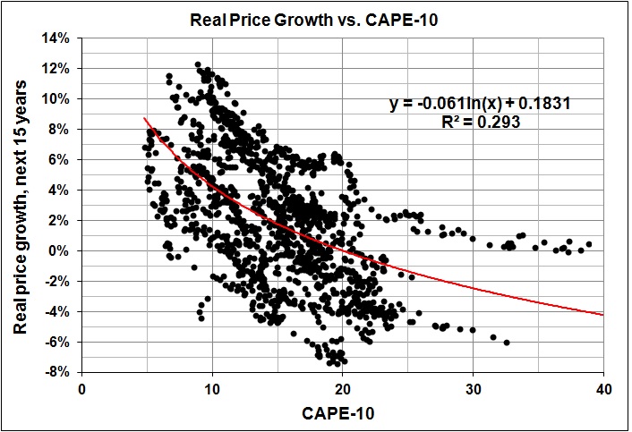
What about the relationship between CAPE-10 and price growth in subsequent years? Shiller made much of this in his non-prediction of 1996. (See his “Valuation Ratios and the Long-Run Stock Market Outlook.”) There is, as you might expect, a generally negative relationship between CAPE-10 and subsequent stock-price returns.

Real price growth in 15 years vs CAPE-10

But the relationship for 1871-2014 (shown above) is so loose as to be useless as a predictor. One might, as Shiller did, select a subset of the data and focus on the relationship for that subset, which is almost certain to be tighter than the relationship for the entire data set. But which subset should one choose? The correct answer — if there is one — becomes obvious only in hindsight. And by the time hindsight comes into play, the relationship will no longer hold.

I said it more than 30 years ago, and I stand by it: Trends were made to broken.

And we never know when they will break.

ADDENDUM (09/03/14):

The focus on stock prices is much ado about relatively little. The rate of real growth in the S&P index since January 1871 is 1.8 percent a year. For the same period, he rate of real growth in the S&P index with dividends reinvested is 6.6 percent a year. Huge difference:

S&P index - real price growth and returns

As of June 2014, the green line had increased 12,750-fold; the blue line, only 23-fold.

Buy and hold” should be: Buy, reinvest dividends, and hold.