UPDATED 10/31/20 — IT’S TIED AGAIN.
As of yesterday:
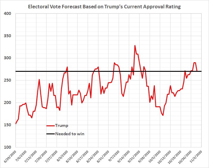
The estimates represented in this graph reflect Trump’s daily strong approval/strong disapproval ratio (derived from the Daily Presidential Tracking Poll at Rasmussen Reports), the relationship between that ratio and Trump’s share of the popular vote (based on White House Watch at Rasmussen Reports), and the relationship between share of popular vote and number of electoral votes (see this).
Previous posts in this series:
Keep Your Eye on Rasmussen Reports
The GOP’s Edge in the Electoral College
Don’t Believe What You Read about Biden’s “Lead” in the Polls
