GDP Update

The Bureau of Economic Analysis yesterday released its revised (second) estimate of GDP for the third quarter of 2020 (2020Q3). The recovery from the recession that was induced by COVID-19 lockdown orders continues, but there’s still a lot of lost ground to make up. And the lost ground to be made up isn’t just from the pre-COVID-19 rate of output, but from the post-Great Recession slump that persisted despite Trump’s deregulatory efforts.

Here’s the big picture:

This graph zooms in on the declining rate of growth in real GDP:

This graph highlights the declining rate of growth from business cycle to business cycle:

The unnecessarily draconian response to COVID-19 made a bad situation even worse.

Estimating the Rahn Curve: Or, How Government Inhibits Economic Growth

UPDATED 12/13/14 — This update consists of a comment about my estimate of the Rahn curve. I have just published a much better estimate of the curve for the post-World War II era.

UPDATED 12/28/11 — This update incorporates GDP and government spending statistics for 2010 and corrects a minor discrepancy in the estimation of government spending. Also, there are new, easier-to-read graphs. The bottom line is the same as before: Government spending and everything that goes with it (including regulation) is destructive of economic growth.

UPDATED 09/19/13 — This version incorporates two later posts “Estimating the Rahn Curve: A Sequel” (01/24/12) and “More Evidence for the Rahn Curve” (05/27/12).

*     *     *

The theory behind the Rahn Curve is simple — but not simplistic. A relatively small government with powers limited mainly to the protection of citizens and their property is worth more than its cost to taxpayers because it fosters productive economic activity (not to mention liberty). But additional government spending hinders productive activity in many ways, which are discussed in Daniel Mitchell’s paper, “The Impact of Government Spending on Economic Growth.” (I would add to Mitchell’s list the burden of regulatory activity, which accumulates with the size of government.)

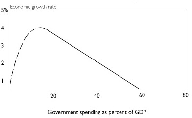
What does the Rahn Curve look like? Daniel Mitchell estimates this relationship between government spending and economic growth:
Rahn curve (2)

The curve is dashed rather than solid at low values of government spending because it has been decades since the governments of developed nations have spent as little as 20 percent of GDP. But as Mitchell and others note, the combined spending of governments in the U.S. was 10 percent (and less) until the eve of the Great Depression. And it was in the low-spending, laissez-faire era from the end of the Civil War to the early 1900s that the U.S. enjoyed its highest sustained rate of economic growth.

Here is a graphic look at the historical relationship between government spending and GDP growth:
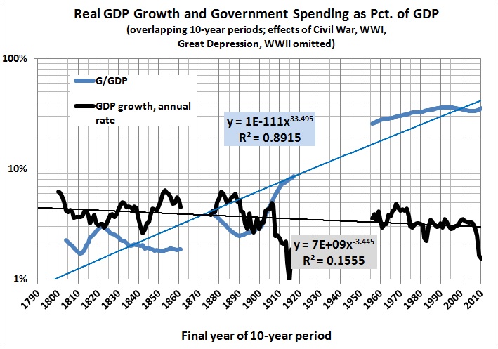
(Source notes for this graph and those that follow are at the bottom of this post.)

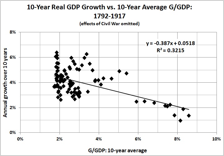
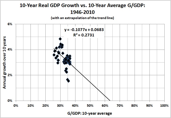
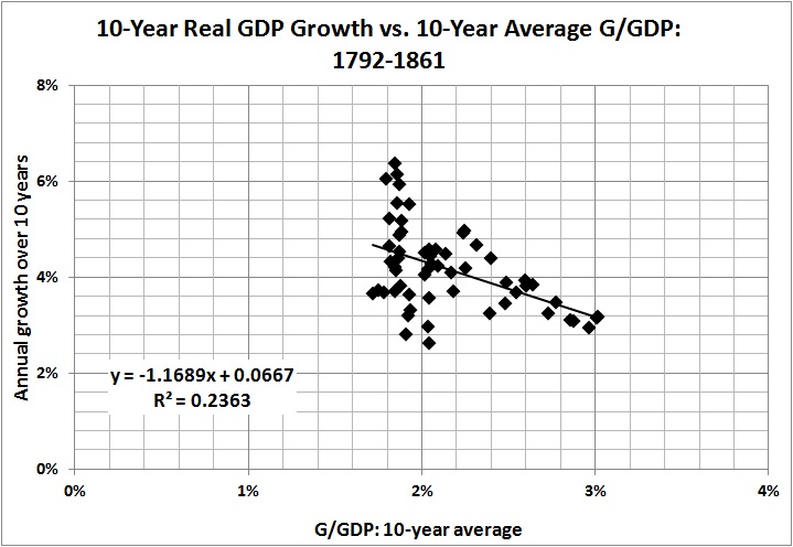
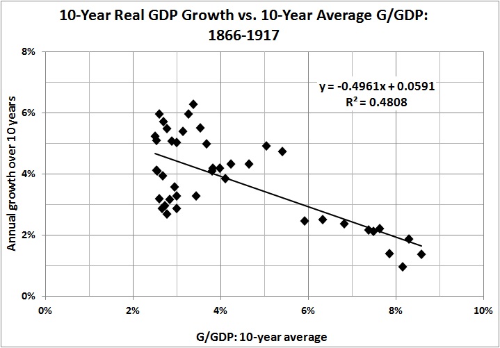
The regression lines are there simply to emphasize the long-term trends. The relationship between government spending as a percentage of GDP (G/GDP) and real GDP growth will emerge from the following graphs. There are chronological gaps because the Civil War, WWI, the Great Depression, and WWII distorted the relationship between G/GDP and economic growth. Large wars inflate government spending and GDP. The Great Depression saw a large rise in G/GDP, by pre-Depression standards, even as the economy shrank and then sputtered to a less-than-full recovery before the onset of WWII.
Est Rahn curve 1792 1861

Est Rahn curve 1866 1917

Est Rahn curve 1792 1917

Est Rahn curve 1946-2010

The graphs paint a consistent picture: Higher G/GDP means lower growth. There is one inconsistency, however, and that is the persistence of growth in the range of 2 to 4 percent during the post-WWII era, despite G/GDP in the range of 25-45 percent. That is not the kind of growth one would expect, given the relationships that obtain in the earlier eras. (The extrapolated trend line for 1946-2009 comes into use below.)

There are at least five plausible — and not mutually exclusive — explanations for the discrepancy. First, there is the difficulty of estimating GDP for years long past. Second, it is almost impossible to generate a consistent estimate of real GDP spanning two centuries; current economic output is vastly greater in volume and variety than it was in the early days of the Republic. Third, productivity gains (advances in technology, management techniques, and workers’ skills) may offset the growth-inhibiting effects of government spending, to some extent. Fourth, government regulations and active interventions (e.g., antitrust activity, the income tax) have a cumulative effect that operates independently of G/GDP. Regulations and interventions may have had an especially strong effect in the early 1900s (see the second graph in this post). The effects of regulations and interventions may diminish with time because of  adaptive behavior (e.g., “capture” of regulatory bodies).

Finally, and perhaps most importantly, there is the shifting composition of government spending. At relatively low levels of G/GDP, G consists largely of government programs that usurp and interfere with private-sector functions by diverting resources from productive uses to uses favored by politicians, bureaucrats, and their patrons. Higher levels of G/GDP — such as those we in the United States have known since the end of WWII — are reached by the expansion of the welfare state. Government spending (at all levels) on so-called social benefits accounted for only 7 percent of G and 0.8 percent of GDP in 1929; in 2009, it accounted for 36 percent of G and 15 percent of GDP. The provision of “social benefits” brings government into the business of redistributing income, which discourages work, saving, and capital formation to some extent, but doesn’t impinge directly on commerce. Therefore, I would expect G to be less damaging to GDP growth at higher levels of G/GDP — which is the message to be found in the contrast between the experience of 1946-2009 and the experience of earlier periods.

With those thoughts in mind, I present this empirical picture of the relationship between G/GDP and GDP growth in the United States:
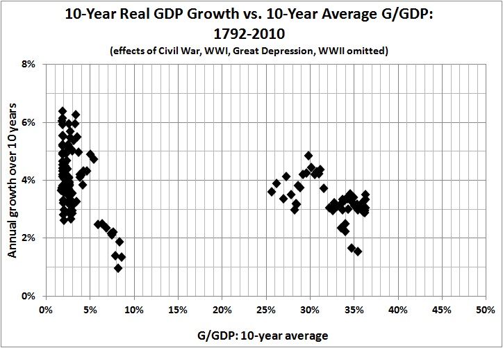
Est Rahn curve 1792-2010

The intermediate points, unfortunately, are missing because of the chronological gaps mentioned above. But, as indicated by the five earlier graphs, it is entirely reasonable to infer from the preceding graph a strong relationship between GDP growth and changes in G/GDP throughout the history of the Republic.

It is possible to obtain a rough estimate of the downward sloping portion of the Rahn curve by focusing on two eras: the post-Civil War years 1866-1890 — before the onset of “progressivism,” with its immediate and strong negative effects — and the post-WWII years 1946-2009. Thus:
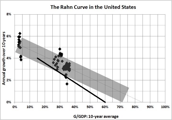
Est Rahn curve rough sketch

My rough estimate is appropriately “fuzzy” and somewhat more generous than Daniel Mitchell’s, which is indicated by the heavy black line. In light of my discussion of the shifting composition of G as G/GDP becomes relatively large, I  have followed the slope of the trend line for 1792-2010; that is, every 1 percentage-point increase in G/GDP yields a decrease in the growth rate of about 0.07 percent. That seemingly small effect becomes a huge one when G/GDP rises over a long period of time (as has been the case for more than a century, with no end in sight).

For the record, the best fit through the “fuzzy” area is:

Annual rate of growth = -0.066(G/GDP) + 0.054.

[A revised and more realistic estimate for the post-World War II era is

Real rate of growth = -0.372(G/GDP) + 0.067(BA/GDP) + 0.080 ,

where the real rate of growth is the annualized rate over a 10-year period, G/GDP is the fraction of GDP spent by government (including social transfers) over the preceding 10-year period, and BA/GDP represents business assets as a fraction of GDP for the preceding 10-year period.]

Again, it’s the annualized rate of growth over a 10-year span, as a function of G/GDP (fraction of GDP spent by governments at all levels) in the preceding 10 years. The new term, BA/GDP, represents the constant-dollar value of private nonresidential assets (i.e., business assets) as a fraction of GDP, averaged over the preceding 10 years. The idea is to capture the effect of capital accumulation on economic growth, which I didn’t do in the earlier analysis.

Maximum GDP growth seems to occur when G/GDP is 2-4  percent. That is somewhat less than the 7-percent share of GDP that was spent on national defense, public order, and safety in 2010. The excess represents additional “insurance” against predators, foreign and domestic. (The effectiveness of the additional “insurance” is a separate question, though I am inclined to err on the side of caution when it comes to defense and law enforcement. Those functions are not responsible for the economic woes facing America’s taxpayers.)

If G/GDP reaches 55 percent — which it will if present entitlement “commitments” are not curtailed — the “baseline” rate of growth will shrink further: probably to less than 2 percent. And thus America will remain mired in its Mega-Depression.

*     *     *

Source notes:

Estimates of real and nominal GDP, back to 1790, come from the feature “What Was the U.S GDP Then?” at MeasuringWorth.com.

Estimates of government spending (federal, State, and local) come from USgovernmentspending.com; Statistical Abstracts of the United States, Colonial Times to 1970: Part 2. Series Y 533-566. Federal, State, and Local Government Expenditures, by Function; and the Bureau of Economic Analysis (BEA), Table 3.1. Government Current Receipts and Expenditures (lines 34, 35).

I found the amount spent by governments (federal, State, and local) on national defense and public order and safety by consulting BEA Table 3.17. Selected Government Current and Capital Expenditures by Function.

The BEA tables cited above are available here.

*     *     *

ADDENDUM: THE RAHN CURVE: A SEQUEL

In the original post (above) I note that maximum GDP growth occurs when government spends two to four percent of GDP. The two-to-four percent range represents the share of GDP claimed by American governments (federal, State, and local) throughout most of the 19th century, when government spending exceeded five percent of GDP only during the Civil War.

Of course, until the early part of the 20th century, when Progressivism began to make itself felt in Americans’ tax bills, governments restricted themselves (in the main) to the functions of national defense, public order, and safety — the terms used in national-income accounting. It is those functions — hereinafter called defense and justice — that foster liberty and economic growth because they protect peaceful, voluntary activity. Effective protection probably would cost more than four percent of GDP in these parlous times. But an adequate figure, except in the rare event of a major war, is probably no more than seven percent of GDP — the value for 2010, which includes the cost of fighting in Iraq and Afghanistan.

In any event, government spending — even on defense and justice — is impossible without private economic activity. It is that activity which yields the wherewithal for the provision of defense and justice. Once those things have been provided, the further diversion of resources by government is economically destructive. Specifically, from “Estimating the Rahn Curve” (above):

It is possible to obtain a rough estimate of the downward sloping portion of the Rahn curve by focusing on two eras: the post-Civil War years 1866-1890 — before the onset of “progressivism,” with its immediate and strong negative effects — and the post-WWII years 1946-2009. Thus:

Est Rahn curve rough sketch

My rough estimate is appropriately “fuzzy” and somewhat more generous than Daniel Mitchell’s [in “The Impact of Government Spending on Economic Growth”], which is indicated by the heavy black line. In light of my discussion of the shifting composition of G as G/GDP becomes relatively large, I  have followed the slope of the trend line for 1792-2010; that is, every 1 percentage-point increase in G/GDP yields a decrease in the growth rate of about 0.06 percent. That seemingly small effect becomes a huge one when G/GDP rises over a long period of time (as has been the case for more than a century, with no end in sight).

The following graphs offer another view of the devastation wrought by the growth of government spending — and regulation. (Sources are given in “Estimating the Rahn Curve.”) I begin with the share of GDP which is not spent by government:
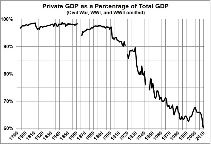
Est Rahn curve sequel_priv GDP as pct total GDP

A note about my measure of government spending is in order. National-income accounting purists would insist that transfer payments (mainly Social Security, Medicare, and Medicaid) should not count as spending, even though I count them as such. But what does it matter whether money is taken from taxpayers and given to retired persons (as Social Security) or to government employees (as salary and benefits) or contractors (as reimbursement for products and services delivered to government)? All government spending represents the transfer of claims on resources from persons who earned those claims to other persons, who either did something of questionable value for the money (government employees and contractors) or nothing (e.g., retirees).

In any event, it is obvious that Americans enjoyed minimal government until the early 1900s, and have since “enjoyed” a vast expansion of government. Here is a closer look at the trend from 1900 onward:
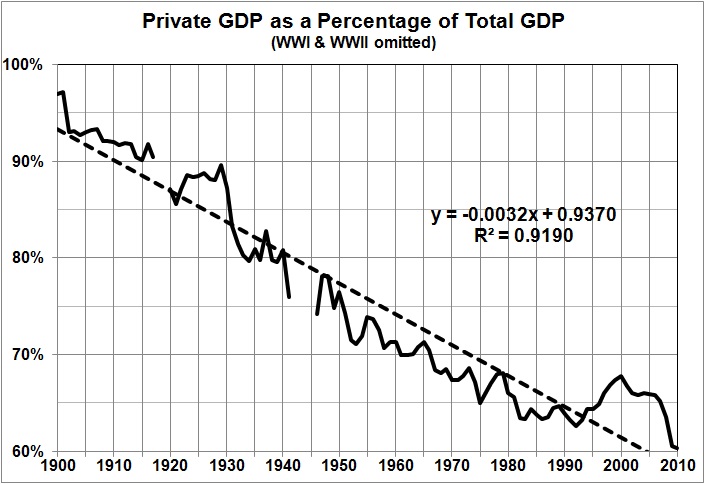
Est Rahn curve sequel_private GDP pct total GDP since 1900

This is a good point at which to note that the expansion of government is understated by the growth of government spending, which only imperfectly captures the effects of the rapidly growing regulatory burden on America’s economy. The combined effects of government spending and regulation can be seen in this “before” and “after” depiction of growth rates:
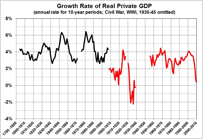
Est Rahn curve sequel_growth rate of private GDP

(I omitted the major wars and the Great Depression because their inclusion would give an exaggerated view of economic growth in the aftermath of abnormally suppressed private economic activity.)

The marked diminution of growth  after 1900 has led to what I call America’s Mega-Depression. Note the similarity between the downward path of private sector GDP (two graphs earlier) and the downward path of the Mega-Depression in the following graph:
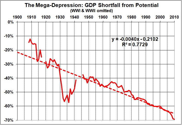
Est Rahn curve sequel_mega-depression

What is the Mega-Depression? It is a measure of the degree to which real GDP has fallen below what it would have been had economic growth continued at its post-Civil War pace. As I explain here, the Mega-Depression began in the early 1900s, when the economy began to sag under the weight of Progressivism (e.g., trust-busting, regulation, the income tax, the Fed). Then came the New Deal, whose interventions provoked and prolonged the Great Depression (see, for example, this, and this). From the New Deal and the Great Society arose the massive anti-market/initiative-draining/dependency-promoting schemes known as Social Security, Medicare, and Medicaid. The extension and expansion of those and other intrusive government programs has continued unto the present day (e.g., Obamacare), with the result that our lives and livelihoods are hemmed in by mountains of regulatory restrictions.

Regulation aside, government spending — except for defense and justice — is counterproductive. Not only does it fail to stimulate the economy in the short run, but it also robs the economy of the investments that are needed for long-run growth.

*     *     *

ADDENDUM: MORE EVIDENCE FOR THE RAHN CURVE

Here:

[W]e have some new research from the United Kingdom. The Centre for Policy Studies has released a new study, authored by Ryan Bourne and Thomas Oechsle, examining the relationship between economic growth and the size of the public sector.

The chart above compares growth rates for nations with big governments and small governments over the past two decades. The difference is significant, but that’s just the tip of the iceberg. The most important findings of the report are the estimates showing how more spending and more taxes are associated with weaker performance.

Here are some key passages from the study.

Using tax to GDP and spending to GDP ratios as a proxy for size of government, regression analysis can be used to estimate the effect of government size on GDP growth in a set of countries defined as advanced by the IMF between 1965 and 2010. …As supply-side economists would expect, the coefficients on the tax revenue to GDP and government spending to GDP ratios are negative and statistically significant. This suggests that, ceteris paribus, a larger tax burden results in a slower annual growth of real GDP per capita. Though it is unlikely that this effect would be linear (we might expect the effect to be larger for countries with huge tax burdens), the regressions suggest that an increase in the tax revenue to GDP ratio by 10 percentage points will, if the other variables do not change, lead to a decrease in the rate of economic growth per capita by 1.2 percentage points. The result is very similar for government outlays to GDP, where an increase by 10 percentage points is associated with a fall in the economic growth rate of 1.1 percentage points. This is in line with other findings in the academic literature. …The two small government economies with the lowest marginal tax rates, Singapore and Hong Kong, were also those which experienced the fastest average real GDP growth.

My own estimate (see above) for the United States, is that

every 1 percentage-point increase in G/GDP yields a decrease in the growth rate of about 0.07 percent. That seemingly small effect becomes a huge one when G/GDP rises over a long period of time (as has been the case for more than a century, with no end in sight).

In other words, every 10 percentage-point increase in the ratio of government spending to GDP causes a not-insignificant drop of 0.7 percentage points in the rate of growth. That is somewhat below the estimate quoted above (1.1 percentage points), but surely it is within the range of uncertainty that surrounds the estimate.

Vulgar Keynesianism and Capitalism

A REISSUE (WITHOUT UPDATES) OF THE ORIGINAL POST DATED DECEMBER 4, 2011

Robert Higgs quite rightly disparages “vulgar Keynesianism”:

Most of the people who purport to possess expertise about the economy rely on a common set of presuppositions and modes of thinking. I call this pseudo-intellectual mishmash vulgar Keynesianism. It’s the same claptrap that has passed for economic wisdom in this country for more than fifty years and seems to have originated in the first edition of Paul Samuelson’s Economics (1948), the best-selling economics textbook of all time and the one from which a plurality of several generations of college students acquired whatever they knew about economic analysis. Long ago, this view seeped into educated discourse and writing in the news media and in politics and established itself as an orthodoxy.

Unfortunately, this way of thinking about the economy’s operation, particularly its overall fluctuations, is a tissue of errors of both commission and omission. Most unfortunate have been the policy implications derived from this mode of thinking, above all the notion that the government can and should use fiscal and monetary policies to control the macroeconomy and stabilize its fluctuations. Despite having originated more than half a century ago, this view seems to be as vital in 2009 as it was in 1949.

Higgs then dissects “the six most egregious aspects of this unfortunate approach to understanding and dealing with economic booms and busts.” These are the aggregation of myriad and disparate economic actions, failure to take into account changes in relative prices, misunderstanding of the meaning and economic role of interest rates, disregard for the importance of capital, blind “money pumping” as a “solution” to recessions, and disregard for the disincentivizing effects of government activism on the private sector.

I agree with everything said by Higgs, and I have said many of the same things (in my own way) at this blog and its predecessor.  However, GDP — an aggregate measure of economic activity — is a useful construct, as flawed as it may be. It is an indicator of the general direction and magnitude of economic activity. Other aggregate measures — such as employment, jobs added and lost, unemployment rate — are also useful in that regard. If, for example, constant-dollar GDP per capita was twice as high in 2010 than it was 40 years earlier, in 1970 (computed here), it indicates that most Americans enjoyed a significantly higher standard of living in 2010 than they and their predecessors did in 1970. Further, the difference is so significant that it overshadows the difficulty of aggregating the value of billions of disparate transactions and separating the effects of price inflation from quality improvements.

What is special about 1970? It marks a turning point in the economic history of the U.S., which I discussed in a post that is now two-and-a-half years old:

Can we measure the price of government intervention [in the economy]? I believe that we can do so, and quite easily. The tale can be told in three graphs, all derived from constant-dollar GDP estimates available here. The numbers plotted in each graph exclude GDP estimates for the years in which the U.S. was involved in or demobilizing from major wars, namely, 1861-65, 1918-19, and 1941-46. GDP values for those years — especially for the peak years of World War II — present a distorted picture of economic output….

The trend line in the first graph indicates annual growth of about 3.7 percent over the long run, with obviously large deviations around the trend. The second graph contrasts economic growth through 1907 with economic growth since: 4.2 percent vs. 3.6 percent. But lest you believe that the economy of the U.S. somehow began to “age” in the early 1900s, consider the story implicit in the third graph:

  • 1790-1861 — annual growth of 4.1 percent — a booming young economy, probably at its freest
  • 1866-1907 — annual growth of 4.3 percent — a robust economy, fueled by (mostly) laissez-faire policies and the concomitant rise of technological innovation and entrepreneurship
  • 1908-1929 — annual growth of 2.2 percent — a dispirited economy, shackled by the fruits of “progressivism” (e.g., trust-busting, regulation, the income tax, the Fed) and the government interventions that provoked and prolonged the Great Depression (see links in third paragraph)
  • 1970-2008 — annual growth of 3.1 percent –  [2.8 percent for 1970-2010] an economy sagging under the cumulative weight of “progressivism,” New Deal legislation, LBJ’s “Great Society” (with its legacy of the ever-expanding and oppressive welfare/transfer-payment schemes: Medicare, Medicaid, a more generous package of Social Security benefits), and an ever-growing mountain of regulatory restrictions.

Taking the period 1970-2010 as a distinctive era — that of the full-fledged regulatory-welfare state — it may be possible to discern some aggregate relationships that were stable during that era (and may well continue to hold). The relationship that I want to explore is suggested by Higgs’s discussion of the vulgar Keynesian view of aggregate demand and the role of capital in economic production:

Because the vulgar Keynesian has no conception of the economy’s structure of output, he cannot conceive of how an expansion of demand along certain lines but not along others might be problematic. In his view, one cannot have, say, too many houses and apartments. Increasing the spending for houses and apartments is, he thinks, always good whenever the economy has unemployed resources, regardless of how many houses and apartments now stand vacant and regardless of what specific kinds of resources are unemployed and where they are located in this vast land. Although the unemployed laborers may be skilled silver miners in Idaho, it is supposedly still a good thing if somehow the demand for condos is increased in Palm Beach, because for the vulgar Keynesian, there are no individual classes of laborers or separate labor markets: labor is labor is labor. If someone, whatever his skills, preferences, or location, is unemployed, then, in this framework of thought, we may expect to put him back to work by increasing aggregate demand, regardless of what we happen to spend the money for, whether it be cosmetics or computers.

This stark simplicity exists, you see, because aggregate output is a simple increasing function of aggregate labor employed:

Q = f (L), where dQ/dL > 0.

Note that this “aggregate production function” has only one input, aggregate labor. The workers seemingly produce without the aid of capital! If pressed, the vulgar Keynesian admits that the workers use capital, but he insists that the capital stock may be taken as “given” and fixed in the short run. And ― which is highly important ― his whole apparatus of thought is intended exclusively to help him understand this short run. In the long run, he may insist, we are, as Keynes quipped, “all dead”; or he may simply deny that the long run is what we get when we place a series of short runs back to back. The vulgar Keynesian in effect treats living for the moment, and only for it, as a major virtue. At any given time, the future may safely be left to take care of itself.

In fact, the Keynesian-Marxian view of capital is about 180 degrees from the truth:

1. A broad array of capital goods (e.g., metal presses and railroad cars) will produce the same outputs (e.g., auto body parts of a certain quality and a certain number of passenger-miles) despite wide variations in the intelligence, education, and motor skills of their operators.

2. That is to say, capital leverages labor (especially unskilled labor).

3. Rewards justifiably — if unpredictably — flow to those who invent capital goods, innovate improvements in capital goods, invest in the production of such goods, and take the risk of owning businesses that use such goods in the production of consumer goods and services.

4. The activities of those inventors, innovators, investors, and entrepreneurs constitute a form of labor, but it is a very special form. It is not the brute force kind of labor envisaged by Marx and his intellectual progeny. It is a kind of labor that involves mental acuity, special knowledge, a penchant for risk-taking, and — yes, at times — hard work.

Without capital, labor would produce far less than it does. Capital, by the same token, enables labor of a given quality to produce more than it otherwise would.

(By “invest in the production of capital goods,” I mean to include individuals whose saving — whether or not it goes directly into the purchases of stocks and corporate bonds — helps to fund the purchases of capital goods by businesses.)

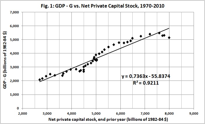
With that in mind, look at the aggregate relationship between the stock of private non-residential capital and private-sector GDP (GDP – G) for the period 1970-2010:

GDP - G vs net private capital stock, 1970-2010
Notes:  Current-dollar values for GDP and G are from Bureau of Economic Analysis, Table 1.1.5. Gross Domestic Product (available here). Capital stock estimates are from Bureau of Economic Analysis, Table 4.1. Current-Cost Net Stock of Private Nonresidential Fixed Assets by Industry Group and Legal Form of Organization (available here). Current-dollar values for GDP – G and capital stock were adjusted to 1982-84 dollars by constructing and applying deflators from CPI-U statistics for 1913-present (available here).

Variations around the trend line indicate fluctuations in economic activity. I treat the difference between “actual” GDP and the trend line as a residual to be explained by factors other than the aggregate value of the private, nonresidential capital stock. Measures of employment or unemployment will not do the job; they are simply proxies for aggregate output. The best measure that I have found is the value of new investment in the current year, relative to the value of the capital stock at the end of the prior year:

Residual vs new invest per PY capital stock
Notes: Residual GDP – G derived from Fig. 1, as discussed in text. Estimates of new investment in private capital stock are from Bureau of Economic Analysis, Table 4.7. Investment in Private Nonresidential Fixed Assets by Industry Group and Legal Form of Organization (available here); adjusted for inflation as discussed in notes for Fig. 1.

Using the trendline equation from Fig. 2, I adjusted the estimates derived from the trendline equation of Fig. 1, with this result:

Adjusted GDP - G vs. net private capital stock

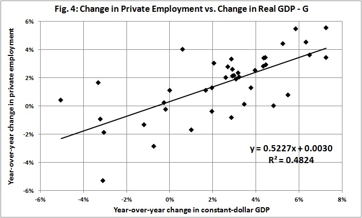
There is precious little for labor to do but to show up for work and apply itself to the tools provided by capitalism:

Change in priv emply vs change in real GDP

*   *   *

Knowledgeable readers will understand that I have taken some statistical liberties. And I have done so as a way of satirizing the view that prosperity depends on labor and its correlate, consumption spending. But my point is a serious one: Capital should not be denigrated. Those who denigrate it give aid and comfort to the enemies of economic growth, that is, to the “progressives” who are the real enemies of the poor, of labor, and of liberty.

The Price of Government, Once More

I was pleased to read a recent post by Mark Perry, “Federal regulations have lowered real GDP growth by 2% per year since 1949 and made America 72% poorer.” It wasn’t the message that pleased me; it was the corroboration of what I have been saying for several years.

Regulation is one of the many counterproductive activities that is financed by government spending. The main economic effect of government spending, aside from regulation, is the deadweight loss it imposes on the economy; that is, it moves resources from productive uses to less productive, unproductive, and counterproductive ones. And then there is taxation (progressive and otherwise), which penalizes success and deters growth-producing investment.

All in all, the price of government is extremely high. But most voters are unaware of the price, and so they continue to elect and support the very “free lunch” politicians who are, in fact, robbing them blind.

Consider, for example, these posts by James Pethokoukis:
Is the Era of Fast U.S. Economic Growth Coming to an End?AEIdeas, July 13, 2013
My Counter: Why U.S. Economic Growth Doesn’t Have to Come to an End,” AEIdeas, August 23, 2012

Pethokoukis’s thesis, with which I agree, is that government — not lack of opportunity — is the main obstacle to the resumption of a high rate of growth.

For much more, see:
The Price of Government
The Price of Government Redux
The Mega-Depression
Ricardian Equivalence Reconsidered
The Real Burden of Government
The Rahn Curve at Work
The “Forthcoming Financial Collapse”
Estimating the Rahn Curve: Or, How Government Inhibits Economic Growth
The Deficit Commission’s Deficit of Understanding
The Bowles-Simpson Report
The Bowles-Simpson Band-Aid
The Stagnation Thesis
America’s Financial Crisis Is Now
Estimating the Rahn Curve: A Sequel
Lay My (Regulatory) Burden Down
More Evidence for the Rahn Curve


The Economic Outlook in Brief

I have elsewhere quantified the connection between government spending and economic growth (e.g., here and here).* I have also shown that stock prices indicate the direction of economic growth. It should not surprise you if I say that

  • the re-election of Obama portends further growth of government spending — specifically, the uncontrolled growth of entitlement spending, as accelerated by Obamacare;
  • the rate of economic growth will continue to decline for as long as entitlements grow as a percentage of GDP; and
  • in anticipation of slower economic growth, stock prices will continue to decline, in real terms.

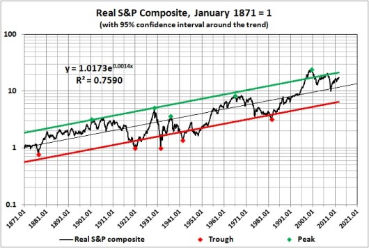
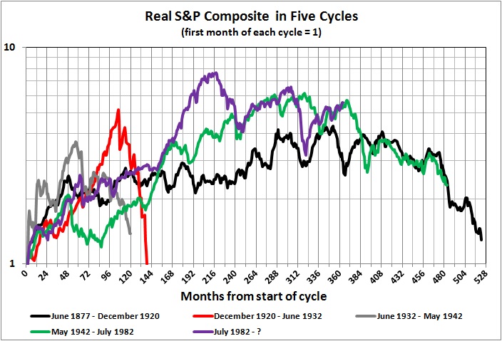
You can follow the links in the first paragraph if you wish to learn more. Here is a bit of additional evidence for my gloomy outlook. The real value of the S&P Composite Index has fluctuated in trough-to peak-to trough cycles, four of which have been completed since the 1870s:


Derived from Robert Shiller’s data set at http://www.econ.yale.edu/~shiller/data/ie_data.xls.

We are now on the downside of the fifth cycle, which began in July 1982 and peaked in August 2000. If the present cycle follows the pattern of the other two long cycles, it may not bottom out until sometime after 2020  (though it may never end if economic growth continues to decline). And if it does bottom out then, the real value of the S&P composite will have risen only about two-fold from where its value at the start of the cycle in July 1982. In nominal terms, the S&P Composite will have dropped to about half its current level by 2020.

But, as I say, the stock market merely anticipates underlying economic conditions. Those conditions seem destined to worsen because the entitlements mess will not be dealt with for as long as there is gridlock in Washington.

__________
* See also the second graph in this post by James Pethokoukis of the American Enterprise Institute. The graph highlights the inverse relationship between entitlement spending and growth-producing innovation. Entitlement spending diminishes investments in innovation by (a) diverting resources from productive to unproductive uses and (b) penalizing (taxing) productive activities that fund innovation and its implementation.

Related posts:
The Laffer Curve, “Fiscal Responsibility,” and Economic Growth
The Causes of Economic Growth
In the Long Run We Are All Poorer
A Short Course in Economics
Addendum to a Short Course in Economics
The Price of Government
The Price of Government Redux
The Mega-Depression
As Goes Greece
Ricardian Equivalence Reconsidered
The Real Burden of Government
The Illusion of Prosperity and Stability
Estimating the Rahn Curve: Or, How Government Inhibits Economic Growth
Taxing the Rich
More about Taxing the Rich
America’s Financial Crisis Is Now
A Keynesian Fantasy Land
The Keynesian Fallacy and Regime Uncertainty
Why the “Stimulus” Failed to Stimulate
The “Jobs Speech” That Obama Should Have Given
Say’s Law, Government, and Unemployment
Unemployment and Economic Growth
Regime Uncertainty and the Great Recession
Regulation as Wishful Thinking
The Real Multiplier
Vulgar Keynesianism and Capitalism
Why Are Interest Rates So Low?
The Commandeered Economy
Stocks for the Long Run?
We Owe It to Ourselves
Stocks for the Long Run? (Part II)
Estimating the Rahn Curve: A Sequel
In Defense of the 1%
Bonds for the Long Run?
The Real Multiplier (II)
Lay My (Regulatory) Burden Down
The Burden of Government
Economic Growth Since World War II
More Evidence for the Rahn Curve
The Economy Slogs Along
The Obama Effect: Disguised Unemployment
The Stock Market as a Leading Indicator of GDP
Government in Macroeconomic Perspective
Where We Are, Economically
Keynesianism: Upside-Down Economics in the Collectivist Cause

Where We Are, Economically

UPDATED (10/26/12)

The advance estimate of GDP for the third quarter of 2012 has been released. Real growth continues to slog along at about 2 percent. I have updated the graph, but the text needs no revision.

*  *   *

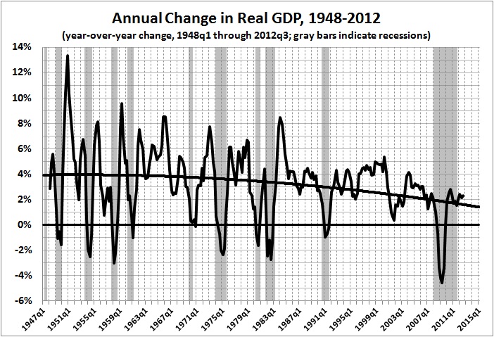
It occurred to me that the trend line in the second graph of “The Economy Slogs Along” is misleading. It is linear, when it should be curvilinear. Here is a better version:


Derived from the October 26, 2012 release of GDP estimates by the Bureau of Economic Analysis. (Contrary to the position of the National Bureau of Economic Research, there was no recession in 2000-2001. For my definition of a recession, see “Economic Growth Since World War II.”)

The more descriptive regression line underscores the moral of “Obama’s Economic Record in Perspective,” which is this:

The claims by Obama and his retinue about O’s supposed “rescue” of the economy from the abyss of depression are ludicrous. (See, for example, “A Keynesian Fantasy Land,” “The Keynesian Fallacy and Regime Uncertainty,” “Why the “Stimulus” Failed to Stimulate,” “Regime Uncertainty and the Great Recession,” The Real Multiplier,” “The Real Multiplier (II),”The Economy Slogs Along,” and “The Obama Effect: Disguised Unemployment.”) Nevertheless our flannel-mouthed president his sycophants insist that he has done great things for the country, though the only great thing that he could do is to leave it alone.

Obama is not to blame for the Great Recession, but the sluggish recovery is due to his anti-business rhetoric and policies (including Obamacare, among others). All that Obama can rightly take “credit” for is an acceleration of the downward trend of economic growth.

Related posts:
Are We Mortgaging Our Children’s Future?
In the Long Run We Are All Poorer
Mr. Greenspan Doth Protest Too Much
The Price of Government
Fascism and the Future of America
The Indivisibility of Economic and Social Liberty
Rationing and Health Care
The Fed and Business Cycles
The Commandeered Economy
The Perils of Nannyism: The Case of Obamacare
The Price of Government Redux
As Goes Greece
The State of the Union: 2010
The Shape of Things to Come
Ricardian Equivalence Reconsidered
The Real Burden of Government
Toward a Risk-Free Economy
The Rahn Curve at Work
The Illusion of Prosperity and Stability
More about the Perils of Obamacare
Health Care “Reform”: The Short of It
The Mega-Depression
I Want My Country Back
The “Forthcoming Financial Collapse”
Estimating the Rahn Curve: Or, How Government Inhibits Economic Growth
The Deficit Commission’s Deficit of Understanding
The Bowles-Simpson Report
The Bowles-Simpson Band-Aid
The Stagnation Thesis
America’s Financial Crisis Is Now
Understanding Hayek
Money, Credit, and Economic Fluctuations
A Keynesian Fantasy Land
The Keynesian Fallacy and Regime Uncertainty
Why the “Stimulus” Failed to Stimulate
The “Jobs Speech” That Obama Should Have Given
Say’s Law, Government, and Unemployment
Regime Uncertainty and the Great Recession
Regulation as Wishful Thinking
Vulgar Keynesianism and Capitalism
Why Are Interest Rates So Low?
Don’t Just Stand There, “Do Something”
The Commandeered Economy
Stocks for the Long Run?
We Owe It to Ourselves
Stocks for the Long Run? (Part II)
Bonds for the Long Run?
The Real Multiplier (II)
The Burden of Government
Economic Growth Since World War II
More Evidence for the Rahn Curve
The Economy Slogs Along
The Obama Effect: Disguised Unemployment
Obama’s Economic Record in Perspective

Higher Taxes, Higher Government Spending, Slower Economic Growth

J.D. Foster and Curtis Dubay, writing at The Foundry (“Of Course Higher Taxes Slow Growth — A Response to Diamond and Saez“), make mincemeat of Peter Diamond and Emmanuel Saez’s arguments for higher taxes on “the rich.” Implicit in Foster and Dubay’s takedown of Diamond and Saez is the demonstrably strong (and negative relationship) between government spending and economic growth.

Spending is funded by taxes, after all. And even when spending is funded by borrowing it amounts to a tax on the productive sectors of the economy. How is that? When government sell bonds to the public it redirects money from productive uses in the private sector to unproductive and counter-productive uses in the so-called public sector (i.e., government). The thievery is no less destructive — but more apparent — when the Fed creates money out of thin air to finance government spending.

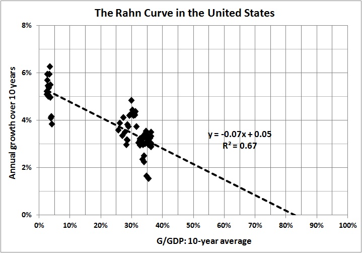
So, the focus should be on spending, for which taxation is a proxy. The effect of government spending on economic growth is nothing less than disastrous. I have treated the subject at length in “Estimating the Rahn Curve: Or, How Government Inhibits Economic Growth.” Here is another version of the final graph in that post:

The bottom line is that for every 10 percentage points by which government spending rises, the rate of growth declines by 0.7 percentage points. If you think that 0.7 percent is negligible, try compounding it over a lifespan of 80 years. In that time, a sustained 10 percent rise in government spending will reduce the average person’s real income by more than 40 percent.

That, my friends, is soak-the-rich Obamanomics at work. Apologists for Obamanomics, like Diamond and Saez, should be ashamed of themselves for abetting economically destructive demagoguery.

Related posts:
The Causes of Economic Growth
A Short Course in Economics
Addendum to a Short Course in Economics
Enough of “Social Welfare”
The Case of the Purblind Economist
Economic Growth since WWII
The Price of Government
Does the Minimum Wage Increase Unemployment?
The Price of Government Redux
The Mega-Depression
The Real Burden of Government
Toward a Risk-Free Economy
The Rahn Curve at Work
The Illusion of Prosperity and Stability
Society and the State
The “Forthcoming Financial Collapse”
Estimating the Rahn Curve: Or, How Government Inhibits Economic Growth
The Deficit Commission’s Deficit of Understanding
Undermining the Free Society
The Bowles-Simpson Report
The Bowles-Simpson Band-Aid
Build It and They Will Pay
Government vs. Community
The Stagnation Thesis
Government Failure: An Example
Taxing the Rich
More about Taxing the Rich
Voluntary Taxation
Money, Credit, and Economic Fluctuations
A Keynesian Fantasy Land
“Tax Expenditures” Are Not Expenditures
The Keynesian Fallacy and Regime Uncertainty
Why the “Stimulus” Failed to Stimulate
The “Jobs Speech” That Obama Should Have Given
Regime Uncertainty and the Great Recession
The Real Multiplier
Vulgar Keynesianism and Capitalism
Why Are Interest Rates So Low?
Don’t Just Stand There, “Do Something”
Economic Growth Since World War II
The Commandeered Economy
We Owe It to Ourselves
In Defense of the 1%
The Real Multiplier (II)