Irrational Exuberance

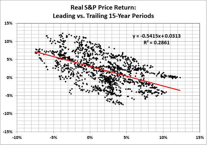
It’s everywhere, but most notably in the stock market and in election returns.

In the stock market, as exemplified by the S&P 500 index, there have been wild swings in the price-earnings ratio:


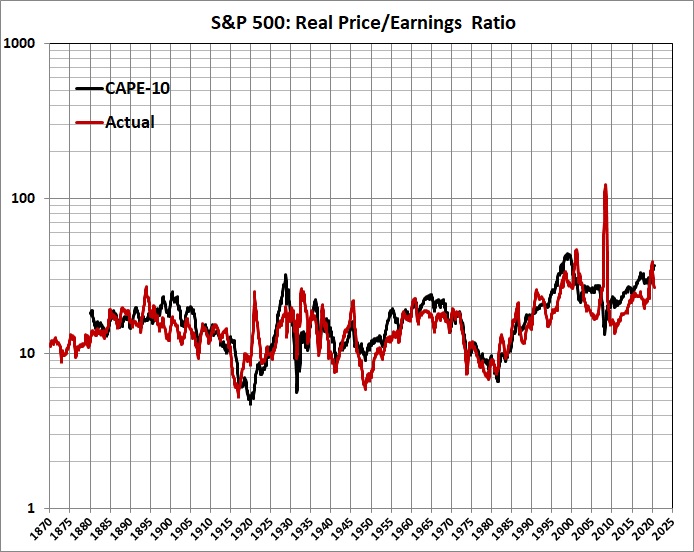
Derived from Robert Shiller’s data set. CAPE-10 is the cyclically adjusted price/earnings ratio, where the cyclical adjustment amounts to a 10 year average of the ratio.

In a world where stock buyers weren’t driven by irrational exuberance — and irrational pessimism — the PE ratio would follow something like a straight line. It might be a rising straight line because, as some analysts have noted, stock buyers have acquired an increasingly greater tolerance for risk-taking. But it would be close to a straight line.

The zigs and zags of the stock market are echoed in the outcomes of presidential elections:


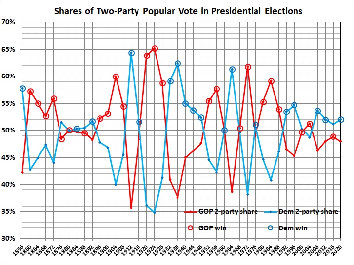
Derived from Dave Leip’s Atlas of U.S. Presidential Elections.

To put it bluntly, almost every American who values his liberty and prosperity would in most elections have preferred the Republican candidate as the lesser of two evils. The success of Democrats testifies to the gullibility of many voters, who are swayed by — among other things — asymmetrical ideological warfare:

Leftists have the advantage of saying the kinds of things that people like to hear, especially when it comes to promising “free” stuff and visions of social perfection….

[L]eftists have another advantage: they’re ruthless. Unlike true conservatives (not Trumpsters) and most libertarians, leftists can be ruthless, unto vicious. They pull no punches; they call people names; they skirt the law — and violate it — to get what they want (e.g., Obama’s various “executive actions”); they use the law and the media to go after their ideological opponents; and on and on.

Why the difference between leftists and true conservatives? Leftists want to rearrange the world to fit their idea of perfection. They have it all figured out, and dissent from the master plan will not be tolerated. (This is very Hitleresque and Stalinesque.) Conservatives and libertarians want people to figure out for themselves how to arrange the world within the roomy confines of simple morality (don’t cheat, don’t steal, don’t murder, etc.).

The left’s ruthlessness was in full spate last year, when the election was bought and probably stolen as well.

In the same post (published on July 23, 2016), my prescience was on display:

If Trump wins in November — a very big “if” — it should be an object lesson to true conservatives and libertarians. Take the gloves off and don brass knuckles. This isn’t a contest for hockey’s Lady Byng Trophy. To change the sports metaphor, we’re in the late rounds of a brutal fight, and well behind on points. It’s time to go for the knockout.

The good news is that recent elections reflect the effects of political polarization. The swings have become less pronounced because the electorate’s “squishy center” has shrunk. The challenge before the GOP is to convince what remains of the “squishy center” that it is in their best interest to reject the anti-libertarian and anti-prosperity policies of the Democrat Party, which has become nothing more than a mouthpiece for an (anti) American brand of Hitlerism and Stalinism.

Shiller’s Folly

Robert Shiller‘s most famous (or infamous) book, is Irrational Exuberance (2000). According to the Wikipedia article about the book,

the text put forth several arguments demonstrating how the stock markets were overvalued at the time. The stock market collapse of 2000 happened the exact month of the book’s publication.

The second edition of Irrational Exuberance was published in 2005 and was updated to cover the housing bubble. Shiller wrote that the real estate bubble might soon burst, and he supported his claim by showing that median home prices were six to nine times greater than median income in some areas of the country. He also showed that home prices, when adjusted for inflation, have produced very modest returns of less than 1% per year. Housing prices peaked in 2006 and the housing bubble burst in 2007 and 2008, an event partially responsible for the Worldwide recession of 2008-2009.

However, as the Wikipedia article notes,

some economists … challenge the predictive power of Shiller’s publication. Eugene Fama, the Robert R. McCormick Distinguished Service Professor of Finance at The University of Chicago and co-recipient with Shiller of the 2013 Nobel Prize in Economics, has written that Shiller “has been consistently pessimistic about prices,”[ so given a long enough horizon, Shiller is bound to be able to claim that he has foreseen any given crisis.

(A stopped watch is right twice a day, but wrong 99.9 percent of the time if read to the nearest minute. I also predicted the collapse of 2000, but four years too soon.)

One of the tools used by Shiller is a cyclically-adjusted price-to-earnings ratio known as  CAPE-10 . It is

a valuation measure usually applied to the US S&P 500 equity market. It is defined as price divided by the average of ten [previous] years of earnings … , adjusted for inflation. As such, it is principally used to assess likely future returns from equities over timescales of 10 to 20 years, with higher than average CAPE values implying lower than average long-term annual average returns.

CAPE-10, like other economic indicators of which I know, is a crude tool:

For example, the annualized real rate of price growth for the S&P Composite Index from October 2003 to October 2018 was 4.6 percent. The value of CAPE-10 in October 2003 was 25.68. According to the equation in the graph (which includes the period from October 2003 through October 2018), the real rate of price growth should have been -0.6 percent. The actual rate is at the upper end of the wide range of uncertainty around the estimate.

Even a seemingly more robust relationship yields poor results. Consider this one:

The equation in this graph produces a slightly better but still terrible estimate: price growth of -0.2 percent over the 15 years ending in October 2018.

If you put stock (pun intended) in the kinds of relationships depicted above, you should expect real growth in the S&P Composite Index to be zero for the next 15 years — plus or minus about 6 percentage points. It’s the plus or minus that matters — a lot — and the equations don’t help you one bit.

As the Danish proverb says, it is difficult to make predictions, especially about the future.

Much Ado about the Price-Earnings Ratio

Does the long-term trend of the price-earnings ratio have an upward tilt? You might think so, if you encounter Robert Shiller’s Cyclically Adjusted Price-Earnings (CAPE) ratio for the S&P Composite. It looks like this:


Derived from Robert Shiller’s data set at http://www.econ.yale.edu/~shiller/data/ie_data.xls.

The plot begins in January 1881 and extends through October 2012. As explained here, CAPE is supposed to more accurately reflect the value of stocks:

Legendary economist and value investor Benjamin Graham noticed the … bizarre P/E behavior during the Roaring Twenties and subsequent market crash. Graham collaborated with David Dodd to devise a more accurate way to calculate the market’s value, which they discussed in their 1934 classic book, Security Analysis. They attributed the illogical P/E ratios to temporary and sometimes extreme fluctuations in the business cycle. Their solution was to divide the price by a multi-year average of earnings and suggested 5, 7 or 10-years. In recent years, Yale professor Robert Shiller, the author of Irrational Exuberance, has reintroduced the concept to a wider audience of investors and has selected the 10-year average of “real” (inflation-adjusted) earnings as the denominator. As the accompanying chart illustrates, this ratio closely tracks the real (inflation-adjusted) price of the S&P Composite. The historic average is 16.4. Shiller refers to this ratio as the Cyclically Adjusted Price Earnings Ratio, abbreviated as CAPE….

CAPE can be quite misleading, however:

The problem with [the 10-year moving average of earnings] is that the typical or average business cycle has been significantly shorter than 10 years. According to data compiled by the National Bureau of Economic Research, economic contractions have become shorter and expansions longer in recent years. Furthermore, while the business cycle has lengthened in recent years, it is still considerably shorter than 10 years. Measured trough to trough, the average business cycle has been six years and one month for the most recent 11 cycles. Measured peak to peak, the average is five years and six months.

The problem with using a moving average that is longer than the business cycle is that it will overestimate “true” average earnings during a contraction and underestimate “true” average earnings during an expansion. According to the National Bureau of Economic Research, the last recession ended in June 2009 and the U.S. economy is now in an expansion phase. Thus, the average earnings estimate used by the July 2011 CAPE is too low and produces a bearishly biased estimate of value.

Using Shiller’s data, a July 2011 CAPE based on the average of six years of real earnings is 21.26 and the long-term average CAPE based on the average of six years of real earnings is 15.78. Comparison to this average indicates that stocks are overvalued by 34.7%. While still signaling that stocks are overvalued, the degree of overvaluation is much less than the 42.3% estimate provided by the July 2011 CAPE based on a 10-year average of real earnings.

When viewed correctly, then, the long-term P-E ratio for the S&P Composite (based on current earnings) looks like this:


Derived from Shiller’s data set. The vertical bars show variations of 1 standard error around the means for each of the three eras.

If I had fitted a long-term trend line through the entire series, it would tilt upward, as it does for CAPE. But that trend would be misleading because it would give undue weight to the stock-market bubble of the late 1990s and the artificially high P-E ratios resulting from the earnings crash during the Great Recession.

In fact, a trend line for the period 1871-1995 would be perfectly flat. Moreover, as shown in the graph immediately above, there is little difference between the first half of that period (1871-1933) and second half (1934-1995). The standard-error bars for both eras are almost the same height and vertically centered at almost the same value. The second era is just slightly (but insignificantly) more volatile than the first era.

As indicated by the standard-error bars, the P-E ratio for 1996-2012 is markedly higher than for the earlier eras. But, of late, the P-E ratio shows signs of returning to the normal range for 1871-1995.

In sum — and contrary to the story that is peddled by “bulls” — I doubt that the real long-term trend of the P-E ratio is upward. Rather, the apparent upward trend reflects bizarre happenings in the past 16 years: an unprecedented price bubble and a brief but steep earnings crash. I would therefore caution investors not to buy stocks in the belief that the P-E trend is upward. For reasons discussed here, the long-term trend of stock prices is more likely downward.

Related posts:
The Price of Government
The Price of Government Redux
The Mega-Depression
Ricardian Equivalence Reconsidered
The Real Burden of Government
The Rahn Curve at Work
The “Forthcoming Financial Collapse”
Estimating the Rahn Curve: Or, How Government Inhibits Economic Growth
The Deficit Commission’s Deficit of Understanding
The Bowles-Simpson Report
The Bowles-Simpson Band-Aid
The Stagnation Thesis
America’s Financial Crisis Is Now
Stocks for the Long Run?
Estimating the Rahn Curve: A Sequel
Bonds for the Long Run?
The Real Multiplier (II)
Lay My (Regulatory) Burden Down
Economic Growth Since World War II
More Evidence for the Rahn Curve
Progressive Taxation Is Alive and Well in the U.S. of A.
The Economy Slogs Along
The Obama Effect: Disguised Unemployment
The Stock Market as a Leading Indicator of GDP
Where We Are, Economically