This is the fifth entry in a series of loosely connected posts on economics. Previous entries are here, here, here, and here.
I wrote “About Economic Forecasting” twelve years ago. Here are some highlights:
In the the previous post I disparaged the ability of economists to estimate the employment effects of the minimum wage. I’m skeptical because economists are notoriously bad at constructing models that adequately predict near-term changes in GDP. That task should be easier than sorting out the microeconomic complexities of the labor market.
Take Professor Ray Fair, for example. Prof. Fair teaches macroeconomic theory, econometrics, and macroeconometric models at Yale University. He has been plying his trade since 1968, first at Princeton, then at M.I.T., and (since 1974) at Yale. Those are big-name schools, so I assume that Prof. Fair is a big name in his field.
Well, since 1983, Prof. Fair has been forecasting changes in real GDP over the next four quarters. He has made 80 such forecasts based on a model that he has undoubtedly tweaked over the years. The current model is here. His forecasting track record is here. How has he done? Here’s how:
1. The median absolute error of his forecasts is 30 percent.
2. The mean absolute error of his forecasts is 70 percent.
3. His forecasts are rather systematically biased: too high when real, four-quarter GDP growth is less than 4 percent; too low when real, four-quarter GDP growth is greater than 4 percent.
4. His forecasts have grown generally worse — not better — with time.
Prof. Fair is still at it. And his forecasts continue to grow worse with time:
FIGURE 1

This and later graphs pertaining to Prof. Fair’s forecasts were derived from The Forecasting Record of the U.S. Model, Table 4: Predicted and Actual Values for Four-Quarter Real Growth, at Prof. Fair’s website. The vertical axis of this graph is truncated for ease of viewing; 8 percent of the errors exceed 200 percent.
You might think that Fair’s record reflects the persistent use of a model that’s too simple to capture the dynamics of a multi-trillion-dollar economy. But you’d be wrong. The model changes quarterly. This page lists changes only since late 2009; there are links to archives of earlier versions, but those are password-protected.
As for simplicity, the model is anything but simple. For example, go to Appendix A: The U.S. Model: July 29, 2016, and you’ll find a six-sector model comprising 188 equations and hundreds of variables.
And what does that get you? A weak predictive model:
FIGURE 2
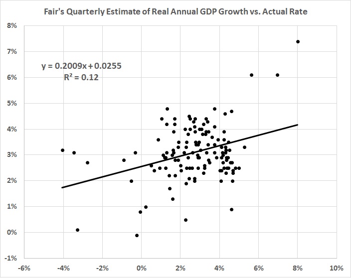
It fails the most important test; that is, it doesn’t reflect the downward trend in economic growth:
FIGURE 3

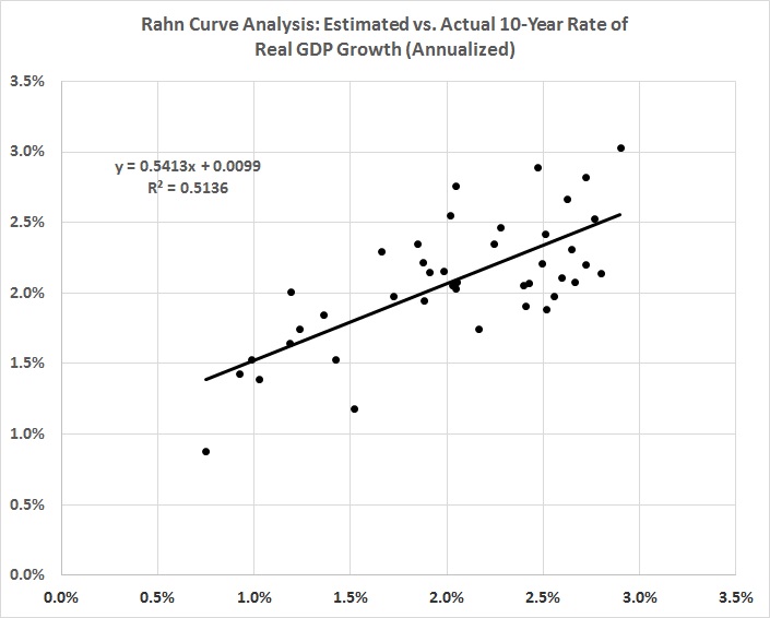
Could I do better? Well, I’ve done better — without knowing it until now — with the simple model that I devised to estimate the Rahn Curve. It’s described in “The Rahn Curve Revisited.” The following quotations and discussion draw on the October 20, 2016, version of that post:
The theory behind the Rahn Curve is simple — but not simplistic. A relatively small government with powers limited mainly to the protection of citizens and their property is worth more than its cost to taxpayers because it fosters productive economic activity (not to mention liberty). But additional government spending hinders productive activity in many ways, which are discussed in Daniel Mitchell’s paper, “The Impact of Government Spending on Economic Growth.” (I would add to Mitchell’s list the burden of regulatory activity, which grows even when government does not.)
. . . .
In an earlier post, I ventured an estimate of the Rahn curve that spanned most of the history of the United States. I came up with this relationship (terms modified for simplicity:
G = 0.054 -0.066F
To be precise, it’s the annualized rate of growth over the most recent 10-year span (G), as a function of F (fraction of GDP spent by governments at all levels) in the preceding 10 years. The relationship is lagged because it takes time for government spending (and related regulatory activities) to wreak their counterproductive effects on economic activity. Also, I include transfer payments (e.g., Social Security) in my measure of F because there’s no essential difference between transfer payments and many other kinds of government spending. They all take money from those who produce and give it to those who don’t (e.g., government employees engaged in paper-shuffling, unproductive social-engineering schemes, and counterproductive regulatory activities).
When F is greater than the amount needed for national defense and domestic justice — no more than 0.1 (10 percent of GDP) — it discourages productive, growth-producing, job-creating activity. And because government spending weighs most heavily on taxpayers with above-average incomes, higher rates of F also discourage saving, which finances growth-producing investments in new businesses, business expansion, and capital (i.e., new and more productive business assets, both physical and intellectual).
I’ve taken a closer look at the post-World War II numbers because of the marked decline in the rate of growth since the end of the war:
Here’s the revised result (with cosmetic changes in terminology):
G = 0.0275 -0.347F + 0.0769A – 0.000327R – 0.135P
Where,
G = real rate of GDP growth in a 10-year span (annualized)
F = fraction of GDP spent by governments at all levels during the preceding 10 years
A = the constant-dollar value of private nonresidential assets (business assets) as a fraction of GDP, averaged over the preceding 10 years
R = average number of Federal Register pages, in thousands, for the preceding 10-year period
P = growth in the CPI-U during the preceding 10 years (annualized).
The r-squared of the equation is 0.73 and the F-value is 2.00E-12. The p-values of the intercept and coefficients are 0.099, 1.75E-07, 1.96E-08, 8.24E-05, and 0.0096. The standard error of the estimate is 0.0051, that is, about half a percentage point. (Except for the p-value on the coefficient, the other statistics are improved from the previous version, which omitted CPI).
Here’s how the equations with and without P stack up against actual changes in 10-year rates of real GDP growth:
The equation with P captures the “bump” in 2000, and is generally (though not always) closer to the mark than the equation without P.
What does the new equation portend for the next 10 years? Based on the values of F, A, R, and P for the most recent 10-year period (2006-2015), the real rate of growth for the next 10 years will be about 1.9 percent. (It was 1.4 percent for the version of the equation without P.) The earlier equation (discussed above) yields an estimate of 2.9 percent. The new equation wins the reality test, as you can tell by the blue line in the second graph above.
In fact the year-over-year rates of real growth for the past four quarters (2015Q3 through 2016Q2) are 2.2 percent, 1.9 percent, 1.6 percent, and 1.3 percent. So an estimate of 1.9 percent for the next 10 years may be optimistic.


I took the data set that I used to estimate the new equation and made a series of out-of-sample estimates of growth over the next 10 years. I began with the data for 1946-1964 to estimate the growth for 1965-1974. I continued by taking the data for 1946-1965 to estimate the growth for 1966-1975, and so on, until I had estimated the growth for every 10-year period from 1965-1974 through 2006-2015. In other words, like Prof. Fair I updated my model to reflect new data, and I estimated the rate of economic growth in the future. How did I do? Here’s a first look:
FIGURE 4

The errors get larger with time, but they are far smaller than the errors in Fair’s model (see figure 1).
Not only that, but there’s a much better fit. Compare the following graph with figure 2:
FIGURE 5
Why do the errors in Fair’s model and mine increase with time? Probably of the erratic downward trend in economic growth, which Fair doesn’t capture in his estimates (see figure 3), but which is matched more closely by my estimates:
FIGURE 6

The moral of the story: It’s futile to build complex models of the economy. They can’t begin to capture the economy’s real complexity, and they’re likely to obscure the important variables — the ones that will determine the future course of economic growth.
A final note: In earlier posts I’ve disparaged economic aggregates, of which GDP is the apotheosis. And yet I’ve built this post around estimates of GDP. Am I contradicting myself?
Not really. There’s a rough consistency in measures of GDP across time, and I’m not pretending that GDP represents anything but an estimate of the monetary value of those products and services to which monetary values can be ascribed.
As a practical matter, then, if you’re a person who wants to know the likely future direction and value of GDP, stick with simple estimation techniques like the one I’ve demonstrated here. Don’t get bogged down in the inconclusive minutiae of a model like Prof. Fair’s.
