UPDATED AND EXTENDED, 11/01/18
There are lots of reasons to disbelieve in “climate change”, that is, a measurable and statistically significant influence of human activity on the “global” temperature. Many of the reasons can be found at my page on the subject — in the text, the list of related readings, and the list of related posts. Here’s the main one: Surface temperature data — the basis for the theory of anthropogenic global warming — simply do not support the theory.
As Dr. Tim Ball points out:
A fascinating 2006 paper by Essex, McKitrick, and Andresen asked, “Does a Global Temperature Exist.” Their introduction sets the scene,
It arises from projecting a sampling of the fluctuating temperature field of the Earth onto a single number (e.g. [3], [4]) at discrete monthly or annual intervals. Proponents claim that this statistic represents a measurement of the annual global temperature to an accuracy of ±0.05 ◦C (see [5]). Moreover, they presume that small changes in it, up or down, have direct and unequivocal physical meaning.
The word “sampling” is important because, statistically, a sample has to be representative of a population. There is no way that a sampling of the “fluctuating temperature field of the Earth,” is possible….
… The reality is we have fewer stations now than in 1960 as NASA GISS explain (Figure 1a, # of stations and 1b, Coverage)….
Not only that, but the accuracy is terrible. US stations are supposedly the best in the world but as Anthony Watt’s project showed, only 7.9% of them achieve better than a 1°C accuracy. Look at the quote above. It says the temperature statistic is accurate to ±0.05°C. In fact, for most of the 406 years when instrumental measures of temperature were available (1612), they were incapable of yielding measurements better than 0.5°C.
The coverage numbers (1b) are meaningless because there are only weather stations for about 15% of the Earth’s surface. There are virtually no stations for
- 70% of the world that is oceans,
- 20% of the land surface that are mountains,
- 20% of the land surface that is forest,
- 19% of the land surface that is desert and,
- 19% of the land surface that is grassland.
The result is we have inadequate measures in terms of the equipment and how it fits the historic record, combined with a wholly inadequate spatial sample. The inadequacies are acknowledged by the creation of the claim by NASA GISS and all promoters of anthropogenic global warming (AGW) that a station is representative of a 1200 km radius region.
I plotted an illustrative example on a map of North America (Figure 2).
Figure 2
Notice that the claim for the station in eastern North America includes the subarctic climate of southern James Bay and the subtropical climate of the Carolinas.
However, it doesn’t end there because this is only a meaningless temperature measured in a Stevenson Screen between 1.25 m and 2 m above the surface….
The Stevenson Screen data [are] inadequate for any meaningful analysis or as the basis of a mathematical computer model in this one sliver of the atmosphere, but there [are] even less [data] as you go down or up. The models create a surface grid that becomes cubes as you move up. The number of squares in the grid varies with the naïve belief that a smaller grid improves the models. It would if there [were] adequate data, but that doesn’t exist. The number of cubes is determined by the number of layers used. Again, theoretically, more layers would yield better results, but it doesn’t matter because there are virtually no spatial or temporal data….
So far, I have talked about the inadequacy of the temperature measurements in light of the two- and three-dimensional complexities of the atmosphere and oceans. However, one source identifies the most important variables for the models used as the basis for energy and environmental policies across the world.
“Sophisticated models, like Coupled General Circulation Models, combine many processes to portray the entire climate system. The most important components of these models are the atmosphere (including air temperature, moisture and precipitation levels, and storms); the oceans (measurements such as ocean temperature, salinity levels, and circulation patterns); terrestrial processes (including carbon absorption, forests, and storage of soil moisture); and the cryosphere (both sea ice and glaciers on land). A successful climate model must not only accurately represent all of these individual components, but also show how they interact with each other.”
The last line is critical and yet impossible. The temperature data [are] the best we have, and yet [they are] completely inadequate in every way. Pick any of the variables listed, and you find there [are] virtually no data. The answer to the question, “what are we really measuring,” is virtually nothing, and what we measure is not relevant to anything related to the dynamics of the atmosphere or oceans.

I am especially struck by Dr. Ball’s observation that the surface-temperature record applies to about 15 percent of Earth’s surface. Not only that, but as suggested by Dr. Ball’s figure 2, that 15 percent is poorly sampled.
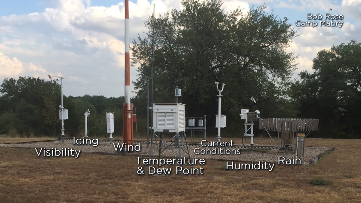
Take the National Weather Service station for Austin, Texas, which is located 2.7 miles from my house. The station is on the grounds of Camp Mabry, a Texas National Guard base near the center of Austin, the fastest-growing large city in the U.S. The base is adjacent to a major highway (Texas Loop 1) that traverses Austin. The weather station is about 1/4 mile from the highway,100 feet from a paved road on the base, and near a complex of buildings and parking areas.
Here’s a ground view of the weather station:
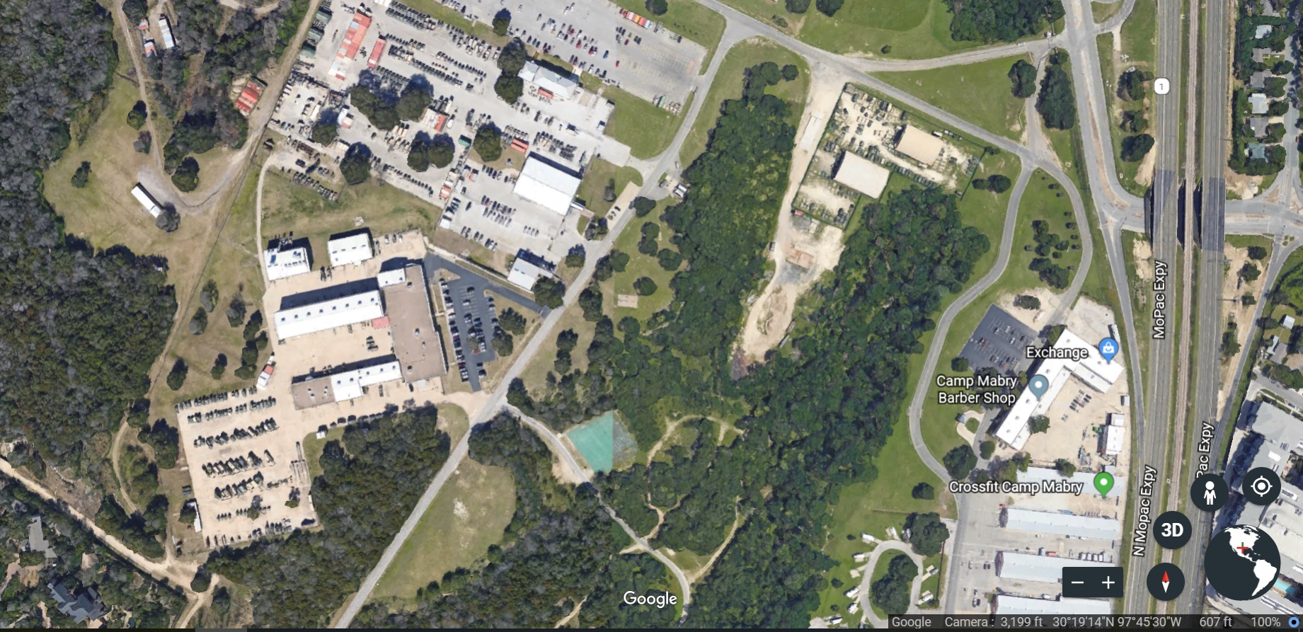
And here’s an aerial view; the weather station is the tan rectangle at the center of the photo:
As I have shown elsewhere, the general rise in temperatures recorded at the weather station over the past several decades is fully explained by the urban-heat-island effect due to the rise in Austin’s population during those decades.
Further, there is a consistent difference in temperature and rainfall between my house and Camp Mabry. My house is located farther from the center of Austin — northwest of Camp Mabry — in a topographically different area. The topography in my part of Austin is typical of the Texas Hill Country, which begins about a mile east of my house and covers a broad swath of land stretching as far as 250 miles from Austin.
The contrast is obvious in the next photo. Camp Mabry is at the “1” (for Texas Loop 1) near the lower edge of the image. Topographically, it belongs with the flat part of Austin that lies mostly east of Loop 1. It is unrepresentative of the huge chunk of Austin and environs that lies to its north and west.

Getting down to cases. I observed that in the past summer, when daily highs recorded at Camp Mabry hit 100 degrees or more 52 times, the daily high at my house reached 100 or more only on the handful of days when it reached 106-110 at Camp Mabry. That’s consistent with another observation; namely, that the daily high at my house is generally 6 degrees lower than the daily high at Camp Mabry when it is above 90 degrees there.
As for rainfall, my house seems to be in a different ecosystem than Camp Mabry’s. Take September and October of this year: 15.7 inches of rain fell at Camp Mabry, as against 21.0 inches at my house. The higher totals at my house are typical, and are due to a phenomenon called orographic lift. It affects areas to the north and west of Camp Mabry, but not Camp Mabry itself.
So the climate at Camp Mabry is not my climate. Nor is the climate at Camp Mabry typical of a vast area in and around Austin, despite the use of Camp Mabry’s climate to represent that area.
There is another official weather station at Austin-Bergstrom International Airport, which is in the flatland 9.5 miles to the southeast of Camp Mabry. Its rainfall total for September and October was 12.8 inches — almost 3 inches less than at Camp Mabry — but its average temperatures for the two months were within a degree of Camp Mabry’s. Suppose Camp Mabry’s weather station went offline. The weather station at ABIA would then record temperatures and precipitation even less representative of those at my house and similar areas to the north and west.
Speaking of precipitation — it is obviously related to cloud cover. The more it rains, the cloudier it will be. The cloudier it is, the lower the temperature, other things being the same (e.g., locale). This is true for Austin:
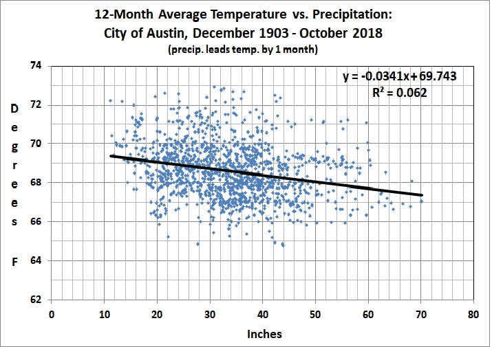
The correlation coefficient is highly significant, given the huge sample size. Note that the relationship is between precipitation in a given month and temperature a month later. Although cloud cover (and thus precipitation) has an immediate effect on temperature, precipitation has a residual effect in that wet ground absorbs more solar radiation than dry ground, so that there is less heat reflected from the ground to the air. The lagged relationship is strongest at 1 month, and considerably stronger than any relationship in which temperature leads precipitation.
I bring up this aspect of Austin’s climate because of a post by Anthony Watts (“Data: Global Temperatures Fell As Cloud Cover Rose in the 1980s and 90s“, Watts Up With That?, November 1, 2018):
I was reminded about a study undertaken by Clive Best and Euan Mearns looking at the role of cloud cover four years ago:
Clouds have a net average cooling effect on the earth’s climate. Climate models assume that changes in cloud cover are a feedback response to CO2 warming. Is this assumption valid? Following a study withEuan Mearns showing a strong correlation in UK temperatures with clouds, we looked at the global effects of clouds by developing a combined cloud and CO2 forcing model to sudy how variations in both cloud cover [8] and CO2 [14] data affect global temperature anomalies between 1983 and 2008. The model as described below gives a good fit to HADCRUT4 data with a Transient Climate Response (TCR )= 1.6±0.3°C. The 17-year hiatus in warming can then be explained as resulting from a stabilization in global cloud cover since 1998. An excel spreadsheet implementing the model as described below can be downloaded from http://clivebest.com/GCC.
The full post containing all of the detailed statistical analysis is here.
But this is the key graph:
Figure 1a showing the ISCCP global averaged monthly cloud cover from July 1983 to Dec 2008 over-laid in blue with Hadcrut4 monthly anomaly data. The fall in cloud cover coincides with a rapid rise in temperatures from 1983-1999. Thereafter the temperature and cloud trends have both flattened. The CO2 forcing from 1998 to 2008 increases by a further ~0.3 W/m2 which is evidence that changes in clouds are not a direct feedback to CO2 forcing.
In conclusion, natural cyclic change in global cloud cover has a greater impact on global average temperatures than CO2. There is little evidence of a direct feedback relationship between clouds and CO2. Based on satellite measurements of cloud cover (ISCCP), net cloud forcing (CERES) and CO2 levels (KEELING) we developed a model for predicting global temperatures. This results in a best-fit value for TCR = 1.4 ± 0.3°C. Summer cloud forcing has a larger effect in the northern hemisphere resulting in a lower TCR = 1.0 ± 0.3°C. Natural phenomena must influence clouds although the details remain unclear, although the CLOUD experiment has given hints that increased fluxes of cosmic rays may increase cloud seeding [19]. In conclusion, the gradual reduction in net cloud cover explains over 50% of global warming observed during the 80s and 90s, and the hiatus in warming since 1998 coincides with a stabilization of cloud forcing.
Why there was a decrease in cloud cover is another question of course.
In addition to Paul Homewood’s piece, we have this WUWT story from 2012:
Spencer’s posited 1-2% cloud cover variation found
A paper published last week finds that cloud cover over China significantly decreased during the period 1954-2005. This finding is in direct contradiction to the theory of man-made global warming which presumes that warming allegedly from CO2 ‘should’ cause an increase in water vapor and cloudiness. The authors also find the decrease in cloud cover was not related to man-made aerosols, and thus was likely a natural phenomenon, potentially a result of increased solar activity via the Svensmark theory or other mechanisms.

Case closed. (Not for the first time.)
