Griffey and Piazza: True Hall-of-Famers or Not?

Ken Griffey Jr. and Mike Piazza have just been voted into baseball’s Hall of Fame.

Griffey belongs there. Follow this link and you’ll see, in the first table, that he’s number 45 on the list of offensive players whom I consider deserving of the honor.

Piazza doesn’t belong there. He falls short of the 8,000 plate appearances (or more) that I would require to prove excellence over a sustained span. Piazza would be a true Hall of Famer if I relaxed the standard to 7,500 plate appearances, but what’s the point of having standards if they can be relaxed just to reward popularity (or mediocrity)?


Back to Baseball

In “Does Velocity Matter?” I diagnosed the factors that account for defensive success or failure, as measured by runs allowed per nine innings of play. There’s a long list of significant variables: hits, home runs, walks, errors, wild pitches, hit batsmen, and pitchers’ ages. (Follow the link for the whole story.)

What about offensive success or failure? It turns out that it depends on fewer key variables, though there is a distinct difference between the “dead ball” era of 1901-1919 and the subsequent years of 1920-2015. Drawing on statistics available at Baseball-Reference.com. I developed several regression equations and found three of particular interest:

  • Equation 1 covers the entire span from 1901 through 2015. It’s fairly good for 1920-2015, but poor for 1901-1919.
  • Equation 2 covers 1920-2015, and is better than Equation 1 for those years. I also used it for backcast scoring in 1901-1919 — and it’s worse than equation 1.
  • Equation 5 gives the best results for 1901-1919. I also used it to forecast scoring in 1920-2015, and it’s terrible for those years.

This graph shows the accuracy of each equation:

Estimation errors as a percentage of runs scored

Unsurprising conclusion: Offense was a much different thing in 1901-1919 than in subsequent years. And it was a simpler thing. Here’s Equation 5, for 1901-1919:

RS9 = -5.94 + BA(29.39) + E9(0.96) + BB9(0.27)

Where 9 stands for “per 9 innings” and
RS = runs scored
BA = batting average
E9 = errors committed
BB = walks

The adjusted r-squared of the equation is 0.971; the f-value is 2.19E-12 (a very small probability that the equation arises from chance). The p-values of the constant and the first two explanatory variables are well below 0.001; the p-value of the third explanatory variable is 0.01.

In short, the name of the offensive game in 1901-1919 was getting on base. Not so the game in subsequent years. Here’s Equation 2, for 1920-2015:

RS9 = -4.47 + BA(25.81) + XBH(0.82) + BB9(0.30) + SB9(-0.21) + SH9(-0.13)

Where 9, RS, BA, and BB are defined as above and
XBH = extra-base hits
SB = stolen bases
SH = sacrifice hits (i.e., sacrifice bunts)

The adjusted r-squared of the equation is 0.974; the f-value is 4.73E-71 (an exceedingly small probability that the equation arises from chance). The p-values of the constant and the first four explanatory variables are well below 0.001; the p-value of the fifth explanatory variable is 0.03.

In other words, get on base, wait for the long ball, and don’t make outs by trying to steal or bunt the runner(s) along,.

Does Velocity Matter?

I came across some breathless prose about the rising trend in the velocity of pitches. (I’m speaking of baseball, in case you didn’t know. Now’s your chance to stop reading.) The trend, such as it is, dates to 2007, when the characteristics of large samples of pitches began to be recorded. (The statistics are available here.) What does the trend look like? The number of pitchers in the samples varies from 77 to 94 per season. I computed three trends for the velocity of fastballs: one for the top 50 pitchers in each season, one for the top 75 pitchers in each season, and one for each season’s full sample:

Pitching velocity trends

Assuming that the trend is real, what difference does it make to the outcome of play? To answer that question I looked at the determinants of runs allowed per 9 innings of play from 1901 through 2015, drawing on statistics available at Baseball-Reference.com. I winnowed the statistics to obtain three equations with explanatory variables that pass the sniff test:*

  • Equation 5 covers the post-World War II era (1946-2015). I used it for backcast estimates of runs allowed in each season from 1901 through 1945.
  • Equation 7 covers the entire span from 1901 through 2015.
  • Equation 8 covers the pre-war era (1901-1940). I used it to forecast estimates of runs allowed in each season from 1941 through 2015.

This graph shows the accuracy of each equation:

Estimation errors as perentage of runs allowed

Equation 7, even though it spans vastly different baseball eras, is as good as or better than equations 5 and 8, even though they’re tailored to their eras. Here’s equation 7:

RA9 = -5.01 + H9(0.67) + HR9(0.73) + BB9(0.32) + E9(0.60) + WP9(0.69) + HBP9(0.51) + PAge(0.03)

Where 9 stands for “per 9 innings” and
RA = runs allowed
H = hits allowed
HR = home runs allowed
BB = bases on balls allowed
E = errors committed
WP = wild pitches
HBP = batters hit by pitches
PAge = average age of pitchers

The adjusted r-squared of the equation is 0.988; the f-value is 7.95E-102 (a microscopically small probability that the equation arises from chance). See the first footnote regarding the p-values of the explanatory variables.

What does this have to do with velocity? Let’s say that velocity increased by 1 mile an hour between 2007 and 2015 (see chart above). The correlations for 2007-2015 between velocity and the six pitcher-related variables (H, HR, BB, WP, HBP, and PAge), though based on small samples, are all moderately strong to very strong (r-squared values 0.32 to 0.83). The combined effects of an increase in velocity of 1 mile an hour on those six variables yield an estimated decrease in RA9 of 0.74. The actual decrease from 2007 to 2015, 0.56, is close enough that I’m inclined to give a lot of credit to the rise in velocity.**

What about the long haul? Pitchers have been getting bigger and stronger — and probably faster — for decades. The problem is that a lot of other things have been changing for decades: the baseball, gloves, ballparks, the introduction of night games, improvements in lighting, an influx of black and Latin players, variations in the size of the talent pool relative to the number of major-league teams, the greater use of relief pitchers generally and closers in particular, the size and strength of batters, the use of performance-enhancing drugs, and so on. Though I would credit the drop in RA9 to a rise in velocity over a brief span of years — during which the use of PEDs probably declined dramatically — I won’t venture a conclusion about the long haul.
_________
* I looked for equations where explanatory variables have intuitively correct signs (e.g., runs allowed should be positively related to walks) and low p-values (i.e., low probability of inclusion by chance). The p-values for the variables in equation 5 are all below 0.01; for equation 7 the p-values all are below 0.001. In the case of equation 8, I accepted two variables with p-values greater than 0.01 but less than 0.10.

** It’s also suggestive that the relationship between velocity and the equation 7 residuals for 2007-2015 is weak and statistically insignificant. This could mean that the effects of velocity are adequately reflected in the coefficients on the pitcher-related variables.

The Yankees vs. the Rest of the American League

No one doubts that the Yankees have been the dominant team in the history of American League. Just how dominant? An obvious measure is the percentage of league championships won by the Yankees: 35 percent (40 of the 114) in the 1901-2015 seasons (no champion was declared for the 1994 season, which ended before post-season play could begin). More compellingly, the Yankees won 45 percent of the championships from their first in 1921 through their last in 2009, and 43 percent since their first in 1921.

Of course, not all championships are created equal. From 1901 through 1960 there were 8 teams in the American League, and the team with the best winning percentage in a season was the league’s champion for that season. The same arrangement prevailed during 1961-1968, when there were 10 teams in the league. After that there were two 6-team divisions (1969-1976), two 7-team divisions (1997-1993), three divisions of 5, 5, and 4 teams each (1994-2012), and three 5-team divisions (2013 to the present).

Since the creation of divisions, league champions have been determined by post-season playoffs involving division champions and, since 1994, wild-card teams (one such team in 1994-2011 and two such teams since 2012). Post-season playoffs often result in the awarding of the league championship to a team that didn’t have the best record in that season. (See this post, for example.) A division championship, on the other hand, is (by definition) awarded to the team with the division’s best record in that season.

Here’s how I’ve dealt with this mess:

The team with the league’s best record in 1901-1960 gets credit for 1 championship (pennant).

The team with the league’s best record in 1961-1968 gets credit for 1.25 pennants because the league had 1.25 (10/8) as many teams in 1961-1968 than in 1901-1960.

Similarly, the team with the best record in its division from 1969-2015 gets credit for the number of teams in its division divided by 8. Thus a division winner in the era of 6-team divisions gets credit for 0.750 (6/8) pennant; a division winner in the era of 7-team divisions gets credit for 0.875 (7/8) pennant,; and a division winner in the era of 4-team and 5-team divisions gets credit for 0.500 (4/8) pennant or 0.625 (5/8) pennant.

The Yankees, for example,won 25 pennants in 1901-1960, each valued at 1; 4 pennants in 1961-1968, each valued at 1.25; a division championship in 1969-1976, valued at 0.75; and 14 division championships in 1977-2015, each valued at 0.625. That adds to 43-pennant equivalents in 115 seasons (1994 counts under this method). That’s 0.374 pennant-equivalents per season of the Yankees’ existence (including 1901-1902, when the predecessor franchise was located in Baltimore and the several seasons when the team was known as the New York Highlanders).

I computed the same ratio for the other American League teams, including the Brewers — who entered in 1969 (as the Seattle Pilots) and moved to the National League after the 1997 season — and the Astros — who moved from the National League 2013. Here’s how the 16 franchises stack up:

Pennant-equivalents per season

The Red Sox, despite the second-best overall W-L record, have the fifth-best pennant-equivalents/season record; they have had the misfortune of playing in the same league and same division as the Yankees for 115 years. The Athletics, on the other hand, escaped the shadow of the Yankees in 1969 — when divisional play began — and have made the most of it.

There are many other stories behind the numbers. Ask, and I will tell them.

Mister Hockey, R.I.P.

Gordie Howe, the greatest goal-scorer in NHL history, has died at the age of 88. It was my privilege to watch Howe in action during the several years when I lived within range of the WXYZ, the Detroit TV station whose play-by-play announcer was Budd Lynch.

Why do I say that Howe was the greatest goal-scorer? Wayne Gretzky scored more career goals than Howe, and had nine seasons in which his goal-scoring surpassed Howe’s best season. I explained it 10 years ago. The rest of this post is a corrected version of the original.

Wayne (The Great One) Gretzky holds the all-time goal-scoring record for major-league hockey:

  • 894 goals in 1,487 regular-season games in the National Hockey League (1979-80 season through 1998-99 season)
  • Another 46 regular-season goals in the 80 games he played in the World Hockey Association (1978-79 season)
  • A total of 940 goals in 1,567 games, or 0.600 goals per game.

The raw numbers suggest that Gretzky far surpassed Gordie (Mr. Hockey) Howe, who finished his much longer career with the following numbers:

  • 801 regular-season goals in 1,767 NHL games (1946-47 through 1970-71 and 1979-80)
  • Another 174 goals and 419 games in the WHA (1973-74 through 1978-79)
  • A total of 975 goals in 2,186 games, or 0.446 goals per game.

That makes Gretzky the greater goal scorer, eh? Not so fast. Comparing Gretzky’s raw numbers with those of Howe is like comparing Pete Rose’s total base hits (4,256) with Ty Cobb’s (4,189), without mentioning that Rose compiled his hits in far more at-bats (14,053) than Cobb (11,434). Thus Cobb’s lifetime average of .366 far surpasses Rose’s average of .303. Moreover, Cobb compiled his higher average in an era when batting averages were generally lower than they were in Rose’s era.

Similarly, Howe scored most of his goals in an era when the average team scored between 2.5 and 3 goals a game; Gretzky scored most of his goals in an era when the average team scored between 3.5 and 4 goals a game. The right way to compare Gretzky and Howe’s goal-scoring prowess is to compare the number of goals they scored in each season to the average output of a team in that season. This following graph does just that.

Howe vs. Gretzky
Sources: Howe’s season-by-season statistics; Gretzky’s season-by-season statistics; gateway to NHL and WHA season-by-season league statistics.

Gretzky got off to a faster start than Howe, but Howe had the better record from age 24 onward. Gretzky played 20 NHL seasons, the first ending when he was 19 years old and the last ending when he was 38 years old. Over the comparable 20-season span, Howe scored 4.3 percent more adjusted goals than did Gretzky. Moreover, Howe’s adjusted-goal total for his entire NHL-WHA career (32 seasons) exceeds Gretzky’s (21 seasons) by 43 percent. Howe not only lasted longer, but his decline was more gradual than Gretzky’s.

And Howe — unlike Gretzky — played an all-around game. He didn’t need an enforcer for protection; he was his own enforcer, as many an opponent learned the hard way.

Gordie Howe was not only Mister Hockey, he was also Mister Goal Scorer. “No doot aboot it.”

With Gordie Howe and Ty Cobb, Detroit’s major-league hockey and baseball franchises can claim the greatest players of their respective sports.

A Rather Normal Distribution

I found a rather normal distribution from the real world — if you consider major-league baseball to be part of the real world. In a recent post I explained how I normalized batting statistics for the 1901-2015 seasons, and displayed the top-25 single-season batting averages, slugging percentages, and on-base-plus-slugging percentages after normalization.

I have since discovered that the normalized single-season batting averages for 14,067 player-seasons bear a strong resemblance to a textbook normal distribution:

Distribution of normalized single-season batting averrages

How close is this to a textbook normal distribution? Rather close, as measured by the percentage of observations that are within 1, 2, 3, and 4 standard deviations from the mean:

Distribution of normalized single-season batting averrages_table

Ty Cobb not only compiled the highest single-season average (4.53 SD above the mean) but 5 of the 12 single-season averages more than 4 SD above the mean:

Ty Cobb's normalized single-season batting_SD from mean

Cobb’s superlative performances in the 13-season span from 1907 through 1919 resulted in 12 American League batting championships. (The unofficial number has been reduced to 11 because it was later found that Cobb actually lost the 1910 title by a whisker — .3834 to Napoleon Lajoie’s .3841.)

Cobb’s normalized batting average for his worst full season (1924) is better than 70 percent of the 14,067 batting averages compiled by full-time players in the 115 years from 1901 through 2015. And getting on base was only part of what made Cobb the greatest player of all time.

Baseball’s Greatest and Worst Teams

When talk turns to the greatest baseball team of all time, most baseball fans will nominate the 1927 New York Yankees. Not only did that team post a won-lost record of 110-44, for a W-L percentage of .714, but its roster featured several future Hall-of-Famers: Babe Ruth, Lou Gehrig, Herb Pennock, Waite Hoyt, Earl Combs, and Tony Lazzeri. As it turns out, the 1927 Yankees didn’t have the best record in “modern” baseball, that is, since the formation of the American League in 1901. Here are the ten best seasons (all above .700), ranked by W-L percentage:

Team Year G W L W-L%
Cubs 1906 155 116 36 .763
Pirates 1902 142 103 36 .741
Pirates 1909 154 110 42 .724
Indians 1954 156 111 43 .721
Mariners 2001 162 116 46 .716
Yankees 1927 155 110 44 .714
Yankees 1998 162 114 48 .704
Cubs 1907 155 107 45 .704
Athletics 1931 153 107 45 .704
Yankees 1939 152 106 45 .702

And here are the 20 worst seasons, all below .300:

Team Year G W L W-L%
Phillies 1945 154 46 108 .299
Brown 1937 156 46 108 .299
Phillies 1939 152 45 106 .298
Browns 1911 152 45 107 .296
Braves 1909 155 45 108 .294
Braves 1911 156 44 107 .291
Athletics 1915 154 43 109 .283
Phlllies 1928 152 43 109 .283
Red Sox 1932 154 43 111 .279
Browns 1939 156 43 111 .279
Phillies 1941 155 43 111 .279
Phillies 1942 151 42 109 .278
Senators 1909 156 42 110 .276
Pirates 1952 155 42 112 .273
Tigers 2003 162 43 119 .265
Athletics 1919 140 36 104 .257
Senators 1904 157 38 113 .252
Mets 1962 161 40 120 .250
Braves 1935 153 38 115 .248
Athletics 1916 154 36 117 .235

But it takes more than a season, or even a few of them, to prove a team’s worth. The following graphs depict the best records in the American and National Leagues over nine-year spans:

Centered nine-year W-L record, best AL

Centered nine-year W-L record, best NL

For sustained excellence over a long span of years, the Yankees are the clear winners. Moreover, the Yankees’ best nine-year records are centered on 1935 and 1939. In the nine seasons centered on 1935 — namely 1931-1939 — the Yankees compiled a W-L percentage of .645. In those nine seasons, the Yankees won five American League championships and as many World Series. The Yankees compiled a barely higher W-L percentage of .646 in the nine seasons centered on 1939 — 1935-1943. But in those nine seasons, the Yankees won the American League championship seven times — 1936, 1937, 1938, 1939, 1941, 1942, and 1943 — and the World Series six times (losing to the Cardinals in 1942).

Measured by league championships, the Yankees compiled better nine-year streaks, winning eight pennants in 1949-1957, 1950-1958, and 1955-1963. But for sheer, overall greatness, I’ll vote for the Yankees of the 1930s and early 1940s. Babe Ruth graced the Yankees through 1934, and the 1939 team (to pick one) included future Hall-of-Famers Bill Dickey, Joe Gordon, Joe DiMaggio, Lou Gehring (in his truncated final season), Red Ruffing, and Lefty Gomez.

Here are the corresponding worst nine-year records in the two leagues:

Centered nine-year W-L record, worst AL

Centered nine-year W-L record, worst NL

The Phillies — what a team! The Phillies, Pirates, and Cubs should have been demoted to Class D leagues.

What’s most interesting about the four graphs is the general decline in the records of the best teams and the general rise in the records of the worst teams. That’s a subject for another post.

Great (Batting) Performances

The normal values of batting average (BA), slugging percentage (SLG), and on-base plus slugging (OPS) have fluctuated over time:

Average major league batting statistics_1901-2015

In sum, no two seasons are alike, and some are vastly different from others. To level the playing field (pun intended), I did the following:

  • Compiled single-season BA, SLG, and OPS data for all full-time batters (those with enough times at bat in a season to qualify for the batting title) from 1901 through 2015 — a total of 14,067 player-seasons. (Source: the Play Index at Baseball-Reference.com.)
  • Normalized (“normed”) each season’s batting statistics to account for inter-seasonal differences. For example, a batter whose BA in 1901 was .272 — the overall average for that year — is credited with the same average as a batter whose BA in 1902 was .267 — the overall average for that year.
  • Ranked the normed values of BA, SLG, and OPS for those 14,067 player-seasons.

I then sorted the rankings to find the top 25 player-seasons in each category:

Top-25 single-season offensive records

I present all three statistics because they represent different aspects of offensive prowess. BA was the most important of the three statistics until the advent of the “lively ball” era in 1919. Accordingly, the BA list is dominated by seasons played before that era, when the name of the game was “small ball.” The SLG and OPS lists are of course dominated by seasons played in the lively ball era.

Several seasons compiled by Barry Bonds and Mark McGwire showed up in the top-25 lists that I presented in an earlier post. I have expunged those seasons because of the dubious nature of Bonds’s and McGwire’s achievements.

The preceding two paragraphs lead to the question of the commensurability (or lack thereof) of cross-temporal statistics. This is from the earlier post:

There are many variations in the conditions of play that have resulted in significant changes in offensive statistics. Among those changes are the use of cleaner and more tightly wound baseballs, the advent of night baseball, better lighting for night games, bigger gloves, lighter bats, bigger and stronger players, the expansion of the major leagues in fits and starts, the size of the strike zone, the height of the pitching mound, and — last but far from least in this list — the integration of black and Hispanic players into major league baseball. In addition to these structural variations, there are others that mitigate against the commensurability of statistics over time; for example, the rise and decline of each player’s skills, the skills of teammates (which can boost or depress a player’s performance), the characteristics of a player’s home ballpark (where players generally play half their games), and the skills of the opposing players who are encountered over the course of a career.

Despite all of these obstacles to commensurability, the urge to evaluate the relative performance of players from different teams, leagues, seasons, and eras is irrepressible. Baseball-Reference.com is rife with such evaluations; the Society for American Baseball Research (SABR) revels in them; many books offer them (e.g., this one); and I have succumbed to the urge more than once.

It is one thing to have fun with numbers. It is quite another thing to ascribe meanings to them that they cannot support.

And yet, it seems right that the top 25 seasons should include so many of Ty Cobb’s, Babe Ruth’s, and of their great contemporaries Jimmie Foxx, Lou Gehrig, Rogers Hornsby, Shoeless Joe Jackson, Nap Lajoie, Tris Speaker, George Sisler, and Honus Wagner. It signifies the greatness of the later players who join them on the lists: Hank Aaron, George Brett, Rod Carew, Roberto Clemente, Mickey Mantle, Willie McCovey, Stan Musial, Frank Thomas, and Ted Williams.

Cobb’s dominance of the BA leader-board merits special attention. Cobb holds 9 of the top 19 slots on the BA list. That’s an artifact of his reign as the American League’s leading hitter in 12 of the 13 seasons from 1907 through 1919. But there was more to Cobb than just “hitting it where they ain’t.” Cobb probably was the most exciting ball player of all time, because he was much more than a hitting machine.

Charles Leershen offers chapter and verse about Cobb’s prowess in his book Ty Cobb: A Terrible Beauty. Here are excerpts of Leershen’s speech “Who Was Ty Cobb? The History We Know That’s Wrong,” which is based on his book:

When Cobb made it to first—which he did more often than anyone else; he had three seasons in which he batted over .400—the fun had just begun. He understood the rhythms of the game and he constantly fooled around with them, keeping everyone nervous and off balance. The sportswriters called it “psychological baseball.” His stated intention was to be a “mental hazard for the opposition,” and he did this by hopping around in the batter’s box—constantly changing his stance as the pitcher released the ball—and then, when he got on base, hopping around some more, chattering, making false starts, limping around and feigning injury, and running when it was least expected. He still holds the record for stealing home, doing so 54 times. He once stole second, third, and home on three consecutive pitches, and another time turned a tap back to the pitcher into an inside-the-park home run.

“The greatness of Ty Cobb was something that had to be seen,” George Sisler said, “and to see him was to remember him forever.” Cobb often admitted that he was not a natural, the way Shoeless Joe Jackson was; he worked hard to turn himself into a ballplayer. He had nine styles of slides in his repertoire: the hook, the fade-away, the straight-ahead, the short or swoop slide (“which I invented because of my small ankles”), the head-first, the Chicago slide (referred to by him but never explained), the first-base slide, the home-plate slide, and the cuttle-fish slide—so named because he purposely sprayed dirt with his spikes the way squid-like creatures squirt ink. Coming in, he would watch the infielder’s eyes to determine which slide to employ.

There’s a lot more in the book, which I urge you to read — especially if you’re a baseball fan who appreciates snappy prose and documented statements (as opposed to the myths that have grown up around Cobb).

Cobb’s unparalleled greatness was still fresh in the minds of baseball people in 1936, when the first inductees to baseball’s Hall of Fame were elected. It was Cobb — not Babe Ruth — who received the most votes among the five players selected for membership in the Hall.

Yankee-Killers (and Victims)

The New York Yankees won 40 American League championships in the 89 years from 1921 through 2009, and compiled a .585 record over that span (including inter-league games and games against American League expansion franchises). Here’s how Yankees teams fared against traditional rivals in that span:

Yankees vs. traditional rivals

The Yankees’ traditional rivals won 40 league championships altogether. Only the Athletics managed to win more championships (9) to the Tigers’ 7 during the 89-year span. The Orioles/Browns also won 7, followed by the Red Sox and Twin/Senators with 6 each, the Indians with 3, and the White Sox with 2.  Expansion franchises won the other 9 championships.

Fittingly, the Tigers’ Frank Lary was the leading Yankee-killer among pitchers who had at least 20 decisions against the Yankees during 1921-2009:

Pitchers vs. Yankees

All statistics presented in this post are derived from Baseball-Reference.com and that site’s Play Index (a subscription service).

*     *     *

Some related posts:

The Hall of Fame Reconsidered

Baseball Trivia for the Fourth of July

All-Time Hitter-Friendly Ballparks

May the Best Team Lose

Competitiveness in Major-League Baseball

Baseball: The King of Team Sports

The End of a Dynasty (the Yankees’ dynasty, that is; updated here)

What Makes a Winning Team?

The American League’s Greatest Hitters: Part II (with a link to Part I)

The Winningest Managers

Ty Cobb and the State of Science

This post was inspired by “Layman’s Guide to Understanding Scientific Research” at bluebird of bitterness.

The thing about history is that it’s chock full of lies. Well, a lot of the lies are just incomplete statements of the truth. Think of history as an artificially smooth surface, where gaps in knowledge have been filled by assumptions and guesses, and where facts that don’t match the surrounding terrain have been sanded down. Charles Leershen offers an excellent example of the lies that became “history” in his essay “Who Was Ty Cobb? The History We Know That’s Wrong.” (I’m now reading the book on which the essay is based, and it tells the same tale, at length.)

Science is much like history in its illusory certainty. Stand back from things far enough and you see a smooth, mathematical relationship. Look closer, however, and you find rough patches. A classic example is found in physics, where the big picture of general relativity doesn’t mesh with the small picture of quantum mechanics.

Science is based on guesses, also known as hypotheses. The guesses are usually informed by observation, but they are guesses nonetheless. Even when a guess has been lent credence by tests and observations, it only becomes a theory — a working model of a limited aspect of physical reality. A theory is never proven; it can only be disproved.

Science, in other words, is never “settled.” Napoleon is supposed to have said “What is history but a fable agreed upon?” It seems, increasingly, that so-called scientific facts are nothing but a fable that some agree upon because they wish to use those “facts” as a weapon with which to advance their careers and political agendas. Or they simply wish to align themselves with the majority, just as Barack Obama’s popularity soared (for a few months) after he was re-elected.

*     *     *

Related reading:

Wikipedia, “Replication Crisis

John P.A. Ionnidis, “Why Most Published Research Findings Are False,” PLOS Medicine, August 30, 2005

Liberty Corner, “Science’s Anti-Scientific Bent,” April 12, 2006

Politics & Prosperity, “Modeling Is Not Science,” April 8, 2009

Politics & Prosperity, “Physics Envy,” May 26, 2010

Politics & Prosperity, “Demystifying Science,” October 5, 2011 (also see the long list of related posts at the bottom)

Politics & Prosperity, “The Science Is Settled,” May 25, 2014

Politics & Prosperity, “The Limits of Science, Illustrated by Scientists,” July 28, 2014

Steven E. Koonin, “Climate Science Is Not Settled,” WSJ.com, September 19, 2014

Joel Achenbach, “No, Science’s Reproducibility Problem Is Not Limited to Psychology,” The Washington Post, August 28, 2015

William A. Wilson, “Scientific Regress,” First Things, May 2016

Jonah Goldberg, “Who Are the Real Deniers of Science?AEI.org, May 20, 2016

Steven Hayward, “The Crisis of Scientific Credibility,” Power Line, May 25, 2016

There’s a lot more here.

The Hall of Fame Reconsidered

Several years ago I wrote some posts (e.g., here and here) about the criteria for membership in baseball’s Hall of Fame, and named some players who should and shouldn’t be in the Hall. A few days ago I published an updated version of my picks. I’ve since deleted that post because, on reflection, I find my criteria too narrow. I offer instead:

  • broad standards of accomplishment that sweep up most members of the Hall who have been elected as players
  • ranked lists of players who qualify for consideration as Hall of Famers, based on those standards.

These are the broad standards of accomplishment for batters:

  • at least 8,000 plate appearances (PA) — a number large enough to indicate that a player was good enough to have attained a long career in the majors, and
  • a batting average of at least .250 — a low cutuff point that allows the consideration of mediocre hitters who might have other outstanding attributes (e.g., base-stealing, fielding).

I rank retired batters who meet those criteria by career wins above average (WAA) per career PA. WAA for a season is a measure of a player’s total offensive and defensive contribution, relative to other players in the same season. (WAA therefore normalizes cross-temporal differences in batting averages, the frequency of home runs, the emphasis on base-stealing, and the quality of fielders’ gloves, for example.) Because career WAA is partly a measure of longevity rather than skill, I divide by career PA to arrive at a normalized measure of average performance over the span of a player’s career.

These are the broad standards of accomplishment for pitchers:

  • at least 3,000 innings pitched, or
  • appearances least 1,000 games (to accommodate short-inning relievers with long careers).

I rank retired pitchers who meet these criteria by career ERA+,. This is an adjusted earned run average (ERA) that accounts for differences in ballparks and cross-temporal differences in pitching conditions (the resilience of the baseball, batters’ skill, field conditions, etc.). Some points to bear in mind:

  • My criteria are broad but nevertheless slanted toward players who enjoyed long careers. Some present Hall of Famers with short careers are excluded (e.g., Ralph Kiner, Sandy Koufax). However great their careers might have been, they didn’t prove themselves over the long haul, so I’m disinclined to include them in my Hall of Fame.
  • I drew on the Play Index at Baseball-Reference.com for the statistics on which the lists are based. The Play Index doesn’t cover years before 1900. That doesn’t bother me because the “modern game” really began in the early 1900s (see here, here, and here). The high batting averages and numbers of games won in the late 1800s can’t be compared with performances in the 20th and 21st centuries.
  • Similarly, players whose careers were spent mainly or entirely in the Negro Leagues are excluded because their accomplishments — however great — can’t be calibrated with the accomplishments of players in the major leagues.

In the following lists of rankings, each eligible player is assigned an ordinal rank, which is based on the adjacent index number. For batters, the index number represents career WAA/PA, where the highest value (Babe Ruth’s) is equal to 100. For pitchers, the index number represents career ERA+, where the highest value (Mariano Rivera’s) is equal to 100. The lists are coded as follows:

  • Blue — elected to the Hall of Fame. (N.B. Joe Torre is a member of the Hall of Fame, but he was elected as a manager, not as a player.)
  • Red — retired more than 5 seasons but not yet elected
  • Bold (with asterisk) — retired less than 5 seasons.

Now, at last, the lists (commentary follows):

Hall of fame candidates_batters

If Bill Mazeroski is in the Hall of Fame, why not everyone who outranks him ? (Barry Bonds, Sammy Sosa, and some others excepted, of course. Note that Mark McGwire didn’t make the list; he had 7,660 PA.) There are plenty of players with more impressive credentials than Mazeroski, whose main claim to fame is a World-Series-winning home run in 1960. Mazeroski is reputed to have been an excellent second-baseman, but WAA accounts for fielding prowess — and other things. Maz’s excellence as a fielder still leaves him at number 194 on my list of 234 eligible batters.

Here’s the list of eligible pitchers:

Hall of fame candidates_pitchers

If Rube Marquard — 111th-ranked of 122 eligible pitchers — is worthy of the Hall, why not all of those pitchers who outrank him? (Roger Clemens excepted, of course.) Where would I draw the line? My Hall of Fame would include the first 100 on the list of batters and the first 33 on the list of pitchers (abusers of PEDs excepted) — and never more than 100 batters and 33 pitchers. Open-ended membership means low standards. I’ll have none of it.

As of today, the top-100 batters would include everyone from Babe Ruth through Joe Sewell (number 103 on the list in the first table). I exclude Barry Bonds (number 3), Manny Ramirez (number 61), and Sammy Sosa (number 99). The top-33 pitchers would include everyone from Mariano Rivera through Eddie Plank (number 34 on the list in the second table). I exclude Roger Clemens (number 5).

My purge would eliminate 109 of the players who are now official members of the Hall of Fame, and many more players who are likely to be elected. The following tables list the current members whom I would purge (blue), and the current non-members (red and bold)  who would miss the cut:

Hall of fame batters not in top 100

Hall of fame pitchers not in top 33

Sic transit gloria mundi.

Signature

Baseball Trivia for the 4th of July

It was a “fact” — back in the 1950s when I became a serious fan of baseball — that the team that led its league on the 4th of July usually won the league championship. (That was in the days before divisional play made it possible for less-than-best teams to win league championships and World Series.)

How true was the truism? I consulted the Play Index at Baseball-Reference.com to find out. Here’s a season-by-season list of teams that had the best record on the 4th of July and at season’s end:

Teams with best record on 4th of July and end of season

It’s obvious that the team with the best record on the 4th of July hasn’t “usually” had the best record at the end of the season — if “usually” means “almost all of the time.”   In fact, for 1901-1950, the truism was true only 64 percent of the time in the American League and 60 percent of the time in the National League. The numbers for 1901-2014: American League, 60 percent; National League, 55 percent.

There are, however, two eras in which the team with the best record on the 4th of July “usually” had the best record at season’s  end — where “usually” is defined by a statistical test.* Applying that test, I found that

  • from 1901 through 1928 the best National League team on the 4th of July usually led the league at the end of the season (i.e., 75 percent of the time); and
  • from 1923 through 1958 the best American League team on the 4th of July usually led the league at the end of the season (i.e., 83 percent of the time).

I was a fan of the Detroit Tigers in the 1950s, and therefore more interested in the American League than the National League. So, when I became a fan it was true (of the American League) that the best team on the 4th of July usually led the league at the end of the season.

It’s no longer true. And even if it has happened 55 to 60 percent of the time in the past 114 years, don’t bet your shirt that it will happen in a particular season.

*     *     *

Related post: May the Best Team Lose

__________
* The event E occurs when a team has the league’s best record on the 4th of July and at the end of the season. E “usually” occurs during a defined set of years if the difference between the frequency of occurrence during that set of years is significantly different than the frequency of occurrence in other years. Significantly, in this case, means that a t-test yields a probability of less than 0.01 that the difference in frequencies occurs by chance.

Signature

All-Time Hitter-Friendly Ballparks

WITH PARTICULAR ATTENTION TO TIGER STADIUM

As opening day nears, my mind turns to ballparks — the green cathedrals. I was lucky enough to have attended several games in Tiger Stadium, where a seat in the upper deck between first base and third base afforded the best view of the game, anywhere, any time. Why? Because the upper deck rose directly above the lower deck, with little setback, so that a fan in the upper deck (in front of the posts) had a bird’s eye view of the action.

Tiger Stadium had another great distinction: it was a hitter’s park. Despite its deep center field, it had accessible power alleys and the upper deck in right field overhung the playing field by about 10 feet — an open invitation to a high fly ball. The park had a “cozy” feeling because it was double-decked (i.e., fully enclosed) all the way around, and the background (green fences, green seats) must have been conducive to hitting.

I wondered how Tiger Stadium stacked up against other hitter-friendly parks of the past and present. I turned to the Play Index at Baseball-Reference.com, where I could generate season-by-season batting statistics for each major-league park from 1914 to the present. I focused on three statistics: batting average (BA), slugging percentage (SLG), and home runs per plate appearance (HR/PA).

I compiled BA, SLG, and HR/PA for each major-league ballpark in every season from 1914 through 2014. Just to avoid wild swings from season to season and over time, I normalized the annual figures, using 2014 as the index year. This graph depicts the normalization factors:

Balpark factors - normalization

These factors doesn’t mean, for example, that a home run in 1918 (the peak year of the green line) is “worth” or “equivalent to” 7.4 home runs in 2014. As I’ve written here, cross-temporal comparisons of baseball statistics (especially over spans of decades) are meaningless given the substantial changes in conditions of play (equipment, lighting, field conditions) and the size and strength of the players.

Having normalized the annual statistics for each ballpark, I then searched for the “outliers” — the parks in which BA, SLG, and HR/PA were markedly above or below average for sustained periods. As it turned out, some of the outliers on the high end were also outliers on the low end. (I’ll say more about that, below.)

Here are the graphs of the outliers of interest for each statistic:

Ballpark factors - BA

Ballpark factors - SLG

Ballpark factors - HR

The names of the ballparks listed in the legends can be found in this table of all ballparks in use from 1914 through 2014:

Ballpark factors - stadiums

If you want to know why some ballparks (e.g., Fenway Park and Tiger Stadium) went from pitcher-friendly to hitter-friendly, look at the changes in their configurations. The details are given at this site, and this one provides diagrams of parks at key stages in their evolution.

There are no surprises (for me) in the graphs. And they show that Tiger Stadium was every bit the hitters’ paradise it was thought to be by millions of fans and thousands of players.

Tiger Stadium holds a special place in my heart not only because it was the home of the favorite team of my youth and early adulthood, but also because my father and I saw the Tigers win both games of a doubleheader there on August 15, 1961. Ironically, they were close, low-scoring games (2-0 and 3-2), though Norm Cash‘s homer was decisive in the first game. Even more exciting, however, was a single by Tiger great Al Kaline that produced a come-from-behind-bottom-of-the-ninth win in the second game. (The box scores and game summaries are here and here.)

The air in Tiger Stadium on that balmy summer evening was blue with the haze of cigar and cigarette smoke; the stadium was packed and rocking (without the aid of a mascot, canned music, or stroboscopic effects); the manicured playing field glowed brightly in the lights; and I was there with my father, seated in the upper deck behind third base and watching every pitch, every swing, and every play unfold in cinematic splendor. A priceless memory.

General View of Playing Field
This photo of Tiger Stadium (then Briggs Stadium), was taken at the All-Star Game on July 8, 1941. It shows the birds-eye view from the upper deck. The foul-ball screen detracted from the view behind home plate, which is why I preferred seats behind third base, where spectators were shielded from the glare of the late-afternoon sun. But for the absence of light towers (added in 1948), the stadium looks as it did in 1961.

Signature

Steroids in Baseball: A Counterproductive Side Show or an Offensive Boon?

The widespread use of steroids and other performance-enhancing drugs (PEDs) in recent decades probably led to an increase in extra-base hits. But, paradoxically, the emphasis on power hitting may have led to a decrease in run production. Or maybe not.

I begin with a statistic that I call Slugging+ (abbreviated as SLG+). It measures total bases on hits and walks per plate appearance:

(1) SLG+ = [1B + 2B(2) + 3B(3) + HR(4) + BB]/PA

where,
1B = singles
2B = doubles
3B = triples
HR = home runs
BB = bases-on-balls (walks)
PA = plate appearances

(I prefer SLG+ to OPS — a popular statistic that combines on-base-average and slugging percentage. OPS is the sum of two fractions with different denominators, PA and AB (at-bats), and it double-counts hits, which are in the numerator of both fractions.)

The following graph of SLG+ is suggestive:

SLG+ 1901-2014

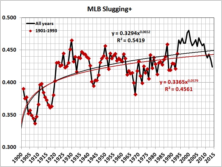
The values of SLG+ after 1993 — and especially for the years 1994-2009 — boost the regression line markedly upward.

A similar picture emerges in the next graph, which focuses on the years after 1968, when offensive statistics reached a nadir:

SLG+ since 1968

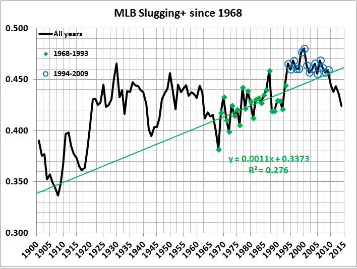
SLG+ values for 1994-2009 lie above the trend line.

On the evidence of the two preceding graphs I designate 1994-2009 as the era of PEDs. (I know that PEDs didn’t come into use in 1994 and disappear from the scene after 2009. It’s just that their effects are most obvious during 1994-2009.)

So much for the effect of PEDs on power hitting. What about the effect of PEDs on run production? You might expect that the unsurpassed surge in power hitting during the PEDs era resulted in an unsurpassed surge in run production: But it didn’t:

MLB team runs per game

Why did run production in the PEDs era fall short of run production in 1921-1942, the original “lively ball” era. Here’s my hypothesis: The frequency of home runs was on the rise during the original “lively ball” era. But the game in that era was still strongly influenced by the dynamic style of play of the preceding “dead ball” era. Scoring in the lively-ball era still depended heavily on slapping out base hits, taking the extra base on an outfield hit, and the hit-and-run. Those practices dwindled in later years, when scoring became more a matter of waiting for sluggers to deliver home runs, when they weren’t drawing walks or striking out. Some of the differences are evident in this graph:

Selected MLB statistics_1901-2014

It turns out that the emphasis on power hitting (especially home-run hitting) may be counterproductive. The relationship between runs per game (R) and other significant variables for the period 1921-2014 looks like this:

(2) R = – 0.220 + 18.7(BA) + 0.721(2B) + 1.26(HR) – 0.160(SO) – 0.0540(BatAge)

where,
BA = batting average
2B = doubles per game
HR = home runs per game
SO = strikeouts per game
BatAge = average age of batters

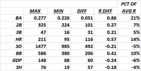
Applying (2) to the actual range of values for each variable, I get:

Effect of variables on run production_1921-2014

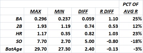
“Max” and “min” are the maximum and minimum values for 1921-2014. “Diff” is the difference between the maximum and minimum values. “R diff” represents the number of runs accounted for by “Diff,” based on equation (2). “Pct. of avg. R” is “R diff” as a percentage of the average number of runs per game during 1921-2014.

Team statistics for 2014 yield a somewhat more detailed but similar result:

(3) R = – 0.153 + 16.8(BA) + 0.00269(2B) + 0.00675(3B) + 0.00488(HR) – 0.000428(SO) + 0.00198(BB) – 0.00408(GDP) – 0.00314(SH)

where,
BA = team batting average
2B = doubles hit by team
3B = triples hit by team
HR = home runs hit by team
SO = team strikeouts
BB = team walks
GDP = number of times a team grounds into double plays
SH = number of times a team executes a sacrifice hit (a bunt that advances a base runner)

Applying (3) to the actual range of values for each variable, I get:

Effect of variables on run production_2014

For a third look, I analyzed the offensive records of the 560 players with at least 3,000 plate appearances whose careers started no sooner than 1946 and ended no later than 1993. I computed, for each player, a measure of his career run-scoring potential (R*):

(4) R* = [(1B + 2(2B) + 3(3B) + 4(HR) + BB + HBP + SH + SF – GDP + SB – CS]/PA

where,
1B = singles
2B = doubles
3B = triples
HR = home runs
BB = bases on balls
HBP = hit by pitcher
SH = sacrifice hits
SF = sacrifice flies
GDP = grounded into double plays
SB = stolen bases
CS = caught stealing
PA = plate appearances

This regression equation explains R*:

(5) R* = 0.0521 + 0.796(1B)  + 1.794(2B) + 3.29 (3B) + 3.68(HR) + 0.998(BB) – 0.0450(SO) + 1.18(SB – CS)

(The explanatory variables are career totals divided by total number of plate appearances. The equation has an r-squared of 0.985, with extremely significant F- and p-values.)

I derived the following table of elasticities from (5):

Elasticities of variables

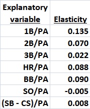
Elasticity measures the responsiveness of R* to a change in the value of each variable. Thus, for example, a 1-percent increase in 1B/PA would cause R* to increase by 0.135 percent, and so on. The elasticities suggest that singles hitters generate more scoring opportunities than home-run hitters, on the whole. Case closed?

Not at all. Look at this table of cross-correlations:

Cross correlations

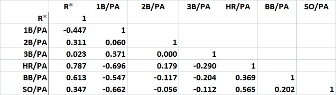
Even though there’s a strong, positive correlation between HR/PA and SO/PA,  the elasticity on SO/PA is relatively small. Further, the elasticity on BB/PA is relatively high, and BB/PA is strongly and negatively correlated with 1B/PA — and less strongly but positively correlated with HR/PA. This leads me to suspect that the elasticities on 1B/PA and HR/PA overstate the contributions of singles hitters and understate the contributions of home-run hitters.

I forced a regression in which the only explanatory variables are 1B, 2B, 3B, and HR. The resulting equation yields these elasticities:

Elasticities of variables_2

(I obtained similar results when I revisited the statistics for 1921-2014 and the 2014 season.)

This is a less-than-satisfactory result because the underlying equation omits several explanatory variables. But it hints at the value of hitters with extra-base power, especially home-run hitters. Issues of health and integrity aside, it seems that a “juiced” hitter can do his team a lot of good — if he doesn’t strike out a lot more or walk a lot less than usual in his pursuit of more home runs.

All of this uncertainty reminds me of “Baseball Statistics and the Consumer Price Index,” where I say this:

There are many variations in the conditions of play that have resulted in significant changes in offensive statistics. Among those changes are the use of cleaner and more tightly wound baseballs, the advent of night baseball, better lighting for night games, bigger gloves, lighter bats, bigger and stronger players, the expansion of the major leagues in fits and starts, the size of the strike zone, the height of the pitching mound, and — last but far from least in this list — the integration of black and Hispanic players into major league baseball. In addition to these structural variations, there are others that mitigate against the commensurability of statistics over time; for example, the rise and decline of each player’s skills, the skills of teammates (which can boost or depress a player’s performance), the characteristics of a player’s home ballpark (where players generally play half their games), and the skills of the opposing players who are encountered over the course of a career.

Despite all of these obstacles to commensurability, the urge to evaluate the relative performance of players from different teams, leagues, seasons, and eras is irrepressible. Baseball-Reference.com is rife with such evaluations; the Society for American Baseball Research (SABR) revels in them; many books offer them (e.g., this one); and I have succumbed to the urge more than once.

It is one thing to have fun with numbers. It is quite another thing to ascribe meanings to them that they cannot support.

All I can safely say about the effect of PEDs on run-scoring is that the PEDs era saw more of it than the preceding era (see the third graph, “MLB Team Runs per Game”).

In the end, the seemingly large effect of PEDs may be illusory:

…In congressional testimony in 2005, [Sandy] Alderson [former general manager of the Oakland A’s] said that during the 1990s, other factors “obscured a steroid problem”:

Home runs and run production were increasing during the time but not always year to year. At the same time, strength programs were in vogue across baseball. Hitter-friendly ballparks were being built. Expansion had occurred in 1993 and again in 1998. Two seasons, ’94 and ’95, had been shortened by a players’ strike. Bat design had changed and there was an emphasis with many clubs on having more offensive players even at traditionally defensive positions. [From pp. 62-3 of the Mitchell report, listed in “Related reading.”]

The factors cited by Alderson probably boosted the rate at which batters were pumping out extra-base hits. Another significant factor is the size of the strike zone, which had been shrinking for years before it began to expand around 2009-10. Has power hitting declined because of the growing strike zone or because fewer players are using PEDs? The right answer is “yes.”

Uncertainty rears its head again.

*     *     *

Acknowledgement: This analysis draws on statistics provided by Baseball-Reference.com.

*    *     *

Related reading:
Mitchell Grossman et al., “Steroids in Major League Baseball,” undated
Baseball Prospectus, “Baseball between the Numbers: What Do Statistics Tell Us About Steroids?,” March 9, 2006
George J. Mitchell, “Report to the Commissioner of Baseball of an Independent Investigation into the Illegal Use of Steroids and Other Performance Enhancing Substances by Players in Major League Baseball,” December 13, 2007
Zachary D. Rymer, “Proof That the Steroids-Era Power Surge in Baseball Has Been Stopped,” Bleacher Report, May 22, 2013
Brian M. Mills, “Expert Workers, Performance Standards, and On-the-Job Training: Evaluating Major League Baseball Umpires,” Journal of Economic Literature, August 27, 2014
Jon Roegele, “Baseball’s Strike Zone Expansion Is Out of Control,” Slate, October 15, 2014

Signature

May the Best Team Lose

This is an update of a six-season-old post. It includes 2016 post-season play to date. I will update it again after the 2016 World Series.

The first 65 World Series (1903 and 1905-1968) were contests between the best teams in the National and American Leagues. The winner of a season-ending Series was therefore widely regarded as the best team in baseball for that season (except by the fans of the losing team and other soreheads). The advent of divisional play in 1969 meant that the Series could include a team that wasn’t the best in its league. From 1969 through 1993, when participation in the Series was decided by a single postseason playoff between division winners (1981 excepted), the leagues’ best teams met in only 10 of 24 series. The advent of three-tiered postseason play in 1995 and four-tiered postseason play in 2012, has only made matters worse.*

By the numbers:

  • Postseason play originally consisted of a World Series (period) involving 1/8 of major-league teams — the best in each league. Postseason play now involves 1/3 of major-league teams and 7 postseason series (3 in each league plus the inter-league World Series).
  • Only 3 of the 22 Series from 1995 through 2016 have featured the best teams of both leagues, as measured by W-L record.
  • Of the 21 Series from 1995 through 2015, only 6 were won by the best team in a league.
  • Of the same 21 Series, 10 (48 percent) were won by the better of the two teams, as measured by W-L record. Of the 65 Series played before 1969, 35 were won by the team with the better W-L record and 2 involved teams with the same W-L record. So before 1969 the team with the better W-L record won 35/63 of the time for an overall average of 56 percent. That’s not significantly different from the result for the 21 Series played in 1995-2015, but the teams in the earlier era were each league’s best, which is no longer true. . .
  • From 1995 through 2016, a league’s best team (based on W-L record) appeared in a Series only 15 of 44 possible times — 6 times for the NL (pure luck), 9 times for the AL (little better than pure luck). (A random draw among teams qualifying for post-season play would have resulted in the selection of each league’s best team about 6 times out of 22.)
  • Division winners have opposed each other in only 11 of the 22 Series from 1995 through 2016.
  • Wild-card teams have appeared in 10 of those Series, with all-wild-card Series in 2002 and 2014.
  • Wild-card teams have occupied more than one-fourth of the slots in the 1995-2016 Series — 12 slots out of 44.

The winner of the World Series used to be a league’s best team over the course of the entire season, and the winner had to beat the best team in the other league. Now, the winner of the World Series usually can claim nothing more than having won the most postseason games — 11 or 12 out of as many as 19 or 20. Why not eliminate the 162-game regular season, select the postseason contestants at random, and go straight to postseason play?

__________
* Here are the World Series pairings for 1994-2016 (National League teams listed first; + indicates winner of World Series):

1995 –
Atlanta Braves (division winner; .625 W-L, best record in NL)+
Cleveland Indians (division winner; .694 W-L, best record in AL)

1996 –
Atlanta Braves (division winner; .593, best in NL)
New York Yankees (division winner; .568, second-best in AL)+

1997 –
Florida Marlins (wild-card team; .568, second-best in NL)+
Cleveland Indians (division winner; .534, fourth-best in AL)

1998 –
San Diego Padres (division winner; .605 third-best in NL)
New York Yankees (division winner, .704, best in AL)+

1999 –
Atlanta Braves (division winner; .636, best in NL)
New York Yankees (division winner; .605, best in AL)+

2000 –
New York Mets (wild-card team; .580, fourth-best in NL)
New York Yankees (division winner; .540, fifth-best in AL)+

2001 –
Arizona Diamondbacks (division winner; .568, fourth-best in NL)+
New York Yankees (division winner; .594, third-best in AL)

2002 –
San Francisco Giants (wild-card team; .590, fourth-best in NL)
Anaheim Angels (wild-card team; .611, third-best in AL)+

2003 –
Florida Marlines (wild-card team; .562, third-best in NL)+
New York Yankees (division winner; .623, best in AL)

2004 –
St. Louis Cardinals (division winner; .648, best in NL)
Boston Red Sox (wild-card team; .605, second-best in AL)+

2005 –
Houston Astros (wild-card team; .549, third-best in NL)
Chicago White Sox (division winner; .611, best in AL)*

2006 –
St. Louis Cardinals (division winner; .516, fifth-best in NL)+
Detroit Tigers (wild-card team; .586, third-best in AL)

2007 –
Colorado Rockies (wild-card team; .552, second-best in NL)
Boston Red Sox (division winner; .593, tied for best in AL)+

2008 –
Philadelphia Phillies (division winner; .568, second-best in NL)+
Tampa Bay Rays (division winner; .599, second-best in AL)

2009 –
Philadelphia Phillies (division winner; .574, second-best in NL)
New York Yankees (division winner; .636, best in AL)+

2010 —
San Francisco Giants (division winner; .568, second-best in NL)+
Texas Rangers (division winner; .556, fourth-best in AL)

2011 —
St. Louis Cardinals (wild-card team; .556, fourth-best in NL)+
Texas Rangers (division winner; .593, second-best in AL)

2012 —
San Francisco Giants (division winner; .580, third-best in AL)+
Detroit Tigers (division winner; .543, seventh-best in AL)

2013 —
St. Louis Cardinals (division winner; .599, best in NL)
Boston Red Sox (division winner; .599, best in AL)+

2014 —
San Francisco Giants (wild-card team; .543, 4th-best in NL)+
Kansas City Royals (wild-card team; .549, 4th-best in AL)

2015 —
New York Mets (division winner; .556, 5th best in NL)
Kansas City Royals (division winner; .586, best in AL)+

2016 —
Chicago Cubs (division winner; .640, best in NL)
Cleveland Indians (division winner; .584, 2nd best in AL)

Signature

Competitiveness in Major League Baseball

Yesterday marked the final regular-season games of the 2014 season of major league baseball (MLB), In observance of that event, I’m shifting from politics to competitiveness in MLB. What follows is merely trivia and speculation. If you like baseball, you might enjoy it. If you don’t like baseball, I hope that you don’t think there’s a better team sport. There isn’t one.

Here’s how I compute competitiveness for each league and each season:

INDEX OF COMPETITIVENESS = AVEDEV/AVERAGE; where

AVEDEV = the average of the absolute value of deviations from the average number of games won by a league’s teams in a given season, and

AVERAGE =  the average number of games won by a league’s teams in a given season.

For example, if the average number of wins is 81, and the average of the absolute value of deviations from 81 is 8, the index of competitiveness is 0.1 (rounded to the nearest 0.1). If the average number of wins is 81 and the average of the absolute value of deviations from 81 is 16, the index of competitiveness is 0.2.  The lower the number, the more competitive the league.

With some smoothing, here’s how the numbers look over the long haul:

Index of competitiveness
Based on numbers of wins by season and by team, for the National League and American League, as compiled at Baseball-Reference.com.

I drew a separate line for the American League without the Yankees, to show the effect of the Yankees’ dominance from the early 1920s to the early 1960s, and the 10 years or so beginning around 1995.

The National League grew steadily more competitive from 1940 to 1987, and has slipped only a bit since then. The American League’s climb began in 1951, and peaked in 1989; the AL has since slipped a bit more than the NL, but seems to be rebounding. In any event, there’s no doubt that both leagues are — and in recent decades have been — more competitive than they were in the early to middle decades of the 20th century. Why?

My hypothesis: integration compounded by expansion, with an admixture of free agency and limits on the size of rosters.

Let’s start with integration. The rising competitiveness of the NL after 1940 might have been a temporary thing, but it continued when NL teams (led by the Brooklyn Dodgers) began to integrate, by adding Jackie Robinson in 1947. The Cleveland Indians of the AL followed suit, by adding Larry Doby later in the same season. By the late 1950s, all major league teams (then 16) had integrated, though the NL seems to have integrated faster. The more rapid integration of the NL could explain its earlier ascent to competitiveness. Integration was followed in short order by expansion: The AL began to expand in 1961 and the NL began to expand in 1962.

How did expansion and integration combine to make the leagues more competitive? Several years ago, I opined:

[G]iven the additional competition for talent [following] expansion, teams [became] more willing to recruit players from among the black and Hispanic populations of the U.S. and Latin America. That is to say, teams [came] to draw more heavily on sources of talent that they had (to a large extent) neglected before expansion.

Further, free agency, which began in the mid-1970s,

made baseball more competitive by enabling less successful teams to attract high-quality players by offering them more money than other, more successful, teams. Money can, in some (many?) cases, compensate a player for the loss of psychic satisfaction of playing on a team that, on its record, is likely to be successful.

Finally,

[t]he competitive ramifications of expansion and free agency [are] reinforced by the limited size of team rosters (e.g., each team may carry only 25 players from May through August). No matter how much money an owner has, the limit on the size of his team’s roster constrains his ability to sign all (even a small fraction) of the best players.

It’s not an elegant hypothesis, but it’s my own (as far as I know). I offer it for discussion.

Signature

*     *     *

Other related posts:
The End of a Dynasty
What Makes a Winning Team
More Lessons from Baseball
Not Over the Hill

Baseball: The King of Team Sports

There are five major team sports: baseball, basketball, football (American style), ice hockey, and soccer (European football). The skills and abilities required to play these sports at the top professional level are several and varied. But, in my opinion — based on experience and spectating — the skills can be ranked hierarchically and across sports. When the ordinal rankings are added, baseball comes out on top by a wide margin; hockey is in the middle; basketball, football, and soccer are effectively tied for least-demanding of skill and ability.

Ranking of sports by skill and ability

Not Over the Hill

The Washington Post reports on some research about intelligence that is as irrelevant as the candle problem. Specifically:

[R]esearchers at Canada’s Simon Fraser University … have found that measurable declines in cognitive performance begin to occur at age 24. In terms of brainpower, you’re over the hill by your mid-20s.

The researchers measured this by studying the performance of thousands of players of Starcraft 2, a strategy video game….

Even worse news for those of us who are cognitively over-the-hill: the researchers find “no evidence that this decline can be attenuated by expertise.” Yes, we get wiser as we get older. But wisdom doesn’t substitute for speed. At best, older players can only hope to compensate “by employing simpler strategies and using the game’s interface more efficiently than younger players,” the authors say.

So there you have it: scientific evidence that we cognitively peak at age 24. At that point, you should probably abandon any pretense of optimism and accept that your life, henceforth, will be a steady descent into mediocrity, punctuated only by the bitter memories of the once seemingly-endless potential that you so foolishly squandered in your youth. Considering that the average American lives to be 80, you’ll have well over 50 years to do so! (Christopher Ingraham, “Your Brain Is Over the Hill by Age 24,” April 16, 2014)

Happily, Starcraft 2 is far from a representation of the real world. Take science, for example. I went to Wikipedia and obtained the list of all Nobel laureates in physics. It’s a long list, so I sampled it — taking the winners for the first five years (1901-1905), the middle five years (1955-1959) and the most recent five years (2009-2013). Here’s a list of the winners for those 15 years, and the approximate age of each winner at the time he or she did the work for which the prize was awarded:

1901 Wilhelm Röntgen (50)

1902 Hendrik Lorentz; (43) and Pieter Zeeman (31)

1903 Henri Becquerel, (44), Pierre Curie (37), and Marie Curie (29)

1904 Lord Rayleigh (52)

1955 Willis Lamb (34) and Polykarp Kusch (40)

1956 John Bardeen (39), Walter Houser Brattain (45), and William Shockley (37)

1957 Chen Ning Yang (27) and Tsung-Dao Lee (23)

1958 Pavel Cherenkov (30), Ilya Frank (26), and Igor Tamm (39)

1959 Emilio G. Segrè (50) and Owen Chamberlain (35)

2009 Charles K. Kao (33), Willard S. Boyle (45), and George E. Smith (39)

2010 Andre Geim (46) and Konstantin Novoselov (34)

2011 Saul Perlmutter (39), Adam G. Riess (29), and Brian Schmidt (31)

2012 Serge Haroche (40-50) and David J. Wineland (40-50)

2013 François Englert (32) and Peter W. Higgs (35)

There’s exactly one person within a year of age 24 (Tsung-Dao Lee, 23), and a few others who were still in their (late) 20s. Most of the winners were in their 30s and 40s when they accomplished their prize-worthy scientific feats. And there are at least as many winners who were in their 50s as winners who were in their 20s.

Let’s turn to so-called physical pursuits, which often combine brainpower (anticipation, tactical improvisation, hand-eye coordination) and pure physical skill (strength and speed). Baseball exemplifies such a pursuit. Do ballplayers go sharply downhill after the age of 24? Hardly. On average, they’re just entering their best years at age 24, and they perform at peak level for several years.

I’ll use two charts to illustrate the point about ballplayers. The first depicts normalized batting average vs. age for 86 of the leading hitters in the history of the American League*:

Greatest hitters_BA by age_86 hitters

Because of the complexity of the spreadsheet from which the numbers are taken, I was unable to derive a curve depicting mean batting average vs. age. But the density of the plot lines suggests that the peak age for batting average begins at 24 and extends into the early 30s. Further, with relatively few exceptions, batting performance doesn’t decline sharply until the late 30s.

Among a more select group of players, and by a different measure of performance, the peak years occur at ages 24-28, with a slow decline after 28**:

Offensive average by age_25 leading hitters

The two graphs suggest to me that ballplayers readily compensate for physical decline (such as it is) by applying the knowledge they acquire in the course of playing the game. Such knowledge would include “reading” pitchers to make better guesses about the pitch that’s coming, knowing where to hit a ball in a certain ballpark against certain fielders, judging the right moment to attempt a stolen base against a certain pitcher-catcher combination, hitting to the opposite field on occasion instead of trying to pull the ball every time, and so on.

I strongly suspect that what is true in baseball is true in many walks of life: Wisdom — knowledge culled from experience — compensates for pure brainpower, and continues to do so for a long time. The Framers of the Constitution, who weren’t perfect but who were astute observers of the human condition, knew as much. That’s why they set 35 as the minimum age for election to the presidency. (Subsequent history — notably, the presidencies of TR, JFK, Clinton, and Obama — tells us that the Framers should have made it 50.)

I do grow weary of pseudo-scientific crap like the research reported in the Post. But it does give me something to write about. And most of the pseudo-science is harmless, unlike the statistical lies on which global-warming hysteria is based.

__________
* The numbers are drawn from the analysis described in detail here and here, which is based on statistics derived through the Play Index at Baseball-Reference.com. The bright red line represents Ty Cobb’s career, which deserves special mention because of Cobb’s unparalleled dominance as a hitter-for-average over a 24-year career, and especially for ages 22-32. I should add that Cobb’s dominance has been cemented by Ichiro Suzuki’s sub-par performance in the three seasons since I posted this, wherein I proclaimed Cobb the American League’s best all-time hitter for average, taking age into account. (There’s no reason to think that the National League has ever hosted Cobb’s equal.)

** This is an index, where 100 represents parity with the league average. I chose the 25 players represented here from a list of career leaders in OPS+ (on-base percentage plus slugging average, normalized for league averages and park factors). Because of significant changes in rules and equipment in the late 1800s and early years of the 1900s (see here, here, and here), players whose careers began before 1907 were eliminated, excepting Cobb, who didn’t become a regular player until 1906. Also eliminated were Barry Bonds and Mark McGwire, whose drug-fueled records don’t merit recognition, and Joey Votto, who has completed only eight seasons. Offensive Average (OA) avoids the double-counting inherent in OPS+, which also (illogically) sums two fractions with different denominators. OA measures a player’s total offensive contribution (TOC) per plate appearance (PA) in a season, normalized by the league average for that season. TOC = singles + doubles x 2 + triples x 3 + home runs x 4 + stolen bases – times caught stealing + walks – times grounded into a double play + sacrifice hits + sacrifice flies. In the graph, Cobb seems to disappear into the (elite) crowd after age 24, but that’s an artifact of Cobb’s preferred approach to the game — slapping hits and getting on base — not his ability to hit the long ball, for which extra credit is given in computing OA. (See this, for example.)

More Lessons from Baseball

Regular readers of this blog will know that I sometimes draw on the game of baseball and its statistics to make points about various subjects — longevity, probability, politics, management, and cosmology, for example. (See the links at the bottom of this post.)

Today’s sermon is about the proper relationship between owners and management. I will address two sets of graphs giving the won-lost (W-L) records of the “old 16” major-league franchises. The “old 16” refers to the 8 franchises in the National League (NL) and the 8 franchises in American League (AL) in 1901, the first year of the AL’s existence as a major league. Focusing on the “old 16” affords the long view that’s essential in thinking about success in an endeavor, whether it is baseball, business, or empire-building.

The first graph in each set gives the centered 11-year average W-L record for each of the old teams in each league, and for the league’s expansion teams taken as a group. The 11-year averages are based on annual W-L records for 1901-2013. The subsequent graphs in each set give, for each team and group of expansion teams, 11-year averages and annual W-L records. Franchise moves from one city to another are indicated by vertical black lines. The titles of each graph indicates the city or cities in which the team has been located and the team’s nickname or nicknames.

Here are the two sets of graphs:

W-L records of old-8 NL franchises

W-L records of old-8 AL franchises

What strikes me about the first graph in each set is the convergence of W-L records around 1990. My conjecture: The advent of free agency in the 1970s must have enabled convergence. Stability probably helped, too. The AL had been stable since 1977, when it expanded to 14 teams; the NL had been stable since 1969, when it expanded to 12 teams. As the expansion teams matured, some of them became more successful, at the expense of the older teams. This explanation is consistent with the divergence after 1993, with the next round of expansion (there was another in 1998). To be sure, all of this conjecture warrants further analysis. (Here’s an analysis from several years ago that I still like.)

Let’s now dispose of franchise shifts as an explanation for a better record. I observe the following:

The Braves were probably on the upswing when they moved from Boston to Milwaukee in 1953. They were on the downswing at the time of their second move, from Milwaukee to Atlanta in 1966. It took many years and the acquisition of astute front office and a good farm system to turn the Braves around.

The Dodgers’ move to LA in 1958 didn’t help the team, just the owners’ bank accounts. Ditto the Giants’ move to San Francisco in 1958.

Turning to the AL, the St. Louis Browns became the latter-day Baltimore Orioles in 1954. That move was accompanied by a change in ownership. The team’s later successes seem to have been triggered by the hiring of Paul Richards and Lee McPhail to guide the team and build its farm system. The Orioles thence became a good-to-great from the mid-1960 to early 1980s, with a resurgence in the late 1980s and early 1990s. The team’s subsequent decline seems due to the meddlesome Peter Angelos, who became CEO in 1993.

The Athletics, like the Braves, moved twice. First, in 1955 from Philadelphia to Kansas City, and again in 1968 from Kansas City to Oakland. The first move had no effect until Charles O. Finley took over the team. His ownership carried over to Oakland. Finley may have been the exceptional owner whose personal involvement in the team’s operations helped to make it successful. But the team’s post-Finely record (1981-present) under less-involved owners suggests otherwise. The team’s pre-Kansas City record reflects Connie Mack’s tight-fisted ways. Mack — owner-manager of the A’s from 1901 until 1950 — was evidently a good judge of talent and a skilled field manager, but as an owner he had a penchant for breaking up great teams to rid himself of high-priced talent — with disastrous consequences for the A’s W-L record from the latter 1910s to late 1920s, and from the early 1930s to the end of Mack’s reign.

The Washington Senators were already resurgent under owner Calvin Griffith when the franchise was moved to Minnesota for the 1961 season. The Twins simply won more consistently than they had under the tight-fisted ownership of Clark Griffith, Calvin’s father.

Bottom line: There’s no magic in a move. A team’s success depends on the willingness of owners to spend bucks and to hire good management — and then to get out of the way. (Yes, George Steinbrenner bankrolled a lot of pennant-winning teams during his ownership years, from 1973 to 2010, but the Yankees’ record improved as “The Boss” became a less-intrusive owner from the mid-1990s until his death.)

There are many other stories behind the graphs — just begging to be told, but I’ll leave it at that.

Except to say this: The “owners” of America aren’t “the people,” romantic political pronouncements to the contrary notwithstanding. As government has become more deeply entrenched in the personal and business affairs of Americans, there has emerged a ruling class which effectively “owns” America. It is composed of professional politicians and bureaucrats, who find ample aid and comfort in the arms of left-wing academicians and the media. The “owners’ grip on power is sustained by the votes of the constituencies to which they pander.

Yes, the constituencies include “crony capitalists,” who benefit from regulatory barriers to competition and tax breaks. Though it must be said that they produce things, and would probably do well without the benefits they reap from professional politicians and bureaucrats. Far more powerful are the non-producers, who are granted favors based on their color, gender, age, etc., in return for the tens of millions of votes that they cast to keep the “owners” in power.

Far too many Americans are whiners who grovel at the feet of their “owners,” begging for handouts. Far too few Americans are self-managed winners.

*     *     *

Related posts:

The End of Dynasty

I have updated “The End of a Dynasty?” and removed the question mark. I am convinced that we have seen the end of Dynasty III of the New York Yankees. Go there for details.