The proprietor of Political Calculations, harkening back to Irving Fisher, makes a case for personal consumption as the proper measure of national output. Robert Higgs argues that personal consumption is the proper benchmark against which to measure the burden of government spending:
How big is government in the United States? The answer depends on the concept used to define its size. Although many such concepts are available, and several are used from time to time, by far the most common measure, especially in studies by economists, is total government spending (G) as a percentage of the gross domestic product (GDP)….
On reflection, however, one might well wonder why G has been “normalized” so often by measuring it relative to GDP. One reason this practice is questionable is that GDP includes a large part—equal in recent years to about 10 percent of the total—known as the capital consumption allowance. This is an estimate of the amount of spending that was required simply to maintain the value of the nation’s capital stock as it depreciated because of wear and tear and obsolescence. Given that GDP is defined to include only “final” goods and services, it is questionable that expenditures made solely to maintain the capital stock should be included at all, rather than excluded as “intermediate goods,” as a large volume of the economy’s total output is already excluded (e.g., steel sold the manufacturers of machinery, wheat sold to flour mills).
One way around this difficulty is to measure G not relative to GDP, but relative to net national product, which, except for a statistical discrepancy, is the same as the accounting concept known as national income (NI). Using NI as the denominator, for the same period 2010-14, we find that size of government in the United States was 41.4 percent. This figure, however, may still give a misleading impression of the relative size of government because NI includes elements that are more or less remote from the economic affairs of individual households.
After some adjustments to NI, including several deductions (e.g., for contributions to government social insurance) and several additions (e.g., for personal income receipts on assets), we arrive at the accounting concept designated personal income (PI), which, because the foregoing deductions and additions have been almost offsetting, has been approximately the same as NI in recent years. From the total PI, individuals pay taxes, spend a portion (designated personal consumption, C), and save the rest. PI is the income concept that accords most closely with ordinary people’s notion of their income.
Personal consumption outlays, which currently amount to about 95 percent of disposable (that is, after-tax) personal income, are an arguably superior denominator for the measurement of the relative size of government. If we use it as such, we find, for the same period 2010-14, a figure of 52.2 percent. Thus, by a more meaningful measure, total government spending is equivalent not to a little more than a third of the economy (G/GDP) nor to a little more than four-tenths of it (G/NI), but rather to a little more than half of the part of the economy that affords immediate satisfaction to consumers (C/PI).
I would argue that something like PI, rather than C, is the proper benchmark for measuring the burden of government spending. As Higgs says, “PI is the income concept that accords most closely with ordinary people’s notion of their income.”
But I would go a step further and say that the relevant measure of personal income is that part of it which derives from private economic activity: private personal income (PPI). I would therefore exclude from PPI any income derived directly from government employment and government transfer payments (Social Security, etc.).
PPI is a measure of “real” economic activity, in that it reflects the aggregate value of voluntary, mutually beneficial exchanges of goods and services. Government, on the other hand, crowds out and hinders real economic activity, in three ways: spending on government programs, redistributive spending, and regulatory activity. In other words, there is more to government spending than G, the formal definition of which excludes transfer payments. I therefore compare PPI to $Ga, which
represents the observable cost of [governmental activities], including [actual transfer payments and de facto transfer payments disguised as compensation of government employees and contractors], even though they flow into private-sector consumption and investment…. $Ga does not include indirect costs, such as those that are imposed by the regulatory burden….
Without further ado, here’s a graphical comparison of PPI and $Ga*:

That’s not the end of the story. Regulations impose a huge burden on the U.S. economy. Higgs cites the work of Wayne Crews, “who makes an annual estimate of the cost of compliance with federal regulations alone.” According to Crews, “Costs for Americans to comply with federal regulations reached $1.863 trillion in 2013.” (That’s remarkably close to an estimate for 2008 obtained by a different study, which I’ve cited elsewhere.)
Let’s focus on 2013. In then-year dollars, PPI was $11.4 trillion, $Ga was $6.3 trillion, and the regulatory burden imposed by federal regulations was $1.9 trillion. The sum of these three (mutually exclusive) quantities is $19.6 trillion. PPI accounts for only 58 percent of the sum. And it is safe to say that if State and local regulations were taken into account, PPI would account for no more than one-half of the dollar value of the nation’s potential economic output.
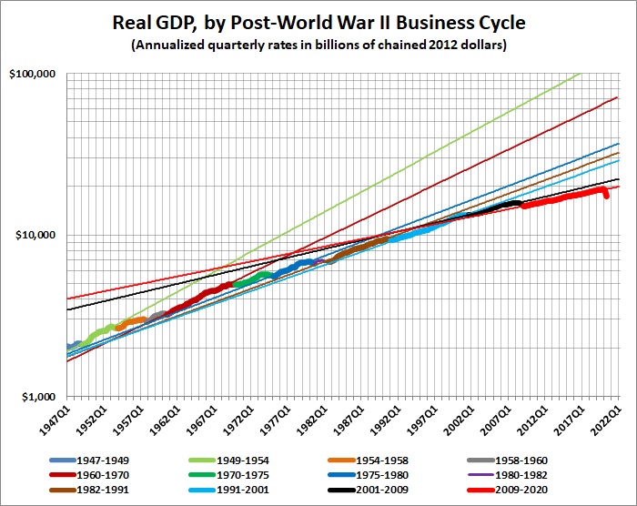
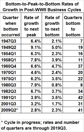
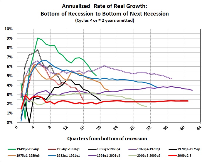
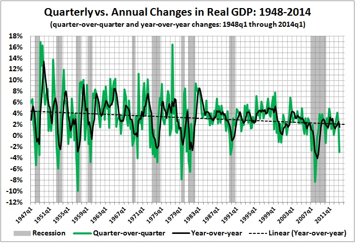
That is a reasonable estimate of the real (economic) burden of government — at the moment. But the cumulative burden is greater than that; decades of government spending and regulatory activity have cut the rate of economic growth almost in half since the end of World War II:

__________
* I estimated PPI from Bureau of Economic Analysis, National Income and Product Accounts Tables, Table 2.1, Personal Income and Its Disposition, by adding line 4 (wages and salaries paid by private industries); the portion of line 6 (supplements to wages and salaries) attributable to private employment (line 4 divided by line 3 — total salaries and wages, including government — times line 6); line 9 (proprietors’ income); line 12 (rental income); and line 13 (interest and dividend income).
I estimated $Ga from Table 3.1, Government Current Receipts and Expenditures, by adding lines 35-38: current expenditures, gross government investment, capital transfer payments, and net purchases on non-produced assets.
In both cases, I estimated per capita values by applying the population figures given at MeasuringWorth. I converted all estimates to 2014 dollars by applying CPI-U values obtained from BLS.gov.
* * *
Related posts:
Lay My (Regulatory) Burden Down
Government in Macroeconomic Perspective
The Rahn Curve Revisited
The Slow-Motion Collapse of the Economy